
[翻译] FlatUIKit
FlatUIKit
FlatUIKit is a collection of iOS components styled with the "Flat UI" aesthetic that we created while buildingGrouper for iPhone. Its design inspiration comes from Flat UI and Kyle Miller. Styling is implemented via categories on/drop-in replacements for existing UIKit components, so integrating it into your project is very straightforward.
FlatUIKit 是一个具有 iOS 扁平化风格美学的组件,我在 Grouper 应用中使用了。设计灵感来自于 Flat UI 和 Kyle Miller。这个组件是通过类目的方式、或者继承自父类的方式来实现的,所以,将他融入到你的工程非常容易。
Installation(安装)
FlatUIKit can be installed via Cocoapods. Simply add
pod 'FlatUIKit'
to your Podfile. If you don't use Cocoapods you're welcome to use git submodules, or simply download it and include it in your project manually.
Note that FlatUIKit requires the CoreText framework as well as iOS > 5.0. The flat stepper component requires iOS > 6.0.
你可以使用 Cocoapods 来安装。你也可以手动下载源码来添加到你的工程当中。
注意,FlatUIKit 需要 CoreText 框架,iOS > 5.0,这个扁平的 stepper 组件需要 iOS > 6.0。
The Components(组件)
Buttons(按钮)
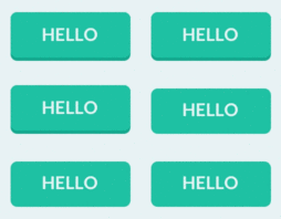
FUIButton is a drop-in subclass of UIButton that exposes the additional properties buttonColor, shadowColor, cornerRadius, and shadowHeight. Note that if you set any of these, you have to set all of them.
FUIButton 继承自父类 UIButton,它添加了一些额外的属性 buttonColor, shadowColor, cornerRadius, 和 shadowHeight,注意,如果你设置了其中的一个,你就必须设置所有剩下的属性。
myButton.buttonColor = [UIColor turquoiseColor];

myButton.shadowColor = [UIColor greenSeaColor];

myButton.shadowHeight = 3.0f;

myButton.cornerRadius = 6.0f;

myButton.titleLabel.font = [UIFont boldFlatFontOfSize:16];

[myButton setTitleColor:[UIColor cloudsColor] forState:UIControlStateNormal];

[myButton setTitleColor:[UIColor cloudsColor] forState:UIControlStateHighlighted];
SegmentedControls(段控制器)
FUISegmentedControl is a drop-in subclass of UISegmentedControl that exposes the additional properties selectedColor, deselectedColor, selectedFont, deselectedFont, selectedFontColor, deselectedFontColor, dividerColor and cornerRadius. Note that if you set any of these, it is recommended that you set all of them.
FUISegmentedControl 继承至父类 UISegmentedControl,它添加了一些额外的属性 selectedColor, deselectedColor, selectedFont, deselectedFont, selectedFontColor, deselectedFontColor, dividerColor 和 cornerRadius,注意,设置了其中一个,其他剩下的属性都需要设置。
mySegmentedControl.selectedFont = [UIFont boldFlatFontOfSize:16];

mySegmentedControl.selectedFontColor = [UIColor cloudsColor];

mySegmentedControl.deselectedFont = [UIFont flatFontOfSize:16];

mySegmentedControl.deselectedFontColor = [UIColor cloudsColor];

mySegmentedControl.selectedColor = [UIColor amethystColor];

mySegmentedControl.deselectedColor = [UIColor silverColor];

mySegmentedControl.dividerColor = [UIColor midnightBlueColor];

mySegmentedControl.cornerRadius = 5.0;
Switches(选择器)
FUISwitch is not a subclass of UISwitch (UISwitch is too inflexible to subclass), but rather a reimplementation that exposes all of the methods of UISwitch. In addition, it also provides access to its underlying on/off UILabels and other subviews.
FUISwitch 不是继承至 UISwitch(UISwitch 太恶心) ,只是重新实现了它,另外,它提供了开关的 UILabel 。
mySwitch.onColor = [UIColor turquoiseColor];

mySwitch.offColor = [UIColor cloudsColor];

mySwitch.onBackgroundColor = [UIColor midnightBlueColor];

mySwitch.offBackgroundColor = [UIColor silverColor];

mySwitch.offLabel.font = [UIFont boldFlatFontOfSize:14];

mySwitch.onLabel.font = [UIFont boldFlatFontOfSize:14];

Alert Views(警告View)
Similar to FUISwitch, FUIAlertView is a reimplemenation of UIAlertView that exposes all of UIAlertView's methods (and delegate methods, with the FUIAlertViewDelegate protocol), but with far greater flexibility in UI customization. All of its child UILabels, UIViews, and FUIButtons can be customized at will.
与 FUISwitch ,FUIAlertView 重新实现了 UIAlertView(以及提供代理方法),更具柔韧性。所有它的子 UILabel ,UIView 以及 FUIbutton 都可以定制。
FUIAlertView *alertView = [[FUIAlertView alloc] initWithTitle:@"Hello"

                                                      message:@"This is an alert view"

                                                     delegate:nil cancelButtonTitle:@"Dismiss"

                                            otherButtonTitles:@"Do Something", nil];

alertView.titleLabel.textColor = [UIColor cloudsColor];

alertView.titleLabel.font = [UIFont boldFlatFontOfSize:16];

alertView.messageLabel.textColor = [UIColor cloudsColor];

alertView.messageLabel.font = [UIFont flatFontOfSize:14];

alertView.backgroundOverlay.backgroundColor = [[UIColor cloudsColor] colorWithAlphaComponent:0.8];

alertView.alertContainer.backgroundColor = [UIColor midnightBlueColor];

alertView.defaultButtonColor = [UIColor cloudsColor];

alertView.defaultButtonShadowColor = [UIColor asbestosColor];

alertView.defaultButtonFont = [UIFont boldFlatFontOfSize:16];

alertView.defaultButtonTitleColor = [UIColor asbestosColor];

[alertView show];

Sliders/Steppers/Progress Views
To provide flat UISliders, UIProgressViews and UISteppers, we simply provide categories on UISlider/ProgressView/UIStepper to automatically configure their appearance with appropriate colors/corner radii. This makes for zero-friction integration with your existing project:
为了提供扁平风格的 UISlider ,UIProgressView 以及 UIStepper。我仅仅提供了相关类目文件来自动的配置这些控件的样式,诸如颜色,圆角值等。把这些添加到你的项目中,零污染。
[mySlider configureFlatSliderWithTrackColor:[UIColor silverColor]

                              progressColor:[UIColor alizarinColor]

                                 thumbColor:[UIColor pomegranateColor]];

[myProgressView configureFlatProgressViewWithTrackColor:[UIColor silverColor]

                              progressColor:[UIColor alizarinColor]];

[myStepper configureFlatStepperWithColor:[UIColor wisteriaColor]

                        highlightedColor:[UIColor wisteriaColor]

                           disabledColor:[UIColor amethystColor]

                               iconColor:[UIColor cloudsColor]];

Bar Button Items
To customize bar button items for your entire application (including back buttons), UIBarButtonItem+FlatUI provides a class method which leverages the UIBarButtonItem appearance proxy to do this in one step:
为了在你整个应用中全局定制 bar item,UIBarButtonItem+FlatUI 提供了一个类方法,用来促使 UIBarButtonItem 的样式改变,你只需要做一步设置即可。
[UIBarButtonItem configureFlatButtonsWithColor:[UIColor peterRiverColor]

                              highlightedColor:[UIColor belizeHoleColor]

                                  cornerRadius:3];

However, this might cause rendering issues with controllers that are pushed from actionsheets, sharesheets or links in webviews. To prevent this behavior, scope the customized bar buttom items to your controllers:
然而,这回引起渲染问题,当你的控制器从 actionsheet ,sharesheet 否则 webview 中 push 出来的。为了防止这个,你可以进行如下的设置。
[UIBarButtonItem configureFlatButtonsWithColor:[UIColor peterRiverColor]

                              highlightedColor:[UIColor belizeHoleColor]

                                  cornerRadius:3

                               whenContainedIn:[YourViewController class]];
Navigation Bars
As above, we provide a category on UINavigationBar to configure it flatly with a single color:
像上面那样,我提供了一个 UINavigationBar 类目文件来配置,仅仅是设置颜色。
[self.navigationController.navigationBar configureFlatNavigationBarWithColor:[UIColor midnightBlueColor]];
TableView Cells
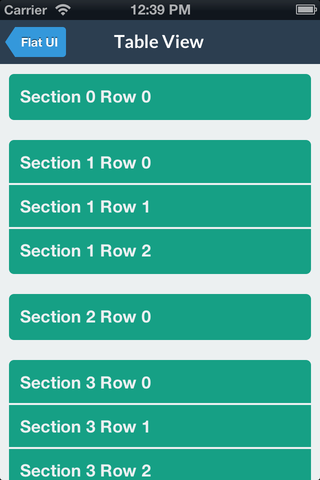
You can modify the backgroundColor and selectedBackgroundColor of a UITableViewCell without losing the rounded corners. The cell will copy the UITableView's separator color. The separator height is exposed as separatorHeight and the radius as cornerRadius.
你可以修改 UITableViewCell 的背景颜色,以及选中时的背景颜色,当然,你也可以设置圆角。这个 cell 会复制 UITableView 的分割条颜色。分割条的高度被扩展了支持圆角以及内圆角。
cell = [UITableViewCell configureFlatCellWithColor:[UIColor greenSeaColor]

                                     selectedColor:[UIColor cloudsColor]

                                             style:UITableViewCellStyleDefault

                                   reuseIdentifier:CellIdentifier];

cell.cornerRadius = 5.0f; // optional

cell.separatorHeight = 2.0f; // optional
Popover
Like some other flat components, we simply provide a category to automatically configure a popover appearance for iPad by only having to set a background color.
像其他的扁平组件一样,我提供了一个类目来自动配置一个 popover 的样式用于 iPad ,仅仅设置一下背景色即可。
popover = [[UIPopoverController alloc] initWithContentViewController:nc];

[popover configureFlatPopoverWithBackgroundColor: [UIColor midnightBlueColor] cornerRadius:3];

popover.delegate = self;

[popover presentPopoverFromRect:button.frame inView:self.view permittedArrowDirections:UIPopoverArrowDirectionAny

Colors
For convenience, FlatUIKit includes the colors defined at Flat UI Colors. You can see examples of these colors in the code/components above. Using them is as simple as:
为了便利,FlatUIKit 包括了已经定义好的颜色。你可以看 demo ,用下面的方式来使用。
#import <FlatUIKit/UIColor+FlatUI.h>

UIColor *myColor = [UIColor turquoiseColor];
Fonts
FlatUIKit comes bundled with Lato, a clean, beautiful open font. More info on Lato can be found here. It is included in FlatUIKit automatically; you can use it as follows:
FlatUIKit 使用了 Lato 字体,整洁而美观。你可以在这里看到更多的信息。FlatUIKit 自动包含了 FlatUIKit。你可以这么用:
#import "UIFont+FlatUI.h"

UIFont *myFont = [UIFont flatFontOfSize:16];
[翻译] FlatUIKit的更多相关文章
- 《Django By Example》第五章 中文 翻译 (个人学习,渣翻)
书籍出处:https://www.packtpub.com/web-development/django-example 原作者:Antonio Melé (译者@ucag注:大家好,我是新来的翻译, ...
- 《Django By Example》第四章 中文 翻译 (个人学习,渣翻)
书籍出处:https://www.packtpub.com/web-development/django-example 原作者:Antonio Melé (译者注:祝大家新年快乐,这次带来<D ...
- [翻译]开发文档:android Bitmap的高效使用
内容概述 本文内容来自开发文档"Traning > Displaying Bitmaps Efficiently",包括大尺寸Bitmap的高效加载,图片的异步加载和数据缓存 ...
- 【探索】机器指令翻译成 JavaScript
前言 前些时候研究脚本混淆时,打算先学一些「程序流程」相关的概念.为了不因太枯燥而放弃,决定想一个有趣的案例,可以边探索边学. 于是想了一个话题:尝试将机器指令 1:1 翻译 成 JavaScript ...
- 《Django By Example》第三章 中文 翻译 (个人学习,渣翻)
书籍出处:https://www.packtpub.com/web-development/django-example 原作者:Antonio Melé (译者注:第三章滚烫出炉,大家请不要吐槽文中 ...
- 《Django By Example》第二章 中文 翻译 (个人学习,渣翻)
书籍出处:https://www.packtpub.com/web-development/django-example 原作者:Antonio Melé (译者注:翻译完第一章后,发现翻译第二章的速 ...
- 《Django By Example》第一章 中文 翻译 (个人学习,渣翻)
书籍出处:https://www.packtpub.com/web-development/django-example 原作者:Antonio Melé (译者注:本人目前在杭州某家互联网公司工作, ...
- 【翻译】Awesome R资源大全中文版来了,全球最火的R工具包一网打尽,超过300+工具,还在等什么?
0.前言 虽然很早就知道R被微软收购,也很早知道R在统计分析处理方面很强大,开始一直没有行动过...直到 直到12月初在微软技术大会,看到我软的工程师演示R的使用,我就震惊了,然后最近在网上到处了解和 ...
- ASP.NET MVC with Entity Framework and CSS一书翻译系列文章之第一章:创建基本的MVC Web站点
在这一章中,我们将学习如何使用基架快速搭建和运行一个简单的Microsoft ASP.NET MVC Web站点.在我们马上投入学习和编码之前,我们首先了解一些有关ASP.NET MVC和Entity ...
随机推荐
- js 获取时间戳的方法
(new Date()).valueOf()1541569364658(new Date()).getTime()1541569372623Number(new Date())154156938662 ...
- mysql 新增时,唯一索引冲突时更新
INSERT INTO table_name(f1 ,f2 ,f3) VALUES(? ,?) on duplicate key update f2 = ? ,f3 = ?
- Session机制一(基础知识点)
一: 1.介绍 对于会话与状态管理,有两种方式,cookie与session. 其中,cookie机制采用客户端保持cookie的方案. 而,session机制采用的是服务器保持Http状态信息的方案 ...
- Ruby windows7安装配置(最新版本)
1.下载最新版本的rubyinstaller并安装http://rubyinstaller.org/downloads/ 如下图所示设置路径,我安装时将所有选项都打够了,免除了后面需要什么配置麻烦. ...
- html5+css3 手机屏幕的适配css
*{ margin:0;padding:0;outline:0}a{ text-decoration:none}body,html{ font-size:20px;font-family:'Micro ...
- OneDrive开发入门
OneDrive API提供了对存储在OneDrive上文件的访问能力,大多数API都遵循REST模式,少部分的API可以通过简单的函数来调用 在使用OneDrive API之前要先了解两个简单的概念 ...
- PHP isset和empty 详细比较
找了几篇博文,这应该是说的最清楚的.链接如下:http://blog.chinaunix.net/uid-25311424-id-3966622.html
- Elasticsearch源码分析 | 单节点的启动和关闭
本文主要简要介绍Elasticsearch单节点的启动和关闭流程.Elasticsearch版本:6.3.2 相关文章 1.Google Guice 快速入门 2.Elasticsearch 中的 G ...
- [ 转载 ] Java中常用的设计模式
Java中常用的设计模式 1.单例模式 单例模式有以下特点: 1.单例类只能有一个实例. 2.单例类必须自己创建自己的唯一实例. 3.单例类必须给所有其他对象提供这一实例. 单例模式确保某个类只有一个 ...
- Django扩展
一.文件上传 当Django在处理文件上传的时候,文件数据被保存在request.FILES FILES中的每个键为<input type="file" name=" ...