Animate.css 前端动画开发教程
1.首先下载animate.css文件;
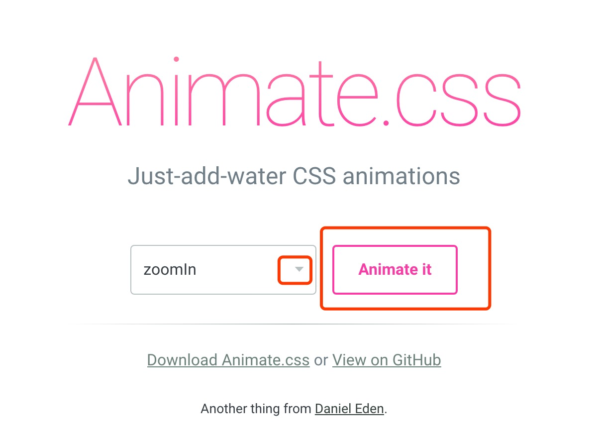
2.打开动画预览地址选择想要的动画,地址:https://daneden.github.io/animate.css/ ,选择好后记住动画的名字在你下载的animate.css中搜索,把该动画的css复制出来;
3.复制出的代码如下:
/*悬浮层跳出动画*/
@-webkit-keyframes zoomInDown {
0% {
opacity: 0;
-webkit-transform: scale3d(.1, .1, .1) translate3d(0, -1000px, 0);
transform: scale3d(.1, .1, .1) translate3d(0, -1000px, 0);
-webkit-animation-timing-function: cubic-bezier(0.55, .055, .675, .19);
animation-timing-function: cubic-bezier(0.55, .055, .675, .19)
}
60% {
opacity: 1;
-webkit-transform: scale3d(.475, .475, .475) translate3d(0, 60px, 0);
transform: scale3d(.475, .475, .475) translate3d(0, 60px, 0);
-webkit-animation-timing-function: cubic-bezier(0.175, .885, .32, 1);
animation-timing-function: cubic-bezier(0.175, .885, .32, 1)
}
}
@keyframes zoomInDown {
0% {
opacity: 0;
-webkit-transform: scale3d(.1, .1, .1) translate3d(0, -1000px, 0);
-ms-transform: scale3d(.1, .1, .1) translate3d(0, -1000px, 0);
transform: scale3d(.1, .1, .1) translate3d(0, -1000px, 0);
-webkit-animation-timing-function: cubic-bezier(0.55, .055, .675, .19);
animation-timing-function: cubic-bezier(0.55, .055, .675, .19)
}
60% {
opacity: 1;
-webkit-transform: scale3d(.475, .475, .475) translate3d(0, 60px, 0);
-ms-transform: scale3d(.475, .475, .475) translate3d(0, 60px, 0);
transform: scale3d(.475, .475, .475) translate3d(0, 60px, 0);
-webkit-animation-timing-function: cubic-bezier(0.175, .885, .32, 1);
animation-timing-function: cubic-bezier(0.175, .885, .32, 1)
}
}
.zoomInDown {
-webkit-animation-name: zoomInDown;
animation-name: zoomInDown
}
4.只需修改上面红色部分为绿色部分,然后将如下css复制到页面就可以直接用了(只需在你想要动的div上加class 这个zoomInDown);
/*悬浮层跳出动画*/
@-webkit-keyframes zoomInDown {
0% {
opacity: 0;
-webkit-transform: scale3d(.1, .1, .1) translate3d(0, -1000px, 0);
transform: scale3d(.1, .1, .1) translate3d(0, -1000px, 0);
-webkit-animation-timing-function: cubic-bezier(0.55, .055, .675, .19);
animation-timing-function: cubic-bezier(0.55, .055, .675, .19)
}
60% {
opacity: 1;
-webkit-transform: scale3d(.475, .475, .475) translate3d(0, 60px, 0);
transform: scale3d(.475, .475, .475) translate3d(0, 60px, 0);
-webkit-animation-timing-function: cubic-bezier(0.175, .885, .32, 1);
animation-timing-function: cubic-bezier(0.175, .885, .32, 1)
}
}
@keyframes zoomInDown {
0% {
opacity: 0;
-webkit-transform: scale3d(.1, .1, .1) translate3d(0, -1000px, 0);
-ms-transform: scale3d(.1, .1, .1) translate3d(0, -1000px, 0);
transform: scale3d(.1, .1, .1) translate3d(0, -1000px, 0);
-webkit-animation-timing-function: cubic-bezier(0.55, .055, .675, .19);
animation-timing-function: cubic-bezier(0.55, .055, .675, .19)
}
60% {
opacity: 1;
-webkit-transform: scale3d(.475, .475, .475) translate3d(0, 60px, 0);
-ms-transform: scale3d(.475, .475, .475) translate3d(0, 60px, 0);
transform: scale3d(.475, .475, .475) translate3d(0, 60px, 0);
-webkit-animation-timing-function: cubic-bezier(0.175, .885, .32, 1);
animation-timing-function: cubic-bezier(0.175, .885, .32, 1)
}
}
.zoomInDown {
animation: zoomInDown 1s;
-webkit-animation: zoomInDown 1s;
}
5.搞定!
Animate.css 前端动画开发教程的更多相关文章
- vue中使用第三方插件animate.css实现动画效果
vue中使用第三方插件animate.css实现动画效果1.首先先引入第三方类animated.css2.将你所需要动画的标签用包裹起来3.在transition元素中添加enter-active-c ...
- CSS--使用Animate.css制作动画效果
一 使用Animate.css动画 // 通过@import引入外部CSS资源; // 引入线上图片及JS文件; // 通过更改CSS类名生成不同类型的CSS3动画; <!DOCTYPE h ...
- vue animate.css训练动画案例 列表循环
制作目标动画:向上入场添加数据,点击数据右滑动离场 简单页面效果: 实现代码如下: <!DOCTYPE html> <html> <head> <meta c ...
- vue中使用animate.css实现动画
参考链接:https://www.cnblogs.com/ccyinghua/p/7872694.html 参考链接:https://www.jianshu.com/p/2e0b2f8d40cf 使用 ...
- vue中使用transition和animate.css动画效果
一.单个动画中,使用div中引用animate动画 1.下载依赖 npm install animate.css –save 2.main.js中全局引用 import animate from 'a ...
- JQuery插件之Animate.css和 jquery-aniview
Animate.css 一款强大的预设css3动画库 简介 animate.css 是一个来自国外的 CSS3 动画库,它预设了抖动(shake).闪烁(flash).弹跳(bounce).翻转(fl ...
- 基于animate.css动画库的全屏滚动小插件,适用于vue.js(移动端、pc)项目
功能简介 基于animate.css动画库的全屏滚动,适用于vue.js(移动端.pc)项目. 安装 npm install vue-animate-fullpage --save 使用 main.j ...
- React 系列教程 1:实现 Animate.css 官网效果
前言 这是 React 系列教程的第一篇,我们将用 React 实现 Animate.css 官网的效果.对于 Animate.css 官网效果是一个非常简单的例子,原代码使用 jQuery 编写,就 ...
- python 全栈开发,Day58(bootstrap组件,bootstrap JavaScript 插件,后台模板,图表插件,jQuery插件库,Animate.css,swiper,运行vue项目)
一.bootstrap组件 无数可复用的组件,包括字体图标.下拉菜单.导航.警告框.弹出框等更多功能. 组件和插件的区别? 插件:一个功能,比如js文件 组件:html css js 组件包含插件 面 ...
随机推荐
- 洛谷 P2389 电脑班的裁员 解题报告
题意: 给定一段长为N的序列,选取其中的至多M段使这些子段和最大. 当N=1000时,我们可以采用动态规划解法 令\(dp[i][j][k]\)代表当前选至位置\(i\)处于第\(j\)段当前是否选取 ...
- 【poj3375】 Network Connection
http://poj.org/problem?id=3375 (题目链接) 题意 有$M$个网络接口和$N$台计算机,给出它们的坐标(在同一直线上),一个接口只能接一台计算机,费用为两坐标之差的绝对值 ...
- MongoDB ShardingCluster
sharding集群中的组件: 1.mongos:router,可以通过keepalived实现高可用. 2.config server:元数据服务器,这里要借助zookeeper存放配置信息. 3. ...
- python的字符串截取
str = ‘’ :] #截取第一位到第三位的字符 print str[:] #截取字符串的全部字符 :] #截取第七个字符到结尾 ] #截取从头开始到倒数第三个字符之前 ] #截取第三个字符 ] # ...
- python对MySQL的CRUD
我是闲的没事干,2014过的太浮夸了,博客也没写几篇,哎~~~ 用这篇来记录即将逝去的2014 python对各种数据库的各种操作满大街都是,不过,我还是喜欢我这种风格的,涉及到其它操作,不过重点还是 ...
- Chapter6(函数) --C++Prime笔记
1.重载函数,也就是说一个名字可以对应几个不同的函数. 2.内置类型的未初始化局部变量将产生未定义的值. 3.局部静态对象在程序执行路径第一次进过对象定义语句时初始化,并且直到程序终止才被销毁. 内置 ...
- 五、java面向对象编程_3
目录 十五.Object类 1.toString 2.equals 十六.对象转型(casting) 十七.动态绑定(多态) 十八.抽象类(abstract) 十九.final关键字 二十.接口 十五 ...
- Ansible8:Playbook循环
目录 1.with_items 2.with_nested嵌套循环 3.with_dict 4.with_fileglob文件匹配遍历 5.with_lines 6.with_subelement遍历 ...
- ubunto 16.04 lts 源
http://601502546.blog.163.com/blog/static/2596107620171502517889 国内有很多ubuntu的源,包括:网易源(这个之前用过,速度很快的), ...
- spring 和 spring boot 的区别
最近越来越多的开发者都开始选择 spring-boot,与传统的 spring 相比,spring-boot又有哪些优势呢? 1.追求开箱即用的效果,只需要很少的配置就可以直接开始运行项目. 例如各种 ...