利用python进行折线图,直方图和饼图的绘制
我用10个国家某年的GDP来绘图,数据如下:
labels = ['USA', 'China', 'India', 'Japan', 'Germany', 'Russia', 'Brazil', 'UK', 'France', 'Italy']
quants = [15094025.0, 11299967.0, 4457784.0, 4440376.0, 3099080.0, 2383402.0, 2293954.0, 2260803.0, 2217900.0, 1846950.0]
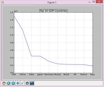
首先绘制折线图,代码如下:
def draw_line(labels,quants):
ind = np.linspace(0,9,10)
fig = plt.figure(1)
ax = fig.add_subplot(111)
ax.plot(ind,quants)
ax.set_title('Top 10 GDP Countries', bbox={'facecolor':'0.8', 'pad':5})
ax.set_xticklabels(labels)
plt.grid(True)
plt.show()
最后如下图:
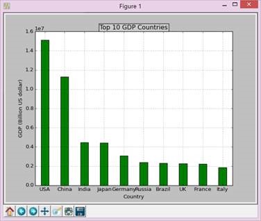
再画柱状图,代码如下:
def draw_bar(labels,quants):
width = 0.4
ind = np.linspace(0.5,9.5,10)
# make a square figure
fig = plt.figure(1)
ax = fig.add_subplot(111)
# Bar Plot
ax.bar(ind-width/2,quants,width,color='green')
# Set the ticks on x-axis
ax.set_xticks(ind)
ax.set_xticklabels(labels)
# labels
ax.set_xlabel('Country')
ax.set_ylabel('GDP (Billion US dollar)')
# title
ax.set_title('Top 10 GDP Countries', bbox={'facecolor':'0.8', 'pad':5})
plt.grid(True)
plt.show()
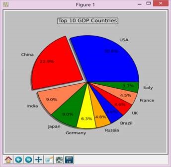
最后画饼图,代码如下:
def draw_pie(labels,quants):
plt.figure(1, figsize=(6,6))
# For China, make the piece explode a bit
expl = [0,0.1,0,0,0,0,0,0,0,0]
# Colors used. Recycle if not enough.
colors = ["blue","red","coral","green","yellow","orange"]
# autopct: format of "percent" string;
plt.pie(quants, explode=expl, colors=colors, labels=labels, autopct='%1.1f%%',pctdistance=0.8, shadow=True)
plt.title('Top 10 GDP Countries', bbox={'facecolor':'0.8', 'pad':5})
plt.show()
三、实验小结
Python的安装比较简单,但是numpy、matplotlib、scipy的安装并没有预期的简单,首先版本得对应安装的python版本,而且分32和64位,资源不容易找,安装成功后还要装其他的东西。至于matplitlib的画图感觉还是比较方便的,初学python,虽然整体简洁了很多,但是python的格式的要求过于严格,尤其是缩进等,初学者查了好久都检查不出错误但后来就又稀里糊涂运行成功了,比较抓狂。
附录:完整代码:
# -*- coding: gbk -*-
import numpy as np
import matplotlib.pyplot as plt
import matplotlib as mpl
def draw_pie(labels,quants):
# make a square figure
plt.figure(1, figsize=(6,6))
# For China, make the piece explode a bit
expl = [0,0.1,0,0,0,0,0,0,0,0]
# Colors used. Recycle if not enough.
colors = ["blue","red","coral","green","yellow","orange"]
# Pie Plot
# autopct: format of "percent" string;
plt.pie(quants, explode=expl, colors=colors, labels=labels, autopct='%1.1f%%',pctdistance=0.8, shadow=True)
plt.title('Top 10 GDP Countries', bbox={'facecolor':'0.8', 'pad':5})
plt.show()
def draw_bar(labels,quants):
width = 0.4
ind = np.linspace(0.5,9.5,10)
# make a square figure
fig = plt.figure(1)
ax = fig.add_subplot(111)
# Bar Plot
ax.bar(ind-width/2,quants,width,color='green')
# Set the ticks on x-axis
ax.set_xticks(ind)
ax.set_xticklabels(labels)
# labels
ax.set_xlabel('Country')
ax.set_ylabel('GDP (Billion US dollar)')
# title
ax.set_title('Top 10 GDP Countries', bbox={'facecolor':'0.8', 'pad':5})
plt.grid(True)
plt.show()
def draw_line(labels,quants):
ind = np.linspace(0,9,10)
fig = plt.figure(1)
ax = fig.add_subplot(111)
ax.plot(ind,quants)
ax.set_title('Top 10 GDP Countries', bbox={'facecolor':'0.8', 'pad':5})
ax.set_xticklabels(labels)
plt.grid(True)
plt.show()
# quants: GDP
# labels: country name
labels = ['USA', 'China', 'India', 'Japan', 'Germany', 'Russia', 'Brazil', 'UK', 'France', 'Italy']
quants = [15094025.0, 11299967.0, 4457784.0, 4440376.0, 3099080.0, 2383402.0, 2293954.0, 2260803.0, 2217900.0, 1846950.0]
draw_pie(labels,quants)
#draw_bar(labels,quants)
#draw_line(labels,quants)
利用python进行折线图,直方图和饼图的绘制的更多相关文章
- 利用JFreeChart生成折线图 (4) (转自 JSP开发技术大全)
利用JFreeChart生成折线图 (4) (转自 JSP开发技术大全) 14.4 利用JFreeChart生成折线图 通过JFreeChart插件,既可以生成普通效果的折线图,也可以生成3D效果的折 ...
- Python制作折线图
利用python的第三方包Pygal制作简单的折线图. 申明:本文仅供学习交流使用.源码大部分来自<python编程从入门到实践>:如有侵权,请联系我删除. 1 #!usr/bin/env ...
- python matplotlib 折线图
1.绘制折线图,去上和右边框,显示中文 import numpy as np import matplotlib.pyplot as plt #plt.style.use('default') #pl ...
- 利用Python+pyecharts+tushare图形化展示股票历史财务信息
在微信或其他平台上,经常能看到别人推荐股票,分析的头头是道,让自己懊恼于没有早点关注到这只股票,好像错失了几个亿.但是投资股票又忌讳听消息跟风,总不能看到别人推荐自己就无脑买入. 看到了一只股票,自己 ...
- 宅男福利--利用Python简单爬图
Ver beta..代码粗陋. 使用说明以Windows为例, Python版本为2.7.6 确认你电脑已经安装了Python, Windows默认安装路径为C:\Python27.如果没有安装,先下 ...
- python绘折线图
# -*- coding: utf-8 -*- import numpy as np import matplotlib.pyplot as plt #X轴,Y轴数据 y = [0.3,0.4,2,5 ...
- 06. Matplotlib 2 |折线图| 柱状图| 堆叠图| 面积图| 填图| 饼图| 直方图| 散点图| 极坐标| 图箱型图
1.基本图表绘制 plt.plot() 图表类别:线形图.柱状图.密度图,以横纵坐标两个维度为主同时可延展出多种其他图表样式 plt.plot(kind='line', ax=None, figsiz ...
- python 绘图---2D、3D散点图、折线图、曲面图
python中绘制2D曲线图需要使用到Matplotlib,Matplotlib 是一个 Python 的 2D绘图库,它以各种硬拷贝格式和跨平台的交互式环境生成出版质量级别的图形,通过 Matplo ...
- 使用python制作动图
利用python制作gif图 引言 当写文章时候,多张图片会影响排版,可以考虑制作gif图 准备 pip install imageio 代码 # This is a sample Python sc ...
随机推荐
- 弹窗开关js
// var guanbi = false; // $("#testbtn").click(function(){ // if(guanbi){ // $("#tan&q ...
- [转载]mvc使用JsonResult返回Json数据
controller 中定义以下方法: public JsonResult UpdateSingle(int id, string actionName, string actionValue) { ...
- spring中注解事务认识
1.配置事务管理器 <!-- 设定transactionManager事务管理器 --> <bean id="txManager" class="org ...
- Nagios : Verifying Your Configuration
Every time you modify your configuration files, you should run a sanity check on them. It is importa ...
- [Unity菜鸟] 材质
1. 材质定义: 2. 把材质都改成支持透明通道 因为物体太多了,比如树跟房子材质必须用不一样的.所以办法还是你得改每个材质的Shader,都改成支持透明通道的. 在Project的搜索窗口输入t: ...
- QT插件开发方式(作者有RemOjbects文档翻译(48)篇)
创建一个QT的库项目,删除自动生成的.h和.cpp文件,添加一个接口定义.h文件和一个接口实现类(一个.h一个.cpp).代码如下: 1.接口文件源码 #ifndef PLUGININTERFACE_ ...
- if语句写在while语句外面效率更高
为了排除某些特殊的文件后缀名,一开始我自然而然的这样写,判断每一个文件的后缀名: // 去除后缀名 foreach (const QString &strKey, local_map.keys ...
- QT UAC问题汇总贴
http://www.qtcn.org/bbs/read-htm-tid-47983.html http://www.cnblogs.com/bombless/archive/2010/12/29/h ...
- zookeeper入门必读
(如果感觉有帮助,请帮忙点推荐,添加关注,谢谢!你的支持是我不断更新文章的动力.本博客会逐步推出一系列的关于大型网站架构.分布式应用.设计模式.架构模式等方面的系列文章) 今天我想谈谈zookeepe ...
- 【HDOJ】4393 Throw nails
水题,优先级队列. /* 4393 */ #include <iostream> #include <sstream> #include <string> #inc ...