学习CSS3之实心圆
CSS3是最新版本的CSS,学习后可以更好的用于工作及自己修改自己代码的各种样式。
border-radius圆角方法画实心圆。相当于在长方形(正方形)上画半径为边长一半的圆弧。
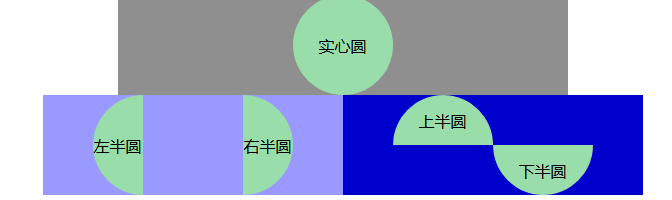
效果如上图,代码如下:
 <!doctype html>

 <html>

 <head>

     <meta charset="utf-8">

     <title>border-radius</title>

     <style type="text/css">

         body{text-align: center;margin:0; padding:0;}

         div.head{width:450px;margin: 0 auto;background: #8f8f8f;line-height: 100px;}

         div.content{width:600px;margin: 0 auto;vertical-align: middle;}

         .left-block{float:left;width:50%;background:#9a99ff;height: 100px;line-height: 100px;}

         .right-block{float:right;width:50%;background: #0000cc;height: 100px;line-height: 50px;}

         /*实心圆*/

         div.circle{

             height:100px;/*与width设置一致*/

             width:100px;

             background:#9da;

             border-radius:50px;

             margin:0 auto;

         }

         /*左半心圆*/

         div.left-circle{

             height:100px;

             width:50px;

             background:#9da;

             border-radius:50px 0 0 50px;

             margin-left: 50px;

             float: left;

         }

         /*右半心圆*/

         div.right-circle{

             height:100px;

             width:50px;

             background:#9da;

             border-radius:0 50px 50px 0;

             margin-left: 100px;

             float: left;

         }

         /*上半心圆*/

         div.top-circle{

             height:50px;

             width:100px;

             background:#9da;

             border-radius:50px 50px 0 0;

             margin-left: 50px;

             float: left;

         }

         /*下半心圆*/

         div.bottom-circle{

             height:50px;

             width:100px;

             background:#9da;

             border-radius:0 0 50px 50px;

             margin-left: 150px;

             float: left;

         }

     </style>

 </head>

 <body>

 <div class="head">

     <div class="circle">实心圆</div>

 </div>

 <div class="content">

     <div class="left-block">

     <div class="left-circle">左半圆</div>

     <div class="right-circle">右半圆</div>

     </div>

     <div class="right-block">

     <div class="top-circle">上半圆</div>

     <div class="bottom-circle">下半圆</div>

     </div>

 </div>

 </body>

 </html>
学习CSS3之实心圆的更多相关文章
- html、css如何画实心圆
css3画实心圆 实现方法相当简单,css代码如下: .circle{ width:100px; height:100px; border-radius:50px; /* 图形的半径 */ }
- 12个学习 CSS3 网站布局设计的优秀案例
网络上有很多的 CSS 画廊站点供大家对各类网站作品进行打分和评论,每天有数以百计的优秀网站被推荐上面,这对于网页设计师来说是很好的灵感来源.今天,我们选择了15赢得 CSS 设计大奖的优秀作品,帮助 ...
- android shap画圆(空心圆、实心圆)
实心圆: <?xml version="1.0" encoding="utf-8"?> <shape xmlns:android=" ...
- css3 如何实现圆边框的渐变
使用 css 实现下面效果: 把效果分解. 代码一: <style> .helper1 { height: 40px; padding: 15px; background: -webkit ...
- 跟我学习css3之transition
HTML5和css3已经是将来的发展趋势,现在有很多移动端还有一些游戏公司已然使用它们开 发了比较成功的产品.我在2011年的时候也跟着技术潮流初浅的学习了html5+css3.毕竟那 时候我没有把学 ...
- 用CSS3.0画圆
CSS3.0中有一个border-radius属性,这个属性允许向 div 元素添加圆角边框,也就是div边角不再一直是直角,在CSS3.0中可以做成圆角了,所以我们可以用这个属性用div画一个圆,或 ...
- 学习 | css3基本动画之demo篇
移动端使用的框架是zepto,但是zepto的内置对象没有传统的animate这个方法,效果都是需要css3来实现的,zepto也不支持fadeIn和fadeOut等一些基本的动画,基于这一现状,我自 ...
- 学习CSS3动画(animation)
CSS3就是出了不少高大上的功能,3D效果.动画.多列等等.今天写篇文章记录怎么一下怎么用CSS3写一个动画. 丑话还得说前头,IE9以及以下版本不支持CSS3动画(如真要实现可以考虑用js,不过估计 ...
- 。。。学习CSS3的第一个属性border-radius。。。
学习border-radius,感觉这个文档写的很不错: http://blog.sina.com.cn/s/blog_61671b520101gelr.html
随机推荐
- C#实现的HttpGet请求
话不多说,代码贴上: /// <summary> /// HTTP Get请求 /// </summary> /// <param name="url" ...
- 页面标准文档流、浮动层、float属性(转)
CSS float 浮动属性介绍 float属性:定义元素朝哪个方向浮动. 1.页面标准文档流.浮动层.float属性 1.1 文档流 HTML页面的标准文档流(默认布局)是:从上到下,从左到右,遇块 ...
- Webpack 热部署检测不到文件的变化
最近在用webpack开发,突然发现热部署检测不到文件的变化,相关webpack的代码并没有发生改变,而且同事们的webpack都是正常的,不能热部署严重影响我的开发效率. 网上查了一下原来 Webp ...
- ThreadPoolExecutor 学习笔记
线程池的奥义 在开发程序的过程中,很多时候我们会遇到遇到批量执行任务的场景,当各个具体任务之间互相独立并不依赖其他任务的时候,我们会考虑使用并发的方式,将各个任务分散到不同的线程中进行执行来提高任务的 ...
- PAT1019:General Palindromic Number
1019. General Palindromic Number (20) 时间限制 400 ms 内存限制 65536 kB 代码长度限制 16000 B 判题程序 Standard 作者 CHEN ...
- SSM-Spring-12:Spring中NameMatchMethodPointcutAdvisor名称匹配方法切入点顾问
------------吾亦无他,唯手熟尔,谦卑若愚,好学若饥------------- advice 是通知advisor 是顾问 顾问(Advisor) 通知Advice是Spring提供的一种切 ...
- IntelliJ IDEA 2018.1.2 安装及汉化教程(附:下载地址)
附:安装包及汉化包下载地址 链接:https://pan.baidu.com/s/1ysxtVH_gnBm0QnnqB5mluQ 密码: 9pqd 1.安装步骤: 选择安装地址:可以默认.本人安装在 ...
- 微信H5中静默登录及非静默登录的正确使用姿势
在微信中打开网页且需要调用微信登录接口时,微信官方给我们提供了两种登录调用方式:静默登录和非静默登录:但是官方文档中却没有说明在何种情况下使用静默登录,何种情况下使用非静默登录,所以在这里,我想将之前 ...
- ajax跨域问题(php)
ajax出现请求跨域错误问题,主要原因就是因为浏览器的"同源策略". 解决方法(我只用过下面这3种): 1. 架设服务器代理:即浏览器请求同源服务器,再由后者请求外部服务(之前博主 ...
- JS(总结)
基础 Javascript是一种弱类型语言,它分别有什么优点和缺点 弱类型语言:简单好用,更灵活多变.但是会牺牲性能,比如一些隐含的类型转换 强类型语言:类型转换的时候非常严格,,强类型语言是直接操纵 ...