关于css3的背景切割(background-clip)、背景原点(background-origin)的使用


<!doctype html>
<html lang="en">
<head>
<meta charset="UTF-8">
<title>Document</title>
<style type="text/css">
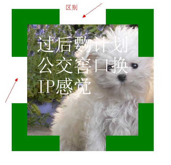
.div1{
width: 300px;
height: 300px;
border:50px dashed green;
font-size: 60px;
color: #fff;
padding: 30px;
margin: 30px;
background: #fff url(bac.jpg) 0 0 no-repeat;
background-clip: border-box;
/*background-clip: padding-box;*/
/*background-clip: content-box;*/
}
</style>
</head>
<body>
<div class="div1">过后覅计划公交窖口换IP感觉</div>
</body>
</html>

<!doctype html>
<html lang="en">
<head>
<meta charset="UTF-8">
<title>Document</title>
<style type="text/css">
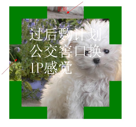
.div1{
width: 300px;
height: 300px;
border:50px dashed green;
font-size: 60px;
color: #fff;
padding: 30px;
margin: 30px;
background: #fff url(bac.jpg) 0 0 no-repeat;
background-clip: border-box;
/*background-clip: padding-box;*/
/*background-clip: content-box;*/
}
</style>
</head>
<body>
<div class="div1">过后覅计划公交窖口换IP感觉</div>
</body>
</html>

<!doctype html>
<html lang="en">
<head>
<meta charset="UTF-8">
<title>Document</title>
<style type="text/css">
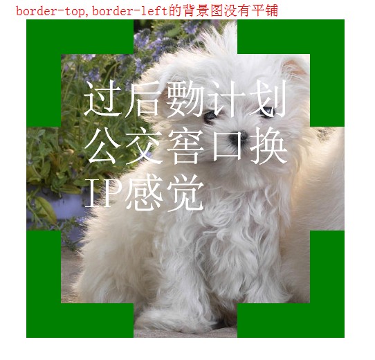
.div1{
width: 300px;
height: 300px;
border:50px dashed green;
font-size: 60px;
color: #fff;
padding: 30px;
margin: 30px;
background: #fff url(bac.jpg) 0 0 no-repeat;
background-clip: border-box;
/*background-clip: padding-box;*/
/*background-clip: content-box;*/
background-origin: border-box;
}
</style>
</head>
<body>
<div class="div1">过后覅计划公交窖口换IP感觉</div>
</body>
</html>


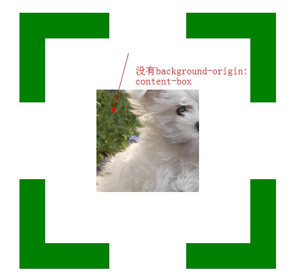
<!doctype html>
<html lang="en">
<head>
<meta charset="UTF-8">
<title>Document</title>
<style type="text/css">
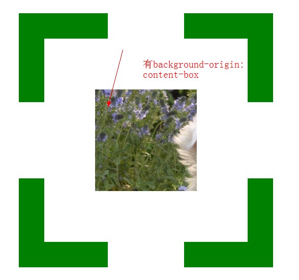
.div1{
width: 200px;
height: 200px;
border:50px dashed green;
font-size: 60px;
color: #fff;
padding: 100px;
margin: 30px;
background: #f00 url(bac.jpg) 0 0 no-repeat;
background-clip: content-box;
background-origin: content-box;
}
</style>
</head>
<body>
<div class="div1"></div>
</body>
</html>
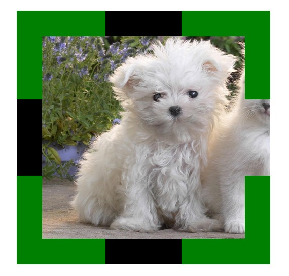
 <!doctype html>

 <html lang="en">

 <head>

 <meta charset="UTF-8">

 <title>Document</title>

 <style type="text/css">

 .div1{

 width: 200px;

 height: 200px;

 border:50px dashed green;

 padding: 100px;

 margin: 30px;

 background: #000 url(bac.jpg) 0 0 no-repeat;

 /*background-size:400px 400px;*/

 /*background-size:100% 100%;*/

 /*background-size:auto;*/

 background-size:cover;

 /*background-size:contain;*/

 }

 </style>

 </head>

 <body>

 <div class="div1"></div>

 </body>

 </html>

 <!doctype html>

 <html lang="en">

 <head>

 <meta charset="UTF-8">

 <title>Document</title>

 <style type="text/css">

 body{

 color: #fff;

 background: #000;

 }

 div{

 color: #fff;

 font-size: 50px;

 font-weight: bold;

 background: rgba(255,255,255,0.5);

 position: absolute;

 }

 </style>

 </head>

 <body>

 <div>会后集合与交通</div>

 </body>

 </html>


 <!doctype html>

 <html lang="en">

 <head>

 <meta charset="UTF-8">

 <title>Document</title>

 <style type="text/css">

 div{

 height: 100px;

 width: 100px;

 background: -webkit-gradient(linear,left center,right center,from(yellow),color-stop(0.5,black),color-stop(0.5,#fff),to(blue));

 }

 </style>

 </head>

 <body>

 <div></div>

 </body>

 </html>


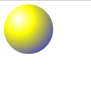
 <!doctype html>

 <html lang="en">

 <head>

 <meta charset="UTF-8">

 <title>Document</title>

 <style type="text/css">

 div{

 height: 100px;

 width: 100px;

 border-radius: 50px;

 background: -webkit-gradient(radial,30 30,1,30 30,100,from(#fff),color-stop(0.3,yellow),to(blue));

 }

 </style>

 </head>

 <body>

 <div></div>

 </body>

 </html>

关于css3的背景切割(background-clip)、背景原点(background-origin)的使用的更多相关文章
- CSS3总结二:(background)背景/渐变色函数
background-color(CSS2) background-image background-position background-size background-repeat backgr ...
- css3基础-选择器+边框与圆角+背景与渐变
Css3选择器相关: section > div直接子元素选择器 div + article相邻兄弟选择器(在元素之后出现) div ~ article通用兄弟选择器(在元素之后出现) 属性选择 ...
- CSS(九):background(背景属性)
通过CSS背景属性,可以给页面元素添加背景样式. 背景属性可以设置背景颜色.背景图片.背景平铺.背景图像固定等. background-color(背景颜色) background-color属性定义 ...
- css考核点整理(八)-在什么情况下通过img引入图片,什么情况用背景图引入?背景属性有哪些
在什么情况下通过img引入图片,什么情况用背景图引入?背景属性有哪些
- PDF如何去除背景,PDF去除背景颜色
PDF文件在使用的时候大多都是单调的白色背景,但是也有小伙伴再制作PDF文件的时候会给PDF文件添加背景颜色,会有影响文字阅读的情况,这个时候就需要把背景颜色去除了,那么该怎么做呢,不会的小伙们就跟小 ...
- CSS3动画设置后台登录页背景切换图片
CSS3的动画很实用很好用,简单几句话就可以做出一个好看而且过渡平滑的body背景图片,不多说,来来来,上代码 body{ animation:mybg 7s; -webkit-animation:m ...
- css3动画,点击圆形背景扩展整个页面效果
上次做项目的时候,要求点击链接,这个链接的圆形背景扩散充满整个页面,今天把这个效果整理一下,是简单的css3的动画特效,粘贴下面的代码看效果 <!DOCTYPE html> <htm ...
- CSS3:元素的边框、背景和大小
边框 和边框相关的属性例如以下. border-width 用于设置边框的宽度,可选择包含: 1)<长度值>:将边框宽度设为以CSS度量单位(如em.px.cm)表达的长度值. 2)< ...
- CSS3背景图片(多重背景、起始位置、裁剪、尺寸)
一.多重背景图片 ①CSS3允许我们在一个元素上添加多个图片 ②多重背景可以把多个图片资源添加到background属性上,用逗号隔开,然后用background-position把他们定位到你想要的 ...
随机推荐
- sql 练习(2)
1.用Decode函数实现横表和竖表的转换 SELECT deptno DEPARTMENT_ID, COUNT(*) "部门人数", ),,,)) "超高收入人数()& ...
- NSString 字符串操作
//一.NSString /*----------------创建字符串的方法----------------*/ //1.创建常量字符串. NSString *astring = @"Th ...
- Qt 编程训练之七
Qt进程间通信 TCP / IP 跨平台的 QtNetwork模块提供的类网络编程便携式和容易. 它提供了高层类(例如,QNetworkAccessManager, QFtp)使用特定的应用层协议通信 ...
- python面向对象(上)
创建类 Python 类使用 class 关键字来创建.简单的类的声明可以是关键字后紧跟类名: class ClassName(bases): 'class documentation string' ...
- AngularJS的指令(Directive) compile和link的区别及使用示例
如果我想实现这样一个功能,当一个input失去光标焦点时(blur),执行一些语句,比如当输入用户名后,向后台发ajax请求查询用户名是否已经存在,好有及时的页面相应. 输入 camnpr 失去焦点后 ...
- 关于left join连接查询 两张表里有同名字段的问题
左连接查询在开发中很常用,但有个问题常常会遇到,两个表中有同名字段时,比如左右表都有一个id字段,会造成查询结果中左表的id值被右表的id值覆盖掉(大部分php框架都是这个效果),而且还不会报错,容易 ...
- Windows下使用TensorFlow
上一篇日志(http://www.cnblogs.com/huidong/p/5426556.html)写了如何在Windows下安装Docker,并且在VM上安装TensorFlow. 在Windo ...
- django之uWSGI配置 +Nginx
参考文档 官方文档 安装: pip install uwsgi 启动命令: 方法一.直接命令启动 /home/zabbix/application/python/bin/uwsgi --socke ...
- SQL Server 查看正在运行的事务信息的 2 种方法。
方法 1.sys.dm_tran_session_transactions; 方法 2.dbcc opentran ------------------------------------------ ...
- requirejs--源码分析
/*---------------------------------------start-------------------------------*/ req({}); // num == 1 ...