css常用左右布局方案整理
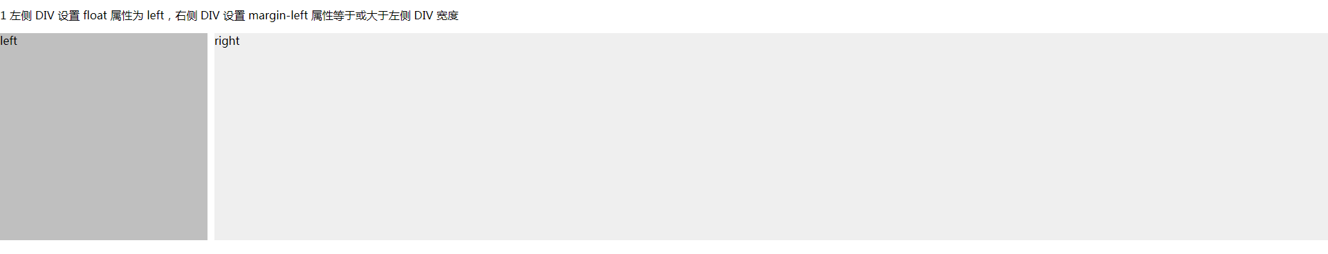
1 左侧 div 设置 float 属性为 left,右侧 div 设置 margin-left 属性等于或大于左侧 div 宽度
<!DOCTYPE html>

<html lang="en">

<head>

  <meta charset="UTF-8">

  <title>左右布局</title>

  <style>

    html, body {

      margin: 0;

      padding: 0;

    }

    .left {

      float: left;

      width: 300px;

      height: 300px;

      background: #bfbfbf;

    }

    .right {

      margin-left: 310px;

      height: 300px;

      background: #efefef;

    }

  </style>

</head>

<body>

<p>1 左侧 DIV 设置 float 属性为 left,右侧 DIV 设置 margin-left 属性等于或大于左侧 DIV 宽度</p>

<div class="left">left</div>

<div class="right">right</div>

</body>

</html>
实际效果:
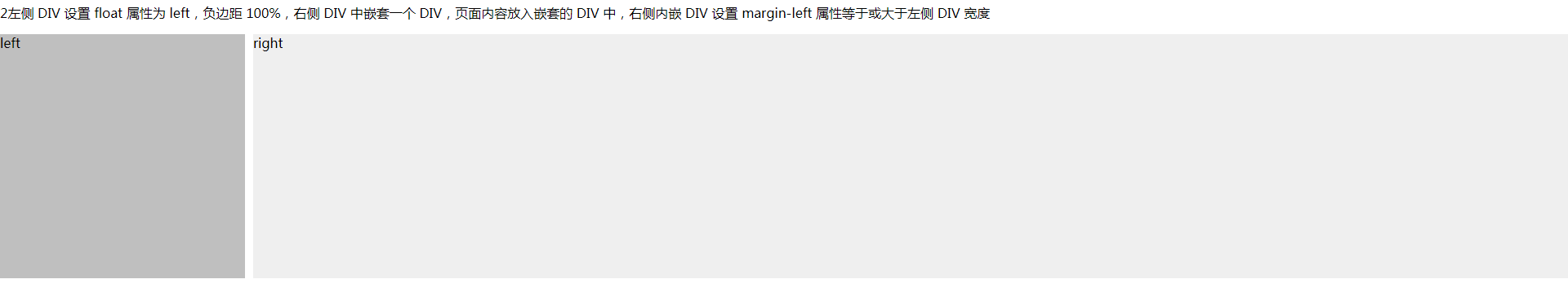
2 左侧 div 设置 float 属性为 left,负边距 100%,右侧 div中嵌套一个 div,页面内容放入嵌套的 div 中,右侧内嵌 div 设置 margin-left 属性等于或大于左侧 div 宽度
<!DOCTYPE html>

<html lang="en">

<head>

  <meta charset="UTF-8">

  <title>左右布局</title>

  <style>

    html, body {

      margin: 0;

      padding: 0;

    }

    .left {

      float: left;

      width: 300px;

      height: 300px;

      background: #bfbfbf;

      margin-right: -100%;

    }

    .right {

      float: left;

      width: 100%;

    }

    .right-content {

      height: 300px;

      margin-left: 310px;

      background: #efefef;

    }

  </style>

</head>

<body>

<p>2左侧 DIV 设置 float 属性为 left,负边距 100%,右侧 DIV 中嵌套一个 DIV,页面内容放入嵌套的 DIV 中,右侧内嵌 DIV 设置 margin-left 属性等于或大于左侧 DIV 宽度</p>

<div class="left">left</div>

<div class="right">

  <div class="right-content">right</div>

</div>

</body>

</html>
实际效果:
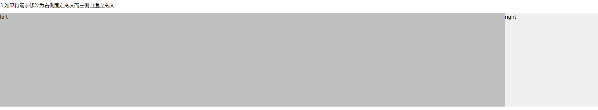
3 如果将需求修改为右侧固定宽度而左侧自适应宽度
<!DOCTYPE html>

<html lang="en">

<head>

  <meta charset="UTF-8">

  <title>左右布局</title>

  <style>

    html, body {

      margin: 0;

      padding: 0;

    }

    .left {

      float: left;

      width: 100%;

      height: 300px;

      background: #bfbfbf;

      margin-right: -300px;

    }

    .right {

      float: right;

      width: 300px;

      height: 300px;

      background: #efefef;

    }

  </style>

</head>

<body>

<p>3 如果将需求修改为右侧固定宽度而左侧自适应宽度</p>

<div class="left">left</div>

<div class="right">right</div>

</body>

</html>
实际效果:
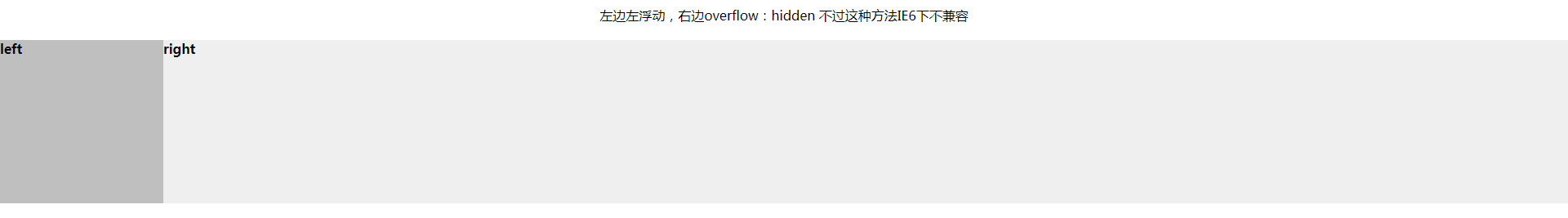
4 左边左浮动,右边overflow:hidden 不过这种方法IE6下不兼容
<!DOCTYPE html>

<html lang="en">

<head>

  <meta charset="UTF-8">

  <title>左边左浮动,右边overflow:hidden 不过这种方法IE6下不兼容</title>

  <style type="text/css">

    * {

      margin: 0;

      padding: 0;

    }

    p{

      margin: 20px 0;

      text-align: center;

    }

    .left {

      float: left;

      width: 200px;

      height: 200px;

      background: #bfbfbf;

    }

    .right {

      overflow: hidden;

      height: 200px;

      background: #efefef;

    }

  </style>

</head>

<body>

<p>左边左浮动,右边overflow:hidden 不过这种方法IE6下不兼容</p>

<div class="left">

  <h4>left</h4>

</div>

<div class="right">

  <h4>right</h4>

</div>

</body>

</html>
实际效果:
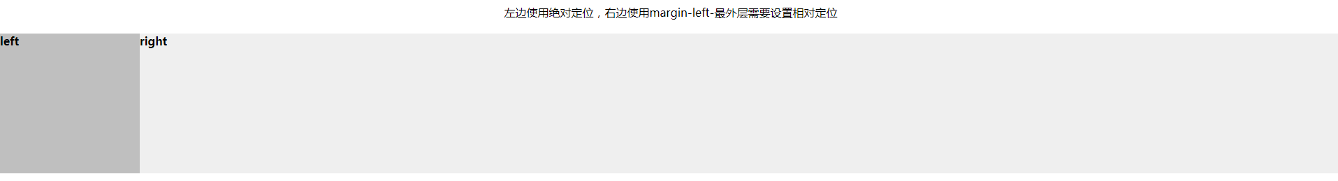
5 左边使用绝对定位,右边使用margin-left
<!DOCTYPE html>

<html lang="en">

<head>

  <meta charset="UTF-8">

  <title>左边使用绝对定位,右边使用margin-left</title>

  <style type="text/css">

    * {

      margin: 0;

      padding: 0;

    }

    p{

      margin: 20px 0;

      text-align: center;

    }

    .content{

      position: relative;

    }

    .left {

      position: absolute;

      top: 0;

      left: 0;

      width: 200px;

      height: 200px;

      background: #bfbfbf;

    }

    .right {

      margin-left: 200px;

      height: 200px;

      background: #efefef;

    }

  </style>

</head>

<body>

<p>左边使用绝对定位,右边使用margin-left-最外层需要设置相对定位</p>

<div class="content">

  <div class="left">

    <h4>left</h4>

  </div>

  <div class="right">

    <h4>right</h4>

  </div>

</div>

</body>

</html>
实际效果:
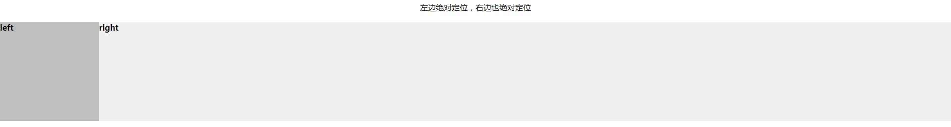
6 左边绝对定位,右边也绝对定位
<!DOCTYPE html>

<html lang="en">

<head>

  <meta charset="UTF-8">

  <title>左边绝对定位,右边也绝对定位</title>

  <style type="text/css">

    * {

      margin: 0;

      padding: 0;

    }

    p {

      margin: 20px 0;

      text-align: center;

    }

    .content {

      position: relative;

    }

    .left {

      position: absolute;

      top: 0;

      left: 0;

      width: 200px;

      height: 200px;

      background: #bfbfbf;

    }

    .right {

      position: absolute;

      left: 200px;

      top: 0;

      right: 0;

      height: 200px;

      background: #efefef;

    }

  </style>

</head>

<body>

<p>左边绝对定位,右边也绝对定位</p>

<div class="content">

  <div class="left">

    <h4>left</h4>

  </div>

  <div class="right">

    <h4>right</h4>

  </div>

</div>

</body>

</html>
实际效果:
css常用左右布局方案整理的更多相关文章
- css三栏布局方案整理
日常开发中,经常会用到css三栏布局,现将工作中常用的css 三栏布局整理如下: 什么是三栏布局: 三栏布局,顾名思义就是两边固定,中间自适应. 一. float布局 <!DOCTYPE htm ...
- DIV+CSS常用网页布局技巧!
以下是我整理的DIV+CSS常用网页布局技巧,仅供学习与参考! 第一种布局:左边固定宽度,右边自适应宽度 HTML Markup <div id="left">Left ...
- div布局方案整理
实际项目开发过程中遇到页面 DIV 左右布局的需求:左侧 DIV 固定宽度,右侧 DIV 自适应宽度,填充满剩余页面,由此引申出本文的几种解决方案 1 左侧 DIV 设置 float 属性为 left ...
- 常用前端布局,CSS技巧介绍
常用前端布局,CSS技巧介绍 对前端常用布局的整理总结,并对其性能优劣,兼容等情况进行介绍 css常用技巧之可变大小正方形的绘制 1:若通过设置width为百分比的方式,则高度不能通过百分比来控制. ...
- css 常用布局
「前端那些事儿」③ CSS 布局方案 我们在日常开发中经常遇到布局问题,下面罗列几种常用的css布局方案 话不多说,上代码! 居中布局 以下居中布局均以不定宽为前提,定宽情况包含其中 1.水平居中 a ...
- css常用布局
1.一列布局 html: <div class="header"></div> <div class="body">< ...
- CSS常见布局问题整理
实现div的水平居中和垂直居中 多元素水平居中 实现栅格化布局 1. 实现div的水平居中和垂直居中 实现效果: 这大概是最经典的一个题目了,所以放在第一个. 方法有好多, 一一列来 主要思路其实就是 ...
- CSS 常用的定位和布局方法汇总(已添加源码地址)
CSS-Layout 旨在打造详尽的前端布局代码学习库(自从用了框架开发,CSS生疏了不少,所以开这个库练练手)SF不能正确解析含有中文的网址,所以某些预览链接无法跳转,请访问我的博客阅读此文 常见定 ...
- 移动适配请使用比rem等更好的布局方案
移动端大行其道,rem/em.百分比.响应式方案更是层出不穷,看见周围的伙伴们都在对使用rem和百分比情有独钟,可我却偏不爱,之所以出现如此多的方法,其目的只有一个屏幕适配. 屏幕适配顾名思义 ...
随机推荐
- css3箭头
<!DOCTYPE html> <html lang="en" class="muui-theme-webapp-main"> < ...
- “全栈2019”Java第六十三章:接口与抽象方法详解
难度 初级 学习时间 10分钟 适合人群 零基础 开发语言 Java 开发环境 JDK v11 IntelliJ IDEA v2018.3 文章原文链接 "全栈2019"Java第 ...
- How to Mount a Remote Folder using SSH on Ubuntu
Connecting to a server across the internet is much more secure using SSH. There is a way that you ca ...
- iptables总结
iptables: 包过滤型防火墙 Firewall: 防火墙,隔离工具:工作于主机或网络的边缘,对于进出本主机或网络的报文根据事先定义好的检查规则作匹配检测,对于能够被规则所匹配到 ...
- 现代 JavaScript 框架存在的主要原因
简评:现代 JavaScript 框架的出现最主要是解决哪个问题?这篇文章很好的解释了这个问题. 我见过许多人盲目地使用像 React,Angular 或 Vue.js 这样的现代框架.这些框架提供了 ...
- UITableView编辑模式
UITableView有两种模式,普通模式和编辑模式.在编辑模式下可以对cell进行排序.删除.插入等等. 如何进入编辑模式 调用tableView的setEditing(editing: Bool, ...
- c语言数据结构学习心得——二叉树
二叉树 n(n>=0)个结点的有限集合:(五种形态) 1.或者为空二叉树,n=0: 2.或者由一个根结点和两个互不相交的被称为根的左子树和右子树组成.左子树和右子树又分别是一棵二叉树. 3.每个 ...
- 主流服务器虚拟化技术简单使用——KVM(一)
Tips:因为博客园排版的原因,图片显示不清晰,可以放大网页查看清晰图片. 如果系统使用物理机,需要在BIOS里面开启Intel VT-x(或AMD-V),如果是VMware workstation, ...
- 达人篇:3.1.3)FAI 首件检验
本章目的:了解FAI. 1)定义: FAI: First Article Inspection Report . 汉语译作:首件全尺寸检验报告. 2)目的 制作FAI报告是为了检查成型后的产品尺寸是否 ...
- Visual Studio 2019 激活码
Visual Studio 2019 Enterprise BF8Y8-GN2QH-T84XB-QVY3B-RC4DF Visual Studio 2019 Professional NYWVH-HT ...