【最全】CSS盒子(div)水平垂直居中居然还有这种方式
最全的CSS盒子(div)水平垂直居中布局,对CSS 布局掌握程度决定你在 Web 开发中的开发页面速度。
相对于屏幕

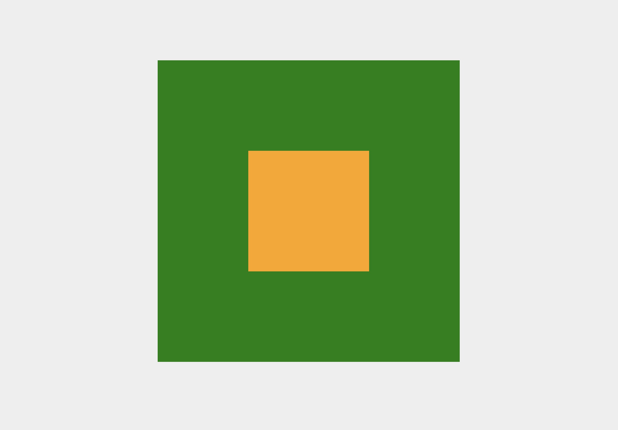
方法一:利用定位
<div class="box"></div>

<style>

    body {

        background: green;

    }

    .box {

        position: fixed;

        top: 50%;

        left: 50%;

        margin: -150px 0 0 -150px;

        width: 300px;

        height: 300px;

        background: orange;

    }

</style>
设置 Position 为 fixed 定位,top 和 left 各设置 50%,margin 设置负的容器宽高的一半。
方法二:利用 transform
<div class="box"></div>

<style>

    body {

        background: green;

    }

    .box {

        position: fixed;

        top: 50%;

        left: 50%;

        width: 300px;

        height: 300px;

        transform: translate(-50%, -50%);

        background: orange;

    }

</style>
设置 Position 为 fixed 定位,top 和 left 各设置 50%,transform 的 translate 设置上、左 -50%。
方法三:利用 margin auto
<div class="box"></div>

<style>

    body {

        background: green;

    }

    .box {

        position: fixed;

        top: 0;

        right: 0;

        bottom: 0;

        left: 0;

        margin: auto;

        width: 300px;

        height: 300px;

        background: orange;

    }

</style>
设置 Position 为 fixed 定位,上、右、下、左设置为 0,margin 设置为 auto。
相对于父容器
方法一:利用定位
<div class="parent">

    <div class="child"></div>

</div>

<style>

    .parent {

        position: relative;

        margin: 100px auto 0;

        width: 500px;

        height: 500px;

        background: green;

    }

    .child {

        position: absolute;

        top: 50%;

        left: 50%;

        margin: -100px 0 0 -100px;

        width: 200px;

        height: 200px;

        background: orange;

    }

</style>
父容器设置为相对定位,子容器设置为绝对定位,top 和 left 各设置 50%,margin 设置负的子容器宽高的一半。
方法二:利用 transform
<div class="parent">

    <div class="child"></div>

</div>

<style>

    .parent {

        position: relative;

        margin: 100px auto 0;

        width: 500px;

        height: 500px;

        background: green;

    }

    .child {

        position: absolute;

        top: 50%;

        left: 50%;

        transform: translate(-50%, -50%);

        width: 200px;

        height: 200px;

        background: orange;

    }

</style>
父容器设置为相对定位,子容器设置为绝对定位,top 和 left 各设置 50%,transform 的 translate 设置上、左 -50%。
方法三:利用 margin auto
<div class="parent">

    <div class="child"></div>

</div>

<style>

    .parent {

        position: relative;

        margin: 100px auto 0;

        width: 500px;

        height: 500px;

        background: green;

    }

    .child {

        position: absolute;

        top: 0;

        right: 0;

        bottom: 0;

        left: 0;

        margin: auto;

        width: 200px;

        height: 200px;

        background: orange;

    }

</style>
父容器设置为相对定位,子容器设置为绝对定位,上、右、下、左设置为 0,margin 设置为 auto。
方法四:利用 flex
<div class="parent">

    <div class="child"></div>

</div>

<style>

    .parent {

        position: relative;

        margin: 100px auto 0;

        width: 500px;

        height: 500px;

        display: flex;

        justify-content: center;

        align-items: center;

        background: green;

    }

    .child {

        width: 200px;

        height: 200px;

        background: orange;

    }

</style>
父容器 display 设置为 flex,水平垂直设置为居中。
方法五:计算父盒子与子盒子的空间距离
<div class="parent">

    <div class="child"></div>

</div>

<style>

    .parent {

        margin: 100px auto 0;

        width: 500px;

        height: 500px;

        overflow: hidden;

        background: green;

    }

    .child {

        margin: 150px auto;

        width: 200px;

        height: 200px;

        background: orange;

    }

</style>
计算父盒子与子盒子的空间距离。
微信交流群
前端面试:剑指 Offer (3群)
【最全】CSS盒子(div)水平垂直居中居然还有这种方式的更多相关文章
- css实现div水平垂直居中
中秋快到了,祝大家中秋快乐. 平时大家写bug过程中肯定会遇到让div框水平或者垂直居中,然而有时候能居中,有时候不能居中.我把平时遇到的一些方法写出来,如果对你有用,那便是晴天. 1.text-al ...
- css让div水平垂直居中
示例1: .div1{ width:200px; height:300px; border:1px solid #000; position: relative; } .div2{ width: 40 ...
- CSS实现DIV水平 垂直居中-1
水平大家都知道,一般固定宽度给个margin:0 auto:就可以了.下面实现水平垂直都居中 HTML <div class="parent"> </div> ...
- Css控制div水平垂直居中显示
<style>#info{height:0px; width:0px;top:50%; left:50%;position:absolute;}#center{background:#FF ...
- CSS控制DIV水平垂直居中
<div style="position:absolute; width: 600px; height: 200px; left: 50%; top: 50%; margin-left ...
- DIV水平垂直居中的CSS兼容写法
DIV水平垂直居中,非IE浏览器可以用CSS3来处理,IE浏览器中分别处理IE6和/IE7.IE8.IE9. 在IE低版本中,虽然大致上没有问题,但还是有一些细微的显示问题. 示例如下: <!D ...
- 如何让div水平垂直居中
引子 我们经常遇到需要把div中的内容进行水平和垂直居中.所以,这里介绍一种方法,可以使div水平居中和垂直居中. 代码: <!DOCTYPE html> <html lang=&q ...
- Flexbox制作CSS布局实现水平垂直居中
Flexbox实现一个div元素在body页面中水平垂直居中: <!DOCTYPE html><html lang="en"><head> & ...
- 文字以及div水平垂直居中
文字以及div水平垂直居中.md <div class=”content”> <div class=”mydiv”> huangyingnin! </div>< ...
随机推荐
- XCTF练习题---MISC---如来十三掌
XCTF练习题---MISC---如来十三掌 flag:flag{bdscjhbkzmnfrdhbvckijndskvbkjdsab} 解题步骤: 1.观察题目,下载附件进行查看 2.打开附件,压根看 ...
- Ubuntu 16.4安装1050ti显卡驱动问题及解决
不得不说,ubuntu上安装nvidia驱动坑是真的多!!! 本来在之前已经安装好了,从 显卡驱动到cuda再到cudnn去不没问题,就已一次推送而来的显卡驱动更新,把我的环境全部弄坏,为了吸取教训, ...
- Linux-进程工具
1.进程树 pstree pstree 可以用来显示进程的父子关系,以树形结构显示 格式: pstree [OPTION] [ PID | USER ] 常用选项: -p 显示PID -T 不显示线程 ...
- 1.6 为什么要学Linux,它比Windows好在哪里?
早在 20 世纪 70 年代,UNIX 系统是开源而且免费的,但是在 1979 年时,AT&T 公司宣布了对 UNIX 系统的商业化计划,随之开源软件业转变成了版权式软件产业,源代码被当作商业 ...
- .NET混合开发解决方案9 WebView2控件的导航事件
系列目录 [已更新最新开发文章,点击查看详细] WebView2控件应用详解系列博客 .NET桌面程序集成Web网页开发的十种解决方案 .NET混合开发解决方案1 WebView2简介 .NE ...
- Apache Struts 2 漏洞汇总
Apache Struts2 是一个基于MVC设计模式的Web应用框架,会对某些标签属性(比如 id)的属性值进行二次表达式解析,因此在某些场景下将可能导致远程代码执行. Struts2特征: 通过页 ...
- HamsterBear Linux Low Res ADC按键驱动的适配 + LVGL button移植
HamsterBear lradc按键驱动的适配 平台 - F1C200s Linux版本 - 5.17.2 ADC按键 - 4 KEY tablet 驱动程序位于主线内核: drivers/inpu ...
- HCNP Routing&Switching之RSTP保护
前文我们了解了RSTP相关话题,回顾请参考https://www.cnblogs.com/qiuhom-1874/p/16240348.html:今天我们来聊一聊RSTP保护相关话题: 我们知道RST ...
- 组织:EFF
电子前沿基金会(Electronic Frontier Foundation), 简称EFF,是一个非营利性的国际法律组织.该组织成立于1990年,创始人包括Mitch Kapor(Lotus公司的总 ...
- 脚踏实地的Netty源码研究笔记——开篇
1. 脚踏实地的Netty源码研究笔记--开篇 1.1. Netty介绍 Netty是一个老牌的高性能网络框架.在众多开源框架中都有它的身影,比如:grpc.dubbo.seata等. 里面有着非常多 ...