[UWP]为番茄钟应用设计一个平平无奇的状态按钮
1. 为什么需要设计一个状态按钮
OnePomodoro应用里有个按钮用来控制计时器的启动/停止,本来这应该是一个包含“已启动”和“已停止”两种状态的按钮,但我以前在WPF和UWP上做过太多StateButton、ProgressButton之类的东西,已经厌倦了这种控件,所以我在OnePomodoro应用里只是简单地使用两个按钮来实现这个功能:
<Button Content=""
Visibility="{x:Bind ViewModel.IsTimerInProgress,Converter={StaticResource NegationBoolToVisibilityConverter}}"
Command="{Binding StartTimerCommand}" />
<Button Content=""
Visibility="{x:Bind ViewModel.IsTimerInProgress,Converter={StaticResource BoolToVisibilityConverter}}"
Command="{Binding StopTimerCommand}" />

颇有花花公子玩腻了找个良家结婚的意味。但两个按钮实际用起来很不顺手,手感也不好,尤其状态切换时会有种撕裂的感觉,越用越不爽,最后还是花时间又做了一个状态按钮PomodoroStateButton 。这个按钮目标是要低调又炫丽,可以匹配OnePomodoro的多个主题。期间试玩了很多种技术,最后留下了这个成果:
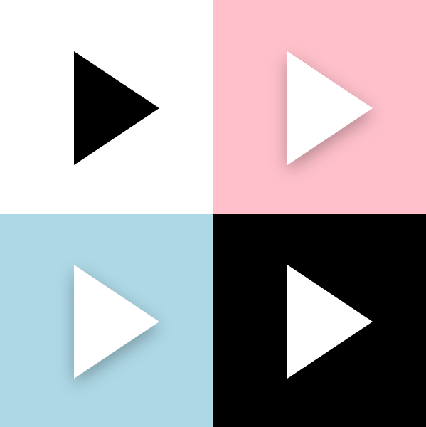
看起来简直就是平平无奇。

下面说说实现细节。
2. 按钮状态
我做自定义控件一定会先写代码部分,然后再写XAML部分,功能和外观要做到解耦,写起来也不会乱。
PomodoroStateButton 继承自Button,除了Button本身的CommonStates,PomodoroStateButton还包含以下两组VisualState:
- ProgressStates:Idle为番茄钟计时器正在计时,Busy为番茄钟停止的状态。
- PromodoroStates:Inwork为正处于工作状态,Break为休息状态。
虽然是一个放飞自我的控件,但基本的规则还是要遵守的,VisualState对应的TemplateVisualState不能省:
[TemplateVisualState(GroupName = ProgressStatesName, Name = IdleStateName)]

[TemplateVisualState(GroupName = ProgressStatesName, Name = BusyStateName)]

[TemplateVisualState(GroupName = PromodoroStatesName, Name = InworkStateName)]

[TemplateVisualState(GroupName = PromodoroStatesName, Name = BreakStateName)]

public class PomodoroStateButton : Button

{

    private const string ProgressStatesName = "ProgressStates";

    private const string IdleStateName = "Idle";

    private const string BusyStateName = "Busy";

    private const string PromodoroStatesName = "PromodoroStates";

    private const string InworkStateName = "Inwork";

    private const string BreakStateName = "Break";

    protected virtual void UpdateVisualStates(bool useTransitions)

    {

        VisualStateManager.GoToState(this, IsInPomodoro ? InworkStateName : BreakStateName, useTransitions);

        VisualStateManager.GoToState(this, IsTimerInProgress ? BusyStateName : IdleStateName, useTransitions);

    }
有了这些按钮基本就满足番茄钟的需求了。
3. ICommand
需要支持Start和Stop两个Command。要实现ICommand支持,控件中要执行如下步骤:
- 定义Command和CommandParameter属性。
- 监视Command的CanExecuteChanged事件。
*在CanExecuteChanged的事件处理函数及CommandParameter的PropertyChangedCallback中,根据Command.CanExecute(CommandParameter)的结果设置控件的IsEnabled属性。
*在某个事件(Click或者ValueChanged)中执行Command。
这篇文章里有详细介绍:了解模板化控件(7):支持Command
因为从需求来说这个按钮不需要CommandParameter,也不需要监视CanExecuteChanged事件,所以实现得简单些:
public ICommand StartCommand

{

    get => (ICommand)GetValue(StartCommandProperty);

    set => SetValue(StartCommandProperty, value);

}

public ICommand StopCommand

{

    get => (ICommand)GetValue(StopCommandProperty);

    set => SetValue(StopCommandProperty, value);

}

private void OnClick(object sender, RoutedEventArgs e)

{

    if (IsTimerInProgress)

    {

        if (StopCommand != null && StopCommand.CanExecute(this))

            StopCommand.Execute(this);

    }

    else

    {

        if (StartCommand != null && StartCommand.CanExecute(this))

            StartCommand.Execute(this);

    }

}
4. 变形
写完代码部分才开始写XAML部分。
PomodoroStateButton的ControlTempalte中最核心的是一个Polygon,在计时器启动和停止之间按钮图标需要改变它的形状,本来是三角形,需要被用户变成正方形的形状。这部分的操纵在ProgressStates里做。如果只是简单地隐藏/显示或者更换Points会很无聊,这里我使用了以前介绍过的ProgressToPointCollectionBridge,具体可以见 用Shape做动画(2) 使用与扩展PointAnimation 这篇文章。为了让变形流畅些我让三角形先变成圆形再变形到正方形,还加入了旋转动画:
<VisualTransition From="Idle" To="Busy">

    <Storyboard >

        <DoubleAnimation Storyboard.TargetName="ProgressToPointCollectionBridge" Storyboard.TargetProperty="Progress" To="1" EnableDependentAnimation="True" Duration="0:0:0.3">

            <DoubleAnimation.EasingFunction>

                <CubicEase EasingMode="EaseOut"/>

            </DoubleAnimation.EasingFunction>

        </DoubleAnimation>

        <DoubleAnimation Storyboard.TargetName="ShapeCompositeTransform" Storyboard.TargetProperty="Rotation" To="180" EnableDependentAnimation="True" Duration="0:0:0.3">

            <DoubleAnimation.EasingFunction>

                <CubicEase EasingMode="EaseOut"/>

            </DoubleAnimation.EasingFunction>

        </DoubleAnimation>

    </Storyboard>

</VisualTransition>

<Border.Resources>

    <controls:ProgressToPointCollectionBridge x:Name="ProgressToPointCollectionBridge"

                   Progress="0">

        <PointCollection>三角形的点</PointCollection>

        <PointCollection>圆型的点</PointCollection>

        <PointCollection>正方形的点</PointCollection>

    </controls:ProgressToPointCollectionBridge>

</Border.Resources>

<Polygon Points="{Binding Source={StaticResource ProgressToPointCollectionBridge},Path=Points}"/>

顺便提一下其它的变形方案。
HandyControl提供了GeometryAnimation,可以像使用其它线性动画那样使用变形动画:
<hc:GeometryAnimationUsingKeyFrames Storyboard.TargetProperty="Data" Storyboard.TargetName="PathDemo">

    <hc:DiscreteGeometryKeyFrame KeyTime="0:0:0.7" Value="{StaticResource FaceBookGeometry}"/>

    <hc:EasingGeometryKeyFrame KeyTime="0:0:1.2" Value="{StaticResource TwitterGeometry}">

        <hc:EasingGeometryKeyFrame.EasingFunction>

            <QuarticEase EasingMode="EaseInOut"/>

        </hc:EasingGeometryKeyFrame.EasingFunction>

    </hc:EasingGeometryKeyFrame>

</hc:GeometryAnimationUsingKeyFrames>

也可以使用MorphSVG,或类似的SVG变形库:
5. 传递AlphaMask
我在使用GetAlphaMask制作阴影这篇文章里介绍了如何使用GetAlphaMask函数获取元素的AlphaMask,在 PomodoroStateButton里我也使用这个函数获取了ControlTemplate中的Polygon(就是上面变形的部分)的AlphaMask,并使用这个AlphaMask创建阴影、处理MouseEnter/MouseLeave的动画、Pressed的状态变换、还有Inwork/Break状态切换的动画。这还真是累坏它了,而要在一个元素上处理这个多动画我也会累,所以我没有使用DropShadowPanel那种ContentControl的方案,因为那样只能由ContentControl自己拥有Polygon的AlphaMask。而是创建了多个ButtonDecorator控件,让它们都用RelativeElement="{Binding ElementName=Shape}"的方式关联Polygon,然后再通过GetAlphaMask函数获取Polygon的AlphaMask,做到人手一份Polygon的AlphaMask,然后各自进行动画,这样避免了动画太过复杂。XML大致这样:
<controls:ButtonDecorator  x:Name="Shadow"

                           RelativeElement="{Binding ElementName=Shape}"

                           Style="{StaticResource Shadow}"/>

<controls:ButtonDecorator RelativeElement="{Binding ElementName=Shape}"

                          x:Name="Outline"

                          Style="{StaticResource Outline}"/>

<controls:ButtonDecorator RelativeElement="{Binding ElementName=Shape}"

                          Style="{StaticResource Glow}"

                          IsInPomodoro="{TemplateBinding IsInPomodoro}"/>

<Polygon Points="{Binding Source={StaticResource ProgressToPointCollectionBridge},Path=Points}"

         StrokeThickness="4"

         Stretch="None"

         StrokeEndLineCap="Round"

         x:Name="Shape"/>
6. 传递ButtonState
<VisualState x:Name="Pressed">

    <VisualState.Setters>

        <Setter Target="RootGrid.(RevealBrush.State)" Value="Pressed" />

        <Setter Target="RootGrid.Background" Value="{ThemeResource ButtonRevealBackgroundPressed}" />

        <Setter Target="ContentPresenter.BorderBrush" Value="{ThemeResource ButtonRevealBorderBrushPressed}" />

        <Setter Target="ContentPresenter.Foreground" Value="{ThemeResource ButtonForegroundPressed}" />

    </VisualState.Setters>

    <Storyboard>

        <PointerDownThemeAnimation Storyboard.TargetName="RootGrid" />

    </Storyboard>

</VisualState>
上面是是ButtonRevealStyle的部分XAML,应用了ButtonRevealStyle样式的按钮有很复杂的外观,但它的Style写得倒很简洁,这是因为它把状态传递给RevealBrush由它去处理动画(还有PointerDownThemeAnimation之类的),这样分解了复杂的XAML。我也为ButtonDecorator添加了State属性,它是一个ButtonState枚举类型的属性:
public enum ButtonState

{

    //

    // 摘要:

    //     元素处于其默认状态。

    Normal = 0,

    //

    // 摘要:

    //     指针在元素上。

    PointerOver = 1,

    //

    // 摘要:

    //     已按下元素。

    Pressed = 2

}
PomodoroStateButton在CommonStates的个状态间转变时会做轮廓的Outward和Inward动画,阴影也会变颜色,但因为通过传递ButtonState分离了复杂的XAML,所以CommonStates的XAML倒是写得很简单:
<VisualState x:Name="Normal" >

    <VisualState.Setters>

        <Setter Target="Outline.State" Value="Normal"/>

        <Setter Target="Shadow.State" Value="Normal"/>

    </VisualState.Setters>

</VisualState>

<VisualState x:Name="PointerOver">

    <VisualState.Setters>

        <Setter Target="Outline.State" Value="PointerOver"/>

        <Setter Target="Shadow.State" Value="PointerOver"/>

    </VisualState.Setters>

</VisualState>

<VisualState x:Name="Pressed">

    <VisualState.Setters>

        <Setter Target="Outline.State" Value="Pressed"/>

        <Setter Target="Shadow.State" Value="Pressed"/>

        <Setter Target="Shape.Opacity" Value="0.7"/>

    </VisualState.Setters>

</VisualState>

7. 圆周动画
PomodoroStateButton在Inwork和Break之间切换的时候让左右两边的蓝色和红色阴影做半圈圆周运动交换位置,虽然也可以将就些,但当时太闲了就讲究起来了。
之前 介绍ProgressRing的文章 里说过怎么做圆周运动,简单来说就是把元素放到一个大的容器里,对整个容器做旋转。
<Page.Resources>

    <Storyboard RepeatBehavior="Forever" x:Key="Sb" >

        <DoubleAnimation Storyboard.TargetName="E1R" BeginTime="0" Storyboard.TargetProperty="Angle" Duration="0:0:4" To="360"/>

    </Storyboard>

</Page.Resources>

<Grid Background="White">

    <Canvas RenderTransformOrigin=".5,.5" Height="100" Width="100">

        <Canvas.RenderTransform>

            <RotateTransform x:Name="E1R" />

        </Canvas.RenderTransform>

        <Rectangle  Width="20"  Height="20"  Fill="MediumPurple"  />

    </Canvas>

</Grid>

但是这样的话里面的元素也会跟着旋转,其中一种解决方法是里面的元素用同样的速度向着反方向做旋转,抵消外层的旋转。但那时我太闲用了另一种方法,也就是平移:
<Page.Resources>

    <Storyboard RepeatBehavior="Forever" x:Key="Sb" >

        <DoubleAnimationUsingKeyFrames Storyboard.TargetName="Translate1" Storyboard.TargetProperty="X" EnableDependentAnimation="True">

            <EasingDoubleKeyFrame KeyTime="0:0:4" Value="120">

                <EasingDoubleKeyFrame.EasingFunction>

                    <QuadraticEase EasingMode="EaseInOut"/>

                </EasingDoubleKeyFrame.EasingFunction>

            </EasingDoubleKeyFrame>

            <EasingDoubleKeyFrame KeyTime="0:0:8" Value="0">

                <EasingDoubleKeyFrame.EasingFunction>

                    <QuadraticEase EasingMode="EaseInOut"/>

                </EasingDoubleKeyFrame.EasingFunction>

            </EasingDoubleKeyFrame>

        </DoubleAnimationUsingKeyFrames>

        <DoubleAnimationUsingKeyFrames Storyboard.TargetName="Translate1" Storyboard.TargetProperty="Y" EnableDependentAnimation="True">

            <EasingDoubleKeyFrame KeyTime="0:0:2" Value="60">

                <EasingDoubleKeyFrame.EasingFunction>

                    <QuadraticEase EasingMode="EaseOut"/>

                </EasingDoubleKeyFrame.EasingFunction>

            </EasingDoubleKeyFrame>

            <EasingDoubleKeyFrame KeyTime="0:0:4" Value="0">

                <EasingDoubleKeyFrame.EasingFunction>

                    <QuadraticEase EasingMode="EaseIn"/>

                </EasingDoubleKeyFrame.EasingFunction>

            </EasingDoubleKeyFrame>

            <EasingDoubleKeyFrame KeyTime="0:0:6" Value="-60">

                <EasingDoubleKeyFrame.EasingFunction>

                    <QuadraticEase EasingMode="EaseOut"/>

                </EasingDoubleKeyFrame.EasingFunction>

            </EasingDoubleKeyFrame>

            <EasingDoubleKeyFrame KeyTime="0:0:8" Value="0">

                <EasingDoubleKeyFrame.EasingFunction>

                    <QuadraticEase EasingMode="EaseIn"/>

                </EasingDoubleKeyFrame.EasingFunction>

            </EasingDoubleKeyFrame>

        </DoubleAnimationUsingKeyFrames>

    </Storyboard>

</Page.Resources>

<Grid Background="White">

    <Grid Height="100" Width="100">

        <Rectangle Width="20" Height="20" Fill="MediumPurple"  RenderTransformOrigin=".5,.5"  HorizontalAlignment="Left" VerticalAlignment="Center">

            <Rectangle.RenderTransform>

                <TranslateTransform x:Name="Translate1" X="0" Y="0" />

            </Rectangle.RenderTransform>

        </Rectangle>

    </Grid>

</Grid>
选择QuadraticEase,搭配得宜的话可以做到漂亮的圆周运动,效果如下:

当然实际上我使用了CircleEase,效果更调皮些,PomodoroStateButton在Inwork和Break之间切换后的效果如下:

(虽然搞这么复杂也没什么意义。)
8. 结语
这样一个手感还不错,看上去很收敛实际上用了一大堆代码的状态按钮就完成了,使用了两个月下来感觉手感还算好,而且很容易和各种主题的番茄钟搭配。
可以安装我的番茄钟应用试玩一下,安装地址:
9. 源码
OnePomodoro_Controls at master
[UWP]为番茄钟应用设计一个平平无奇的状态按钮的更多相关文章
- 蒲公英 · JELLY技术周刊 Vol 27: 平平无奇 React 17
蒲公英 · JELLY技术周刊 Vol.27 这个热闹的十月终于要走到尾声,React 17 历经 4 个 RC 版本之后,也于数天前正式发布了,而同在几天前发布的 CRA 4.0 也已经完成了 Re ...
- 平平无奇的项目「GitHub 热点速览 v.22.10」
不知道大家对高星项目什么印象?提到这个词第一个想到哪个项目呢?本周有几个项目看着普普通通,却完成了一周 2k+ star 的事迹.比如 SingleFile,它是个浏览器扩展,点击图标之后即可保存一个 ...
- Linux/Unix 下自制番茄钟
习惯使用番茄工作法,在Linux上工作时也需要一个番茄钟. 安装一个Linux下番茄钟工作软件? 其实根本没必要,我们可以用Linux下经典的at命令实现一个简单的番茄钟. 安装AT 一般Linux基 ...
- [UWP]从头开始创建并发布一个番茄钟
1. 自己用的番茄钟自己做 在PC上我一直使用"小番茄"作为我的番茄钟软件,我把它打开后放在副显示器最大化,这样不仅可以让它尽到本分,而且还可以告诉我的同事"我正在专心工 ...
- APP案例分析——嘀嗒番茄钟
第一部分 调研, 评测 个人第一次上手体验 一直在用时间管理的软件,但是下载了卸载,来来去去也用了很多个.这个嘀嗒番茄钟也是最近比较喜欢的软件,界面简洁,功能简单,没有那么复杂非常容易上手. 功能性的 ...
- 番茄钟的实现(基于Xilinx EGO1学习板)
番茄钟设计 一.总体设计 1.番茄工作法简介 番茄工作法由意大利的奇列洛创造.其内容就是:工作25分钟休息5分钟,循环四次后休息15分钟. 本项目就是基于Xilinx Ego1开发板实现一个计时器,该 ...
- 番茄钟App(Pomodoro Tracker)
最近为了学习Swift编程语言,写了一个番茄钟的App(Pomodoro Tracker).刚上线的1.2版本增加了Apple Watch的支持. iPhone版 Apple Watch版 如果你跟我 ...
- 云课堂Android模块化实战--如何设计一个通用性的模块
本文来自 网易云社区 . 如何设计一个通用性的模块 前言 每个开发者都会知道,随着项目的开发,会发现业务在不断壮大,产品线越来越丰富,而留给开发的时间却一直有限,在有限的时间,尽快完成某个功能的迭代. ...
- 如何一步一步用DDD设计一个电商网站(九)—— 小心陷入值对象持久化的坑
阅读目录 前言 场景1的思考 场景2的思考 避坑方式 实践 结语 一.前言 在上一篇中(如何一步一步用DDD设计一个电商网站(八)—— 会员价的集成),有一行注释的代码: public interfa ...
随机推荐
- Java的Object类
(1)Object是类层次结构的根类,所有的类都直接或者间接的继承自Object类. (2)Object类的构造方法有一个,并且是无参构造 这其实就是理解当时我们说过,子类构造方法默认访问父类的构造是 ...
- Vue框架构造
Vue 程序结构框架 Vue.js是典型的MVVM框架,什么是MVVM框架,介绍之前我们先介绍下什么是MVC框架 MVC 即 Model-View-Controller 的缩写,就是 模型-视图-控制 ...
- JS中的事件委托/事件代理详解
起因: 1.这是前端面试的经典题型,要去找工作的小伙伴看看还是有帮助的: 2.其实我一直都没弄明白,写这个一是为了备忘,二是给其他的知其然不知其所以然的小伙伴们以参考: 概述: 那什么叫事件委托呢?它 ...
- SVN工具常用功能总结
使用SVN作为版本管理工具,可以使用VisualSVN Server+TortoiseSVN搭建SVN版本控制系统,组长安装VisualSVN Server,组员安装TortoiseSVN. Tort ...
- python 2.x中的中文
先不管一大堆的中文显示的原理,在这里记录下正确显示中文的方式,便于以后的查阅和深入学习. 方法1 a = {} a["哈哈哈"] = "啦啦啦啦啦啦啦" s1 ...
- 4. NFS存储服务器搭建
1.什么是NFS? Network file system 网络文件系统 nfs共享存储 2.nfs能干什么? nfs 能为 不同主机系统之间 实现 文件的共享 3.为什么要使用nfs? 在集群架构中 ...
- Java NIO之Java中的IO分类
前言 前面两篇文章(Java NIO之理解I/O模型(一).Java NIO之理解I/O模型(二))介绍了,IO的机制,以及几种IO模型的内容,还有涉及到的设计模式.这次要写一些更贴近实际一些的内容了 ...
- Java IO_003.Reader与Writer--字符流以及编码对数据的操作(读取与写入)
Java IO之Reader与Writer对象常用操作(包含了编码问题的处理) 涉及到文件(非文件夹)内容的操作,如果是纯文本的情况下,除了要用到File(见之前文章),另外就必须用到字符输入流或字符 ...
- node项目发布+域名及其二级域名配置+nginx反向代理+pm2
学习node的时候也写了一些demo.但是只是限于本地测试,从来没有发布.今天尝试发布项目. 需要准备的东西 node 项目:为了突出重点,说明主要问题.我只是拿express 写了很简单的demo. ...
- ajax同步请求与异步请求的区别
ajax 区别: async:布尔值,用来说明请求是否为异步模式.async是很重要的,因为它是用来控制JavaScript如何执行该请求. 当设置为true时,将以异步模式发送该请求,JavaScr ...