
介绍css 的3D 变换(3D transform)
https://desandro.github.io/3dtransforms/docs/card-flip.html
---------------------------------------------------------------------------------------------------
Card Flip
We now have all the tools to start making 3D objects. Let’s get started with the basics, flipping a card.
Here’s the basic markup we’ll need:
<section class="container">

  <div id="card">

    <figure class="front">1</figure>

    <figure class="back">2</figure>

  </div>

</section>
The .container will house the 3D space. The #card acts as a wrapper for the 3D object. Two separate elements for both faces of the card, .front and .back. Even for such a simple object, I recommend using this same pattern for any 3D transform. Keeping the 3D space element and the object separate element establishes a paradigm that is simple to understand and easier to style.
We’re ready for some 3D stylin’. First, apply necessary perspective to the parent 3D space, along with any size or positioning styles.
.container {

  width: 200px;

  height: 260px;

  position: relative;

  perspective: 800px;

}
Now the #card element can be transformed in its parent’s 3D space. We’re using absolute/relative positioning so the 3D object is removed from the flow of the document. We’ll also add @width: 100%; and height: 100%;@. This ensures the object’s transform-origin will occur in the center of container. More on transform-origin later.
Let’s add a CSS3 transition so users can see the transform take effect.
#card {

  width: 100%;

  height: 100%;

  position: absolute;

  transform-style: preserve-3d;

  transition: transform 1s;

}
The .container’s perspective only applies to direct descendant children, in this case #card. In order for subsequent children to inherit a parent’s perspective, and live in the same 3D space, the parent can pass along its perspective with transform-style: preserve-3d. Without 3D transform-style, the faces of the card would be flattened with its parents and the back face’s rotation would be nullified.
To position the faces in 3D space, we’ll need to reset their positions in 2D with position: absolute. In order to hide the back-side of the faces when they are faced away from the viewer, we use backface-visibility: hidden.
#card figure {

  margin: 0;

  display: block;

  position: absolute;

  width: 100%;

  height: 100%;

  backface-visibility: hidden;

}
To flip the .back face, we add a basic 3D transform of rotateY( 180deg ).
#card .front {

  background: red;

}

#card .back {

  background: blue;

  transform: rotateY( 180deg );

}
With the faces in place, the #card requires a corresponding style for when it is flipped.
#card.flipped {

  transform: rotateY( 180deg );

}
Now we have a working 3D object. To flip the card, we can toggle the flipped class. When .flipped, the #card will rotate 180 degrees, thus exposing the .back face.
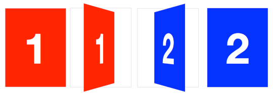
Slide-flip
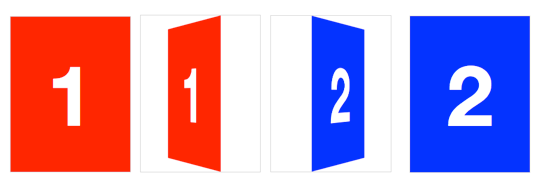
Take another look at the Weather App 3D transition. You’ll notice that it’s not quite the same effect as our previous demo. If you follow the right edge of the card, you’ll find that it stays flush with the container. Instead of pivoting from the horizontal center, it pivots on that right edge. But the transition is not just a rotation – the edge moves horizontally from right to left. We can reproduce this transition just by modifying a couple lines of CSS from our original card flip demo.
The pivot point for the rotation occurs at the right side of the card. By default, the transform-origin of an element is at its horizontal and vertical center (50% 50% or center center). Let’s change it to the right side:
#card { transform-origin: right center; }That flip now needs some horizontal movement with translateX. We’ll set the rotation to -180deg so it flips right side out.
#card.flipped {

  transform: translateX( -100% ) rotateY( -180deg );

}
介绍css 的3D 变换(3D transform)的更多相关文章
- CSS3 3D变换实例 滚动的正方体
笔记: 2D变换 transform 位移 translateX() translateY() 简写:translate(X值,Y值) 正值向右,负值向左 旋转 rotate() rotat ...
- css之3D变换
3D变换的x,y,z轴是分别效果是: x轴旋转的话,就是头和脚进行转动 y轴旋转的话,就是左右手进行转动 z轴旋转的话,就是整个身体平铺在旋转. 上面是针对旋转的意思去,但是对于其他的类似一样,就是这 ...
- 基本3D变换之World Transform, View Transform and Projection Transform
作者:i_dovelemon 来源:CSDN 日期:2014 / 9 / 28 主题:World Transform, View Transform , Projection Transform 引言 ...
- CSS3 3D变换
可以这么说,3D变换是基于三维坐标系的.以下是“盗用”的图 CSS3中的3D变换主要包括以下几个功能函数: 3D位移:包括translateZ()和translate3d(): 3D旋转:包括rota ...
- CSS3之3D变换实例详解
CSS3的3D效果很赞,本文实现简单的两种3D翻转效果.首先看效果和源代码,文末是文绉绉的总结部分^_^ 以下CSS代码为了简洁没有添加前缀,请视情况自行添加(自动化时代推荐使用其他的一些方法,如gu ...
- (一一九)通过CALayer实现阴影、圆角、边框和3D变换
在每个View上都有一个CALayer作为父图层,View的内容作为子层显示,通过layer的contents属性决定了要显示的内容,通过修改过layer的一些属性可以实现一些华丽的效果. [阴影和圆 ...
- CSS3之3d变换与关键帧
3d变换是在transform基础上实现的 transform-style:preserve-3d; 建立3d空间 perspective:; 景深(设置用户看的距离) perspective-ori ...
- OpenGL学习进程(12)第九课:矩阵乘法实现3D变换
本节是OpenGL学习的第九个课时,下面将详细介绍OpenGL的多种3D变换和如何操作矩阵堆栈. (1)3D变换: OpenGL中绘制3D世界的空间变换包括:模型变换.视图变换.投影变换和视口 ...
- [OpenGL ES 03]3D变换:模型,视图,投影与Viewport
[OpenGL ES 03]3D变换:模型,视图,投影与Viewport 罗朝辉 (http://blog.csdn.net/kesalin) 本文遵循“署名-非商业用途-保持一致”创作公用协议 系列 ...
- 第1部分: 游戏引擎介绍, 渲染和构造3D世界
原文作者:Jake Simpson译者: 向海Email:GameWorldChina@myway.com ---------------------------------------------- ...
随机推荐
- 为什么jfinal的控制器不用单例模式
先假controller定采用单例模式,通常两种设计方式来存放 HttpServletRequest.HttpServletResponse 等对象,一是利用一个类似于 ActionContext 的 ...
- webpack2代码分割
代码分割-CSS 要通过webpack打包CSS,像任何其他模块一样将CSS导入JavaScript代码,并使用css-loader(它输出CSS作为JS模块), 并可选地应用ExtractTextW ...
- github修改仓库项目的语言类型
github是 采用Linguist来自动识别你的代码应该归为哪一类. 解决方法: 我们可以在仓库的根目录下添加.gitattributes文件: ## 使用 `.gitattributes` 配置文 ...
- patest_1007_Maximum Subsequence Sum_(dp)(思维)
1007. Maximum Subsequence Sum (25) 时间限制 400 ms 内存限制 65536 kB 代码长度限制 16000 B 判题程序 Standard 作者 CHEN, Y ...
- CAD实现批量打印(网页版)
主要用到函数说明: IMxDrawPrint::BatchPrintDialog 批量打印对话框,详细说明如下: 参数 说明 [in] IMxDrawResbuf* pParam 批量打印位置参数, ...
- Linux C动态链接库实现一个插件例子
实现一个简单的计算动态链接库:升级动态链接库后,在不重新编译主程序的情况下,直接生效. lib库: #cat math.c #include <stdio.h> int add(int x ...
- 初识Python(windows)——下载、安装、使用
Table of Contents 1. Why is Python 1.1. Python和R 2. python的下载与安装 2.1. python的版本选择 2.2. python的下载 2.3 ...
- mysql jdbc驱动与java 版本对应关系
当使用某些密码套件时,Connector/J5.1需要JRE 1.8.x才能使用SSL/TLS连接到MySQL 5.6,5.7和8.0.
- SpringBoot中部署Swagger2和Swagger-UI
1 Gradle配置在dependencies中添加以下依赖: implementation("io.springfox:springfox-swagger2:2.7.0") im ...
- python3.x Day6 多进程
多进程:1.每个子进程申请到的资源都是独立的,不与其他进程共享.2.语法上和线程基本上差不多,使用multiprocessing.Process(target=xxxx,args=(xxx,xxx,x ...