CSS动画实例:旋转的圆角正方形
在页面中放置一个类名为container的层作为效果呈现容器,在该层中再定义十个名为shape的层层嵌套的子层,HTML代码描述如下:
<div class="container">
<div class="shape"><div class="shape"><div class="shape"><div class="shape">
<div class="shape"><div class="shape"><div class="shape"><div class="shape">
<div class="shape">
<div class="shape">
</div>
</div>
</div></div></div></div>
</div></div></div></div>
</div>
分别为container和shape定义CSS样式规则如下:
.container
{
margin: 0 auto;
width: 650px;
height: 650px;
position: relative;
overflow: hidden;
border: 4px solid rgba(255, 0, 0, 0.9);
display: flex;
padding: 0;
flex: 1;
align-items: center;
justify-content: center;
}
.shape
{
background: radial-gradient(circle, #000, transparent) #f00;
border: 1px solid;
box-sizing: border-box;
border-radius: 5%;
padding: 20px;
}
在CSS样式的作用下,这11个层在浏览器中显示如图1所示。10个层层嵌套的子层显示为10个圆角正方形。
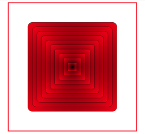
图1 10个圆角正方形
现在让这10个圆角正方形旋转起来,编写关键帧定义为:
@keyframes turn
{
0% { transform: rotate(0deg); }
100% { transform: rotate(360deg); }
}
然后在.shape样式定义中加上一句“animation: turn 30s infinite linear;”,此时,10个圆角正方形会旋转起来,如图2所示。
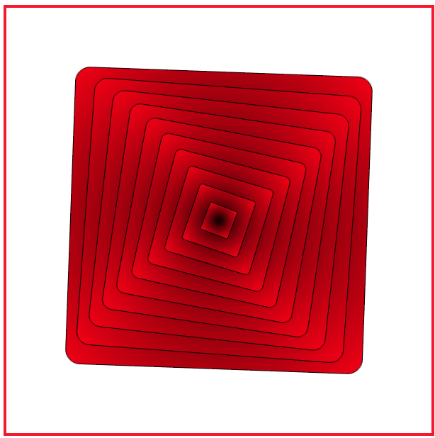
图2 旋转的红色圆角正方形
图2中旋转的10个正方形的背景色全部为红色,我们想让颜色进行些变化,在编写一个名为rainbow(彩虹)的颜色变化的关键字定义如下:
@keyframes rainbow
{
0%,100% { color: #f00; }
16.667% { color: #ff0; }
33.333% { color: #0f0; }
50.000% { color: #0ff; }
66.667% { color: #00f; }
83.333% { color: #f0f; }
}
再修改shape的样式规则定义为:
.shape
{
background: radial-gradient(circle, #000, transparent) currentcolor;
border: 1px solid;
box-sizing: border-box;
border-radius: 5%;
padding: 20px;
animation: turn 10s infinite linear,rainbow 10s infinite linear;
}
其中修改了两处:一处是将背景颜色由红色(#f00)改成当前色(currentcolor),另一处是在动画属性animation中加入了颜色变化的动画定义。
此时,在浏览器中呈现出如图3所示的效果。

图3 旋转的变色圆角正方形
图3中旋转过程中正方形虽然会改变颜色,但10个正方形的颜色仍然一样。为了让各个正方形颜色不同,可以为每个层定义一个变量—n,然后为颜色变化的动画加上属性animation-delay,它的属性值根据变量—n进行计算。
完整的HTML文件内容如下。


<!DOCTYPE html>

<html>

<head>

<title>旋转的正方形</title>

<style>

  .container

  {

     margin: 0 auto;

     width: 600px;

     height: 600px;

     position: relative;

     overflow: hidden;

     border: 4px solid rgba(255, 0, 0, 0.9);

     display: flex;

     padding: 0;

     flex: 1;

     align-items: center;

     justify-content: center;

   }

   .shape

   {

      background: radial-gradient(circle, #000, transparent)  currentcolor;

      border: 1px solid;

      box-sizing: border-box;

      border-radius: 5%;

      padding: 20px;

      animation: turn 30s infinite linear,

                 rainbow 30s infinite linear

           calc(30 * (10 * (10 - var(--n)) * 0.01) * -1s);

   }

   @keyframes turn

   {

      0%   {  transform: rotate(0deg); }

      100% {  transform: rotate(360deg); }

   }

   @keyframes rainbow

   {

      0%,100% { color: #f00; }

      16.667% { color: #ff0; }

      33.333% { color: #0f0; }

      50.000% { color: #0ff; }

      66.667% { color: #00f; }

      83.333% { color: #f0f; }

   }

</style>

</head>

<body>

<div class="container">

  <div class="shape" style="--n: 10;"><div class="shape" style="--n: 9;">

  <div class="shape" style="--n: 8;"><div class="shape" style="--n: 7;">

  <div class="shape" style="--n: 6;"><div class="shape" style="--n: 5;">

  <div class="shape" style="--n: 4;"><div class="shape" style="--n: 3;">

     <div class="shape" style="--n: 2;">

        <div class="shape" style="--n: 1;">

        </div>

     </div>

  </div></div></div></div>

  </div></div></div></div>

</div>

</body>

</html>
在浏览器中打开包含这段HTML代码的html文件,可以呈现如图4所示的旋转效果。
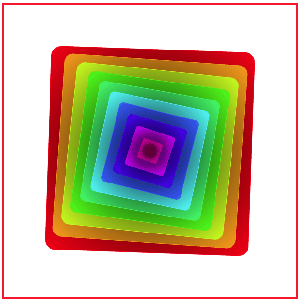
图4 旋转的彩色正方形
我们也可以采用如下的方法实现旋转的圆角正方形。
在页面中放置一个类名为container的层作为效果呈现容器,在该层中再定义18个名为shape的子层,为每个子层设置三个变量:表示该子层缩放比例的变量—scale,表示该子层初始旋转角度的变量—rotation和表示该子层背景色的变量—color。HTML代码描述如下:
<div class="container">
<div class="shape" style="--scale: 0.840;--rotation: 180deg;--color:#f00"></div>
<div class="shape" style="--scale: 0.720;--rotation: 360deg;--color:#f36"></div>
<div class="shape" style="--scale: 0.605;--rotation: 540deg;--color:#f69"></div>
<div class="shape" style="--scale: 0.518;--rotation: 720deg;--color:#f9c"></div>
<div class="shape" style="--scale: 0.435;--rotation: 900deg;--color:#900"></div>
<div class="shape" style="--scale: 0.373;--rotation: 1080deg;--color:#936"></div>
<div class="shape" style="--scale: 0.314;--rotation: 1260deg;--color:#969"></div>
<div class="shape" style="--scale: 0.269;--rotation: 1440deg;--color:#993"></div>
<div class="shape" style="--scale: 0.226;--rotation: 1620deg;--color:#9c0"></div>
<div class="shape" style="--scale: 0.193;--rotation: 1800deg;--color:#909"></div>
<div class="shape" style="--scale: 0.163;--rotation: 1980deg;--color:#f06"></div>
<div class="shape" style="--scale: 0.139;--rotation: 2160deg;--color:#a9a9a9"></div>
<div class="shape" style="--scale: 0.117;--rotation: 2340deg;--color:#bdb76b"></div>
<div class="shape" style="--scale: 0.100;--rotation: 2520deg;--color:#556b2f"></div>
<div class="shape" style="--scale: 0.084;--rotation: 2700deg;--color:#ff8c00"></div>
<div class="shape" style="--scale: 0.072;--rotation: 2880deg;--color:#e9967a"></div>
<div class="shape" style="--scale: 0.061;--rotation: 3060deg;--color:#8fbc8f></div>
<div class="shape" style="--scale: 0.052;--rotation: 3240deg;--color:#2f4f4f"></div>
</div>
分别为container和shape定义CSS样式规则,并定义动画关键帧。
完整的HTML代码如下。
<!DOCTYPE html>

<html>

<head>

<title>旋转的圆角正方形</title>

<style>

  .container

  {

     margin: 0 auto;

     width: 500px;

     height: 500px;

     position: relative;

     overflow: hidden;

     border: 4px solid rgba(255, 0, 0, 0.9);

     display: flex;

     padding: 0;

     flex: 1;

     align-items: center;

     justify-content: center;

     background:#d8d8d8;

     border-radius: 10%;

   }

   .shape

   {

     position: absolute;

     width: 80%;

     height: 80%;

     top: 50%;

     left: 50%;

     opacity: 0.6;

     border-radius:10%;

     animation: rotate 5s alternate infinite ease-in-out;

   }

   .shape:nth-child(1n+0)

   {

      background: var(--color);

   }

   @keyframes rotate

   {

       from { transform: translate(-50%, -50%) rotate(var(--rotation)) scale(var(--scale)); }

       to   { transform: translate(-50%, -50%) rotate(90deg) scale(var(--scale));  }

   }

</style>

</head>

<body>

<div class="container">

    <div class="shape" style="--scale: 0.840;--rotation: 180deg;--color:#f00"></div>

    <div class="shape" style="--scale: 0.720;--rotation: 360deg;--color:#f36"></div>

    <div class="shape" style="--scale: 0.605;--rotation: 540deg;--color:#f69"></div>

    <div class="shape" style="--scale: 0.518;--rotation: 720deg;--color:#f9c"></div>

    <div class="shape" style="--scale: 0.435;--rotation: 900deg;--color:#900"></div>

    <div class="shape" style="--scale: 0.373;--rotation: 1080deg;--color:#936"></div>

    <div class="shape" style="--scale: 0.314;--rotation: 1260deg;--color:#969"></div>

    <div class="shape" style="--scale: 0.269;--rotation: 1440deg;--color:#993"></div>

    <div class="shape" style="--scale: 0.226;--rotation: 1620deg;--color:#9c0"></div>

    <div class="shape" style="--scale: 0.193;--rotation: 1800deg;--color:#909"></div>

    <div class="shape" style="--scale: 0.163;--rotation: 1980deg;--color:#f06"></div>

    <div class="shape" style="--scale: 0.139;--rotation: 2160deg;--color:#a9a9a9"></div>

    <div class="shape" style="--scale: 0.117;--rotation: 2340deg;--color:#bdb76b"></div>

    <div class="shape" style="--scale: 0.100;--rotation: 2520deg;--color:#556b2f"></div>

    <div class="shape" style="--scale: 0.084;--rotation: 2700deg;--color:#ff8c00"></div>

    <div class="shape" style="--scale: 0.072;--rotation: 2880deg;--color:#e9967a"></div>

    <div class="shape" style="--scale: 0.061;--rotation: 3060deg;--color:#8fbc8f></div>

    <div class="shape" style="--scale: 0.052;--rotation: 3240deg;--color:#2f4f4f"></div>

</div>

</body>

</html>
在浏览器中打开包含这段HTML代码的html文件,可以呈现如图5所示的旋转效果。
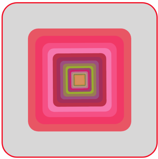
图5 旋转的圆角正方形
CSS动画实例:旋转的圆角正方形的更多相关文章
- CSS动画实例
上一篇讲过css动画transform transition的语法,这一节展示自己做的几个小例子加深印象 1. 线条动画效果 代码:最外层div包含2个小的div : a和b. a有左右边框(高度 ...
- CSS动画之旋转魔方轮播
很久没有回头来复习CSS方面的知识了, 正好又到了月底写文章的deadline......所以这次选择了详细巩固一下CSS3动画有关的知识点,因为之前只是用过一些属性并没有深究细节. 在我自己写完这篇 ...
- CSS动画实例:太极图在旋转
利用CSS可以构造出图形,然后可以对构造的图形添加动画效果.下面我们通过旋转的太极图.放大的五角星.跳“双人舞”的弯月等实例来体会纯CSS实现动画的方法. 1.旋转的太极图 设页面中有<div ...
- CSS动画实例:一颗躁动的心
在页面中放置一个类名为container的层作为盛放心心的容器,在该层中再定义一个名为heart的子层,HTML代码描述如下: <div class="container"& ...
- CSS动画实例:Loading加载动画效果(三)
3.小圆型Loading 这类Loading动画的基本思想是:在呈现容器中定义1个或多个子层,再对每个子层进行样式定义,使得其均显示为一个实心圆形,最后编写关键帧动画控制,使得各个实心圆或者大小发生改 ...
- CSS动画实例:移动的眼珠子
适当地利用CSS的box-shadow可以构造图形,然后可以对构造的图形添加动画效果.下面我们通过移动的眼珠子.圆珠一二三.一分为四.四小圆旋转扩散等实例来体会box-shadow属性在动画制作中的使 ...
- CSS动画实例:小圆球的海洋
CSS背景属性用于定义HTML元素的背景,在CSS提供的背景属性中, background-image:指定要使用的一个或多个背景图像: background-color:指定要使用的背景颜色: ba ...
- CSS动画实例:行星和卫星
设页面中有<div class=" planet "></div>,用来绘制一个行星和卫星图形.这个图形包括三部分:行星.卫星和卫星旋转的轨道.定义. pl ...
- CSS动画实例:图文切换
先准备好一张图片,在页面中放置一个类名为container的层作为图文容器,在该层中再定义两个层:一个类名为image-box的层放置图片,一个类名为text-desc的层放置文本描述,HTML代码描 ...
随机推荐
- Linux安装禅道项目管理软件
1.从官网上面下载禅道的rpm文件 #wget http://dl.cnezsoft.com/zentao/7.1/zentaopms-7.1.stable-1.noarch.rpm 2.用指令安装 ...
- 最小割&网络流应用
重要链接 基础部分链接 : 二分图 & 网络流初步 zzz大佬博客链接 : 网络流学习笔记 重点内容:最小割二元关系新解(lyd's ppt) 题目:网络流相关题目 lyd神犇课件链接 : 网 ...
- APP自动化 -- MobileBy
一.BobileBy源码 selenium中有 By appium就有MobileBy. 二.MobileBy示例 MobileBy就是继承的By,所以,语法基本是一样的.
- 干货分享丨玩转物联网IoTDA服务系列四-智能网关
摘要:该场景主要描述的是设备可以通过MQTT协议与物联网平台进行交互,用户可以在控制台产品详情中自定义Topic,通过应用侧接口或控制台创建数据转发规则,把设备上报的消息转发给其他华为云服务,供应用侧 ...
- http与https的简单比较
一.概念 1.HTTP:是互联网上应用最为广泛的一种网络协议,是一个客户端和服务器端请求和应答的标准(TCP),用于从WWW服务器传输超文本到本地浏览器的传输协议,它可以使浏览器更加高效,使网络传输减 ...
- python Scrapy 从零开始学习笔记(二)
在之前的文章中我们简单了解了一下Scrapy 框架和安装及目录的介绍,本章我们将根据 scrapy 框架实现博客园首页博客的爬取及数据处理. 我们先在自定义的目录中通过命令行来构建一个 scrapy ...
- ES数据库重建索引——Reindex(数据迁移)
应用背景: 1.当你的数据量过大,而你的索引最初创建的分片数量不足,导致数据入库较慢的情况,此时需要扩大分片的数量,此时可以尝试使用Reindex. 2.当数据的mapping需要修改,但是大量的数据 ...
- Day11_基本搜索
学于黑马和传智播客联合做的教学项目 感谢 黑马官网 传智播客官网 微信搜索"艺术行者",关注并回复关键词"乐优商城"获取视频和教程资料! b站在线视频 0.学习 ...
- float对内联元素和块元素的影响
写在前面:附一篇w3s的关于css float的讲解:http://www.w3school.com.cn/css/css_positioning_floating.asp float属性还没有彻底了 ...
- PHP is_uploaded_file() 函数
定义和用法 is_uploaded_file() 函数检查指定的文件是否是通过 HTTP POST 上传的. 如果文件是通过 HTTP POST 上传的,该函数返回 TRUE. 语法 is_uploa ...