CSS效果集锦(持续更新中)
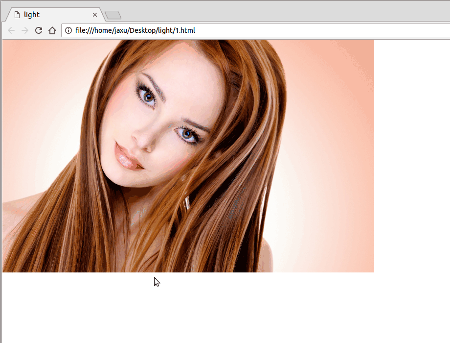
高亮光弧效果
使用CSS3实现的一个高亮光弧效果,当鼠标hover到某一个元素上时,一道光弧从左向右闪过,效果如下:
代码如下:
<!DOCTYPE html>

<html lang="en">

<head>

    <meta charset="UTF-8">

    <title>light</title>

    <style>

        body{

            margin: 0;

        }

        a.floor{

            display: block;

            height: 475px;

        }

        a.floor:hover:before{

            -webkit-transition: left 1.5s;

            -moz-transition: left 1.5s;

            transition: left 1.5s;

            left: 920px;

        }

        a.floor:before{

            content: "";

            position: absolute;

            width: 80px;

            height: 475px;

            top: 0;

            left: -150px;

            overflow: hidden;

            background: -moz-linear-gradient(left,rgba(255,255,255,0)0,rgba(255,255,255,.2)50%,rgba(255,255,255,0)100%);

            background: -webkit-gradient(linear,left top,right top,color-stop(0%,rgba(255,255,255,0)),color-stop(50%,rgba(255,255,255,.2)),color-stop(100%,rgba(255,255,255,0)));

            background: -webkit-linear-gradient(left,rgba(255,255,255,0)0,rgba(255,255,255,.2)50%,rgba(255,255,255,0)100%);

            background: -o-linear-gradient(left,rgba(255,255,255,0)0,rgba(255,255,255,.2)50%,rgba(255,255,255,0)100%);

            -webkit-transform: skewX(-25deg);

            -moz-transform: skewX(-25deg);

        }

    </style>

</head>

<body>

<a class="floor" href="javascript:;">

    <img src="./images/girl.jpg" height="475" width="760" alt="">

</a>

</body>

</html>
鼠标hover图片突出显示
类似于今日头条首页的图片,当鼠标hover到上面的时候会着重显示图片(放大效果):

代码如下:
<!DOCTYPE html>

<html lang="en">

<head>

    <meta charset="UTF-8">

    <title>hover</title>

    <style>

        body{

            margin: 0;

        }

        .img-wrap {

            width: 194px;

            height: 108px;

            float: left;

            margin-left: 6px;

            background: #e8e8e8;

            border: 1px solid #e8e8e8;

            overflow: hidden;

            cursor: pointer;

            -webkit-transform-style: preserve-3d;

            transform-style: preserve-3d;

        }

        .img-wrap img {

            width: 100%;

            height: 100%;

            border: 0;

            -webkit-transition: all .5s ease-out .1s;

            transition: all .5s ease-out .1s;

        }

        .img-wrap:hover img {

            -webkit-transform: matrix(1.04,0,0,1.04,0,0);

            -ms-transform: matrix(1.04,0,0,1.04,0,0);

            transform: matrix(1.04,0,0,1.04,0,0);

            -webkit-backface-visibility: hidden;

            backface-visibility: hidden;

        }

    </style>

</head>

<body>

<a class="img-wrap" target="_blank" href="/group/6347460154771013889/">

    <img alt="" src="http://p3.pstatp.com/list/640x360/e59000a6ecaab7d1535">

</a>

</body>

</html>
鼠标hover图片移动
向上移动:

代码:
<!DOCTYPE html>

<html lang="en">

<head>

    <meta charset="UTF-8">

    <title>hover</title>

    <style>

        body{

            padding: 4rem;

        }

        .img-wrap {

            width: 194px;

            height: 108px;

            display: block;

            cursor: pointer;

        }

        .img-wrap:hover img {

            -webkit-transform: translateY(-5px);

            -moz-transform: translateY(-5px);

            -ms-transform: translateY(-5px);

            transform: translateY(-5px);

        }

        .img-wrap img {

            width: 100%;

            height: 100%;

            border: 0;

             -webkit-transition: -webkit-transform .4s ease;

             transition: -webkit-transform .4s ease;

            -moz-transition: transform .4s ease,-moz-transform .4s ease;

             transition: transform .4s ease;

            transition: transform .4s ease,-webkit-transform .4s ease,-moz-transform .4s ease;

            -webkit-transform: translateY(0);

            -moz-transform: translateY(0);

            -ms-transform: translateY(0);

            transform: translateY(0);

        }

    </style>

</head>

<body>

<a class="img-wrap" href="javascript:;">

    <img alt="" src="http://p3.pstatp.com/list/640x360/11ff00027e781c4f7807">

</a>

</body>

</html>
向左移动:

将上面CSS样式改成下面即可:
body{

    padding: 4rem;

}

.img-wrap {

    width: 194px;

    height: 108px;

    display: block;

    cursor: pointer;

}

.img-wrap:hover img {

    -webkit-transform: translateX(-5px);

    -moz-transform: translateX(-5px);

    -ms-transform: translateX(-5px);

    transform: translateX(-5px);

}

.img-wrap img {

    width: 100%;

    height: 100%;

    border:;

     -webkit-transition: -webkit-transform .4s ease;

     transition: -webkit-transform .4s ease;

    -moz-transition: transform .4s ease,-moz-transform .4s ease;

     transition: transform .4s ease;

    transition: transform .4s ease,-webkit-transform .4s ease,-moz-transform .4s ease;

    -webkit-transform: translateX(0);

    -moz-transform: translateX(0);

    -ms-transform: translateX(0);

    transform: translateX(0);

}
晃动的计算器图标

代码如下:
<!DOCTYPE html>

<html lang="en">

<head>

    <meta charset="UTF-8">

    <title>animation</title>

    <style>

        body{

            padding: 4rem;

        }

       .calculator{

            margin: -35px auto 30px;

            width: 150px;

            line-height: 30px;

            text-align: center;

            border: 1px solid #ff7200;

            -webkit-border-radius: 30px;

            -moz-border-radius: 30px;

            border-radius: 30px;

            cursor: pointer;

            font-size: 0;

       }

       .calculator:hover{

            background-color: #fb7b14;

       }

       .calculator i{

            display: inline-block;

            width: 12px;

            height: 16px;

            line-height: 1;

            margin-right: 10px;

            vertical-align: middle;

            background: url("cal.png") no-repeat;

       }

       .calculator i.tada{

            -webkit-animation: tada 2s infinite linear;

            -moz-animation: tada 2s infinite linear;

            animation: tada 2s infinite linear;

       }

       .calculator .calculator-txt{

            line-height: 1;

            vertical-align: middle;

            color: #ff7200;

            font-size: 14px;

       }

       .calculator:hover .calculator-txt{

            color: #fff;

       }

       .calculator:hover i{

            background-position: 0 -16px;

       }

       .calculator:hover i.tada{

            -webkit-animation: ccc 2s infinite;

            -moz-animation: ccc 2s infinite;

            animation: ccc 2s infinite;

       }

       @keyframes tada{

            0% {

                -webkit-transform: none;

                -moz-transform: none;

                transform: none;

            }

            5% {

                -webkit-transform: translate3d(-25%,0,0) rotate3d(0,0,1,-5deg);

                -moz-transform: translate3d(-25%,0,0) rotate3d(0,0,1,-5deg);

                transform: translate3d(-25%,0,0) rotate3d(0,0,1,-5deg);

            }

            10% {

                -webkit-transform: translate3d(20%,0,0) rotate3d(0,0,1,3deg);

                -moz-transform: translate3d(20%,0,0) rotate3d(0,0,1,3deg);

                transform: translate3d(20%,0,0) rotate3d(0,0,1,3deg);

            }

            15% {

                -webkit-transform: translate3d(-15%,0,0) rotate3d(0,0,1,-3deg);

                -moz-transform: translate3d(-15%,0,0) rotate3d(0,0,1,-3deg);

                transform: translate3d(-15%,0,0) rotate3d(0,0,1,-3deg);

            }

            20% {

                -webkit-transform: translate3d(10%,0,0) rotate3d(0,0,1,2deg);

                -moz-transform: translate3d(10%,0,0) rotate3d(0,0,1,2deg);

                transform: translate3d(10%,0,0) rotate3d(0,0,1,2deg);

            }

            25%, 26% {

                -webkit-transform: translate3d(-5%,0,0) rotate3d(0,0,1,-1deg);

                -moz-transform: translate3d(-5%,0,0) rotate3d(0,0,1,-1deg);

                transform: translate3d(-5%,0,0) rotate3d(0,0,1,-1deg);

            }

            100% {

                -webkit-transform: none;

                -moz-transform: none;

                transform: none;

            }

       }

    </style>

</head>

<body>

<div class="calculator">

    <i class="tada"></i><span class="calculator-txt">省钱计算器</span>

</div>

</body>

</html>
转动的地球

代码如下:
<!DOCTYPE html>

<html lang="en">

<head>

    <meta charset="UTF-8">

    <title>Global</title>

    <style tyle="text/css">

        body {

            background-color: #111;

        }

        #earth {

            width: 300px;

            height: 300px;

            background: url(http://users.evtek.fi/~sampsara/3D/Earth-Spec4096.jpg);

            border-radius: 50%;

            background-size: 610px;

            box-shadow: inset 8px 36px 80px 36px rgb(0, 0, 0), inset -6px 0 12px 4px rgba(255, 255, 255, 0.3);

            animation-name: rotate;

            animation-duration: 12s;

            animation-iteration-count: infinite;

            animation-timing-function: linear;

            -webkit-animation-name: rotate;

            -webkit-animation-duration: 12s;

            -webkit-animation-iteration-count: infinite;

            -webkit-animation-timing-function: linear;

        }

        @keyframes rotate {

            from {

                background-position: 0px 0px;

            }

            to {

                background-position: 610px 0px;

            }

        }

        @-webkit-keyframes rotate {

            from {

                background-position: 0px 0px;

            }

            to {

                background-position: 610px 0px;

            }

        }

    </style>

</head>

<body>

    <div id="earth"></div>

</body>

</html>
点赞效果

代码如下:
<!DOCTYPE html>

<html lang="en">

<head>

    <meta charset="UTF-8">

    <title>like</title>

    <style type="text/css">

        img{

            /*width: 20px;

            height: 20px;*/

            position: absolute;

            bottom: 100px;

            left: 50%;

            margin-left: -12.5px;

        }

        .btn{ width: 100px; height: 30px; border:0; background: red; color: #fff; position: absolute; bottom: 100px; left: 50%; margin-left: -50px; }

    </style>

    <script src="jquery.min.js" type="text/javascript" charset="utf-8"></script>

    <script type="text/javascript">

        $(function(){

            $("#btn1").on('click', function(){

                $(".demo").append("<img src='love-r.png'>");

                $("img").animate({

                    bottom:"200px",

                    width: "50px",

                    marginLeft: "-25px",

                    opacity:"0"

                }, 1000, function(){

                    $(".demo").empty();

                });

            });

        });

    </script>

</head>

<body>

    <div class="demo"></div>

    <input id="btn1" type="button" class="btn" value="点赞">

</body>

</html>
CSS效果集锦(持续更新中)的更多相关文章
- JavaEE进阶集锦(持续更新中)
1.影响Servlet生命周期的注解:@PostConstruct和@PreDestroy @PostConstruct:被修饰的方法会在服务器加载Servlet的时候运行,并且只会被服务器调用一次, ...
- Linux 集锦(持续更新中)
// 获取文件夹下的代码总行数 find . -name "*.*" | xargs wc -l // ls 排序 ls -lt 按照最后修改时间降序 ls -lrt 按照时间升序 ...
- fastadmin 后台管理框架使用技巧(持续更新中)
fastadmin 后台管理框架使用技巧(持续更新中) FastAdmin是一款基于ThinkPHP5+Bootstrap的极速后台开发框架,具体介绍,请查看文档,文档地址为:https://doc. ...
- 前端面试题总结——HTML(持续更新中)
前端面试题总结--HTML(持续更新中) 1.什么是HTML? HTML:HyperText Markup Language超文本标记语言 2.XHTML和HTML有什么区别 HTML是一种基本的WE ...
- 【前端面试】Vue面试题总结(持续更新中)
Vue面试题总结(持续更新中) 题目参考链接 https://blog.csdn.net/weixin_45257157/article/details/106215158 由于已经有很多前辈深造VU ...
- Atom使用记录(持续更新中)
部分内容取自:http://www.jianshu.com/p/dd97cbb3c22d,我自己也在使用,持续更新中 Atom安装插件在窗口中File---Setting---install 在里面进 ...
- java视频教程 Java自学视频整理(持续更新中...)
视频教程,马士兵java视频教程,java视频 1.Java基础视频 <张孝祥JAVA视频教程>完整版[RMVB](东西网) 历经5年锤炼(史上最适合初学者入门的Java基础视频)(传智播 ...
- tp5 使用技巧(持续更新中...)
tp5 使用技巧(持续更新中...) 1.自动写入时间 create_time和update_time 使用save方法才行,insert方法不生效,不知为何 2.过滤字段 allowfield和st ...
- 史上最全的spark面试题——持续更新中
史上最全的spark面试题——持续更新中 2018年09月09日 16:34:10 为了九亿少女的期待 阅读数 13696更多 分类专栏: Spark 面试题 版权声明:本文为博主原创文章,遵循C ...
- git常用命令(持续更新中)
git常用命令(持续更新中) 本地仓库操作git int 初始化本地仓库git add . ...
随机推荐
- FMDB 排它锁
-------------------------------------基本操作------------------------------------- #import "ViewCon ...
- 《DSP using MATLAB》示例Example5.21
- JavaScript(四) Window窗体操作
window: 属性(值或者子对象):opener:打开当前窗口的源窗口,如果当前窗口是首次启动浏览器打开的,则opener是null,可以利用这个属性来关闭源窗口. 方法(函数):事件(事先设置好的 ...
- Unity 依赖注入之一
在项目中引入Unity,建立一个接口IWork跟一个继承IWork接口的Work类 public interface IMyWork { void Work(); } public class MyW ...
- Android进阶系列之源码分析Activity的启动流程
美女镇楼,辟邪! 源码,是一个程序猿前进路上一个大的而又不得不去翻越障碍,我讨厌源码,看着一大堆.5000多行,要看完得啥时候去了啊.不过做安卓的总有这一天,自从踏上这条不归路,我就认命了.好吧,我慢 ...
- [深度学习大讲堂]从NNVM看2016年深度学习框架发展趋势
本文为微信公众号[深度学习大讲堂]特约稿,转载请注明出处 虚拟框架杀入 从发现问题到解决问题 半年前的这时候,暑假,我在SIAT MMLAB实习. 看着同事一会儿跑Torch,一会儿跑MXNet,一会 ...
- 20161023 NOIP 模拟赛 T1 解题报告
Task 1.纸盒子 (box.pas/box.c/box.cpp) [题目描述] Mcx是一个有轻度洁癖的小朋友.有一天,当他沉溺于数学卷子难以自拔的时候,恍惚间想起在自己当初学习概率的时候准备的一 ...
- java与javac命令的功用
一.javac用来编译java程序,比如说我写了一个Server.java文件,首先通过命令行进入.java文件所在的路径, 然后通过输入 javac Server.java 命令行来完成编译,编译之 ...
- 懒加载lazyload
什么是懒加载 懒加载就是当你做滚动到页面某个位置,然后再显示当前位置的图片,这样做可以减少页面请求. 懒加载:主要目的是作为服务器前端的优化,减少请求数或延迟请求数,一些图片非常多的网站中非常有用,在 ...
- 基于shell脚本比较数字大小
让用户输入两个数来比较他们的大小 先用touch命令新建一个1.sh文件 在用vi进入i进入编辑状态 输入 #!/bin/bash read "" a read "&qu ...