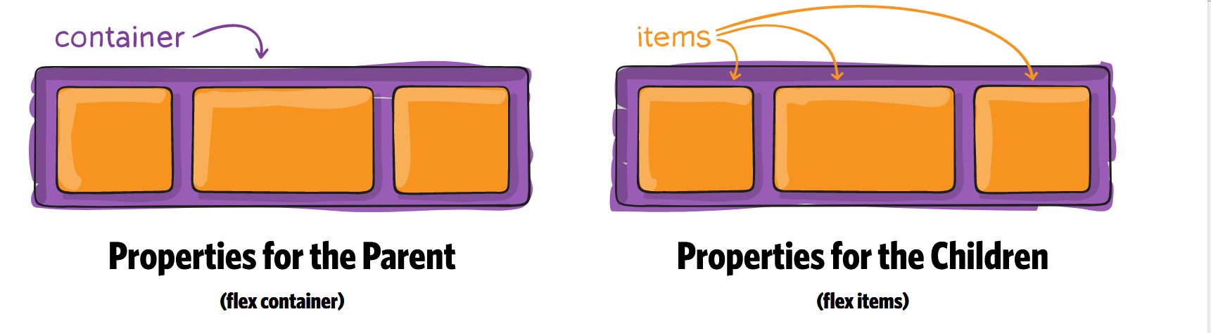
CSS3 Flex布局
Flex 用于使页面上的内容自适应屏幕
首先,在网页代码的头部,加入一行viewport元标签。
<meta name=”viewport” content=”width=device-width, initial-scale=1″ />
viewport是网页默认的宽度和高度,上面这行代码的意思是,网页宽度默认等于屏幕宽度(width=device-width),原始缩放比例(initial-scale=1)为1.0,即网页初始大小占屏幕面积的100%。
HTML 代码
<div class="container">

    <div class="item"></div>

    <div class="item"></div>

    <div class="item order"></div>

    <div class="item"></div>

    <div class="item"></div>

</div>
Container CSS 代码
1. flex
要使用flex必须在container上加上display:flex 和 display: -webkit-flex; /_ Safari _/
.container {

  display: flex; /* or inline-flex */
  display: -webkit-flex; /_ Safari _/
}
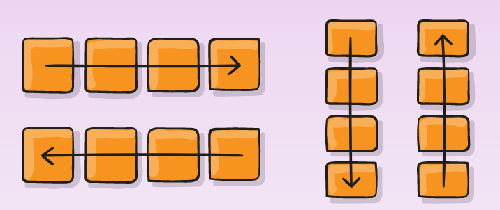
2. flex-direction
.container {

  -webkit-flex-direction: row | row-reverse | column | column-reverse;

  flex-direction: row | row-reverse | column | column-reverse;

}
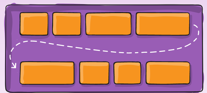
3. flex-wrap
.container{
  -webkit-flex-wrap: nowrap | wrap | wrap-reverse;

  flex-wrap: nowrap | wrap | wrap-reverse;

}
4. flex-flow
This property is a shorthand for setting the flex-direction and flex-wrap properties.
flex-flow: <‘flex-direction’> || <‘flex-wrap’>
.container {

  -webkit-flex-flow:  row nowrap;

  flex-flow:  row nowrap ;

}
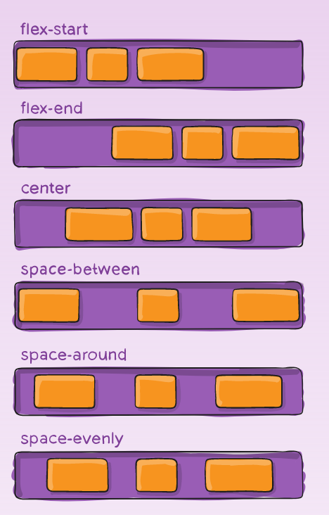
5. justify-content
Value : flex-start | flex-end | center | space-between | space-around | space-evenly;
.container {

  -webkit-justify-content: flex-start; /_ Safari _/

  justify-content:         flex-start;

}
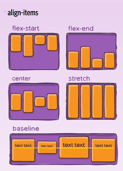
6. align-items
Value : flex-start | flex-end | center | baseline | stretch;
.container {

  -webkit-align-items: stretch; /_ Safari _/

  align-items:         stretch;

}
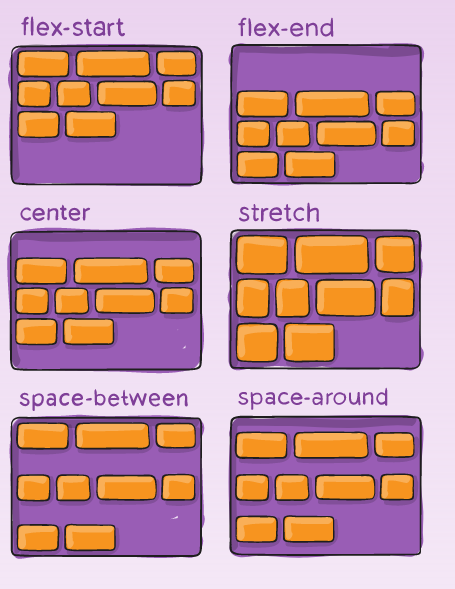
7. align-content
Value : flex-start | flex-end | center | space-between | space-around | stretch;
.container {

  -webkit-align-content: stretch; /_ Safari _/

  align-content:         stretch;

}
Item CSS 代码
1. Order
默认值为0,数值越小,排列越靠前.
.item.order {

  -webkit-order: 1; /_ Safari _/

  order:         1;

}
2. flex-grow
属性定义项目的放大比例,默认为0,即如果存在剩余空间,也不放大。
.item {

  -webkit-flex-grow: 0; /_ Safari _/

  flex-grow:         0;

}
3. flex-shrink
属性定义了项目的缩小比例,默认为1,即如果空间不足,该项目将缩小。
.item {

  flex-shrink: 1;

}
4. flex-basis
This property takes the same values as the width and height properties, and specifies the initial main size of the flex item, before free space is distributed according to the flex factors.
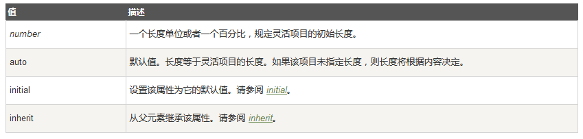
.item {

  -webkit-flex-basis: auto; /_ Safari _/

  flex-basis:         auto;

}
5. flex
This property is the shorthand for the flex-grow, flex-shrink and flex-basis properties. Among other values it also can be set to auto (1 1 auto) and none (0 0 auto).
Default value: 0 1 auto
.item {

  -webkit-flex: 0 1 auto; /_ Safari _/

  flex: 0 1 auto;

}
6. align-self
align-self属性允许单个项目有与其他项目不一样的对齐方式,可覆盖align-items属性。默认值为auto,表示继承父元素的align-items属性,如果没有父元素,则等同于stretch。
Value : auto | flex-start | flex-end | center | baseline | stretch;
.item {

  -webkit-align-self: auto; /_ Safari _/

  align-self:         auto;

}
https://developer.mozilla.org/en-US/docs/Web/CSS/CSS_Flexible_Box_Layout
https://css-tricks.com/snippets/css/a-guide-to-flexbox/
https://scotch.io/tutorials/a-visual-guide-to-css3-flexbox-properties
http://www.ruanyifeng.com/blog/2015/07/flex-grammar.html?utm_source=tuicool)
CSS3 Flex布局的更多相关文章
- CSS3 Flex布局整理(三)-项目属性
一.Flex布局中 Flex Item属性控制,可以指定显示顺序.剩余空间的放大,缩小.交叉轴的排列 1.order:定义项目的排列顺序,数值越小,排列越靠前,默认为0.类似z-index 2.fle ...
- CSS3 Flex布局整理(二)-容器属性
一.Flex容器属性介绍 1.flex-flow :水平或垂直方向上的流动方式,包裹处理,其中包括了flex-direction属性和flex-wrap属性. 2.justify-content:定义 ...
- CSS3 Flex布局整理(一)
一.说明 1.在以往的布局方案中,都是基于盒装模型,依赖display属性+position属性+float属性等. 他对于那些特殊布局非常不方便,比如,垂直居中等. 并且不同浏览器的盒模型还有些差异 ...
- CSS3 Flex布局(伸缩布局盒模型)学习
CSS3 Flex布局(伸缩布局盒模型)学习 转自:http://www.xifengxx.com/web-front-end/1408.html CSS2定义了四种布局:块布局.行内布局.表格布局盒 ...
- CSS3 Flex布局(项目)
一.order属性 order属性定义项目的排列顺序.数值越小,排列越靠前,默认为0. 二.flex-grow属性 flex-grow属性定义项目的放大比例,默认为0,即如果存在剩余空间,也不放大. ...
- CSS3 Flex布局(容器)
一.flex-direction属性 row(默认值):主轴为水平方向,起点在左端. row-reverse:主轴为水平方向,起点在右端. column:主轴为垂直方向,起点在上沿. column-r ...
- CSS3 Flex 布局教程
网页布局(layout)是 CSS 的一个重点应用. 布局的传统解决方案,基于盒状模型,依赖 display 属性 + position属性 + float属性.它对于那些特殊布局非常不方便,比如,垂 ...
- css3 flex 布局
今天做一个小实战,需要让一个登录框始终保持水平和垂直居中,第一个想到的就是通过定位(要想让一个div居中,采用定位可以解决,示例), 然后开始接触flex布局,学完感觉真的好用,现把知识点记录一下,以 ...
- css3 flex布局结合transform生成一个3D骰子
预览地址: https://zhaohh.github.io/flex-dice/index.html 1 Flex 布局 首先聊聊Flex 布局,Flex 布局又称"弹性布局", ...
- css3 flex布局/grid布局
1.CSS3 Flexbox 布局完全指南(图解 Flexbox 布局详细教程) 2.CSS Grid 布局完全指南(图解 Grid 详细教程)
随机推荐
- ginput函数用法
1.ginput函数:获取指定点坐标值 2.用法说明 (1)[x,y] = ginput(n) 函数从当前的坐标轴上选择n个点,并返回这n个点相应的坐标值(x,y).这n个点可由鼠标定位.用户可以按下 ...
- ccpc杭州站 赛后总结
Ccpc杭州站赛后总结 2017年11月4号五号,我参加了ccpc杭州站的比赛,我的队友是聂少飞和王艳,在4号一点半,举行了比赛开幕式,听着教练代表的发言,听着参赛选手代表的发言,听着志愿者的发言,都 ...
- 【问题解决方案】Github中的jupyter notebook文件(.ipynb)加载失败/失败
两个方法: 法一:本机安装jupyter notebook的情况下直接下载文件并打开 本机打开的话会在浏览器中显示,地址为localhost:8888,也就是本机 法二:在线打开:利用 'https: ...
- 2D-2D:对极几何 基础矩阵F 本质矩阵E 单应矩阵H
对极约束 \[ \boldsymbol{x}_{2}^{T} \boldsymbol{F} \boldsymbol{x}_{1}=\boldsymbol{0} \quad \hat{\boldsymb ...
- ArrayList循环遍历并删除元素的几种情况
如下代码,想要循环删除列表中的元素b,该怎么处理? public class ListDemo { public static void main(String[] args) { ArrayList ...
- “纽劢科技杯”第十六届同济大学程序设计竞赛暨上海邀请赛同步赛 J-张老师的游戏
传送门 题目描述 在空闲时间,张老师习惯性地和菜哭武玩起了取石子游戏,这次的游戏规则有些不同,在他们面前有n堆石子,其中,第i堆石子的个数为a[i],现在制定规则如下: 从张老师开始, ...
- iOS NSInteger 的输出 %d %ld %zd %ld (long)
NSInteger 输出类型 %zd
- Java面试题之基础篇概览
Java面试题之基础篇概览 1.一个“.java”源文件中是否可以包含多个类(不是内部类)?有什么限制? 可以有多个类,但只能有一个public的类,且public的类名必须与文件名相一致. 2.Ja ...
- x86/x64/x86_64/i386/ia32/ia64/amd/amd64 辨析
x64 = x86_64 = amd64 64位指令集,是对IA-32的扩展,由AMD提出,implemented by AMD,Intel.可兼容32位指令集(IA-32) 目前大部分64位计算机均 ...
- Django_ORM操作 - 查询
ORM 操作 必知必会13条 <1> all(): 查询所有结果 <2> filter(**kwargs): 它包含了与所给筛选条件相匹配的对象 <3> get(* ...