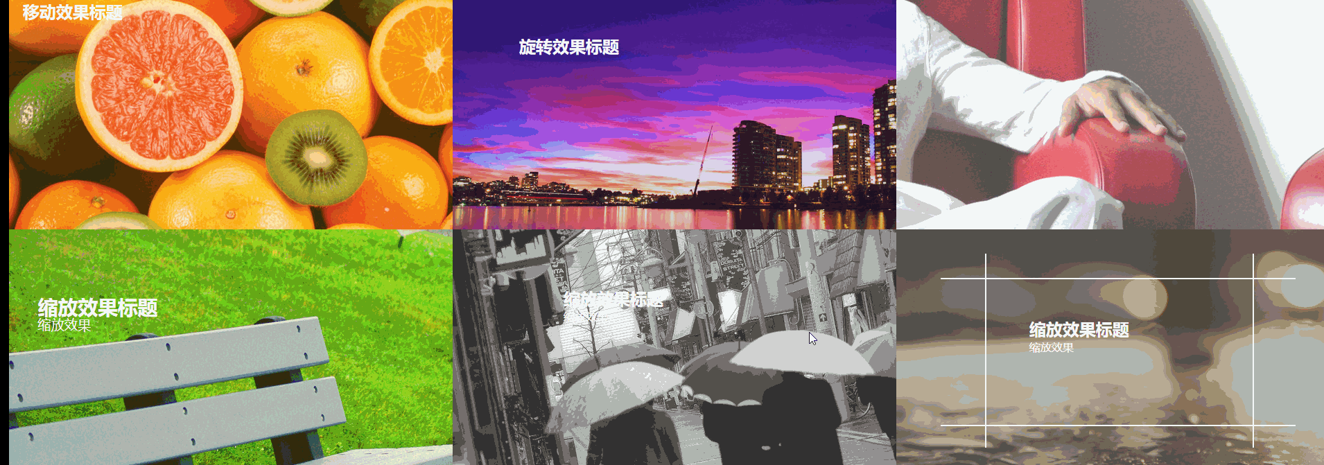
6种css3 transform图片悬停动态效果
html骨架代码
<!DOCTYPE html>

<html>

<head lang="en">

    <meta charset="UTF-8">

    <!--<meta name="viewport" content="width=device-width, initial-scale=1.0">-->

    <title></title>

    <link rel="stylesheet" href="css/css3.css"/>

</head>

<body>

<figure class="one">

    <img src="img/img01.jpg" />

    <figcaption>

        <h2>移动效果标题</h2>

        <p>移动效果一</p>

        <p>移动效果二</p>

        <p>移动效果三</p>

    </figcaption>

</figure>

<figure class="two">

    <img src="img/img02.jpg"/>

    <figcaption>

        <h2>旋转效果标题</h2>

        <p>旋转效果</p>

        <div></div>

    </figcaption>

</figure>

<figure class="three">

    <img src="img/img03.jpg"/>

    <figcaption>

        <h2>斜切效果标题</h2>

        <p>斜切效果</p>

    </figcaption>

</figure>

<figure class="four">

    <img src="img/img04.jpg"/>

    <figcaption>

        <h2>缩放效果标题</h2>

        <p>缩放效果</p>

        <div></div>

    </figcaption>

</figure>

<figure class="five">

    <img src="img/img05.jpg"/>

    <figcaption>

        <h2>缩放效果标题</h2>

        <p>缩放效果</p>

        <div><input type="button" value="button1"/></div>

    </figcaption>

</figure>

<figure class="six">

    <img src="img/img07.jpg"/>

    <figcaption>

        <h2>缩放效果标题</h2>

        <p>缩放效果</p>

        <div class="border1"></div>

        <div class="border2"></div>

    </figcaption>

</figure>

</body>

</html>
css
body,figure,figcaption,img,h2,p{padding: 0; margin: 0;}
body{width: 100%;}
figure{position:relative; float: left; overflow: hidden; height: 350px; width: 33.33%; }
figcaption{position: absolute; top: 0; left:0;color: #fff; font-family: "寰蒋闆呴粦"; }
figure img{opacity: 0.8;}
figure figcaption,figure figcaption p,figure img{transition:all 0.35s;}
figure figcaption,figure figcaption div{transition:all 0.35s;}
figure figcaption p,figure figcaption h2{transition:all 0.35s;}
figure:hover img{transform:translate(-150px,0); opacity: 0.5}
@media screen and ( max-width: 600px) {
figure{width: 100%}
}
@media screen and (min-width: 601px) and ( max-width: 1000px) {
figure{width: 50%}
}
@media screen and (min-width: 1001px) {
figure{width: 33.33%}
}
.one{background: #f9aa0f;}
.one figcaption{padding: 20px;}
.one figcaption p{ text-align: center; background:#fff; color: #333; margin-top: 3px; transform:translate(-200px,0);}
.one:hover figcaption p{transform:translate(0,0);}
.one:hover figcaption p:nth-of-type(1){transition-delay:0.15s;}
.one:hover figcaption p:nth-of-type(2){transition-delay:0.3s;}
.one:hover figcaption p:nth-of-type(3){transition-delay:0.35s;}
.two{background-color: #60299e;}
.two figcaption{width: 100%; height: 100%;}
.two figcaption div{width: 80%; height: 80%; border: 2px solid #fff; position: absolute; top:10%; left: 10% ; transform:translate(0,-350px) rotate(0deg) scale(0.5,0.5);}
.two figcaption h2{ margin-left: 15%; margin-top: 11%; }
.two figcaption p{margin-left: 15%; transform:translate(0,30px);opacity: 0;}
.two:hover figcaption div{transform:translate(0,0) rotate(360deg) scale(1,1);}
.two:hover figcaption p{opacity: 1; transform:translate(0,0)}
.three figcaption{margin-top: 20%; margin-left: 40%; transform:skew(90deg,0) }
.three:hover figcaption{transform:skew(0,0)}
.four{background-color: #89cf3f;}
.four figcaption{width: 100%; height: 100%;}
.four figcaption div{width: 100%; height: 100%; border: 2px solid #fff; position: absolute;top: 0;left: 0; opacity: 0;}
.four:hover figcaption div{transform:scale(0.8,0.8); opacity: 1;}
.four:hover img{transform:scale(1.2,1.2);}
.four figcaption h2{margin-left: 15%; margin-top: 15%; transform:scale(1.2,1.2)}
.four figcaption p{margin-left: 15%; transform:scale(1.2,1.2)}
.four:hover figcaption h2{transform:scale(1,1);}
.four:hover figcaption p{transform:scale(1,1);}
.five{ background-color: #b5b5b5;}
.five figcaption{padding: 10% 25%; width: 100%; height: 100%; transform:translate(0,20px)}
.five figcaption div{width:100%; height: 100%; background-color:rgba(250,250,250,0.8); position: absolute; top:350px; left:0;}
.five figcaption div input{transform:rotate(15deg); margin-left:40%; margin-top: 5%; }
.five:hover figcaption div{ transform-origin:0 0; transform:rotate(-15deg);}
.five:hover figcaption{ transform:translate(0,0)}
.six{background-color: #777569;}
.six figcaption{ width: 100%; height: 100%;}
.six figcaption h2{margin-left: 30%; margin-top: 10%;}
.six figcaption p{margin-left: 30%; }
.six figcaption div{position: absolute; border: 2px solid #fff; }
.six figcaption div.border1{width: 60%; height: 0%; top: 45%; left: 20%; border-top: none; border-bottom: none;}
.six figcaption div.border2{width: 0%; height: 60%; top: 20%; left: 50%; border-left: none; border-right: none;}
.six:hover figcaption div.border1{ height: 80%; top:10%;}
.six:hover figcaption div.border2{ width: 80%; left:10%;}
.six:hover figcaption h2{margin-top: 20%;}
6种css3 transform图片悬停动态效果的更多相关文章
- iHover – 30+ 纯 CSS3 实现的超炫的图片悬停特效
iHover 是一个令人印象深刻的图片悬停效果集合,完全基于 CSS3 实现,无依赖,能够搭配 Bootstrap 3 很好地工作.基于 SCSS 技术构建(包括文件),便于修改变量.有模块化的代码, ...
- 基于CSS3图片悬停放大特效
今天我们要来分享一款很酷的CSS3图片特效,这款图片特效可以利用鼠标滑过图片使其悬停放大,并使图片的周围出现发光的效果.配合黑色的背景,这款CSS3图片悬停放大效果显得更加立体大气,非常适合产品图片的 ...
- iHover – 30+ 纯 CSS 实现的超炫的图片悬停特效
iHover 是一个令人印象深刻的图片悬停效果集合,完全基于 CSS3 实现,无依赖,能够搭配 Bootstrap 3 很好地工作.基于 SCSS 技术构建,便于修改变量.有模块化的代码,无需包含整个 ...
- 【CSS3】 理解CSS3 transform中的Matrix(矩阵)
理解CSS3 transform中的Matrix(矩阵) by zhangxinxu from http://www.zhangxinxu.com 本文地址:http://www.zhangxinxu ...
- CSS3 transform rotate(旋转)锯齿的解决办法
-moz-transform: rotate(5deg);-webkit-transform: rotate(5deg); 把图片旋转了5度.本以为轻而易举,可遇到了问题.在Fireofx中显示正常, ...
- 理解CSS3 transform中的Matrix(矩阵)
一.哥,我被你吓住了 打架的时候会被块头大的吓住,学习的时候会被奇怪名字吓住(如“拉普拉斯不等式”).这与情感化设计本质一致:界面设计好会让人觉得这个软件好用! 所以,当看到上面“Matrix(矩阵) ...
- div 中图片溢出问题及 CSS3中图片翻转问题
如果设置一个div 装两张以上的图片,如果不设置好div的宽度和高度,就会使图片溢出. 我们知道,div是可以由图片撑开其宽高的,也就是说如果只放一张图片的情况下,不设置div的宽高,div的宽高会默 ...
- 理解CSS3 transform中的Matrix(矩阵)——张鑫旭
by zhangxinxu from http://www.zhangxinxu.com本文地址:http://www.zhangxinxu.com/wordpress/?p=2427 一.哥,我被你 ...
- css3 transform中的matrix矩阵
CSS3中的矩阵CSS3中的矩阵指的是一个方法,书写为matrix()和matrix3d(),前者是元素2D平面的移动变换(transform),后者则是3D变换.2D变换矩阵为3*3, 如上面矩阵示 ...
随机推荐
- Javascript基础知识面试题
[]==![] 解题思路: step1, []==!Boolean([]);step2, []==!true;step3, []==false;step4, [].valueOf()= ...
- Javascript全世界最短的IE判定
以前最短的IE判定借助于IE不支持垂直制表符的特性搞出来的. var ie=!+'\v' 但这纪录今年1月8日被一个俄国人打破了,现在只要6 bytes!它利用了IE与标准浏览器在处理数组的toS ...
- tcpdump详解(转)
tcpdump是Linux下强大的抓包工具,不仅可以分析数据包流向,还可以对数据包内容进行监听.通过分析数据包流向,可以了解一条连接是如何建立双向连接的.tcpdump允许用户(一般是root)拦截和 ...
- linux修改网卡的mac地址
linux在安装一些软件的时候可能会用到修改主机的mac地址的问题,在网卡配置文件 /etc/network/interface 中添加mac地址的方式我在修改重启机器后没有生效,所以采用其他方式 在 ...
- Python_opencv库
1.车牌检测 ''' 项目名称:opencv/cv2 车牌检测 简介: 1.训练级联表 ***.xml [跳过...] 2.用如下代码加载级联表和目标图片识别车牌 注:推荐用anconda安装open ...
- Python_PyQt5_库
QtQWidgets 小组件(暂无资料,但是Python中做窗口/网页时用的很多 *-*) QtCore 模块包括了核心的非GUI功能,该模块用来对时间.文件.目录.各种数据类型.流.网址.媒体 ...
- 详解scanf与getchar
原文: (https://www.myjinji.top/articles/2020/07/22/1595399358246.html)[https://www.myjinji.top/article ...
- Web安全常见漏洞修复建议
转载地址:https://security.pingan.com/blog/17.html SQL注入 在服务器端要对所有的输入数据验证有效性. 在处理输入之前,验证所有客户端提供的数据,包括所有的参 ...
- Metasploit渗透使用攻略
msf关于tomcat口令暴力猜解模块 use auxiliary/scanner/http/tomcat_mgr_login show options set rhosts 192.168.2.14 ...
- ATM管理系统(三)
一.作业信息 博客班级 软件工程 作业要求 作业要求 作业目标 你理解的作业目标具体内容 学号 3180701218 二.题目要求 编写一个ATM管理系统,语言不限,要求应包括以下主要功能:(1)开户 ...