6种css3 transform图片悬停动态效果
html骨架代码
<!DOCTYPE html>
<html>
<head lang="en">
<meta charset="UTF-8">
<!--<meta name="viewport" content="width=device-width, initial-scale=1.0">-->
<title></title>
<link rel="stylesheet" href="css/css3.css"/>
</head>
<body>
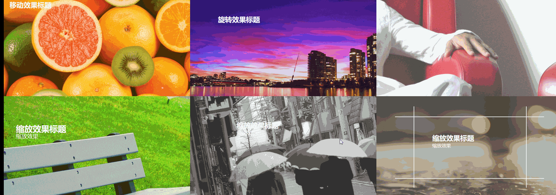
<figure class="one">
<img src="img/img01.jpg" />
<figcaption>
<h2>移动效果标题</h2>
<p>移动效果一</p>
<p>移动效果二</p>
<p>移动效果三</p>
</figcaption>
</figure>
<figure class="two">
<img src="img/img02.jpg"/>
<figcaption>
<h2>旋转效果标题</h2>
<p>旋转效果</p>
<div></div>
</figcaption>
</figure>
<figure class="three">
<img src="img/img03.jpg"/>
<figcaption>
<h2>斜切效果标题</h2>
<p>斜切效果</p>
</figcaption>
</figure>
<figure class="four">
<img src="img/img04.jpg"/>
<figcaption>
<h2>缩放效果标题</h2>
<p>缩放效果</p>
<div></div>
</figcaption>
</figure>
<figure class="five">
<img src="img/img05.jpg"/>
<figcaption>
<h2>缩放效果标题</h2>
<p>缩放效果</p>
<div><input type="button" value="button1"/></div>
</figcaption>
</figure>
<figure class="six">
<img src="img/img07.jpg"/>
<figcaption>
<h2>缩放效果标题</h2>
<p>缩放效果</p>
<div class="border1"></div>
<div class="border2"></div>
</figcaption>
</figure>
</body>
</html>
css
body,figure,figcaption,img,h2,p{padding: 0; margin: 0;}
body{width: 100%;}
figure{position:relative; float: left; overflow: hidden; height: 350px; width: 33.33%; }
figcaption{position: absolute; top: 0; left:0;color: #fff; font-family: "寰蒋闆呴粦"; }
figure img{opacity: 0.8;}
figure figcaption,figure figcaption p,figure img{transition:all 0.35s;}
figure figcaption,figure figcaption div{transition:all 0.35s;}
figure figcaption p,figure figcaption h2{transition:all 0.35s;}
figure:hover img{transform:translate(-150px,0); opacity: 0.5}
@media screen and ( max-width: 600px) {
figure{width: 100%}
}
@media screen and (min-width: 601px) and ( max-width: 1000px) {
figure{width: 50%}
}
@media screen and (min-width: 1001px) {
figure{width: 33.33%}
}
.one{background: #f9aa0f;}
.one figcaption{padding: 20px;}
.one figcaption p{ text-align: center; background:#fff; color: #333; margin-top: 3px; transform:translate(-200px,0);}
.one:hover figcaption p{transform:translate(0,0);}
.one:hover figcaption p:nth-of-type(1){transition-delay:0.15s;}
.one:hover figcaption p:nth-of-type(2){transition-delay:0.3s;}
.one:hover figcaption p:nth-of-type(3){transition-delay:0.35s;}
.two{background-color: #60299e;}
.two figcaption{width: 100%; height: 100%;}
.two figcaption div{width: 80%; height: 80%; border: 2px solid #fff; position: absolute; top:10%; left: 10% ; transform:translate(0,-350px) rotate(0deg) scale(0.5,0.5);}
.two figcaption h2{ margin-left: 15%; margin-top: 11%; }
.two figcaption p{margin-left: 15%; transform:translate(0,30px);opacity: 0;}
.two:hover figcaption div{transform:translate(0,0) rotate(360deg) scale(1,1);}
.two:hover figcaption p{opacity: 1; transform:translate(0,0)}
.three figcaption{margin-top: 20%; margin-left: 40%; transform:skew(90deg,0) }
.three:hover figcaption{transform:skew(0,0)}
.four{background-color: #89cf3f;}
.four figcaption{width: 100%; height: 100%;}
.four figcaption div{width: 100%; height: 100%; border: 2px solid #fff; position: absolute;top: 0;left: 0; opacity: 0;}
.four:hover figcaption div{transform:scale(0.8,0.8); opacity: 1;}
.four:hover img{transform:scale(1.2,1.2);}
.four figcaption h2{margin-left: 15%; margin-top: 15%; transform:scale(1.2,1.2)}
.four figcaption p{margin-left: 15%; transform:scale(1.2,1.2)}
.four:hover figcaption h2{transform:scale(1,1);}
.four:hover figcaption p{transform:scale(1,1);}
.five{ background-color: #b5b5b5;}
.five figcaption{padding: 10% 25%; width: 100%; height: 100%; transform:translate(0,20px)}
.five figcaption div{width:100%; height: 100%; background-color:rgba(250,250,250,0.8); position: absolute; top:350px; left:0;}
.five figcaption div input{transform:rotate(15deg); margin-left:40%; margin-top: 5%; }
.five:hover figcaption div{ transform-origin:0 0; transform:rotate(-15deg);}
.five:hover figcaption{ transform:translate(0,0)}
.six{background-color: #777569;}
.six figcaption{ width: 100%; height: 100%;}
.six figcaption h2{margin-left: 30%; margin-top: 10%;}
.six figcaption p{margin-left: 30%; }
.six figcaption div{position: absolute; border: 2px solid #fff; }
.six figcaption div.border1{width: 60%; height: 0%; top: 45%; left: 20%; border-top: none; border-bottom: none;}
.six figcaption div.border2{width: 0%; height: 60%; top: 20%; left: 50%; border-left: none; border-right: none;}
.six:hover figcaption div.border1{ height: 80%; top:10%;}
.six:hover figcaption div.border2{ width: 80%; left:10%;}
.six:hover figcaption h2{margin-top: 20%;}
6种css3 transform图片悬停动态效果的更多相关文章
- iHover – 30+ 纯 CSS3 实现的超炫的图片悬停特效
iHover 是一个令人印象深刻的图片悬停效果集合,完全基于 CSS3 实现,无依赖,能够搭配 Bootstrap 3 很好地工作.基于 SCSS 技术构建(包括文件),便于修改变量.有模块化的代码, ...
- 基于CSS3图片悬停放大特效
今天我们要来分享一款很酷的CSS3图片特效,这款图片特效可以利用鼠标滑过图片使其悬停放大,并使图片的周围出现发光的效果.配合黑色的背景,这款CSS3图片悬停放大效果显得更加立体大气,非常适合产品图片的 ...
- iHover – 30+ 纯 CSS 实现的超炫的图片悬停特效
iHover 是一个令人印象深刻的图片悬停效果集合,完全基于 CSS3 实现,无依赖,能够搭配 Bootstrap 3 很好地工作.基于 SCSS 技术构建,便于修改变量.有模块化的代码,无需包含整个 ...
- 【CSS3】 理解CSS3 transform中的Matrix(矩阵)
理解CSS3 transform中的Matrix(矩阵) by zhangxinxu from http://www.zhangxinxu.com 本文地址:http://www.zhangxinxu ...
- CSS3 transform rotate(旋转)锯齿的解决办法
-moz-transform: rotate(5deg);-webkit-transform: rotate(5deg); 把图片旋转了5度.本以为轻而易举,可遇到了问题.在Fireofx中显示正常, ...
- 理解CSS3 transform中的Matrix(矩阵)
一.哥,我被你吓住了 打架的时候会被块头大的吓住,学习的时候会被奇怪名字吓住(如“拉普拉斯不等式”).这与情感化设计本质一致:界面设计好会让人觉得这个软件好用! 所以,当看到上面“Matrix(矩阵) ...
- div 中图片溢出问题及 CSS3中图片翻转问题
如果设置一个div 装两张以上的图片,如果不设置好div的宽度和高度,就会使图片溢出. 我们知道,div是可以由图片撑开其宽高的,也就是说如果只放一张图片的情况下,不设置div的宽高,div的宽高会默 ...
- 理解CSS3 transform中的Matrix(矩阵)——张鑫旭
by zhangxinxu from http://www.zhangxinxu.com本文地址:http://www.zhangxinxu.com/wordpress/?p=2427 一.哥,我被你 ...
- css3 transform中的matrix矩阵
CSS3中的矩阵CSS3中的矩阵指的是一个方法,书写为matrix()和matrix3d(),前者是元素2D平面的移动变换(transform),后者则是3D变换.2D变换矩阵为3*3, 如上面矩阵示 ...
随机推荐
- mysql中数据类型DECIMAL(M,D)的说明
本文转载自Boblim的文章http://www.cnblogs.com/fnlingnzb-learner/p/8108119.html 在MySQL数据类型中,例如INT,FLOAT,DOUBLE ...
- API简介(二)
API简介(二) API简介(一)一文中,介绍了使用API的目的.设计.发行政策以及公共API的含义,本篇主要介绍API的用法,从库和框架.操作系统.远程API.Web API四个方面展开. 库和框架 ...
- spring boot和spring cloud的区别
Java中说到微服务肯定离不开Spring Boot和Spring Cloud,这两者到底有什么关系,什么是微服务,如果单纯的说SpringBoot,SpringCloud,都是不准确的,那应该怎么回 ...
- Hadoop框架:MapReduce基本原理和入门案例
本文源码:GitHub·点这里 || GitEE·点这里 一.MapReduce概述 1.基本概念 Hadoop核心组件之一:分布式计算的方案MapReduce,是一种编程模型,用于大规模数据集的并行 ...
- php 判断网站是http还是https
//判断是http还是https $http_type = ((isset($_SERVER['HTTPS']) && $_SERVER['HTTPS'] == 'on') || (i ...
- ci爬坑
1.row_array() 问题描述:没有数据返回NULL,直接foreach,报错
- 面试官:你说你精通SpringBoot,你给我说一下类的自动装配吧
## 剖析@SpringBootApplication注解 创建一个SpringBoot工程后,SpringBoot会为用户提供一个Application类,该类负责项目的启动: ```@Spring ...
- 在CorelDRAW中为对象添加块阴影效果
我们可以使用CorelDRAW来绘制矢量图形,在勾画出简单的图形后,往往还需要对它们进行一些或简单或复杂的处理,以增加一定的艺术效果.CDR中可供选择的效果有很多,作用的对象可以是文字,也可以是图案. ...
- FL Studio乐理教程之和弦进行
和弦级数 在一个调内,分别由调内7个音为根音组成的和弦总共有7个,每个和弦依次为1-7级和弦.例如在C大调内,以C为根音建立和弦,就是一级和弦,以D为根音建立和弦,即是二级和弦,以此类推. 图1:1- ...
- FL Studio附加快捷面板讲解
在FL Studio功能面板中有一个类似于快捷面板功能的面板.你们看,它们连名字都很像,叫做附加快捷面板.该面板主要由撤销.另存为.转换为音频文件(导出).一键录音.查看工程信息和帮助.为了帮助大家知 ...