HTML--比较实用的小例子
常用的前端实例:
1略
2、在网页商城中的图片当我们把鼠标放上去之后,图片会显示一个有颜色的外边框,图片某一部分的字体的颜色并发生改变
鼠标放上去之前

鼠标放上去之后:
实现的代码:
<!DOCTYPE html>

<html lang="en">

<head>

    <meta charset="UTF-8" content="text/html" http-equiv="Content-Type">

    <title>Title</title>

    <style>

        .ele{

            /*先给图片的变框设置一个有宽度的变框这个鼠标放上去看到的效果就是静态的*/

            border: 1px solid transparent;

            /*加变框是为了不希望看到图片的位置发生改变*/

        }

        .ele:hover{

            /*伪类 :鼠标放上去会出现一个外边框*/

            border: 1px solid gray;

        }

        /*鼠标放上去 一部分的字体颜色发生改变*/

        .ele:hover .ele-item{

            color: red;

        }

    </style>

</head>

<body>

    <div class="ele">

        <div>123</div>

        <div class="ele-item">123</div>

    </div>

</body>

</html>
边框加颜色-并改变某一部分的字体颜色
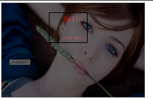
3、鼠标放到图片上,图片上会显示一些相关的信息:
之前的效果:

设置代码之后的效果:
上代码:
<!DOCTYPE html>

<html lang="en">

<head>

    <meta charset="UTF-8" content="text/html" http-equiv="Content-Type">

    <title>隐藏</title>

    <style>

        .touch{

            /*父亲div的position采用relative

            那么在其内部的div只需要使用absolute就可以定位在父div的任意位置*/

            overflow: hidden;

            position: relative;

            width: 600px;

            height: 400px;

        }

        .touch img{

            /*设置图片的宽和高让它在框架的div中铺满*/

            width: 600px;

            height: 400px;

        }

        .touch .content{

            position: absolute;

            top:0;

            left:0;

            right:0;

            bottom:0;

            background-color: black;

            opacity: 0.6;   /*透明度*/

            color: red;

            text-align: center;

            visibility: hidden;

        }

        .touch:hover .content{

            /*内容设置一个伪类 鼠标放上去让其可见*/

            visibility: visible;

        }

        .touch .content .c1{

            font-size: 32px;

            padding: 50px 0;

        }

     </style>

</head>

<body>

    <div class="touch">

        <div><img src="nice.png"></div>

        <div class="content">

            <div class="c1">Hello</div>

            <div class="c2">nice girl</div>

        </div>

    </div>

</body>

</html>
图片上边加一层效果
4、画三角形:
4.1、border的特性:拐角处是特殊的样式:
<!DOCTYPE html>

<html lang="en">

<head>

    <meta charset="UTF-8" content="text/html" http-equiv="Content-Type">

    <title>画图</title>

    <style>

        .picture{

            border-top: 30px solid black;

            border-bottom: 30px solid red;

            border-right: 30px solid purple;

            border-left: 30px solid pink;

        }

    </style>

</head>

<body>

<div class="picture"></div>

</body>

</html>
拉长的效果是由于div是块级标签
4.2、将图形变成一个正方形:

<!DOCTYPE html>

<html lang="en">

<head>

    <meta charset="UTF-8" content="text/html" http-equiv="Content-Type">

    <title>画图</title>

    <style>

        .picture{

            border-top: 30px solid black;

            border-bottom: 30px solid red;

            border-right: 30px solid purple;

            border-left: 30px solid pink;

            /*将块级变成内联的且可以设置宽度高度*/

            display: inline-block;

        }

    </style>

</head>

<body>

<div class="picture"></div>

</body>

</html>
画一个正方形
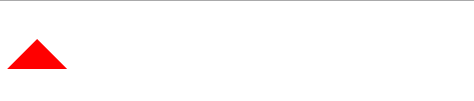
4.3画一个上三角形
就是把上边的正方的其他边设置成透明色就可以达到设置三角的目的:
<!DOCTYPE html>

<html lang="en">

<head>

    <meta charset="UTF-8" content="text/html" http-equiv="Content-Type">

    <title>画三角</title>

    <style>

        .up{

            border-top: 30px solid transparent;

            border-bottom: 30px solid red;

            border-right: 30px solid transparent;

            border-left: 30px solid transparent;

            /*将块级变成内联的且可以设置宽度高度*/

            display: inline-block;

        }

    </style>

</head>

<body>

<div class="up"></div>

</body>

</html>
上三角
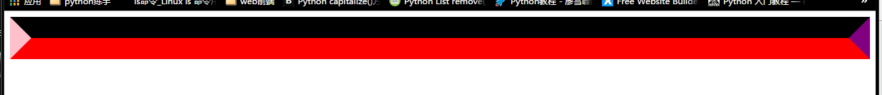
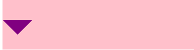
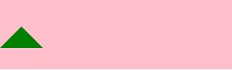
4.4画一个下三角,鼠标放上去变成下三角且颜色不一样:
<!DOCTYPE html>

<html lang="en">

<head>

    <meta charset="UTF-8" content="text/html" http-equiv="Content-Type">

    <title>尖角</title>

    <style>

                .c1{

            border: 30px solid transparent;

            border-top: 30px solid purple;

           margin-top: 40px;

            display: inline-block;

        }

        .c1:hover{

            border: 30px solid transparent;

            border-bottom: 30px solid green;

            margin-top: 10px;

        }

           </style>

</head>

<body>

<div style="height: 100px;background-color: pink;">

    <div class="c1"></div>

</div>

</body>

</html>
下三角变上三角
5、引用特殊的图标:(awesome)

<!DOCTYPE html>

<html lang="en">

<head>

    <meta charset="UTF-8" content="text/html" http-equiv="Content-Type">

    <title>图标</title>

    <link rel="stylesheet" href="font-awesome/css/font-awesome.css">

    <style>

    </style>

</head>

<body>

    <i class="icon-cny"></i>

    <i class="icon-collapse"></i>

    <i class="icon-twitter-sign"></i>

</body>

</html>
6、输入框
<!DOCTYPE html>

<html lang="en">

<head>

    <meta charset="UTF-8" content="text/html" http-equiv="Content-Type">

    <title>form-input</title>

    <link href="font-awesome/css/font-awesome.css" rel="stylesheet">

    <style>

        .user{

            position: relative;

            /*background-color: purple;*/

            width: 250px;

        }

        .user input{

            height: 30px;

            width: 170px;

            background-color: gainsboro;

            padding-right: 30px;

        }

        .user .ren{

            position: absolute;

            top: 10px;

            left: 180px;

        }

        .icon-collapse{

            cursor: pointer;

        }

    </style>

</head>

<body>

    <div class="user">

        <input type="text">

        <span class="ren icon-collapse"></span>

    </div>

</body>

</html>
form-input
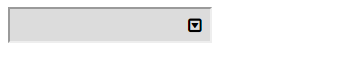
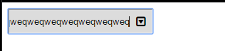
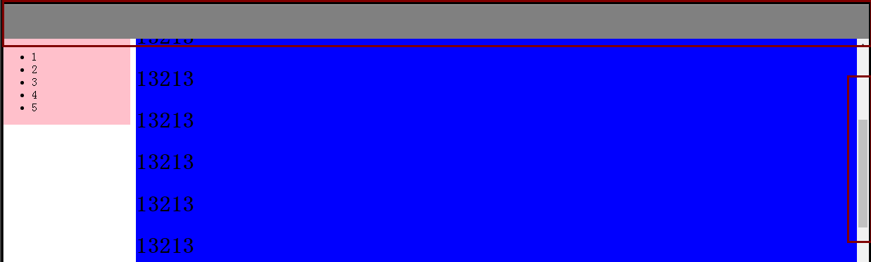
7、页面布局:
- 导航栏固定
- 菜单栏如果超出屏幕范围则有下拉框
- 内容部分超出页面也会有下拉框
<!DOCTYPE html>

<html lang="en">

<head>

    <meta charset="UTF-8" content="text/html" http-equiv="Content-Type">

    <title>布局页-1</title>

    <style>

        body{

            margin: 0;

        }

        .pg-body{

            height: 48px;

            background-color: gray;

        }

        .pg-body .body-menu{

            top: 48px;

            position: absolute;

            width: 180px;

            background-color: pink;

            left: 0px;

        }

        .pg-body .body-content{

            position:absolute;

            top: 48px;

            left: 188px;

            right:0;

            bottom:0;

            background-color: blue;

            overflow: auto;

        }

    </style>

</head>

<body>

<div class="pg-header">

</div>

<div class="pg-body">

    <div class="body-menu">

        <ul>

            <li>1</li>

            <li>2</li>

            <li>3</li>

            <li>4</li>

            <li>5</li>

        </ul>

    </div>

    <div class="body-content">

        <h1>13213</h1><h1>13213</h1><h1>13213</h1><h1>13213</h1><h1>13213</h1><h1>13213</h1><h1>13213</h1><h1>13213</h1><h1>13213</h1><h1>13213</h1><h1>13213</h1><h1>13213</h1>

        <h1>13213</h1><h1>13213</h1><h1>13213</h1><h1>13213</h1><h1>13213</h1><h1>13213</h1><h1>13213</h1><h1>13213</h1><h1>13213</h1><h1>13213</h1><h1>13213</h1><h1>13213</h1><h1>13213</h1><h1>13213</h1>

        <h1>13213</h1><h1>13213</h1><h1>13213</h1><h1>13213</h1><h1>13213</h1><h1>13213</h1><h1>13213</h1><h1>13213</h1><h1>13213</h1><h1>13213</h1><h1>13213</h1><h1>13213</h1><h1>13213</h1><h1>13213</h1>

    </div>

</div>

<div></div>

</body>

</html>
页面布局
8、有些页面打开之后我们点击登录,会弹出一个小的文本框,在屏幕的中间让用户登录或者注册,且页面的内容是可见的;
效果如下:
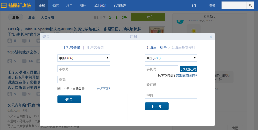
这个画面共有三个层次,最底部是网页,第二层是一个遮罩层(透明的灰色), 第三层就是我们看到的登录注册的页面且在页面偏上的位置:
<!DOCTYPE html>

<html lang="en">

<head>

    <meta charset="UTF-8" content="text/html" http-equiv="Content-Type">

    <title>模态对话框</title>

    <style>

        body{

            margin: 0;

            padding: 0;

        }

        .model{

            position: fixed;

            top:0;

            left:0;

            bottom:0;

            right:0;

            background: rgba(0,0,0,.6);

            z-index: 2;

        }

        .content{

            height: 300px;

            width: 400px;

            background-color: white;

            position: fixed;

            top:50%;

            left: 50%;

            z-index: 3;

            margin-top: -200px;

            margin-left: -200px;

        }

    </style>

</head>

<body>

<div style="height: 2000px;background-color: gainsboro">

    <h1>132</h1><h1>132</h1><h1>132</h1><h1>132</h1><h1>132</h1>

    <h1>132</h1><h1>132</h1><h1>132</h1>

</div>

    <div class="model"></div>

    <div class="content"></div>

</body>

</html>
模拟对话框
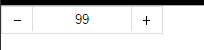
9、购物的时候可以选择一个或者多个
<!DOCTYPE html>

<html lang="en">

<head>

    <meta charset="UTF-8" content="text/html" http-equiv="Content-Type">

    <title>商品数量的加减</title>

    <style>

        body{

            margin: 0;

        }

        .left{

            float: left;

        }

        .center{

            line-height: 26px;

            text-align: center;

        }

        .wrap{

            width: 160px;

            height: 26px;

            border: 1px solid #dddddd;

            /*background-color: gainsboro;*/

        }

        .wrap .minus{

            height: 26px;

            width: 30px;

            cursor: pointer;

        }

        .wrap .plus{

            height: 26px;

            width: 30px;

            cursor: pointer;

        }

        .wrap .count input{

            height: 24px;

            border: 0;

            width: 98px;

            padding: 0;

            border-right: 1px solid #dddddd;

            border-left: 1px solid #dddddd;

            text-align: center;

        }

    </style>

</head>

<body>

<div class="wrap">

    <div class="minus left center" onclick="Minus();">-</div>

    <div class="count left">

        <input id="count" type="text" value="">

    </div>

    <div class="plus left center" onclick="Plus();">+</div>

</div>

<script type="text/javascript">

    function Plus(){

        var old_str = document.getElementById("count").value;

        var old_int = parseInt(old_str);

        var new_int = old_int + 1;

        document.getElementById('count').value = new_int;

    }

    function Minus(){

        var old_str = document.getElementById("count").value;

        var old_int = parseInt(old_str);

        var new_int = old_int - 1;

        document.getElementById('count').value = new_int;

    }

</script>

</body>

</html>
商品数量的加减
HTML--比较实用的小例子的更多相关文章
- 疯狂delphi - 朱建强 (一些小例子很实用,也是我所关心的几个问题)
疯狂delphi - 朱建强 (一些小例子很实用,也是我所关心的几个问题) Android实例-获取安卓手机WIFI信息(XE8+小米2)http://www.cnblogs.com/FKdelphi ...
- Runtime的几个小例子(含Demo)
一.什么是runtime(也就是所谓的“运行时”,因为是在运行时实现的.) 1.runtime是一套底层的c语言API(包括很多强大实用的c语言类型,c语言函数); [runti ...
- python2.7练习小例子(十六)
16):题目:输入一行字符,分别统计出其中英文字母.空格.数字和其它字符的个数. 程序分析:利用 while 或 for 语句,条件为输入的字符不为 '\n'. 程序源代码: #!/u ...
- 一个能获取如果hash或search是中文的内容小例子
代码: (function () { var url = "http//baidu.com#a=你好&b=world"; var url1 = "http//ba ...
- springmvc入门的第一个小例子
今天我们探讨一下springmvc,由于是初学,所以简单的了解一下 springmvc的流程,后续会持续更新... 由一个小例子来简单的了解一下 springmvc springmvc是spring框 ...
- java即时通信小例子
学习java一段时间了,今天写来一个即时通信的小例子练手在其过程中也学到了一些知识拿出来和大家分享,请路过的各位大神多多赐教... 好了下面讲一下基本的思路: 首先,编写服务器端的程序,简单点说吧就是 ...
- bootstrap 模态 modal 小例子
bootstrap 模态 modal 小例子 <html> <head> <meta charset="utf-8" /> <title ...
- INI配置文件分析小例子
随手写个解析INI配置字符串的小例子 带测试 #include <iostream> #include <map> #include <string> #inclu ...
- JavaScript小例子:复选框全选
JavaScript小例子:复选框全选 这只是一个小例子,很简单,但是这个功能还是很常用的: 实现后效果如图: JavaScript代码: <script type="text/jav ...
随机推荐
- laravel使用总结(二)
Mysql Eloquent 模型 新建Model 对应 表前缀 + 类名称 + s namespace App; use Illuminate\Database\Eloquent\Model; cl ...
- Java基础知识:集合框架
*本文是最近学习到的知识的记录以及分享,算不上原创. *参考文献见链接. 目录 集合框架 Collection接口 Map接口 集合的工具类 这篇文章只大致回顾一下Java的总体框架. 集合框架 ht ...
- Redis 数据类型分析 字符串 哈希 列表 集合 有序集合 优缺点 分析 注意事项 存储结构
一.提高Redis使用性能秘诀 KEY尽量少的原则,能放在1个KEY的就放入1个KEY,KEY开销很大尽量减少与Redis发生的交互次数,能批量的就批量,能事务.管道的就事务.管道从业务架构分析确定使 ...
- 【08】css sprite是什么,有什么优缺点
[08]css sprite是什么?有什么优缺点? 概念:将多个小图片拼接到一个图片中.通过background-position和元素尺寸调节需要显示的背景图案. 优点: 减少HTTP请求数,极大地 ...
- loj2253 「SNOI2017」礼物
对于一个在位置 \(i\) 的数,他等于 \(i^k+sum_{1,k-1}\). 二项式定理推 \(i^k\),矩阵快速幂即可. #include <iostream> #include ...
- SQL server 数据库备份至服务器本地磁盘和其他服务器磁盘
前言 因工作需要将数据库每日备份至服务器本地磁盘和其他服务器磁盘,对网上的例子进行改造,解决了SQL server数据库备份的问题. 一.将指定数据库备份到本地 将数据库affair_stydy全备份 ...
- tinyMCE获取鼠标选中的值
今天遇到一个需求就是要在WordPress的文章编辑页面增加选中文字时要将选中值传递到弹出窗口中 解决方法: 去网上找到了下面这段代码,可以获取到选中文本 { type: 'textbox', nam ...
- Leetcode 324.摆动排序II
摆动排序II 给定一个无序的数组 nums,将它重新排列成 nums[0] < nums[1] > nums[2] < nums[3]... 的顺序. 示例 1: 输入: nums ...
- ListView虚拟模式封装
public class ListViewAH : ListViewEx { #region 虚拟模式相关操作 ///<summary> /// 前台行集合 ///</summary ...
- iOS学习笔记05-触摸事件
一.事件分发处理[由外到内] 在iOS中发生触摸后,事件会加到UIApplication事件队列,UIApplication会从事件队列取出最前面的事件进行分发处理,通常会先分发给主窗口,主窗口会调用 ...