周末愉快--css画大熊猫
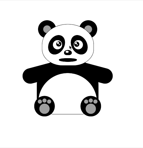
周末找了点轻松的话题,css画大熊猫。
先上效果图
欢迎竞猜大熊猫到底说了什么??

再上源码
<!DOCTYPE html>

<html lang="en">

<head>

  <meta charset="UTF-8">

  <meta name="viewport" content="width=device-width, initial-scale=1.0,

minimum-scale=1.0, maximum-scale=1.0, viewport-fit=cover, user-scalable=no">

  <title>纯css画大熊猫</title>

</head>

<body>

<div id="scene1" class="scene-1">

  <!--熊猫坐着-->

  <div class="head">

    <div class="ear ear-left"></div>

    <div class="ear ear-right"></div>

    <div class="face">

      <div class="eye-out eye-left">

        <div id="leftEyeOut" class="eye">

          <div id="leftEye" class="eyeball"></div>

        </div>

      </div>

      <div class="eye-out eye-right">

        <div class="eye">

          <div id="rightEye" class="eyeball"></div>

        </div>

      </div>

      <div class="nose"></div>

      <div id="mouth" class="mouth">

        <div id="tongue" class="tongue"></div>

      </div>

    </div>

  </div>

  <div id="pandaBody" class="body">

    <div id="leftArm" class="arm-left"></div>

    <div id="rightArm" class="arm-right"></div>

    <div class="foot foot-left">

      <div class="toe"></div>

    </div>

    <div class="foot foot-right">

      <div class="toe"></div>

    </div>

  </div>

</div>

<style>

  /*动画相关*/

  @keyframes mouth_animation {

    0%   {

      top: 132px;

      height: 14px;

    }

    25%  {

      top: 123px;

      height: 32px;

    }

    50%  {

      top: 125px;

      height: 26px;

    }

    75%  {

      top: 123px;

      height: 32px;

    }

    100% {

      top: 132px;

      height: 14px;

    }

  }

  .mouth-animation {

    /*animation: infinite;*/

    animation-name: mouth_animation;

    animation-duration: 3s;

  }

  .tongue-animation {

    /*animation: infinite;*/

    animation-name: tongue_animation;

    animation-duration: 3s;

  }

  @keyframes tongue_animation {

    10%   {

      bottom: 3px;

      height: 8px;

      opacity: 0;

    }

    15%  {

      bottom: 4px;

      height: 14px;

      opacity: 1;

    }

    50%  {

      bottom: 4px;

      height: 16px;

      opacity: 1;

    }

    85%  {

      bottom: 4px;

      height: 14px;

      opacity: 1;

    }

    90% {

      bottom: 3px;

      height: 8px;

      opacity: 0;

    }

  }

  .arm-left-animation {

    animation-name: arm_left_animation;

    animation-duration: 3s;

  }

  @keyframes arm_left_animation {

    0% {

      transform: rotate(75deg);

    }

    50%   {

      transform: rotate(125deg);

    }

    100% {

      transform: rotate(75deg);

    }

  }

  .arm-right-animation {

    animation-name: arm_right_animation;

    animation-duration: 3s;

  }

  @keyframes arm_right_animation {

    0% {

      transform: rotate(-75deg);

    }

    50%   {

      transform: rotate(-125deg);

    }

    100% {

      transform: rotate(-75deg);

    }

  }

</style>

<script>

  // 打招呼

  var hasAnimation = false

  function doAnimation(e, centerx) {

    let arm, ani;

    if (centerx > e.pageX) {

      arm = document.getElementById('leftArm');

      ani = 'arm-left-animation'

    } else {

      arm = document.getElementById('rightArm');

      ani = 'arm-right-animation'

    }

    var mouth = document.getElementById('mouth');

    mouth.classList.add("mouth-animation");

    var tongue = document.getElementById('tongue');

    tongue.classList.add("tongue-animation");

    arm.classList.add(ani);

    setTimeout(() => {

      hasAnimation = false

      mouth.classList.remove("mouth-animation");

      tongue.classList.remove("tongue-animation");

      arm.classList.remove(ani);

    }, 3000)

  }

  var pandaBody = document.getElementById('pandaBody');

  pandaBody.addEventListener("dblclick", function (e) {

    if (hasAnimation) {

      return ;

    }

    hasAnimation = true

    var x = pandaBody.getBoundingClientRect().x + pandaBody.getBoundingClientRect().width / 2.0;

    doAnimation(e, x)

  })

</script>

<script>

  // 眼睛跟随动

  var leftEyeCenter = {}, rightEyeCenter = {}

  setTimeout(() => {

    var eyel = document.getElementById('leftEye');

    var eyeCenterX = eyel.getBoundingClientRect().x + eyel.getBoundingClientRect().width / 2.0;

    var eyeCenterY = eyel.getBoundingClientRect().y + eyel.getBoundingClientRect().height / 2.0;

    leftEyeCenter = {x: eyeCenterX, y: eyeCenterY, dom: eyel}

    var eyer = document.getElementById('rightEye');

    eyeCenterX = eyer.getBoundingClientRect().x + eyer.getBoundingClientRect().width / 2.0;

    eyeCenterY = eyer.getBoundingClientRect().y + eyer.getBoundingClientRect().height / 2.0;

    rightEyeCenter = {x: eyeCenterX, y: eyeCenterY, dom: eyer}

  }, 100)

  var body = document.body;

  body.addEventListener("click", function (e) {

    eyePosition(leftEyeCenter, e);

    eyePosition(rightEyeCenter, e);

  })

  function eyePosition(eyeCenter, e) {

    var cx = e.pageX, cy = e.pageY;

    var eye = eyeCenter.dom;

    if ((cx < eyeCenter.x + 8 && cx > eyeCenter.x - 8) && cy < eyeCenter.y + 8 && cy > eyeCenter.y - 8) {

      eye.style = "";

    } else {

      var st = Math.atan2((cy - eyeCenter.y), (cx - eyeCenter.x));

      var x = 6 + 6 * Math.cos(st);

      var y = 6 + 6 * Math.sin(st);

      eye.style.left = x + 'px';

      eye.style.top = y + 'px';

    }

  }

  var timeOut = null;

  body.addEventListener("mousemove", function (e) {

    if (timeOut) {

      return ;

    }

    eyePosition(leftEyeCenter, e);

    eyePosition(rightEyeCenter, e);

    timeOut = setTimeout(() => {

      timeOut = null

    }, 50)

  })

</script>

<style>

  html, body {

    margin: 0;

    width: 100%;

    height: 100%;

    position: relative;

  }

  .scene-1 {

    position: absolute;

    left: 50%;

    top: 50%;

    transform: translate(-50%, -50%);

    width: 300px;

    height: 360px;

  }

</style>

<style>

  /*头*/

  .head {

    position: absolute;

    top: 0;

    left: 50%;

    transform: translateX(-50%);

    height: 160px;

    width: 200px;

    z-index: 10;

  }

  .head .face {

    position: relative;

    height: 160px;

    width: 200px;

    border-radius: 50% 50% 40% 40%;

    background: white;

    border: 1px solid black;

    z-index: 1;

  }

  .head .ear {

    position: absolute;

    top: -15px;

    height: 70px;

    width: 70px;

    border-radius: 50%;

    background: black;

  }

  .head .ear:after {

    content: ' ';

    position: absolute;

    left: 20px;

    top: 20px;

    height: 30px;

    width: 30px;

    border-radius: 50%;

    background-color: darkgrey;

  }

  .head .ear-left {

    left: -15px;

  }

  .head .ear-right {

    right: -15px;

  }

  .head .eye-out {

    position: absolute;

    top: 30px;

    height: 80px;

    width: 60px;

    border-radius: 50%;

    background: black;

  }

  .head .eye {

    position: absolute;

    top: 20px;

    height: 32px;

    width: 32px;

    border-radius: 50%;

    border: 2px solid white;

    background-color: white;

  }

  .head .eye-left {

    left: 50px;

    transform: rotate(30deg);

    transform-origin: 0% 0%;

  }

  .head .eye-left .eye {

    left: 15px;

    transform: rotate(-30deg);

    transform-origin: 50% 50%;

  }

  .head .eye-right {

    right: 50px;

    transform: rotate(-30deg);

    transform-origin: 100% 0%;

  }

  .head .eye-right .eye {

    right: 15px;

    transform: rotate(30deg);

    transform-origin: 50% 50%;

  }

  .head .eyeball {

    position: absolute;

    top: 6px;

    left: 6px;

    height: 20px;

    width: 20px;

    border-radius: 50%;

    background-color: black;

  }

  .head .eyeball:before {

    content: " ";

    position: absolute;

    left: 3px;

    top: 2px;

    width: 8px;

    height: 8px;

    border-radius: 50% / 50%;

    background-color: white;

  }

  .head .eyeball:after {

    content: " ";

    position: absolute;

    left: 10px;

    top: 10px;

    width: 4px;

    height: 4px;

    border-radius: 50% / 50%;

    background-color: white;

  }

  .head .nose {

    position: absolute;

    top: 100px;

    left: 50%;

    width: 30px;

    height: 20px;

    transform: translateX(-50%);

    border-radius: 50% 50% 40% 40%;

    background-color: black;

  }

  .head .nose:after {

    content: ' ';

    position: absolute;

    left: 6px;

    top: 3px;

    width: 12px;

    height: 8px;

    border-radius: 50% / 50%;

    background-color: white;

  }

  .head .mouth {

    position: absolute;

    top: 132px;

    left: 50%;

    width: 70px;

    height: 14px;

    transform: translateX(-50%);

    border-radius: 40% 40% 50% 50%;

    background-color: black;

  }

  .head .mouth .tongue {

    position: absolute;

    bottom: 3px;

    left: 50%;

    width: 40px;

    height: 8px;

    transform: translateX(-50%);

    border-radius: 50%;

    background-color: red;

    opacity: 0;

  }

</style>

<style>

  /*身子*/

  .body {

    position: absolute;

    top: 130px;

    left: 50%;

    transform: translateX(-50%);

    height: 220px;

    width: 240px;

    z-index: 5;

  }

  .body:before {

    content: '';

    position: absolute;

    top: 0px;

    left: 0;

    height: 220px;

    width: 240px;

    border-radius: 50% 50% 20% 20%;

    background-color: black;

    z-index: 2;

  }

  .body:after {

    content: '';

    position: absolute;

    left: 5px;

    top: 60px;

    width: 228px;

    height: 160px;

    overflow: hidden;

    border-radius: 160px 160px 40% 40%;

    background-color: white;

    border: 1px solid black;

    z-index: 3;

  }

  .body .arm-left {

    position: absolute;

    top: 40px;

    left: 20px;

    height: 120px;

    width: 60px;

    transform: rotate(75deg);

    transform-origin: 50% 10%;

    background-color: black;

    border-radius: 0 0 30px 30px;

  }

  .body .arm-right {

    position: absolute;

    top: 40px;

    right: 20px;

    height: 120px;

    width: 60px;

    transform: rotate(-75deg);

    transform-origin: 50% 10%;

    background-color: black;

    border-radius: 0 0 30px 30px;

  }

  .body .foot {

    position: absolute;

    top: 150px;

    height: 80px;

    width: 80px;

    background-color: black;

    border-radius: 40px;

    z-index: 5;

  }

  .body .foot:after {

    content: '';

    position: absolute;

    top: 30px;

    left: 20px;

    height: 40px;

    width: 40px;

    background-color: darkgrey;

    border-radius: 40px;

    z-index: 5;

  }

  .body .foot-left {

    left: -10px;

  }

  .body .foot-right {

    right: -10px;

  }

  .body .toe {

    position: absolute;

    top: 10px;

    left: 32px;

    height: 16px;

    width: 16px;

    background-color: darkgrey;

    border-radius: 40px;

  }

  .body .toe:before {

    content: " ";

    position: absolute;

    top: 4px;

    left: -18px;

    height: 16px;

    width: 16px;

    background-color: darkgrey;

    border-radius: 40px;

  }

  .body .toe:after {

    content: " ";

    position: absolute;

    top: 4px;

    left: 18px;

    height: 16px;

    width: 16px;

    background-color: darkgrey;

    border-radius: 40px;

  }

</style>

</body>

</html>
周末愉快--css画大熊猫的更多相关文章
- 一步一步教你用CSS画爱心
今天小颖给大家分享一个用CSS画的爱心,底下有代码和制作过程,希望对大家有所帮助. 第一步: 先画一个正方形.如图: <!DOCTYPE html> <html> <he ...
- 参考bootstrap中的popover.js的css画消息弹框
前段时间小颖的大学同学给小颖发了一张截图,图片类似下面这张图: 小颖当时大概的给她说了下,其实小颖也不知道上面那个三角形怎么画嘻嘻,给她说了DOM结构,具体的css让她自己百度,今天小颖自己参考boo ...
- Effective前端3:用CSS画一个三角形
p { text-indent: 2em } .triangle-container p { text-indent: 0 } img { margin: 15px 0 } 三角形的场景很常见,打开一 ...
- 用css画出三角形
看到有面试题里会有问到如何用css画出三角形 众所周知好多图形都可以拆分成三角形,所以说会了画三角形就可以画出很多有意思的形状 画出三角形的原理是调整border(边框)的四个方向的宽度,线条样式以及 ...
- 用纯css画个三角形
用纯css画个三角形以下是源代码: <!DOCTYPE html PUBLIC "-//W3C//DTD XHTML 1.0 Transitional//EN" " ...
- 用css画图标
css3的属性 transform(转换) 用途很广泛,功能也很强大,为了熟悉它的各种转换方式(平移 translate,旋转 rotate,扭曲 skew,放缩 scale),我做了一些平常常用的一 ...
- 如何用css画出三角形
看到有面试题里会有问到如何用css画出三角形 众所周知好多图形都可以拆分成三角形,所以说会了画三角形就可以画出很多有意思的形状 画出三角形的原理是调整border(边框)的四个方向的宽度,线条样式以及 ...
- 用css画出三角形【转】
看到有面试题里会有问到如何用css画出三角形 众所周知好多图形都可以拆分成三角形,所以说会了画三角形就可以画出很多有意思的形状 画出三角形的原理是调整border(边框)的四个方向的宽度,线条样式以及 ...
- CSS画三角形引发的一些思考
今天刷知乎时看到了一个问题,有谁能详细讲一下css如何画出一个三角形?怎么想都想不懂? - 知乎.很巧,刚入前端坑的我前不久也遇到过这个问题,今天再来谈一谈这个问题则是因为知乎的一些答案引发了我的 ...
随机推荐
- Salesforce LWC学习(三十六) Quick Action 支持选择 LWC了
本篇参考: https://developer.salesforce.com/docs/component-library/documentation/en/lwc/lwc.use_quick_act ...
- Mysql常用sql语句(3)- select 查询语句基础使用
测试必备的Mysql常用sql语句系列 https://www.cnblogs.com/poloyy/category/1683347.html 前言 针对数据表里面的每条记录,select查询语句叫 ...
- Linux - 安装 ant
官方下载地址 https://ant.apache.org/bindownload.cgi 旧版下载地址 https://archive.apache.org/dist/ant/binaries/ 挑 ...
- php-fpm进程数控制
一.名词解释 CGI是Common Gateway Interface(通用网管协议),用于让交互程序和Web服务器通信的协议.负责处理URL的请求,启动一个进程,将客户端发送的数据作为输入,有Web ...
- Fastjson反序列化漏洞基础
Fastjson反序列化漏洞基础 FastJson是alibaba的一款开源JSON解析库,可用于将Java对象转换为其JSON表示形式,也可以用于将JSON字符串转换为等效的Java对象. 0x0 ...
- C# 动态构建表达式树(一)—— 构建 Where 的 Lambda 表达式
C# 动态构建表达式树(一)-- 构建 Where 的 Lambda 表达式 前言 记得之前同事在做筛选功能的时候提出过一个问题:如果用户传入的条件数量不确定,条件的内容也不确定(大于.小于和等于), ...
- 274 day04_Map,斗地主案例
day04 [Map] 主要内容 Map集合 教学目标 [ ] 能够说出Map集合特点 [ ] 使用Map集合添加方法保存数据 [ ] 使用"键找值"的方式遍历Map集合 [ ...
- 数据结构逆向分析-Vector
数据结构逆向分析-Vector 这个应该是家喻户晓了的东西把,如果说C/C++程序员Vector都不用的话,可能就是一个不太好的程序员. Vector就是一个STL封装的动态数组,数组大家都知道是通过 ...
- windows 中cmd一些特殊命令
chcp 65001 就是换成UTF-8代码页 chcp 936 可以换回默认的GBK chcp 437 是美国英语 shutdown -s -t 60 60秒后关机 shutdown /a ...
- 如何使用SQL的备份文件(.bak)恢复数据库
出于很多情况,数据库只剩下.bak文件,想要恢复数据库,找了很多资料才知道可以这样!!!!! 个人觉得图片教程更有意义,请看步骤: 1.选中"数据库" 右击 选择"还原数 ...