Web前端入门第 44 问:CSS 循环动画 animation 效果演示
相关属性
@keyframes 定义动画的关键帧序列
animation-name 指定 @keyframes 动画的名称
animation-duration 动画单次循环的持续时间(必需属性,否则动画不会生效)
animation-timing-function 动画速度曲线
animation-iteration-count 动画播放次数,数字或者 infinite 无限循环
animation-delay 动画开始前的等待时间(延迟)
animation-direction 动画播放方向
animation-fill-mode 控制动画执行前后的样式状态
animation-play-state 控制动画播放状态,暂停/播放
animation 简写属性,包含 duration | timing-function | delay | iteration-count | direction | fill-mode | play-state | name。
2023 新增属性:
animation-composition 指定了当多个动画同时影响同一属性时应使用的复合操作。
@keyframes
@keyframes 用于定义动画关键帧,还是必须的那种,没有 @keyframes 的关键帧,CSS 动画就没法玩!!
在使用 CSS 动画前,必须优先定义动画关键帧,写法:
@keyframes ani1 {

  0% {

    transform: translateX(0);

  }

  100% {

    transform: translateX(605px);

  }

}
以上代码定义了一个名为 ani1 的动画关键帧序列,其中 0% 表示动画开始时没有位移,100% 表示动画结束时位移了 605px。
关键帧名称定义规范:
必须以字母(a-z, A-Z)、下划线(_) 或 连字符(-) 开头,后面可以是字母、数字(0-9)、下划线或连字符,建议不要使用 CSS 关键字,虽然不一定报错。
除了使用百分比定义关键帧序列,还可以使用关键字 from(0%) 和 to(100%)定义,比如:
@keyframes ani1 {

  from {

    transform: translateX(0);

  }

  to {

    transform: translateX(605px);

  }

}
还可以多个帧用同一条规则:
@keyframes ani1 {

  0% {

    transform: translateX(0);

  }

  40%,

  60% { /* 40% 和 60% 的关键帧都是同一个位置,表示元素不动 */

    transform: translateX(305px);

  }

  100% {

    transform: translateX(605px);

  }

}
需注意关键帧的 CSS 属性不支持 !important,有此写法浏览器会判定属性值无效!!
animation-name
用于指定动画使用的关键帧序列名称,比如:
.child {

  animation-name: ani1;

  animation-name: ani1, ani2; /* 同时使用 ani1 和 ani2 两个关键帧序列 */

}
此时,给 .child 指定了一个 ani1 的关键帧序列,但动画还无法执行,原因是缺少动画持续时间。
animation-duration
指定执行一次动画的运行时长,与前文说过的 transition-duration 一致,以秒(s)或毫秒(ms)为单位,默认是 0s。
语法:
``` css

.child {

  animation-duration: 2s;

}
看例子,同时应用多个关键帧序列:
<div class="box">

  <div class="child">1s</div>

  <div class="child">2s</div>

  <div class="child">3s</div>

</div>

<style>

  @keyframes ani1 {

    0% {

      transform: translateX(0);

    }

    100% {

      transform: translateX(605px);

    }

  }

  @keyframes ani2 {

    0% {

      background-color: #fff;

    }

    100% {

      background-color: rgba(255, 71, 87,1);

    }

  }

  .box {

    border: 2px solid rgba(255, 71, 87,0.3);

    margin: 20px 0;

    width: calc(235px * 3);

  }

  .child {

    border: 2px solid rgba(255, 71, 87,1);

    border-radius: 40px;

    width: 100px;

    height: 40px;

    display: flex;

    align-items: center;

    justify-content: center;

    box-sizing: border-box;

    animation-name: ani1, ani2;

  }

  .child:nth-child(1) {

    animation-duration: 1s; /* 两个关键帧序列都使用一样的时长 */

  }

  .child:nth-child(2) {

    animation-duration: 2s, 1s; /* 第一个关键帧序列的时长是 2s,第二个关键帧序列的时长是 1s */

  }

  .child:nth-child(3) {

    animation-duration: 500ms, 3s; /* 第一个关键帧序列的时长是 500ms,第二个关键帧序列的时长是 3s */

  }

</style>
效果:

animation-timing-function
用于设置速度曲线,控制动画速度变化,与前文的 transition-timing-function 一致,默认是 ease。
关于 贝塞尔曲线 可阅读前一篇文章!
示例:
<div class="box">

  <div class="child">ease</div>

  <div class="child">ease-in-out</div>

  <div class="child">cubic-bezier</div>

</div>

<style>

  @keyframes ani1 {

    0% {

      transform: translateX(0);

    }

    100% {

      transform: translateX(605px);

    }

  }

  @keyframes ani2 {

    0% {

      background-color: #fff;

    }

    100% {

      background-color: rgba(255, 71, 87,1);

    }

  }

  .box {

    border: 2px solid rgba(255, 71, 87,0.3);

    margin: 20px 0;

    width: calc(235px * 3);

  }

  .child {

    border: 2px solid rgba(255, 71, 87,1);

    border-radius: 40px;

    width: 100px;

    height: 40px;

    display: flex;

    align-items: center;

    justify-content: center;

    box-sizing: border-box;

    animation-name: ani1, ani2;

    animation-duration: 2s;

  }

  .child:nth-child(1) {

    animation-timing-function: ease;

  }

  .child:nth-child(2) {

    animation-timing-function: ease-in-out;

  }

  .child:nth-child(3) {

    animation-timing-function: cubic-bezier(0.18, 0.89, 0.32, 1.28); /* 使用贝塞尔曲线 */

  }

</style>
效果:

animation-iteration-count
动画默认只执行 1 此,上面效果看起来是循环执行,原因是 gif 图片会重复播放!!
示例:
<div class="box">

  <div class="child">ease</div>

  <div class="child">ease-in-out</div>

  <div class="child">cubic-bezier</div>

</div>

<style>

  @keyframes ani1 {

    0% {

      transform: translateX(0);

    }

    100% {

      transform: translateX(605px);

    }

  }

  @keyframes ani2 {

    0% {

      background-color: #fff;

    }

    100% {

      background-color: rgba(255, 71, 87,1);

    }

  }

  .box {

    border: 2px solid rgba(255, 71, 87,0.3);

    margin: 20px 0;

    width: calc(235px * 3);

  }

  .child {

    border: 2px solid rgba(255, 71, 87,1);

    border-radius: 40px;

    width: 100px;

    height: 40px;

    display: flex;

    align-items: center;

    justify-content: center;

    box-sizing: border-box;

    animation-duration: 2s;

    animation-timing-function: cubic-bezier(0.18, 0.89, 0.32, 1.28);

  }

  .box:hover .child { /* 鼠标放上时候,才开始执行动画 */

    animation-name: ani1, ani2;

  }

  .child:nth-child(1) {

    animation-iteration-count: 1; /* 动画执行1次 */

  }

  .child:nth-child(2) {

    animation-iteration-count: 0; /* 动画不执行 */

  }

  .child:nth-child(3) {

    animation-iteration-count: infinite; /* 动画执行无限次 */

  }

</style>
效果:

animation-delay
设置动画开始时的等待时长,默认是 0s。
示例:
<div class="box">

  <div class="child">ease</div>

  <div class="child">ease-in-out</div>

  <div class="child">cubic-bezier</div>

</div>

<style>

  @keyframes ani1 {

    0% {

      transform: translateX(0);

    }

    100% {

      transform: translateX(605px);

    }

  }

  @keyframes ani2 {

    0% {

      background-color: #fff;

    }

    100% {

      background-color: rgba(255, 71, 87,1);

    }

  }

  .box {

    border: 2px solid rgba(255, 71, 87,0.3);

    margin: 20px 0;

    width: calc(235px * 3);

  }

  .child {

    border: 2px solid rgba(255, 71, 87,1);

    border-radius: 40px;

    width: 100px;

    height: 40px;

    display: flex;

    align-items: center;

    justify-content: center;

    box-sizing: border-box;

    animation-duration: 2s;

    animation-timing-function: cubic-bezier(0.18, 0.89, 0.32, 1.28);

    animation-iteration-count: 1; /* 动画执行1次 */

  }

  .box:hover .child { /* 鼠标放上时候,才开始执行动画 */

    animation-name: ani1, ani2;

  }

  .child:nth-child(1) {

    animation-delay: 500ms;

  }

  .child:nth-child(2) {

    animation-delay: 1s

  }

  .child:nth-child(3) {

    animation-delay: 2s;

  }

</style>
效果:

animation-direction
设置动画方向,默认是 normal,即从开始到结束。
有效值:
normal 动画在每个循环中正向播放。
reverse 动画在每个循环中反向播放。动画将从结束状态往开始状态运动,速度曲线也将反转。
alternate 动画在每个循环中正反交替播放,第一次迭代是正向播放。
alternate-reverse 动画在每个循环中正反交替播放,第一次迭代是反向播放。
alternate 的两个值会让动画往返来回执行,reverse 两个值会让动画倒着执行。
示例:
<div class="box">

  <div class="child">normal</div>

  <div class="child">reverse</div>

  <div class="child">alternate</div>

  <div class="child">alternate-reverse</div>

</div>

<style>

  @keyframes ani1 {

    0% {

      transform: translateX(0);

    }

    100% {

      transform: translateX(605px);

    }

  }

  @keyframes ani2 {

    0% {

      background-color: #fff;

    }

    100% {

      background-color: rgba(255, 71, 87,1);

    }

  }

  .box {

    border: 2px solid rgba(255, 71, 87,0.3);

    margin: 20px 0;

    width: calc(235px * 3);

  }

  .child {

    border: 2px solid rgba(255, 71, 87,1);

    border-radius: 40px;

    width: 100px;

    height: 40px;

    margin: 10px 0;

    display: flex;

    align-items: center;

    justify-content: center;

    box-sizing: border-box;

    animation-duration: 2s;

    animation-timing-function: ease;

    animation-iteration-count: 2; /* 动画执行1次 */

  }

  .box:hover .child { /* 鼠标放上时候,才开始执行动画 */

    animation-name: ani1, ani2;

  }

  .child:nth-child(1) {

    animation-direction: normal;

  }

  .child:nth-child(2) {

    animation-direction: reverse;

  }

  .child:nth-child(3) {

    animation-direction: alternate;

  }

  .child:nth-child(4) {

    animation-direction: alternate-reverse;

  }

</style>
效果:

animation-fill-mode
设置元素动画开始时和结束时的状态,可以理解为动画开始和结束时,是用关键帧序列的 0% 还是 100% 的状态,这与运动方向和运动次数有关。
有效值:
none 默认值,不设置状态。
forwards 设置为动画结束状态。
backwards 设置为动画开始状态。
both 动画将遵循 forwards 和 backwards 的规则,从而在两个方向上扩展动画属性。
示例:
<div class="box">

  <div class="child">none</div>

  <div class="child">forwards</div>

  <div class="child">backwards</div>

  <div class="child">both</div>

</div>

<style>

  @keyframes ani1 {

    0% {

      transform: translateX(100px);

    }

    100% {

      transform: translateX(605px);

    }

  }

  @keyframes ani2 {

    0% {

      background-color: #fff;

    }

    100% {

      background-color: rgba(255, 71, 87,1);

    }

  }

  .box {

    border: 2px solid rgba(255, 71, 87,0.3);

    margin: 20px 0;

    width: calc(235px * 3);

  }

  .child {

    border: 2px solid rgba(255, 71, 87,1);

    border-radius: 40px;

    width: 100px;

    height: 40px;

    margin: 10px;

    text-align: center;

    display: flex;

    align-items: center;

    justify-content: center;

    box-sizing: border-box;

    animation-duration: 1s;

    animation-timing-function: ease;

    animation-iteration-count: 1; /* 动画执行1次 */

    animation-direction: alternate; /* 往返运动 */

    animation-delay: 500ms; /* 延迟 500ms 看 fill-mode 效果 */

  }

  .box:hover .child { /* 鼠标放上时候,才开始执行动画 */

    animation-name: ani1, ani2;

  }

  .child:nth-child(1) {

    animation-fill-mode: none;

  }

  .child:nth-child(2) {

    animation-fill-mode: forwards;

  }

  .child:nth-child(3) {

    animation-fill-mode: backwards;

  }

  .child:nth-child(4) {

    animation-fill-mode: both;

  }

</style>
效果:

可以看到,在动画开始时,backwards 和 both 会应用 0% 的状态,在动画结束时,forwards 和 both 会应用 100% 的状态。
animation-play-state
用于控制动画暂停、播放状态。
比如最常见的音乐播放,有个转圈圈的音符,在音乐暂停时候,音符需要暂停。如果使用移除属性的方式,就会回到元素默认状态,而没办法做到暂停。
<div class="box">

  <div class="child">音符</div>

</div>

<style>

  @keyframes ani1 {

    0% {

      transform: rotate(0deg);

    }

    100% {

      transform: rotate(360deg);

    }

  }

  .box {

    border: 2px solid rgba(255, 71, 87,0.3);

    margin: 20px 0;

    width: 100px;

  }

  .child {

    border: 2px solid rgba(255, 71, 87,1);

    border-radius: 80px;

    width: 80px;

    height: 80px;

    margin: 10px;

    text-align: center;

    display: flex;

    align-items: center;

    justify-content: center;

    box-sizing: border-box;

    animation-name: ani1;

    animation-duration: 3s;

    animation-timing-function: linear;

    animation-iteration-count: infinite;

  }

  .box .child:hover { /* 鼠标放上时候,暂停动画 */

    animation-play-state: paused;

  }

</style>
效果:
animation
使用简写 animation,可以同时设置多个动画属性,毕竟要实现一个动画需要多个属性配合,只写一个属性就要省事多了。
语法:
/* @keyframes duration | timing-function | delay |

iteration-count | direction | fill-mode | play-state | name */

animation: 3s ease-in 1s 2 reverse both paused ani1;

/* 多个动画 */

animation:

  3s linear ani1,

  3s ease-out 5s ani2;
虽然属性值浏览器没有强制要求先后顺序,就算先后顺序错乱浏览器也会自动修正,但推荐按照语法要求来:duration | timing-function | delay | iteration-count | direction | fill-mode | play-state | name 。
animation-composition
使用此属性时,需注意浏览器兼容性,基本上都是2023年后的浏览器版本才开始支持!!
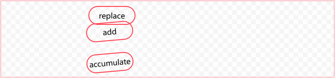
有效值:
replace 默认值,替换已有属性。
add 累加效果。
accumulate 组合效果。
看示例:
<div class="box">

  <div class="child">replace</div>

  <div class="child">add</div>

  <div class="child">accumulate</div>

</div>

<style>

  @keyframes ani1 {

    0% {

      transform: translateX(0);

    }

    100% {

      transform: translateX(605px);

    }

  }

  .box {

    border: 2px solid rgba(255, 71, 87,0.3);

    margin: 20px 0;

    width: calc(235px * 3);

  }

  .child {

    border: 2px solid rgba(255, 71, 87,1);

    border-radius: 40px;

    width: 100px;

    height: 40px;

    margin: 10px 0;

    text-align: center;

    display: flex;

    align-items: center;

    justify-content: center;

    box-sizing: border-box;

    animation: 2s ease infinite ani1;

    transform: rotate(-5deg);

  }

  .child:nth-child(1) {

    animation-composition: replace;

  }

  .child:nth-child(2) {

    animation-composition: add;

  }

  .child:nth-child(3) {

    animation-composition: accumulate;

  }

</style>
效果:
以上示例,元素自身携带有 transform: rotate(-5deg);,动画属性也进行了 transform: translateX(605px); 变换,三个值区别就显示出来了:
- replace 覆盖了元素自身的
transform变换。 - add 将元素自身的属性值放在了动画属性前面,变成了 transform: rotate(-5deg) translateX(605px);
- accumulate 将两个属性组合成了一个 3D 矩阵 transform: matrix3d(0.996195, -0.0871557, 0, 0, 0.0871557, 0.996195, 0, 0, 0, 0, 1, 0, 605px, 0, 0, 1);
如果使用 width 属性动画,add 和 accumulate 则看起来没有任何区别。
四个实验性属性
实验性属性规范还未定稿,小范围浏览器支持,未来有可能还会发生变化。
animation-timeline 指定了用于控制 CSS 动画进度的时间线。
animation-range-start 设置 timeline 的开始位置。
animation-range-end 设置 timeline 的结束位置。
animation-range 简写属性,包含 animation-range-start, animation-range-end。
使用 animation-timeline 做一个跟滚动条有关的动画效果,示例:
<div class="box">

  <div class="content"></div>

  <div class="child">timeline</div>

  <div class="content"></div>

</div>

<style>

  @keyframes ani1 {

    0% {

      transform: rotate(0deg);

    }

    100% {

      transform: rotate(360deg);

    }

  }

  .box {

    border: 2px solid rgba(255, 71, 87,0.3);

    margin: 20px 0;

    width: calc(235px * 3);

    height: calc(100px * 3);

    overflow: auto;

  }

  .content {

    height: 400px;

  }

  .child {

    border: 2px solid rgba(255, 71, 87,1);

    border-radius: 40px;

    width: 100px;

    height: 40px;

    margin: 10px 0;

    text-align: center;

    display: flex;

    align-items: center;

    justify-content: center;

    box-sizing: border-box;

    view-timeline: --subjectReveal block;

    animation-timeline: --subjectReveal;

    animation-name: ani1;

    animation-range: entry 10% contain 200%;

    animation-fill-mode: both;

    animation-duration: 1ms; /* Firefox requires this to apply the animation */

  }

</style>
效果:

写在最后
其他与动画相关的属性:
- scroll-timeline 滚动条触发动画
- offset-path 让元素沿复杂路径运动
CSS 动画在书写上比 JS 简单很多,也让前端的动画实现变得更容易,但一些涉及到用户交互的动画,还是必须让 JS 登场才行。
CSS animation 与 transition 都能实现动画效果,transition 胜在单次属性过渡,而 animation 胜在可以指定关键帧实现更加复杂的动画场景。
Web前端入门第 44 问:CSS 循环动画 animation 效果演示的更多相关文章
- web前端入坑第五篇:秒懂Vuejs、Angular、React原理和前端发展历史
秒懂Vuejs.Angular.React原理和前端发展历史 2017-04-07 小北哥哥 前端你别闹 今天来说说 "前端发展历史和框架" 「前端程序发展的历史」 「 不学自知, ...
- 好程序员web前端分享18个用CSS制作出来的东西
好程序员web前端分享18个用CSS制作出来的东西,与流行的看法相反,CSS不仅仅是用来提供一个WEB页面的基本风格,以使它看起来更有吸引力.还有很多其他的事情,CSS也可以做的很好.由于它创建动画和 ...
- 好程序员web前端分享值得参考的css理论:OOCSS、SMACSS与BEM
好程序员web前端分享值得参考的css理论:OOCSS.SMACSS与BEM 最近在The Sass Way里看到了Modular CSS typography一文,发现文章在开头部分就提到了OOCS ...
- 进击的Python【第十三章】:Web前端基础之HTML与CSS样式
进击的Python[第十四章]:Web前端基础之HTML与CSS样式 一.web框架的本质 众所周知,对于所有的Web应用,本质上其实就是一个socket服务端,用户的浏览器其实就是一个socket客 ...
- Android零基础入门第44节:ListView数据动态更新
原文:Android零基础入门第44节:ListView数据动态更新 经过前面几期的学习,关于ListView的一些基本用法大概学的差不多了,但是你可能发现了,所有ListView里面要填充的数据都是 ...
- web前端入坑第二篇:web前端到底怎么学?干货资料! 【转】
http://blog.csdn.net/xllily_11/article/details/52145172 版权声明:本文为博主[小北]原创文章,如要转载请评论回复.个人前端公众号:前端你别闹,J ...
- Brackets - 强大免费的开源跨平台Web前端开发工具IDE (HTML/CSS/Javascript代码编辑器)
Brackets 是一个免费.开源且跨平台的 HTML/CSS/JavaScript 前端 WEB 集成开发环境 (IDE工具).该项目由 Adobe 创建和维护,根据MIT许可证发布,支持 Wind ...
- web前端(7)—— 了解CSS样式,引入css样式的方式
CSS 在前面大概的介绍了css,从本片博文开始,会详细的介绍它,在最开始介绍web前端时,打开百度首页,当时我提出了一个问题,为什么百度首页的输入框可以放在正中间,就是由于有css的控制,我们可以打 ...
- [转载]Brackets - 强大免费的开源跨平台Web前端开发工具IDE (HTML/CSS/Javascript代码编辑器)
http://brackets.io/ Brackets 是一个免费.开源且跨平台的 HTML/CSS/JavaScript 前端 WEB 集成开发环境 (IDE工具).该项目由 Adobe 创建和维 ...
- web前端的10个顶级CSS UI开源框架
随着CSS3和HTML5的流行,我们的WEB页面不仅需要更人性化的设计理念,而且需要更酷的页面特效和用户体验.作为开发者,我们需要了解一些宝贵的CSS UI开源框架资源,它们可以帮助我们更快更好地实现 ...
随机推荐
- Java 将 RTF 转换为Word、PDF、HTML、图片
RTF文档因其跨平台兼容性而广泛使用,但有时在不同的应用场景可能需要特定的文档格式.例如,Word文档适合编辑和协作,PDF文档适合打印和分发,HTML文档适合在线展示,图片格式则适合社交媒体分享.因 ...
- RabbitMQ(七)——主题模式
RabbitMQ系列 RabbitMQ(一)--简介 RabbitMQ(二)--模式类型 RabbitMQ(三)--简单模式 RabbitMQ(四)--工作队列模式 RabbitMQ(五)--发布订阅 ...
- OpenCascade 开源的三维建模几何造型开发平台
官方文档 https://dev.opencascade.org/doc/overview/html/index.html Open CASCADE(简称OCC)平台是由法国Matra Datavis ...
- [THUSC2015] 异或运算 题解
学到新思路了:求解 \(k\) 大值时,可以将所有元素放一块一起跑. 考虑到 \(n,q\) 奇小无匹,我们便可以制造一个 \(O(qn\log V)\) 的代码. 那么对于我们不想在时间复杂度中出现 ...
- MOS管选型
MOS管基本参数 MOS管(Metal-Oxide-Semiconductor Field-Effect Transistor, MOSFET)作为开关元件的应用非常广泛,其开关特性与三极管相比有所不 ...
- Golang 实现本地持久化缓存
// Copyright (c) 2024 LiuShuKu // Project Name : balance // Author : liushuku@yeah.net package cache ...
- QT5笔记: 21. QStandardItemModel
QStandardItemModel 存放数据 QItemSelectionModel 选择项模型 例子:本例子中QListView 没有做任何处理,只是拖放至ui文件,设置了布局 mainwindo ...
- C#(面向对象的托管语言)类库(区别于应用程序)的异常处理思路
1.不要做出任何应用程序才需要考虑抉择策略,不能想当然的决定一些错误情形.具体的一个体现形式是什么异常都捕获.这不是类库的职责,因为无法掌握所有的调用者的使用情形,这些不确定性是委托.虚方法.接口等特 ...
- luogu-P3343题解
简要题意 给定一张 \(n\) 个点 \(m\) 条边的图,边的边权是 \([0, 1]\) 之间均匀分布的随机实数,且相互独立.求最小生成树的最大边权的期望值. 思路 首先有一个比较神秘的跟概率有关 ...
- 用DeepSeek+可灵AI+剪映制作哪吒2走T台秀AI视频 (保姆级教程)
内容首发周老师的付费社群,挑其中部分内容免费同步给公号读者 今天给大家分享如何利用DeepSeek这类AI工具,制作哪吒2走T台秀视频,保姆级的制作方法,简单易懂,小白也能轻松上手. 关键操作,分为四 ...