Css 特性之 transition和transform
CSS 有一些新的属性,可以简化代码的书写,用简单的代码就可以实现复杂的变化。不用像 js 那样,需要写很多代码
这里主要介绍三个属性:transition ,transform,以及translate
1. transition: 允许属性在一定时间内进行过渡
规则: transition:property duration timing-function delay;
property--->属性值,例如width,height,background-color等,默认值为all
duration---->过渡时间,必须有单位,如5s,1000ms 等,默认值为0s
timing-function---->过渡效果,如 linear|ease|ease-in|ease-out|ease-in-out|cubic-bezier(n,n,n,n); 默认为ease;
delay--->过渡延迟时间,默认为0s
可以分开写:
 <!DOCTYPE html>

   <html lang="en">

   <head>

       <meta charset="UTF-8">

       <title>Document</title>

       <style lang="">

           .box{

              width:300px;

              height:300px;

              background: #ccc;

              margin:30px auto;

              position:relative;

          }

          .child{

              position:absolute;

              width:100px;

              height:100px;

              top:50%;

              left:50%;

              background: #666;

              margin-left:-50px;

              margin-top: -50px;

              transition-property: width;

              transition-duration: 2s;

              transition-timing-function: linear;

              transition-delay: 200ms;

             -moz-transition-property:width; /* Firefox 4 */

             -webkit-transition-property:width; /* Safari and Chrome */

             -o-transition-property:width; /* Opera */

             -moz-transition-duration:2s; /* Firefox 4 */

             -webkit-transition-duration:2s; /* Safari and Chrome */

             -o-transition-duration:2s; /* Opera */

             -moz-transition-timing-function:linear; /* Firefox 4 */

             -webkit-transition-timing-function:linear; /* Safari and Chrome */

             -o-transition-timing-function:linear; /* Opera */

             -moz-transition-delay:200ms; /* Firefox 4 */

             -webkit-transition-delay:200ms; /* Safari and Chrome */

             -o-transition-delay:200ms; /* Opera */

          }

          .child:hover{

             width:200px;

             cursor:pointer;

          }

      </style>

  </head>

  <body>

     <div class="box">

       <div class="child"></div>

     </div>

  </body>

  </html>
也可以合起来将4个属性写在一起
 <!DOCTYPE html>

   <html lang="en">

   <head>

       <meta charset="UTF-8">

       <title>Document</title>

       <style lang="">

           .box{

              width:300px;

              height:300px;

              background: #ccc;

              margin:30px auto;

              position:relative;

          }

          .child{

              position:absolute;

              width:100px;

              height:100px;

              top:50%;

              left:50%;

              background: #666;

              margin-left:-50px;

              margin-top: -50px;

              transition:width 2s linear 200ms;

              -moz-transition:width 2s linear 200ms; /* Firefox 4 */

              -webkit-transition:width 2s linear 200ms; /* Safari and Chrome */

              -o-transition:width 2s linear 200ms; /* Opera */

          }

          .child:hover{

             width:200px;

             cursor:pointer;

          }

      </style>

  </head>

  <body>

     <div class="box">

       <div class="child"></div>

     </div>

  </body>

  </html>
运行结果:

要改变多个属性时候,用逗号分开,如:
transition:witdth 2s linear 200ms,background 2s ease 200ms;
2.transform :就是变形,改变的意思。主要有几种效果:旋转rotate,扭曲skew,缩放scale,移动translate 以及矩阵变形matrix(还可以细分(2D)对应为X,Y)
规则:transform : none | transform-function
2.1 旋转rotate
 <!DOCTYPE html>

   <html lang="en">

   <head>

       <meta charset="UTF-8">

       <title>Document</title>

       <style lang="">

           .box{

              width:300px;

              height:300px;

              background: #ccc;

              margin:30px auto;

              position:relative;

          }

          .child{

              position:absolute;

              width:100px;

              height:100px;

              top:50%;

              left:50%;

              background: #666;

              margin-left:-50px;

              margin-top: -50px;

          }

          .child:hover{

             transform: rotate(20deg);

             cursor:pointer;

          }

      </style>

  </head>

  <body>

     <div class="box">

       <div class="child"></div>

     </div>

  </body>

  </html>
运行结果:
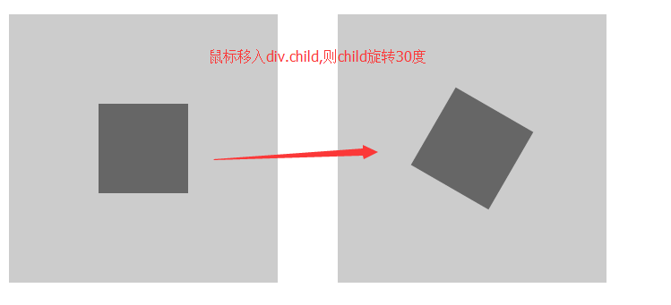
也可以单独旋转X轴或者Y轴,对应函数rotateX(),rotateY()
2.2 扭曲skew
 <!DOCTYPE html>

   <html lang="en">

   <head>

       <meta charset="UTF-8">

       <title>Document</title>

       <style lang="">

           .box{

              width:300px;

              height:300px;

              background: #ccc;

              margin:30px auto;

              position:relative;

          }

          .child{

              position:absolute;

              width:100px;

              height:100px;

              top:50%;

              left:50%;

              background: #666;

              margin-left:-50px;

              margin-top: -50px;

          }

          .child:hover{

             transform: skew(30deg);

             cursor:pointer;

          }

      </style>

  </head>

  <body>

     <div class="box">

       <div class="child"></div>

     </div>

  </body>

  </html>
运行结果:
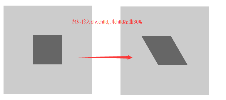
也可以单独扭曲X轴或者Y轴,对应函数skewX(),skewY()
2.3 缩放scale
 <!DOCTYPE html>

   <html lang="en">

   <head>

       <meta charset="UTF-8">

       <title>Document</title>

       <style lang="">

           .box{

              width:300px;

              height:300px;

              background: #ccc;

              margin:30px auto;

              position:relative;

          }

          .child{

              position:absolute;

              width:100px;

              height:100px;

              top:50%;

              left:50%;

              background: #666;

              margin-left:-50px;

              margin-top: -50px;

          }

          .child:hover{

             transform: scale(1.5);

             cursor:pointer;

          }

      </style>

  </head>

  <body>

     <div class="box">

       <div class="child"></div>

     </div>

  </body>

  </html>
运行效果:
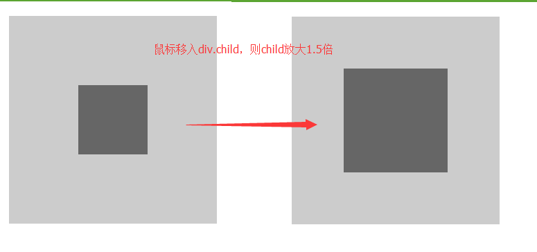
也可以单独缩放X轴或者Y轴,对应函数scaleX(),scaleY()
2.4 移动translate
 <!DOCTYPE html>

   <html lang="en">

   <head>

       <meta charset="UTF-8">

       <title>Document</title>

       <style lang="">

           .box{

              width:300px;

              height:300px;

              background: #ccc;

              margin:30px auto;

              position:relative;

          }

          .child{

              position:absolute;

              width:100px;

              height:100px;

              top:50%;

              left:50%;

              background: #666;

              margin-left:-50px;

              margin-top: -50px;

          }

          .child:hover{

             transform: translate(50%,50%);

             cursor:pointer;

          }

      </style>

  </head>

  <body>

     <div class="box">

       <div class="child"></div>

     </div>

  </body>

  </html>
translate的单位,可以是百分比(相对本身),也可以是px
运行结果:
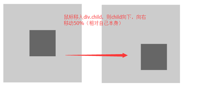
也可以单独移动X轴或者Y轴,对应函数translateX(),translateY()
2.5 矩阵变形matrix,这部分我自己现在也还没有搞懂,就不说了
不过以上四种一般情况下也够用了
2.6 当需要多个属性一起变化时,用空格隔起来就可以了
 <!DOCTYPE html>

   <html lang="en">

   <head>

       <meta charset="UTF-8">

       <title>Document</title>

       <style lang="">

           .box{

              width:300px;

              height:300px;

              background: #ccc;

              margin:30px auto;

              position:relative;

          }

          .child{

              position:absolute;

              width:100px;

              height:100px;

              top:50%;

              left:50%;

              background: #666;

              margin-left:-50px;

              margin-top: -50px;

          }

          .child:hover{

             transform: translate(50%,50%) scale(1.5) rotate(30deg);

             cursor:pointer;

          }

      </style>

  </head>

  <body>

     <div class="box">

       <div class="child"></div>

     </div>

  </body>

  </html>
运行结果:

Css 特性之 transition和transform的更多相关文章
- CSS动画:animation、transition、transform、translate
https://blog.csdn.net/px01ih8/article/details/80780470 一.区分容易混淆的几个属性和值 先区分一下css中的几个属性:animation(动画). ...
- css3之transition、transform、animation比较
css3动画多少都有些了解,但是对于transition.transform.animation这几个属性一直是比较模糊的,所以啊,这里做一个总结,也希望大家都可以对此有一个更好地理解. 其实, ...
- CSS:word-wrap/overflow/transition
一 自动换行:一个div有固定宽高,如果其内容很长,必须两行以上才能显示完整的时候,有两种情况要留意 1 默认如果其内容都是中文,那么内容是可以自适应,而不会溢出div 2 如果内容除了中文之外,还有 ...
- 深入探讨 CSS 特性检测 @supports 与 Modernizr
什么是 CSS 特性检测?我们知道,前端技术日新月异的今天,各种新技术新属性层出不穷.在 CSS 层面亦不例外. 一些新属性能极大提升用户体验以及减少工程师的工作量,并且在当下的前端氛围下: 很多实验 ...
- css 调转180度:transform: rotate(180deg);
css 调转180度:transform: rotate(180deg);
- 2017年值得学习的3个CSS特性
原文:https://bitsofco.de/3-new-css-features-to-learn-in-2017/译文:http://caibaojian.com/3-new-css-featur ...
- 即将来到: CSS Feature Queries (CSS特性查询)
Feature Queries 是CSS3 Conditional Rules specification中的一部分,它支持“@supports”规则,“@supports”规则可以用来测试浏览器是否 ...
- CSS3的transition和transform
CSS3中的transition和transform是制作HTML5动画一定要使用到的两个属性. 注:这篇文章不考虑兼容性,只讨论webkit核心的浏览器.所以本文的所有例子请用chrome,safa ...
- css基础(css书写 背景设置 标签分类 css特性)
css书写位置 行内式写法 <p style="color:red;" font-size:12px;></p> 外联式写法 <link re ...
随机推荐
- Oracle Supplemental 补全日志介绍
转. Oracle补全日志(Supplemental logging)特性因其作用的不同可分为以下几种:最小(Minimal),支持所有字段(all),支持主键(primary key),支持唯一键( ...
- gitlab怎么删除创建的项目
在gitlab新建了一个项目,怎么将此项目删除呢?打开这个工程,点击右上角的“settings”拉到最下面,有个show them to me,点击~在下拉选项的最后,有个remove框,点击即可以彻 ...
- C#中如何把byte[]数组转换成其他类型
http://bbs.csdn.net/topics/20447859 byte[] bytes = new byte[256]; //receive some stream from network ...
- 【jmeter】jMeter使用Badboy录制Web测试脚本
JMeter 是纯Java编写的软件功能和性.能测试工具,其录制脚本过于笨拙和复杂.而Badboy是用C++开发的动态应用测试工具,其拥有强大的屏幕录制和回放 功能,同时提供图形结果分析功能,刚好弥补 ...
- 【android】Android ADB 端口占用问题解决方案
解决ADB端口占用问题 方式一5037为adb默认端口,若5037端口被占用,查看占用端口的进程PIDC:\Users\wwx229495>netstat -aon|findstr 5037 ...
- linux 信号处理 三 (信号集的使用)
sigprocmask系统调用 使用条件: 1.有时候不希望在接到信号时就立即停止当前执行,去处理信号,同时也不希望忽略该信号,而是延时一段时间去调用信号处理函数.这种情况是通过阻塞信号实现的. 2. ...
- javadoc 文档
Java 文档 // 注释一行/* ...... */ 注释若干行/** ...... */ 注释若干行,并写入 javadoc 文档 通常这种注释的多行写法如下: /*** .........* . ...
- vs2015 去除 git 源代码 绑定,改成向tfs添加源码管理
除了下文的方法是将源码管理从git改成tfs之外,还要做以下几步即可 向tfs添加源码 打开源码管理(管理连接),双击打开你要向其中添加的tfs连接 选中该解决方案,右键 将解决方案添加到源码管理 嵌 ...
- windows平台安装配置Gitblit
1 安装配置jdk环境变量 2下载GitBlit,下载地址:http://www.gitblit.com或者http://gitblit.com 解压即可 3修改gitblit\data下defau ...
- jquery.cookie.js $.cookie()是怎么使用
jquery.cookie() 方法的使用(读取.写入.删除) <script type="text/javascript" src="js/jquery.cook ...