CSS弹性盒布局(display:flex)
CSS弹性布局(display:flex)
参考:
http://www.runoob.com/w3cnote/flex-grammar.html
https://www.jianshu.com/p/5856c4ae91f2
http://www.ruanyifeng.com/blog/2015/07/flex-grammar.html
https://www.cnblogs.com/xuyuntao/articles/6391728.html
主要内容:
父级:

    display:flex;

    (兼容绝大部分浏览器):-webkit-     真实工作下使用postCss插件-自动添加浏览器兼容

    display: -webkit-flex; /* Safari */

    display: flex;

    *如果使用了弹性布局,子元素不需要使用浮动float

    父级身上的常用属性:

        justify-content:    子元素水平排列

            flex-start(默认)    从左开始

            flex-end    从右开始

            center    居中!!

            space-between    两端对齐

            space-around    子元素张开手分布

        align-items        子元素垂直排列

            flex-start(默认)    从上开始

            flex-end    从下开始

            center    居中!!

            stretch(默认值):如果项目未设置高度或设为auto,将占满整个容器的高度

            baseline: 项目的第一行文字的基线对齐

        align-content        多行子元素垂直排列

            flex-start:        与交叉轴的起点对齐。

            flex-end:            与交叉轴的终点对齐。

            center:            与交叉轴的中点对齐。

            space-between:     与交叉轴两端对齐,轴线之间的间隔平均分布。

            space-around:        每根轴线两侧的间隔都相等。所以,轴线之间的间隔比轴线与边框的间隔大一倍。

            stretch(默认值):    轴线占满整个交叉轴。

        flex-flow(基本不用,面试可能会提到)

            flex-flow属性是flex-direction属性和flex-wrap属性的简写形式,默认值为row nowrap

            flex-flow: <flex-direction> <flex-wrap>;

            举例:flex-flow:column wrap;

        flex-direction    子元素排列方向

            row(默认值):主轴为水平方向,起点在左端。

            row-reverse:主轴为水平方向,起点在右端。

            column:主轴为垂直方向,起点在上沿。

            column-reverse:主轴为垂直方向,起点在下沿。

        flex-wrap        子元素一行排不下如何换行

            nowrap(默认):不换行

            wrap:换行,第一行在上方

            wrap-reverse:换行,第一行在下方

    子集身上的属性:

        flex    是flex-grow, flex-shrink 和 flex-basis的简写,默认值为0 1 auto。后两个属性可选

            将行分为定义比例的几份

            *子元素在划分父元素宽度,先刨除固定宽度

        align-self        允许单个子元素有与其他项目不一样的垂直对齐方式,可覆盖align-items属性

            .item {

                align-self: auto | flex-start | flex-end | center | baseline | stretch;

                    }

        flex-grow        定义子元素的放大比例,默认为0,即如果存在剩余空间,也不放大

            .item {

                flex-grow: <number>;     /* default 0 */        <number>只代表缩放系数

                    }

        order        定义子元素的排列顺序。数值越小,排列越靠前,默认为0

            .item {

                  order: <integer>;

                }
练习案例:

<!DOCTYPE html>

<html lang="en">

<head>

    <meta charset="UTF-8">

    <title>flex布局案例-淘宝底部导航栏</title>

    <link rel="stylesheet" href="bootstrap/css/bootstrap.css">

    <style>

        * {

            margin: 0;

            padding: 0;

            list-style: none;

        }

        .footer-nav{

            width: 100%;

            height: 60px;

            background-color: grey;

            display: flex;

            position: absolute;

            left: 0;

            bottom: 0;

        }

        .footer-nav .tab{

            width: 20%;

            box-sizing: border-box;

            border-left: 1px solid red;

            flex: 1;

            text-align: center;

            line-height: 30px;

            font-size: 16px;

            color: white;

        }

        .footer-nav .tab .tab-icon{

           height: 30%;

        }

    </style>

</head>

<body>

<div class="footer-box">

<div class="footer-nav">

    <span class="tab">

        <span class="tab-icon glyphicon glyphicon-home"></span>

        <p class="text">首页</p>

    </span>

    <span class="tab">

        <span class="tab-icon glyphicon glyphicon-shopping-cart"></span>

        <p class="text">购物车</p>

    </span>

    <span class="tab">

        <span class="tab-icon glyphicon glyphicon-list-alt"></span>

        <p class="text">订单列表</p>

    </span>

    <span class="tab">

        <span class="tab-icon glyphicon glyphicon-user"></span>

        <p class="text">我的淘宝</p>

    </span>

    <span class="tab">

        <span class="tab-icon glyphicon glyphicon-option-horizontal"></span>

        <p class="text">更多</p>

    </span>

    <span class="tab">

        <span class="tab-icon glyphicon glyphicon-grain"></span>

        <p class="text">欢度清明</p>

    </span>

</div>

</div>

</body>

</html>
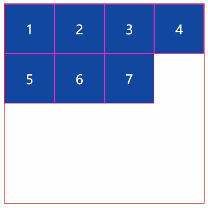
<!DOCTYPE html>

<html lang="en">

<head>

    <meta charset="UTF-8">

    <title>Title</title>

    <link rel="stylesheet" href="style/flex-1.css">

</head>

<body>

    <div class="outer">

        <div class="item div1">1</div>

        <div class="item div2">2</div>

        <div class="item div3">3</div>

        <div class="item div4">4</div>

        <div class="item">5</div>

        <div class="item">6</div>

        <div class="item">7</div>

    </div>

</body>

</html>
HTML代码
*{

    margin:;

    padding:;

    list-style: none;

}

.outer{

    width: 500px;

    height: 500px;

    border: 1px solid red;

    margin: 30px auto;

    display: flex;

    flex-wrap: wrap;

    align-content:flex-start;

}

.item{

    width: 125px;

    border: 1px solid #ff1bbe;

    background-color: #0D47A1;

    height: 125px;

    box-sizing: border-box;

    font-size: 32px;

    color: white;

    line-height: 125px;

    text-align: center;

    align-content: flex-start;

}
css代码
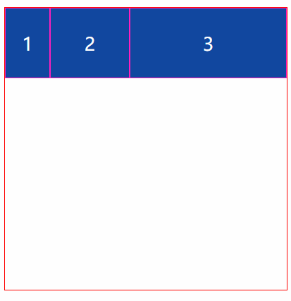
<!DOCTYPE html>

<html lang="en">

<head>

    <meta charset="UTF-8">

    <title>Title</title>

    <style>

        * {

            margin: 0;

            padding: 0;

            list-style: none;

        }

        .outer {

            width: 500px;

            height: 500px;

            border: 1px solid red;

            margin: 30px auto;

            display: flex;

            flex-wrap: wrap;

            align-content: flex-start;

        }

        .item {

            border: 1px solid #ff1bbe;

            background-color: #0D47A1;

            height: 125px;

            box-sizing: border-box;

            font-size: 32px;

            color: white;

            line-height: 125px;

            text-align: center;

        }

        .div1{width: 80px}

        .div2{flex: 1}

        .div3{flex: 2}

    </style>

</head>

<body>

    <div class="outer">

        <div class="item div1">1</div>

        <div class="item div2">2</div>

        <div class="item div3">3</div>

    </div>

</body>

</html>
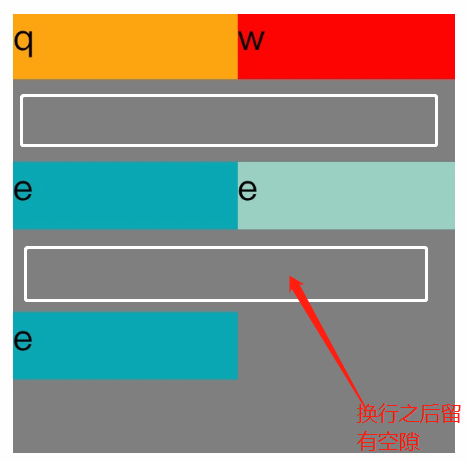
<!DOCTYPE=html>

<html lang="zh-cn">

<head>

<meta charset="UTF-8">

<title>

关于文档元素测试

</title>

<style>

#father{

    width:200px;

    display:flex;

    flex-direction:row;

    flex-wrap:wrap;

    align-content:center;

    height:200px;

    background-color:grey;

}

.son1{

    height:30px;

    width:100px;

    background-color:orange;

}

.son2{

    height:30px;

    width:100px;

    background-color:red;

}

.son3{

    height:30px;

    width:100px;

    background-color:#08a9b5;

}

.son4{

    height:30px;

    width:100px;

    background-color:#9ad1c3;

}

.son5{

    height:30px;

    width:100px;

    background-color:rgb(21,123,126);

}

</style>

</head>

<body>

<div id="father">

    <div class="son1">q</div>

    <div class="son2">w</div>

    <div class="son3">e</div>

    <div class="son4">e</div>

    <div class="son5">e</div>

</div>

</body>

</html>
flex布局换行空白间隙之align-content
参考:https://blog.csdn.net/txfyteen/article/details/82663029
CSS弹性盒布局(display:flex)的更多相关文章
- 弹性盒布局display:flex详解
一:弹性盒子 随着响应式设计的流行,网站开发者在设计网页布局时往往要考虑到页面在适配不同分辨率的浏览器时其内部组件位置大小都会产生变化,因此需要设计者根据窗口尺寸来调整布局,从而改变组件的尺寸和位置, ...
- 弹性盒模型display:flex
Flex布局意为"弹性布局",用来为盒模型提供更多灵活性.此外,Flex定义的容器可以对块级元素(display: flex;)或行内元素(display: inline-flex ...
- 弹性盒布局(flex)
一.Flex 布局是什么? Flex 是 Flexible Box 的缩写,意为"弹性布局",用来为盒状模型提供最大的灵活性. 任何一个容器都可以指定为 Flex 布局. .box ...
- CSS弹性盒布局
<html> <head> <meta charset="utf-8"/> <title></title> <st ...
- 弹性盒布局详解(display: flex;)
弹性盒布局详解 弹性盒介绍 弹性盒的CSS属性 开启弹性盒 弹性容器的CSS属性 flex-direction设置弹性元素在弹性容器中的排列方向 主轴与侧轴(副轴) flex-wrap设置弹性容器空间 ...
- css怪异盒模型和弹性盒布局(flex)详解及其案例
一.怪异盒模型 怪异盒模型的属性是box-sizing,他有两个属性值: 1.content-box 这是由 CSS2.1 规定的宽度高度行为.宽度和高度分别应用到元素的内容框.在宽度和高度之外绘制元 ...
- css笔记 - flex弹性盒布局
flex: display:-webkit-box | -moz-box;盒布局 -webkit-box-flex | -moz-box-flex;弹性盒布局 -webkit-box-ordinal- ...
- CSS弹性盒模型(flex box)
本文介绍的是 CSS3 规范中引入的新布局模型:弹性盒模型(flex box).随着响应式用户界面的流行,Web 应用一般都要求适配不同的设备尺寸和浏览器分辨率. 浏览器支持: 弹性盒布局的容器(fl ...
- 弹性盒模型,flex布局
弹性盒模型 弹性盒子是css3的一种新布局模式,由容器(父元素)和项目(子元素)组成. 弹性盒子是一种当页面需要适应不同的屏幕大小以及设备类型时确保元素拥有恰当的行为的布局方式. 引入弹性盒模型的 ...
随机推荐
- JSSDK微信支付封装的支付类方法,代码比较齐全,适合收藏
第1肯定是配置的参数类 public class JsApiConfig { #region 字段 private string mch_id = string.Empty; private stri ...
- Content of "Essential Software Test Design"
Content of "Essential Software Test Design" 2015-11-16 PART I 7 TEST DESIGN TECHNIQUES: AN ...
- 【Java】类加载过程
JVM把class文件加载到内存,并对数据进行校验.解析和初始化,最终形成JVM可以直接使用的Java类型的过程. 类加载的过程主要分为三个部分: 加载 链接 初始化 而链接又可以细分为三个小部分: ...
- sql查父节点小笔记
)) ),sortNum int) as BEGIN DECLARE @sortNum int --得到当前id的父id, select @id = ParentId, @sortNum =Sortn ...
- ftrace:跟踪你的内核函数! | Linux 中国
版权声明:本文为博主原创文章.未经博主同意不得转载. https://blog.csdn.net/F8qG7f9YD02Pe/article/details/79161135 ftrace 是一个 L ...
- MongoDB学习总结(二)
前言:学习札记! MongoDB学习总结(二) 1. 安装.初识 之前写过一篇MongoDB的快速上手文章,里边详细的讲了如何安装.启动MongoDB,这里就不再累述安装过程,简单介绍一下Mongo ...
- EasyPopup
EasyPopup PopupWindow 对 PopupWindow 的封装,使得在项目中使用起来更加简单.方便.快捷 项目特性 链式调用:除了在传统的 PopupWindow 使用方法之外还加入了 ...
- saltstack在jianja模板中,执行salt函数来获取某些变量的值,并且将配置写入到配置文件中?
问题描述: 通过saltstack的jinja模板方式,可以将变量的值写入到配置文件,即动态获取的方式.这里介绍,通过执行salt函数来获取值的方式. 演示: 1.通过在sls中,增加jinja的模板 ...
- easyui的tree节点的获取和选中
1.设置选中tree的节点 var node = $('#tt').tree('find', 1);//找到id为”tt“这个树的节点id为”1“的对象$('#tt').tree('select', ...
- 新唐MCU常用的工具软件
ICP 在电路编程 需要NULINK ISP 在系统编程,可通过串口或USB PINVIEW 可以显示管脚目前的状态.提供keil下或者单独运行两种模式.Keil下进入debug模式后,点击 ...