PoPo数据可视化周刊第3期 - 台风可视化
9月台风席卷全球,本刊特别选取台风最佳可视化案例,数据可视化应用功力最深厚者,当属纽约时报,而传播效果最佳的是The Weather Channel关于Florence的视频预报,运用了数据可视化、可视化特效以及虚拟特效制作等技术,简直是灾难大片电影预告(在本文末尾查看视频)。
See Flood Waters Rise Across the Carolinas After Hurricane Florence
Hurricane Florence brought a lot of rain, which in turn made river levels rise. The New York Times animated the rise over a five-day period. The height of the bars represents the rise of the river level, as compared to levels on Thursday.
https://www.nytimes.com/interactive/2018/09/18/us/hurricane-florence-flooding.html
Mapping Florence’s Impact:Rainfall, Power Outages, and Wind
https://www.nytimes.com/interactive/2018/09/13/us/hurricane-florence-impact-damage-map.html?utm_content=buffer5c590&utm_medium=social&utm_source=twitter.com&utm_campaign=buffer
Hurricane Florence Water Footprint Data Visualization
Watch Florence move through the Carolinas in this data visualization and see USGS streamgage measurements spike as the storm’s extreme rainfall leads to intense flooding. USGS streamgages provide critical information during storms to flood forecasters and emergency managers as they make decisions that contributes to protecting lives and property. Understanding river levels and locations of flooding can make a huge difference in these dangerous storms. The water footprint visualization shows patterns of precipitation and river discharge of 18 USGS streamgages greatly impacted by Florence. USGS photo.
https://www.usgs.gov/media/images/hurricane-florence-water-footprint-data-visualization
Steering Ships Around Hurricane Florence
The image below loops an animation of Optix.Earth’s rendition of ship traffic around the southeastern United States from Tuesday to Thursday of last week. It shows that all the ships are avoiding an area about 800 miles wide that was moving towards the North and South Carolina coast: Hurricane Florence.
http://www.ccri.com/2018/09/18/steering-ships-around-hurricane-florence/
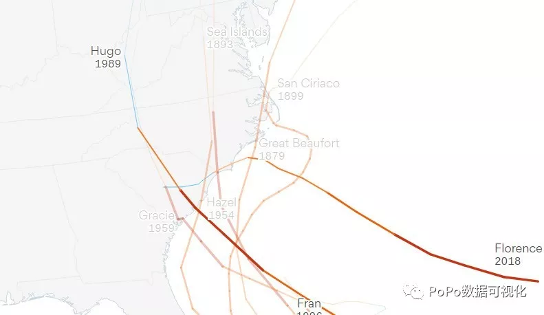
Why Florence is so unusual — and so dangerous
Hurricane Florence is a highly unusual storm, not just because of its intensity and size, but also the journey it's taking toward the Carolina coastline.
https://www.axios.com/florence-map-shows-every-major-hurricane-to-hit-carolinas-0b05a244-9ebd-44a8-aaa0-75b48580aafa.html
Flights Rome 条条道路通罗马,航线可视化
After confirming that all roads lead to Rome, we set out onto a new adventure.
https://flightstorome.moovellab.com/
What is the heartbeat of a city in motion?
What does it look and feel like? How can we strengthen it? At Lime, these questions have inspired us to create a system of shared scooters and bikes designed to move riders seamlessly across cities and communities around the world.
https://www.li.me/10-million-rides
谷歌带来GAN入门神器:浏览器上运行的可视化工具GAN Lab
http://www.sohu.com/a/253018841_129720
https://poloclub.github.io/ganlab/
佐治亚理工学院和谷歌大脑的研究者开发了 GAN 的可视化工具 GAN Lab,无需安装也无需专门硬件,通过网页浏览器(推荐 Chrome)就可以打开。用户可以利用 GAN Lab 交互地训练生成模型并可视化动态训练过程的中间结果,用动画来理解 GAN 训练过程中的每一个细节。
灯光可视化
https://jwasilgeo.github.io/esri-experiments/earth-at-night/
Jacob Wasilkowski使用ArcGIS Javascript API 和 chroma.js 颜色库 制作的类似于 地形可视化的灯光可视化效果
97种投影系的动态对比
Jacob Wasilkowski 使用D3制作的97种不同投影系的动态对比效果
http://popodv.com/dv/ef8c411537625953552.html
Just Another Day on Aerosol Earth
https://earthobservatory.nasa.gov/images/92654/just-another-day-on-aerosol-earth
Take a deep breath. Even if the air looks clear, it is nearly certain that you will inhale millions of solid particles and liquid droplets. These ubiquitous specks of matter are known as aerosols, and they can be found in the air over oceans, deserts, mountains, forests, ice, and every ecosystem in between.
World map shows aerosol billowing in the wind
https://flowingdata.com/2018/08/24/world-map-shows-aerosol-billowing-in-the-wind/
Using a mathematical model based on satellite data, NASA shows an estimate of aerosol in the atmosphere on August 23, 2018:
Bus Speed Visualization
https://ky-kimeng.netlify.com/posts/bus-speed-viz/
Within the past couple decades, many transit agencies across North America and all over the world have started to collect location records of every bus using the Automatic Vehicle Location (AVL) technology. This technology allows buses to generate their locations for as frequent as every few seconds. With this new source of data, new ways of visualizing and understanding bus speed need to be adopted.
Interactive Spatial Analysis and Visualization in the Browser
Client-side mapping and rendering of data in the browser has improved substantially over the last few years. A variety of new methods are available for geospatial analysis, geometry manipulation, and rendering large spatial datasets in the browser. In fact, using modern JavaScript packages, we rarely make any round trips to the server to perform analysis or dynamic rendering. This trend will continue as devices and browsers that leverage GPU become increasingly capable of performing advanced graphics processing. Here’s a short synopsis of some of the major browser-based tools we’ve leveraged in our projects at DVG. Best of all, they are all free.
https://www.dvginteractive.com/interactive-spatial-analysis-and-visualization-in-the-browser/
The Weather Channel 运用数据可视化与特效制作的台风预报,效果堪比灾难大片预告。(视频关注公众号浏览)
PoPo 数据可视化
www.popodv.com
聚焦于Web数据可视化与可视化交互领域,发现可视化领域有意思的内容。不想错过可视化领域的精彩内容, 就快快关注我们吧 :)
PoPo数据可视化周刊第3期 - 台风可视化的更多相关文章
- PoPo数据可视化周刊第5期
PoPo数据可视化 聚焦于Web数据可视化与可视化交互领域,发现可视化领域有意思的内容.不想错过可视化领域的精彩内容, 就快快关注我们吧 :) World Wire 数据可视化演示(视频) IBM公司 ...
- PoPo数据可视化周刊第4期
PoPo数据可视化 聚焦于Web数据可视化与可视化交互领域,发现可视化领域有意思的内容.不想错过可视化领域的精彩内容, 就快快关注我们吧 :) 微信号:popodv_com 由于国庆节的原因,累计 ...
- PoPo数据可视化周刊第6期
PoPo数据可视化 聚焦于Web数据可视化与可视化交互领域,发现可视化领域有意思的内容.不想错过可视化领域的精彩内容, 就快快关注我们吧 :) 本期可视化精彩视频请关注公众号浏览 全天智能获Pre-A ...
- PoPo数据可视化周刊第2期
羡辙在bilibili开课啦 就在这个月,不知道是不是受了 @Jannchie见齐 的影响,羡辙竟然在bilibili开授Echarts课程,目前已开课两节. [滚城一团]的 ECharts 训练营 ...
- PoPo数据可视化周刊第一期
PoPo数据可视化 聚焦于Web数据可视化领域, 发现前端可视化领域有意思的内容. 涵盖前端可视化领域最新资讯, 开源可视化库的发布更新消息, 可视化案例分析与讲解, 可视化技术文章, 可视化大神的日 ...
- 想要快速上手 Spring Boot?看这些教程就足够了!| 码云周刊第 81 期
原文:https://blog.gitee.com/2018/08/19/weekly-81/ 想要快速上手 Spring Boot?看这些教程就足够了!| 码云周刊第 81 期 码云周刊 | 201 ...
- CNN可视化技术总结(四)--可视化工具与项目
CNN可视化技术总结(一)-特征图可视化 CNN可视化技术总结(二)--卷积核可视化 CNN可视化技术总结(三)--类可视化 导言: 前面介绍了可视化的三种方法--特征图可视化,卷积核可视化,类可视化 ...
- Python 周刊第 418 期
新闻 PyCon US 2020 开始接受财务赞助! https://pycon.blogspot.com/2019/10/financial-aid-launches-for-pycon-us-20 ...
- seaborn 数据可视化(一)连续型变量可视化
一.综述 Seaborn其实是在matplotlib的基础上进行了更高级的API封装,从而使得作图更加容易,图像也更加美观,本文基于seaborn官方API还有自己的一些理解. 1.1.样式控制: ...
随机推荐
- URL的三类编码格式(JavaScript实现)
编码函数: 1.escape(): 不编码的字符有69个:* + - . / @ _ 0~9 a~z A~Z 而且escape对0~255以外的Unicode值进行 ...
- YC全球总裁:我招揽陆奇好多年,如今终于如愿了!
简评:YC 老大多年来一直在努力招揽陆奇,终于如愿了. YC 总裁 Sam Altman 在 8 月 14 日,发布了关于陆奇以及 YC 中国的公告,全文如下: 我非常荣幸地宣布,陆奇加入 YC 并且 ...
- iOS 时区获取问题
时区缩写 UTC, CST, GMT, CEST 以及转换 UTC是协调世界时(Universal Time Coordinated)英文缩写,是由国际无线电咨询委员会规定和推荐,并由国际时间局(BI ...
- HTML03--表单、input、框架、URL
接上一篇“HTML02随笔”,在这里单独说一下HTML中最重要的标签--表单<form> 1.表单form:用于收集用户输入 <form action="" me ...
- SqlServer子查询、高级
子查询:把一个结果集让别人继续分析查询的就叫子查询 子查询如果定义了别名,在查询引用时,必须使用别名 --子查询定义了别名,引用就必须用别名 select id,n from Person,(sele ...
- xilinx DMA IP核(二) —— 文档阅读
本笔记不记录DMA的Scatter/Gather特性.DMA上有三种总线:AXI4-LIte(对寄存器进行配置),AXI4-Memory Map(用于与内存交互)和AXI4 Stream(用于与外设交 ...
- C# 多线程系列之异步回调(委托)
本文参考自C#基础:线程之异步回调(委托),纯属读书笔记 在解析异步回调之前,先看同步回调的执行过程,以及代码原理. 1.线程的同步执行 同步执行:在主线程执行的时候,主线程调用一个其它方法,此时主线 ...
- 在Ubuntu16.04集群上手工部署Kubernetes
目前Kubernetes为Ubuntu提供的kube-up脚本,不支持15.10以及16.04这两个使用systemd作为init系统的版本. 这里详细介绍一下如何以非Docker方式在Ubuntu1 ...
- IDEA Maven Mybatis generator 自动生成代码
IDEA Maven Mybatis generator 自动生成代码 一.安装配置maven以及在Idea中配置maven 安装过程步骤可以看上面的博文,里面介绍得很详细. 二.建数据表 DROP ...
- 创建第一个WCF服务
创建WCF服务 1. 新建立空白解决方案,并在解决方案中新建项目,项目类型为:WCF服务应用程序. 2.建立完成后如下图所示: 3.删除系统生成的两个文件IService1.cs与Service1.s ...