JCombobox组合框效果实现(转)
JCombobox是Swing中比较常用的控件,它显示一个项列表,扩展的是ListModel接口的模型,它的显示绘制器通过实现ListCellBenderer接口来绘制列表单元,下面介绍 ①普通应用例子;②显示图片选项框例子;③修改下拉按钮的例子;④下拉框可选与否的例子.
①
对于普通情况下使用JCombobox,没有什么注意事项,只需要把JCombobox new出来,设置它的Model的值就可以了.
先看Sun给的官方的例子:
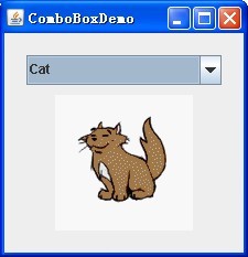
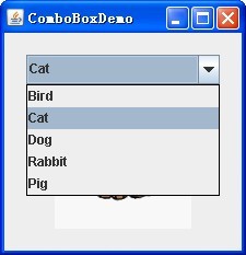
具体的实现很简单:
String[] petStrings = { "Bird", "Cat", "Dog", "Rabbit", "Pig" };
//Create the combo box, select the item at index 4.
JComboBox petList = new JComboBox(petStrings);
petList.setSelectedIndex(4);
petList.addActionListener(this);
也可以通过petList.setEditable(true);设置是否可以编辑.对于Action的处理和普通的一样.
②
JCombobox默认下拉显示和显示项是文本,为了显示其它内容比如图片或者更复杂的东西,则需要设置新的Renderer,JCombobox的Renderer需要实现ListCellRenderer接口.
这个也比较简单,Sun官方也给了例子:
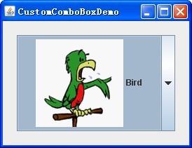
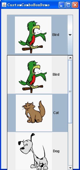
具体的实现其实和普通的一样,先把JCombobox new出来,在使用setRenderer方法设置自己定义的Renderer就可以了.
// Create the combo box.
JComboBox petList = new JComboBox(intArray);
ComboBoxRenderer renderer = new ComboBoxRenderer();
renderer.setPreferredSize(new Dimension(200, 130));
petList.setRenderer(renderer);
当然这个Renderer是实现了ListCellRenderer接口的.
privateclass ComboBoxRenderer extends JLabel implements ListCellRenderer {
这样要是实现接口的方法:
/*
* This method finds the image and text corresponding to the selected
* value and returns the label, set up to display the text and image.
*/
@Override
public Component getListCellRendererComponent(JList list, Object value, int index, booleanisSelected, boolean cellHasFocus) {
然后然后this就是继承的JLabel了,对它可以设置属性了:
setIcon(icon);
setText(pet);
最后把设置好的控件返回就可以了,
returnthis;
当然你也可以设置更复杂的控件,比如继承JButton可以设置成按钮的样式.
③
Swing的MVC模式非常的好,当你需要更改控件的显示的时候只需要继承控件的基本UI,重写你需要重写的部位就可以了,这儿想下拉框的按钮不显示向下的箭头,只需要继承BasicComboBoxUI,重写createArrowButton方法就可以了.
重写UI
privatestaticclass MyComboBoxUI extends BasicComboBoxUI {
publicstatic ComponentUI createUI(JComponent c) {
returnnew MyComboBoxUI();
}
@Override
protected JButton createArrowButton() {
JButton button = new BasicArrowButton(BasicArrowButton.EAST);
return button;
}
}
当你需要修改JCombobox的UI的时候,只需要调用setUI方法就可以了.
JComboBox comboBox = new JComboBox(labels);
comboBox.setUI((ComboBoxUI) MyComboBoxUI.createUI(comboBox));
④
对于修改JCombobox的显示可以从两个方向考虑,一个是修改MetalComboBoxUI,一个是继承ListCellRenderer.在通过设置UI和Renderer使界面修改.
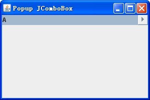
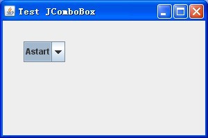
先看完成后的界面:

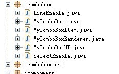
工程的目录结构如下:
先设置JCombobox下拉框是否有线,为了使以后扩展容易,设置为接口:
/**
*theinterfacethattheJComboBoxcanhavelineenable.
*/
publicinterface LineEnable {
/**
*setbean.
*@paramisLineEnable
* isLineenable
*/
publicvoid setLineEnabled(boolean isLineEnable);
/**
*getbean.
*@returnisLineenable
*/
publicboolean isLineEnabled();
}
同样的对于JCombobox下拉框是否可以选择也设置为接口:
/**
*theinterfacethattheJComboBoxcanselectenable.
*/
publicinterface SelectEnable {
/**
*setbean.
*@paramisSelectEnable
* isSelectenable
*/
publicvoid setSelectEnabled(boolean isSelectEnable);
/**
*getbean.
*@returnisSelectenable
*/
publicboolean isSelectEnabled();
}
当然需要别的属性,比如颜色、形状等也可以再设置相同的接口.
对于JCombobox的没一个Item,都可以通过实现这些接口获得相应的显示:
/**
*theitemsthatyouwanttoshowinJComboBox.
*/
publicclass MyComboBoxItem implements SelectEnable, LineEnable {
对于特殊的JCombobox设置Item时,设置MyComboBoxItem就可以使Item具有选择可否和是否是线的样式.
它具有3个属性:
/**
*JComboBoxitems.
*/
private Object comboxItem = null;
/**
*isselectenabled.
*/
booleanisSelectEnabled = true;
/**
*islineenabled.
*/
booleanisLineEnabled = false;
可以通过设置它们得到JCombobox样式,这个类就是一个简单的Java Bean.
然后就是设置JCombobox的选项的显示,实现ListCellRenderer接口,通过对组件的重写设置描绘它的新属性:
/**
*JComboBoxcellrenderer.
*/
publicclass MyComboBoxRenderer extends JLabel implements ListCellRenderer, ActionListener {
重写它的方法:
/**
*Returnacomponentthathasbeenconfiguredtodisplaythespecified
*value.
*/
@Override
public Component getListCellRendererComponent(JList list, Object value, int index, booleanisSelected, boolean cellHasFocus) {
先设置它的显示
String item = (value == null) ? "" : value.toString();
再设置是否是线:
if (((LineEnable) value).isLineEnabled()) {
returnnew JSeparator(JSeparator.HORIZONTAL);
}
接着设置tooltip,提示是否可以显示:
if (-1 < index) {
if (((SelectEnable) value).isSelectEnabled()) {
list.setToolTipText("You select is : " + item);
} else {
list.setToolTipText("You cn't select : " + item
+ ", It select unEnable.");
}
}
最后设置是否可以显示:
if (!((SelectEnable) value).isSelectEnabled()) {
setBackground(list.getBackground()); setForeground(UIManager.getColor("Label.disabledForeground"));
}
然后还是需要设置某些选择不可选时候的设置不可选:
/**
*Thelistenerinterfaceforreceivingactionevents.
*/
publicvoid actionPerformed(ActionEvent e) {
Object tempItem = combox.getSelectedItem();
当是线的Item不可选,返回之前选项
if (((LineEnable) tempItem).isLineEnabled()) {
combox.setSelectedItem(currentItem);
} else {
currentItem = tempItem;
}
当是不可选的Item不可选,返回之前选项
if (!((SelectEnable) tempItem).isSelectEnabled()) {
combox.setSelectedItem(currentItem);
} else {
currentItem = tempItem;
}
}
接下来的类就是设置JCombobox的UI了,
/**
*MetalUIforJComboBox.
*/
publicclass MyComboBoxUI extends MetalComboBoxUI {
这里的UI设置主要是设置选择不可选的项时清除,并对JCombobox的下拉的菜单设置
/**
*showthepopupmenusize.
*/
@Override
publicvoid show() {
Dimension popupSize = ((MyComboBox) comboBox).getPopupSize();
// reset size.
popupSize.setSize(popupSize.width, getPopupHeightForRowCount(comboBox.getMaximumRowCount()));
Rectangle popupBounds = computePopupBounds(0, comboBox
.getBounds().height, popupSize.width, popupSize.height);
// set max and mini size.
scroller.setMaximumSize(popupBounds.getSize());
scroller.setPreferredSize(popupBounds.getSize());
scroller.setMinimumSize(popupBounds.getSize());
// Invalidates the container.
list.invalidate();
// set select.
int selectedIndex = comboBox.getSelectedIndex();
if (selectedIndex == -1) {
list.clearSelection();
} else {
list.setSelectedIndex(selectedIndex);
}
list.ensureIndexIsVisible(list.getSelectedIndex());
setLightWeightPopupEnabled(comboBox.isLightWeightPopupEnabled());
// show it.
show(comboBox, popupBounds.x, popupBounds.y);
}
然后在UI的new BasicComboPopup(comboBox) {
popup.getAccessibleContext().setAccessibleParent(comboBox);
就可以了.
最后的类就是自己的MyComboBox了,这个类其实也可以不要,只需要你在新建自己特殊的JCombobox时,不要忘记设置UI和传入的Item是MyComboBoxItem就可以了,这里为了方便自己实现了,以后使用时只需要New MyComboBox就可以了.
/**
*theJComboBoxthatithavesomeownmethod.
*/
publicclass MyComboBox extends JComboBox {
在构造函数里设置UI:
setUI(new MyComboBoxUI());
另外为了显示宽度合适,它提供了设置popupWidth的方法:
public Dimension getPopupSize() {
Dimension size = getSize();
// reset size.
if (popupWidth < 1) {
popupWidth = size.width;
}
returnnew Dimension(popupWidth, size.height);
}
这样一个属于自己的JComboBox就设置完成了,使用方法如下:
MyComboBoxItem [] items = { new MyComboBoxItem("Astart"),
new MyComboBoxItem("BGold", true, true),
new MyComboBoxItem("ilove", false),
new MyComboBoxItem("fire your game", true),
new MyComboBoxItem("", true, true),
new MyComboBoxItem("NIHA", false),
new MyComboBoxItem("生活"),
new MyComboBoxItem("", false, true) };
JComboBox jComboBox = new MyComboBox(items);
jComboBox.setRenderer(new MyComboBoxRenderer(jComboBox));
以后就可以当做一个普通的Java控件使用了
http://www.blogjava.net/zeyuphoenix/archive/2010/04/12/318014.html
JCombobox组合框效果实现(转)的更多相关文章
- java界面编程(8) ------ 组合框(下拉列表)
本文是自己学习所做笔记,欢迎转载,但请注明出处:http://blog.csdn.net/jesson20121020 与一组单选button的功能类似,组合框(下拉列表)也是强制用户从一组可能的元素 ...
- MFC编程入门之二十五(常用控件:组合框控件ComboBox)
上一节讲了列表框控件ListBox的使用,本节主要讲解组合框控件Combo Box.组合框同样相当常见,例如,在Windows系统的控制面板上设置语言或位置时,有很多选项,用来进行选择的控件就是组合框 ...
- MagicSuggest – Bootstrap 主题的多选组合框
MagicSuggest 是专为 Bootstrap 主题开发的多选组合框.它支持自定义呈现,数据通过 Ajax 异步获取,使用组件自动过滤.它允许空间免费项目,也有动态加载固定的建议. 您可能感兴趣 ...
- Qt Style Sheet实践(二):组合框QComboBox的定制
导读 组合框是一个重要且应用广泛的组件,一般由两个子组件组成:文本下拉单部分和按钮部分.在许多既需要用户选择.又需要用户手动输入的应用场景下,组合框能够很好的满足我们的需求.如我们经常使用的聊天软件Q ...
- 【转】VS2010/MFC编程入门之二十五(常用控件:组合框控件Combo Box)
原文网址:http://www.jizhuomi.com/software/189.html 上一节鸡啄米讲了列表框控件ListBox的使用,本节主要讲解组合框控件Combo Box.组合框同样相当常 ...
- 积累的VC编程小技巧之组合框
1.如何正确的得到ComBox的指针 CComboBox *mComb = (CComboBox*)GetDlgItem(IDC_DuanCB); CComboBox *mComb = (CCombo ...
- Java知多少(88)列表和组合框
列表和组合框是又一类供用户选择的界面组件,用于在一组选择项目选择,组合框还可以输入新的选择. 列表 列表(JList)在界面中表现为列表框,是JList类或它的子类的对象.程序可以在列表框中加入多个文 ...
- Java知多少(89)列表和组合框
有两种类型的菜单:下拉式菜单和弹出式菜单.本章只讨论下拉式菜单编程方法.菜单与JComboBox和JCheckBox不同,它们在界面中是一直可见的.菜单与JComboBox的相同之处是每次只可选择一个 ...
- VS2010/MFC编程入门之二十五(常用控件:组合框控件Combo Box)
上一节鸡啄米讲了列表框控件ListBox的使用,本节主要讲解组合框控件Combo Box.组合框同样相当常见,例如,在Windows系统的控制面板上设置语言或位置时,有很多选项,用来进行选择的控件就是 ...
随机推荐
- chmod u+s(转)
参看了 http://hi.baidu.com/hehongrong/item/b64a6d6b094cf634ac3e8382 里面说 -s :在文件执行时把进程的属主或组ID置为该文件的文件属主. ...
- Java提高篇(三二)-----List总结
前面LZ已经充分介绍了有关于List接口的大部分知识,如ArrayList.LinkedList.Vector.Stack,通过这几个知识点能够对List接口有了比較深的了解了.仅仅有通过归纳总结的知 ...
- 【C#遗补】获取应用程序路径之System.IO.Directory.GetCurrentDirectory和System.Windows.Forms.Application.StartupPath的区别
原文:[C#遗补]获取应用程序路径之System.IO.Directory.GetCurrentDirectory和System.Windows.Forms.Application.StartupPa ...
- C++ Preprosessor import
#import Attributes Provides links to attributes used with the #import directive. Microsoft Specific ...
- poj3237(树链剖分)
题目链接:http://poj.org/problem?id=3237 题目大意:指定一颗树上有3个操作: 1)询问操作,询问a点和b点之间的路径上最长的那条边的长度(即最大值): 2)取反操作,将a ...
- SWT的GridLayout一些参数解释
1. GridLayout类的说明GridLayout在包org.eclipse.swt.layout中,各参数意义如下:1. numColumns指定布局器中的列数2. horizontalSpac ...
- zTree实现地市县三级级联Service接口測试
zTree实现地市县三级级联Service接口測试 ProvinceServiceTest.java: /** * @Title:ProvinceServiceTest.java * @Package ...
- Java虚拟机几个命令行参数说明
一.运行class文件 执行带main方法的class文件,Java虚拟机命令参数行为: java <CLASS文件名> 注意:CLASS文件名不要带文件后缀.class 例如: java ...
- Java整型数组的最大长度到底有多长?
Java整型数组的最大长度到底有多长? 今天上网查了一下,各种说法都有,这个问题似乎总困扰我们Java初学者,无奈,只好自己试了一下,以下是我的测试代码,如果有错误,还望不吝赐教! 使用eclipse ...
- MD5加密,解密
using System; using System.Collections.Generic; using System.Text; using System.Globalization; using ...