css 导航菜单+下拉菜单
一、导航菜单
1.横向导航
代码如下:
<!doctype html>

<html>

<head>

    <meta charset="utf-8"/>

    <title>横向导航菜单</title>

    <style>

        body{

            margin:0;

        }

        ul{

            list-style-type:none;

            background-color: #f3f3f3;

            position: fixed;

            overflow:hidden;

            margin:0;

            padding:0;

            width:100%;

            position:fixed;

            border-bottom:1px solid #e7e7e7;

        }

        ul li{

            float:left;

            text-align: center;

        }

        ul li a{

            color:#666;

            text-decoration:none;

            padding:8px 16px;

            display:block;

            width:60px;

        }

        ul li a:hover{

            background-color:#ddd;

        }

        ul li:last-child{

            float:right;

            border-right:none;

        }

        li:last-child {

            border-bottom: none;

        }

        .active {

            background-color: #4CAF50;

            color: white;

        }

    </style>

    <link rel="stylesheet" type="text/css" href="demo02.css"/>

</head>

<body>

    <ul>

        <li><a href="#" class="active">首页</a></li>

        <li><a href="#">新闻</a></li>

        <li><a href="#">联系</a></li>

        <li style="f"><a href="#">关于</a></li>

    </ul>

    <div style="padding:20px;background-color:#1abc9c;height:1500px;">

        <h1>Fixed Top Navigation Bar</h1>

        <h2>Scroll this page to see the effect</h2>

        <h2>The navigation bar will stay at the top of the page while scrolling</h2>

        <p>Some text some text some text some text..</p>

        <p>Some text some text some text some text..</p>

        <p>Some text some text some text some text..</p>

        <p>Some text some text some text some text..</p>

        <p>Some text some text some text some text..</p>

        <p>Some text some text some text some text..</p>

        <p>Some text some text some text some text..</p>

        <p>Some text some text some text some text..</p>

        <p>Some text some text some text some text..</p>

        <p>Some text some text some text some text..</p>

        <p>Some text some text some text some text..</p>

        <p>Some text some text some text some text..</p>

        <p>Some text some text some text some text..</p>

        <p>Some text some text some text some text..</p>

        <p>Some text some text some text some text..</p>

        <p>Some text some text some text some text..</p>

        <p>Some text some text some text some text..</p>

        <p>Some text some text some text some text..</p>

        <p>Some text some text some text some text..</p>

        <p>Some text some text some text some text..</p>

    </div>

</body>

</html>
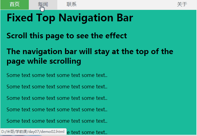
效果图:
2.竖向导航
代码如下:
<!doctype html>
<html>
<head>
<meta charset="utf-8"/>
<title></title>
<style>
body{
margin:0;
}
ul{
list-style-type:none;
background-color: #f1f1f1;
width: 25%;
height: 100%;
position: fixed;
overflow: auto;
margin:0;
padding:0;
}
ul li{
text-align: center;
}
ul li a{
color:#000;
text-decoration:none;
padding:8px 16px;
display:block;
}
li:last-child {
border-bottom: none;
}
.active {
background-color: #4CAF50;
color: white;
}
div{
margin-left:25%;
padding:1px 16px;
height:1000px;
}
</style>
</head>
<body>
<ul>
<li><a href="#" class="active">首页</a></li>
<li><a href="#">新闻</a></li>
<li><a href="#">联系</a></li>
<li><a href="#">关于</a></li>
</ul>
<div>
<h2>Fixed Full-height Side Nav</h2>
<h3>Try to scroll this area, and see how the sidenav sticks to the page</h3>
<p>Notice that this div element has a left margin of 25%. This is because the side navigation is set to 25% width. If you remove the margin, the sidenav will overlay/sit on top of this div.</p>
<p>Also notice that we have set overflow:auto to sidenav. This will add a scrollbar when the sidenav is too long (for example if it has over 50 links inside of it).</p>
<p>Some text..</p>
<p>Some text..</p>
<p>Some text..</p>
<p>Some text..</p>
<p>Some text..</p>
<p>Some text..</p>
<p>Some text..</p>
</div>
</body>
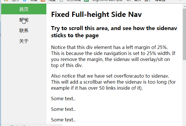
</html>效果图:
二、下拉菜单
- display:none和display:block切换实现
代码如下:
<!doctype html>

<html>

<head>

    <meta charset="utf-8"/>

    <title></title>

    <style>

        body{

            margin:0;

            text-align:center;

        }

        .dropdown{

            background-color:green;

            text-align:center;

            padding:20px;

            display:inline-block;

            cursor:pointer;

            position:relative;

        }

        .di{

            display:none;

            position:absolute;

            top:61px;

            left:0;

        }

        .di ul{

            list-style:none;

            padding:0;

            margin:0;

            background-color: #f9f9f9;

        }

        .di ul li{

            min-width:104px;

            padding:10px 15px;

        }

        .dropdown:hover{

            background-color:#3e8e41

        }

        .dropdown:hover .di{

            display:block;

        }

        .di ul li:hover{

            background-color: #f1f1f1

        }

    </style>

</head>

<body>

    <div class="dropdown">

        <span>

            下拉菜单

        </span>

        <div class="di">

            <ul>

                <li>你好!</li>

                <li>我好!</li>

                <li>大家好!</li>

            </ul>

        </div>

    </div>

</body>

</html>
效果图:

持续更新,欢迎各位指教!
css 导航菜单+下拉菜单的更多相关文章
- 4 CSS导航栏&下拉菜单&属性选择器&属性和值选择器
CSS导航栏 熟练使用导航栏,对于任何网站都非常重要 使用CSS你可以转换成好看的导航栏而不是枯燥的HTML菜单 垂直导航栏: <!DOCTYPE html> <html> & ...
- Bootstrap框架(基础篇)之按钮,网格,导航栏,下拉菜单
一,按钮 注意:虽然在Bootstrap框架中使用任何标签元素都可以实现按钮风格,但个人并不建议这样使用,为了避免浏览器兼容性问题,个人强烈建议使用button或a标签来制作按钮. 框架中提供了基础按 ...
- 织梦DedeCMS v5.7 实现导航条下拉菜单
首先将下面这段代码贴到templets\default\footer.htm文件里(只要在此文件里就行,位置无所谓) <</span>script type='text/javasc ...
- 经典的 div + css 鼠标 hover 下拉菜单
经典的 div + css 鼠标 hover 下拉菜单 效果图: 源码: <html> <head> <meta charset="utf-8"> ...
- Bootstrap历练实例:导航内下拉菜单的用法
<!DOCTYPE html><html><head><meta http-equiv="Content-Type" content=&q ...
- CSS3——对齐 组合选择符 伪类 伪元素 导航栏 下拉菜单
水平&垂直对齐 元素居中对齐 .center { margin: auto; width: 50%; border: 3px solid green; padding: 10px; } 文本 ...
- 更改SharePoint 2010 顶部导航为下拉菜单样式
更改SharePoint 2010 顶部导航为下拉菜单样式 最后的效果图: 假如一个网站集顶级站点下面有子网站:sub site1,该子站点下面又有两个子站点:sub site1_1,sub si ...
- Css之导航栏下拉菜单
Css: /*下拉菜单学习-2017.12.17 20:17 added by ldb*/ ul{ list-style-type:none; margin:; padding:; overflow: ...
- CSS写动态下拉菜单 -----2017-03-27
动态网站第一步:动态下拉菜单 关键点: overflow:hidden max-height xx:hover {} 设置当鼠标移上之后的效果 transition: 设置过度时间 cursor: ...
随机推荐
- python global和nonlocal的使用
◆global和nonlocal是Python的两个重要变量作用域关键字 1.global用在全局变量,应用场景: 变量定义在函数外部的时候,如果函数里面想改变这个全局变量的值,需要在当前的引用函数里 ...
- myeclipse2017使用总结
1.之前的myeclipse 2010项目导入后,需要配置项目发布内容,否则class.lib.web.xml等文件不会自动发布到tomcat中:
- 117、TensorFlow变量共享
# sharing variables # Tensorflow supports two ways of sharing variables # 1.Explicitly passing tf.Va ...
- cnn模型
https://blog.csdn.net/qq_26591517/article/details/79805884
- win10右键在此处打开CMD
1.在网上找了好多发现都不能运行,最后找到一个靠谱的记下来,方便以后使用. 2.新建一个 .reg格式的脚本 Windows Registry Editor Version 5.00 [HKEY_CL ...
- 第一次刷Leetcode,为什么耗费很多时间
Leetcode第2题思考过程分析:耗费的时间与思考过程 1. 审题耗费了很长时间,英文看不懂.两个单链表代表了两个整数,整数逆序,(2 -> 4 -> 3) + (5 -> 6 - ...
- C++内存修改器开源代码
我们玩单机游戏时,游戏难度可能过大, 或者游戏已经比较熟练,想要增加游戏的玩法,这时候可以使用修改器. 内存式游戏修改器主要对游戏内存修改 修改时有两种方式,一是定时对内存数值进行修改.实现类似锁定的 ...
- MySQL开启SSL认证,以及简单优化
1.1 MySQL开启SSL认证 #生成一个 CA 私钥 [root@db01 ssl]# openssl genrsa 2048 > ca-key.pem Generating RSA pri ...
- Java解释器模式`
解释器模式提供了一种评估计算语言语法或表达式的方法. 这种类型的模式属于行为模式. 这种模式涉及实现一个表达式接口,它告诉解释一个指定的上下文. 此模式用于SQL解析,符号处理引擎等. 实现示例 我们 ...
- 推荐系统之隐语义模型LFM
LFM(latent factor model)隐语义模型,这也是在推荐系统中应用相当普遍的一种模型.那这种模型跟ItemCF或UserCF的不同在于: 对于UserCF,我们可以先计算和目标用户兴趣 ...