CSS3实现魔方动画
本文将借助css3实现魔方动画效果,设计思路如下:
- HTML方面采用六个div容器形成六个立方面;
- CSS方面采用transform-style: preserve-3d;形成三维场景;transform: rotateX(-90deg) translateZ(150px);实现立方面旋转组成立方体;animation: rotate 10s linear infinite alternate;动画效果添加;
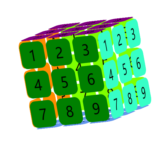
效果图:
HTML内容:
  <div class="box">

             <div class="before">

                 <ul>

                     <li>1</li>

                     <li>2</li>

                     <li>3</li>

                     <li>4</li>

                     <li>5</li>

                     <li>6</li>

                     <li>7</li>

                     <li>8</li>

                     <li>9</li>

                 </ul>

             </div>

             <div class="back"></div>

 </div>
设置before、back等六面分别作为立面的前后左右上下各面;
CSS核心:
 @keyframes rotate {

             0% {

                 transform: rotateY(0deg) rotateX(0deg) rotateZ(0deg);

             }

             20% {

                 transform: rotateY(30deg) rotateX(40deg) rotateZ(20deg);

             }

             40% {

                 transform: rotateY(-60deg) rotateX(-40deg) rotateZ(-20deg);

             }

             60% {

                 transform: rotateY(145deg) rotateX(80deg) rotateZ(10deg);

             }

             80% {

                 transform: rotateY(90deg) rotateX(60deg) rotateZ(-20deg);

             }

             100% {

                 transform: rotateY(135deg) rotateX(-45deg) rotateZ(30deg);

             }

         }

 .top {

               background-color: transparent;

               transform: rotateX(90deg) translateZ(150px);

          }

 .box {

               width: 300px;

               height: 300px;

               margin: 150px auto;

               position: relative;

               font-size: 50px;

               /*perspective: 1000px;*/

               transform-style: preserve-3d;

               animation: rotate 10s linear infinite alternate;

          }
- 动画rotate设置不同时间段的立方体旋转角度;
- box容器指定了三维场景以及动画效果;
- top 则将平面旋转(rotateX)、设置距离屏幕距离(translateZ);
如何理解3D场景下perspective与translateZ的关系?
translateZ() CSS函数沿着z轴在三维空间中重新定位元素,即,从观察者的角度而言更近或者更远。这个变换是由一个<length>元素定义的,它指定元素向内或向外移动的距离。
perspective CSS属性决定在z = 0平面和用户之间的距离以便使所述3D定位的元素一些透视效果。z> 0的每个3D元素变大;,每个z <0的三维元素则变小。效果的强度由此属性的值决定。
说明:
- d代表perspective设置的用户目视距屏幕的距离;
- z代表translateZ设置的元素移动距离;

源码来了:
 <!DOCTYPE html>

 <html>

 <head lang="en">

     <meta charset="UTF-8">

     <title></title>

     <style>

          ul {

              list-style: none;

              margin:0;

              padding:0;

          }

          .box {

               width: 300px;

               height: 300px;

               margin: 150px auto;

               position: relative;

               font-size: 50px;

               /*perspective: 1000px;*/

               transform-style: preserve-3d;

               animation: rotate 10s linear infinite alternate;

          }

          .box>div {

               width: 300px;

               height: 300px;

               position: absolute;

          }

          .right {

              background-color: transparent;

              transform: rotateY(90deg) translateZ(150px);

          }

          .left {

              background-color: transparent;

              transform: rotateY(-90deg) translateZ(150px);

          }

          .top {

               background-color: transparent;

               transform: rotateX(90deg) translateZ(150px);

          }

         .bottom {

              background-color: transparent;

              transform: rotateX(-90deg) translateZ(150px);

         }

         .before {

              background-color: transparent;

              transform: translateZ(150px);

         }

         .back {

              background-color: transparent;

              transform: translateZ(-150px);

         }

         li {

              float: left;

              width: 90px;

              height: 90px;

              border-radius: 20px;

              margin: 5px;

              text-align: center;

              line-height: 90px;

         }

         .before li {

             background-color: green;

         }

          .back li {

              background-color:chartreuse;

          }

          .top li {

               background-color: purple;

          }

          .bottom li {

               background-color: cornflowerblue;

          }

          .left li {

               background-color: darkorange;

          }

          .right li {

               background-color: #37ffc7;

          }

         .box:hover {

              animation-play-state: paused;

         }

         @keyframes rotate {

             0% {

                 transform: rotateY(0deg) rotateX(0deg) rotateZ(0deg);

             }

             20% {

                 transform: rotateY(30deg) rotateX(40deg) rotateZ(20deg);

             }

             40% {

                 transform: rotateY(-60deg) rotateX(-40deg) rotateZ(-20deg);

             }

             60% {

                 transform: rotateY(145deg) rotateX(80deg) rotateZ(10deg);

             }

             80% {

                 transform: rotateY(90deg) rotateX(60deg) rotateZ(-20deg);

             }

             100% {

                 transform: rotateY(135deg) rotateX(-45deg) rotateZ(30deg);

             }

         }

     </style>

 </head>

 <body>

         <div class="box">

             <div class="before">

                 <ul>

                     <li>1</li>

                     <li>2</li>

                     <li>3</li>

                     <li>4</li>

                     <li>5</li>

                     <li>6</li>

                     <li>7</li>

                     <li>8</li>

                     <li>9</li>

                 </ul>

             </div>

             <div class="back">

                 <ul>

                     <li>1</li>

                     <li>2</li>

                     <li>3</li>

                     <li>4</li>

                     <li>5</li>

                     <li>6</li>

                     <li>7</li>

                     <li>8</li>

                     <li>9</li>

                 </ul>

             </div>

             <div class="top">

                 <ul>

                     <li>1</li>

                     <li>2</li>

                     <li>3</li>

                     <li>4</li>

                     <li>5</li>

                     <li>6</li>

                     <li>7</li>

                     <li>8</li>

                     <li>9</li>

                 </ul>

             </div>

             <div class="bottom">

                 <ul>

                     <li>1</li>

                     <li>2</li>

                     <li>3</li>

                     <li>4</li>

                     <li>5</li>

                     <li>6</li>

                     <li>7</li>

                     <li>8</li>

                     <li>9</li>

                 </ul>

             </div>

             <div class="left">

                 <ul>

                     <li>1</li>

                     <li>2</li>

                     <li>3</li>

                     <li>4</li>

                     <li>5</li>

                     <li>6</li>

                     <li>7</li>

                     <li>8</li>

                     <li>9</li>

                 </ul>

             </div>

             <div class="right">

                 <ul>

                     <li>1</li>

                     <li>2</li>

                     <li>3</li>

                     <li>4</li>

                     <li>5</li>

                     <li>6</li>

                     <li>7</li>

                     <li>8</li>

                     <li>9</li>

                 </ul>

             </div>

         </div>

 </body>

 </html>
CSS3实现魔方动画的更多相关文章
- css3之3D魔方动画(小白版)
在这里分享一下3D魔方动画,html5+CSS3即可完成~无图无真相,先上效果图 第一步非常简单,就是先将魔方的结构画出来.大家都玩过魔方,知道魔方是一个有六个面的正方体.这里我们先写一个大的di ...
- CSS3 制作魔方 - 玩转魔方
在上一篇<CSS3 制作魔方 - 形成魔方>中介绍了一个完整魔方的绘制实现,本文将介绍魔方的玩转,支持上下左右每一层独立地旋转.先来一睹玩转的风采. 1.一个问题 由于魔方格的位置与转动的 ...
- css3制作旋转动画
现在的css3真是强大,之前很多动画都是用jq来实现,但是css3制作的动画要比jq实现起来简单很多,今天呢,我自己也写了一个css旋转动画和大家分享.效果如下面的图片 思路:1.制作之前呢,我们先来 ...
- CSS3中的动画效果记录
今天要记录的是CSS3中的三种属性transform.transition以及animation,这三个属性大大提升了css处理动画的能力. 一.Transform 变形 CSS中transform ...
- CSS3的自定义动画帧
CSS3新增的动画帧非常绚丽,可以简单实现一些动画效果,目前除IE外各大主流浏览器都支持 本文演示三个:transform: scale3d(x, y, z)-缩放;.transform: trans ...
- CSS3中的动画功能(一)
css3中的动画功能分为transitions功能和animations功能,这两种功能都可以通过改变css属性值来产生动画效果.今天带大家一起来看看css3动画功能中的transitions的用法. ...
- 3D Grid Effect – 使用 CSS3 制作网格动画效果
今天我们想与大家分享一个小的动画概念.这个梦幻般的效果是在马库斯·埃克特的原型应用程序里发现的.实现的基本思路是对网格项目进行 3D 旋转,扩展成全屏,并呈现内容.我们试图模仿应用程序的行为,因此 ...
- 25个CSS3 渐变和动画效果教程
随着最新版CSS3渐变和动画功能发布,Web开发者在开发的过程中有了更多的选择.实际上,已经有了一些替代的技术,目的都是使网站的建设变得简易,高效和快速.不过CSS3所提供的渐变功能有着显著的优点,特 ...
- 纯css3实现的动画加载条
之前大大家分享了很多款加载条.今天给大家带来一款纯css3实现的动画加载条. 这款加载条适用浏览器:360.FireFox.Chrome.Safari.Opera.傲游.搜狗.世界之窗. 不支持IE8 ...
随机推荐
- 神舟战神笔记本使用U盘重装系统
今天我的神舟战神笔记本电脑系统故障了,在这里记录一下使用U盘重装系统的方法: 1.插入装机U盘. 2.按开机键,然后马上按Esc键. 3.选择Boot Manager进入. 4.选择EFI USB D ...
- Elasticsearch集群知识笔记
Elasticsearch集群知识笔记 Elasticsearch内部提供了一个rest接口用于查看集群内部的健康状况: curl -XGET http://localhost:9200/_clust ...
- 四种常见的APP分类界面布局设计案例学习
相信各位对于APP设计,已经很熟练啦.如何在熟练的基础上提高我们界面的优美度,或者是进行APP界面的迭代设计. 重构APP设计布局是我们必须要经历的一个过程. 在之前,学习UI设计的时候,经常要接触到 ...
- ServletContext总结(转)
今天我们学习的是ServletContext的应用. WEB容器在启动时,它会为每个WEB应用程序都创建一个对应的ServletContext对象,它代表当前web应用. ServletConfig对 ...
- 计数器IP核
Quartus II提供的LPM_couter IP核的使用 FPGA设计方式: 原理图,Verilog HDL设计方式,IP核输入方式 创建IP核 点击TOOLS—IP catalog-libray ...
- CSP2019第一轮游记
Day -1 发现还有\(2\)天就初赛了\((?)\) 赶紧复习\(ing\) 然后基础知识基本上都不知道 后面的大题--全靠蒙 感觉第一轮就要\(\mathrm{AFO}\)啊\(QwQ\) Da ...
- java测试框架详细说明-mvn+testng+allure
java测试框架 mvn+testng+allure 1.mvn代码目录结构 2.testng框架 2.1 testng.xml配置 2.2 注解 3.allure插件,方便报告阅览 4.配置文件.p ...
- IDEA配置pom.xml
<project xmlns="http://maven.apache.org/POM/4.0.0" xmlns:xsi="http://www.w3.org/20 ...
- docker删除镜像时报错解决办法
报错信息 [root@kvm ~]# docker rmi 4950a54ede5a Error response from daemon: conflict: unable to delete 49 ...
- 对C#面向对象三大特性的一点总结
一.三大特性 封装: 把客观事物封装成类,并把类内部的实现隐藏,以保证数据的完整性 继承:通过继承可以复用父类的代码 多态:允许将子对象赋值给父对象的一种能力 二.[封装]特性 把类内部的数据隐藏,不 ...