纯CSS打造萌萌哒大白
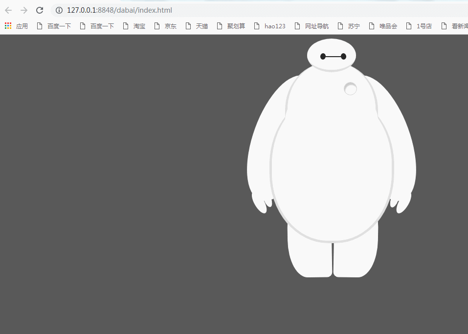
HTML部分:
<body>

        <div id="baymax">

        <!-- 定义头部,包括两个眼睛、嘴 -->

        <div id="head">

            <div id="eye"></div>

            <div id="eye2"></div>

            <div id="mouth"></div>

        </div>

        <!-- 定义躯干,包括心脏 -->

        <div id="torso">

            <div id="heart"></div>

        </div>

        <!-- 定义肚子腹部,包括 cover(和躯干的连接处) -->

        <div id="belly">

            <div id="cover"></div>

        </div>

        <!-- 定义左臂,包括一大一小两个手指 -->

        <div id="left-arm">

            <div id="l-bigfinger"></div>

            <div id="l-smallfinger"></div>

        </div>

        <!-- 定义右臂,同样包括一大一小两个手指 -->

        <div id="right-arm">

            <div id="r-bigfinger"></div>

            <div id="r-smallfinger"></div>

        </div>

        <!-- 定义左腿 -->

        <div id="left-leg"></div>

        <!-- 定义右腿 -->

        <div id="right-leg"></div>

    </div>

    </body>
css样式:
     <style>

 body {

     background: #595959;

 }

 #baymax {

     /*设置为 居中*/

     margin: 0 auto;

     /*高度*/

     height: 600px;

     /*隐藏溢出*/

     overflow: hidden;

 }

 #head {

     height: 64px;

     width: 100px;

     /*以百分比定义圆角的形状*/

     border-radius: 50%;

     /*背景*/

     background: #fff;

     margin: 0 auto;

     margin-bottom: -20px;

     /*设置下边框的样式*/

     border-bottom: 5px solid #e0e0e0;

     /*属性设置元素的堆叠顺序;

     拥有更高堆叠顺序的元素总是会处于堆叠顺序较低的元素的前面*/

     z-index:;

     /*生成相对定位的元素*/

     position: relative;

 }

 #eye,

 #eye2 {

     width: 11px;

     height: 13px;

     background: #282828;

     border-radius: 50%;

     position: relative;

     top: 30px;

     left: 27px;

     /*旋转该元素*/

     transform: rotate(8deg);

 /*眼睛的动画*/

     animation:myfirst 5s;

     -moz-animation:myfirst 5s; /* Firefox */

     -webkit-animation:myfirst 5s; /* Safari and Chrome */

      -o-animation:myfirst 5s; /* Opera */

       animation-iteration-count:infinite;/*动画无限的循环*/

 }

 #eye2 {

     /*使其旋转对称*/

     transform: rotate(-8deg);

     left: 69px;

     top: 17px;

     animation:myfirst 5s;

    -moz-animation:myfirst 5s; /* Firefox */

    -webkit-animation:myfirst 5s; /* Safari and Chrome */

     -o-animation:myfirst 5s; /* Opera */

     animation-iteration-count:infinite;

 }

 @keyframes myfirst

 {

 from {background:black;}

 to {background:white;}

 }

 @-moz-keyframes myfirst /* Firefox */

 {

 from {background:black;}

 to {background:white;}

 }

 @-webkit-keyframes myfirst /* Safari and Chrome */

 {

 from {background:black;}

 to {background:white;}

 }

 @-o-keyframes myfirst /* Opera */

 {

 from {background:black;}

 to {background:white;}

 }

 #mouth {

     width: 38px;

     height: 1.5px;

     background: #282828;

     position: relative;

     left: 34px;

     top: 10px;

 }

 #torso,

 #belly {

     margin: 0 auto;

     height: 200px;

     width: 180px;

     background: #fff;

     border-radius: 47%;

     /*设置边框*/

     border: 5px solid #e0e0e0;

     border-top: none;

     z-index:;

 }

 #belly {

     height: 300px;

     width: 245px;

     margin-top: -140px;

     z-index:;

 }

 #cover {

     width: 190px;

     background: #fff;

     height: 150px;

     margin: 0 auto;

     position: relative;

     top: -20px;

     border-radius: 50%;

 }

 #heart{

   width:25px;

   height:25px;

   border-radius:50%;

   position:relative;

   /*向边框四周添加阴影效果*/

   box-shadow:2px 5px 2px #ccc inset;

   right:-115px;

   top:40px;

   z-index:;

   border:1px solid #ccc;

 }

 #left-arm,

 #right-arm {

     height: 270px;

     width: 120px;

     border-radius: 50%;

     background: #fff;

     margin: 0 auto;

     position: relative;

     top: -350px;

     left: -100px;

     transform: rotate(20deg);

     z-index: -1;

 }

 #right-arm {

     transform: rotate(-20deg);

     left: 100px;

     top: -620px;

 }

 #l-bigfinger,

 #r-bigfinger {

     height: 50px;

     width: 20px;

     border-radius: 50%;

     background: #fff;

     position: relative;

     top: 250px;

     left: 50px;

     transform: rotate(-50deg);

 }

 #r-bigfinger {

     left: 50px;

     transform: rotate(50deg);

 }

 #l-smallfinger,

 #r-smallfinger {

     height: 35px;

     width: 15px;

     border-radius: 50%;

     background: #fff;

     position: relative;

     top: 195px;

     left: 66px;

     transform: rotate(-40deg);

 }

 #r-smallfinger {

     background: #fff;

     transform: rotate(40deg);

     top: 195px;

     left: 37px;

 }

 #left-leg,

 #right-leg {

     height: 170px;

     width: 90px;

     border-radius: 40% 30% 10px 45%;

     background: #fff;

     position: relative;

     top: -640px;

     left: -45px;

     transform: rotate(-1deg);

     z-index: -2;

     margin: 0 auto;

 }

 #right-leg {

     background: #fff;

     border-radius:30% 40% 45% 10px;

     margin: 0 auto;

     top: -810px;

     left: 50px;

     transform: rotate(1deg);

 }

 </style>
纯CSS打造萌萌哒大白的更多相关文章
- 【CSS Demo】纯 CSS 打造 Flow-Steps 导航
low-Steps 导航效果常用于需要表示执行步骤的交互页面,效果如下: 步骤一 步骤二 步骤三 通常使用图片来实现 Flow-Steps 效果,但此方法的灵活性不足,当内容变化较大时就可能需要重 ...
- Expression构建DataTable to Entity 映射委托 sqlserver 数据库里面金额类型为什么不建议用float,实例告诉你为什么不能。 sql server 多行数据合并成一列 C# 字符串大写转小写,小写转大写,数字保留,其他除外 从0开始用U盘制作启动盘装Windows10系统(联想R720笔记本)并永久激活方法 纯CSS打造淘宝导航菜单栏 C# Winform
Expression构建DataTable to Entity 映射委托 1 namespace Echofool.Utility.Common { 2 using System; 3 using ...
- 纯CSS打造银色MacBook Air(完整版)
上一篇:<selection伪元素小解> ::selection{ background:blue; color:red; }p{font-size:14px;} 作者主页:myvin 博 ...
- 纯CSS打造可折叠树状菜单
1:Html代码 <li> <label for="subsubfolder1">下级</label> <input id="s ...
- 纯CSS打造BiliBili样式博客主题
前言 一直以来,我都在思考如何减少不必要的JS代码,仅通过CSS来实现博客园主题美化.CSS有很多魔法代码,例如:before,iconfont,order,等等,利用好这些技巧,也能实现很好美化效果 ...
- HTML5 CSS3专题 纯CSS打造相冊效果
转载请标明出处:http://blog.csdn.net/lmj623565791/article/details/30993277 今天偶然发现电脑里面还有这种一个样例.感觉效果还不错,不记得啥时候 ...
- HTML5 CSS3专题 纯CSS打造相册效果
转载请标明出处:http://blog.csdn.net/lmj623565791/article/details/30993277 今天偶然发现电脑里面还有这样的一个例子,感觉效果还不错,不记得啥时 ...
- 学用纯CSS打造可折叠树状菜单
随着CSS3的发布,国外研究正如火如荼,但在国内还有很多人抱着IE不支持CSS3的想法,始终无动于衷不肯去学习.但是历史告诉我们,好的东西必将盛行,CSS3也终将也会替代CSS2,下面就和大家分享一个 ...
- 纯 css 打造一个小提示 tooltip
最后编辑:2019/11/26 前 无意间在寻找资料时候,发现一个不错的小提示,查看源码竟然是纯手工 css 编写(文章底部参考链接). 效果 使用的特性 css2 中的 attr 函数,所以现在(2 ...
随机推荐
- ROSETTA使用技巧随笔--控制Log输出等级
一般运行ROSETTA,屏幕上的Log很多,而且很复杂,让我们看着眼晕,现在我们可以通过控制Log等级来控制屏幕上输出的东西. Integer Level 0 Fatal 100 Error 200 ...
- iOS 聊天表情键盘
具体思路 通过UIKeyboardWillChangeFrameNotification通知,监听键盘的改变,同时可以得到键盘的Frame和动画的持续时间, 新建键盘顶部工具条YSComposeToo ...
- Bootstrap-按钮相关的class
.btn 基础class.btn-default 白底黑字的按钮.btn-warning 红色按钮.btn-success 绿色按钮.btn-info 浅蓝色按钮.bt ...
- 环形数组 最大子段和 dp
题目链接:https://nanti.jisuanke.com/t/36118 环形数组的连续最大子段和,有两种情况. 1.最大和的这个子段没有包含头尾.所以直接dp[i] = max(dp[i-1] ...
- [1]windows 内核情景分析---说明
本文说明:这一系列文章(笔记)是在看雪里面下载word文档,现转帖出来,希望更多的人能看到并分享,感谢原作者的分享精神. 说明 本文结合<Windows内核情景分析>(毛德操著).< ...
- wordpress学习(二)
学习如何使用wpdb<br/> <? global $wpdb; //声明wpdb类 $wpdb->show_errors(); //1.学会向数据库中数据表添加一行数据(增) ...
- ueditor上传图片配置成功,但是如何删除无用的图片
我使用ueditor作为富文本编辑器,配置已经好了,上传功能也好了.现在的问题是当使用ueditor上传图片的时候,选择了图片就立刻上传到指定的文件夹里,而后续即使没有保存该篇文章内容,即取消操作,图 ...
- Yii数据对象笔记
要执行一个SQL查询,应该遵循以下步骤 - 创建一个 yii\db\Command 的 SQL查询命令 绑定参数(非必须) 执行命令 第1步 - 创建一个 actionTestDb()方法在 Site ...
- linux centos重置mysql密码教程
第一步 查看确定安装了mysql # rpm -qa|grep -i mysql 执行效果如下 第二步 重启mysql: # /etc/init.d/mysqld 截图如下 因为我已经开了,所以用re ...
- Linux中常用的50个命令
1. [命令]:cat [功能说明]: concatenate files and print on the standard output #连接文件并打印到标准输出,有标准输出的都可以用重定向定向 ...