Android应用程序支持不同屏幕(尺寸、密度)
how to build a user interface using Android layouts for all types of devices 使用Android布局设计的UI接口用于不同的Android设备
Android provides a flexible framework for UI design that allows your app to display different layouts for different devices(针对不同的设备显示不同的布局), create custom UI widgets(自定义UI组件), and even control aspects of the system UI outside your app's window(控制系统UI).
主题一:支持不同屏幕尺寸
有以下几种方式用于支持多屏幕:
1. 确保设计的布局能够自适应不同尺寸的屏幕;
2. 能够根据屏幕配置提供适合的UI布局;
3. 确保正确的布局应用到正确的屏幕尺寸上;
4. 提供正确的Bitmap缩略文件;
在布局文件中使用“wrap_content”和“match_parent”
To ensure that your layout is flexible and adapts to different screen sizes, you should use "wrap_content" and "match_parent" for the width and height of some view components.
因为“wrap_content”将根据View的内容提供最小的布局空间;而“match_parent”则根据父容器(parent view)提供相同的布局大小。
通过使用“wrap_content”和“match_parent”代替硬编码尺寸,将分别只使用控件所需要的空间或者被拓展以填充所有有效的空间。
<LinearLayout xmlns:android="http://schemas.android.com/apk/res/android"

    android:orientation="vertical"

    android:layout_width="match_parent"

    android:layout_height="match_parent">

    <LinearLayout android:layout_width="match_parent"

                  android:id="@+id/linearLayout1"

                  android:gravity="center"

                  android:layout_height="50dp">

        <ImageView android:id="@+id/imageView1"

                   android:layout_height="wrap_content"

                   android:layout_width="wrap_content"

                   android:src="@drawable/logo"

                   android:paddingRight="30dp"

                   android:layout_gravity="left"

                   android:layout_weight="0" />

        <View android:layout_height="wrap_content"

              android:id="@+id/view1"

              android:layout_width="wrap_content"

              android:layout_weight="1" />

        <Button android:id="@+id/categorybutton"

                android:background="@drawable/button_bg"

                android:layout_height="match_parent"

                android:layout_weight="0"

                android:layout_width="120dp"

                style="@style/CategoryButtonStyle"/>

    </LinearLayout>

    <fragment android:id="@+id/headlines"

              android:layout_height="fill_parent"

              android:name="com.example.android.newsreader.HeadlinesFragment"

              android:layout_width="match_parent" />

</LinearLayout>
上述.xml布局文件自适应了不同屏幕方向,注意组件的尺寸是自动适应宽和高的。
使用RelativeLayout布局
你可以使用LinearLayout以及wrap_content和match_parent组合来构建复杂的布局,但是LinearLayout却不允许精确地控制它子View的关系;子View在线性布局中只能简单地一个接一个地排成行或列。如果想让子View不是简简单单地排成行或列,更好的方法是使用RelativeLayout;它允许指定布局中控件与控件中的位置关系。
<?xml version="1.0" encoding="utf-8"?>

<RelativeLayout xmlns:android="http://schemas.android.com/apk/res/android"

    android:layout_width="match_parent"

    android:layout_height="match_parent">

    <TextView

        android:id="@+id/label"

        android:layout_width="match_parent"

        android:layout_height="wrap_content"

        android:text="Type here:"/>

    <EditText

        android:id="@+id/entry"

        android:layout_width="match_parent"

        android:layout_height="wrap_content"

        android:layout_below="@id/label"/>

    <Button

        android:id="@+id/ok"

        android:layout_width="wrap_content"

        android:layout_height="wrap_content"

        android:layout_below="@id/entry"

        android:layout_alignParentRight="true"

        android:layout_marginLeft="10dp"

        android:text="OK" />

    <Button

        android:layout_width="wrap_content"

        android:layout_height="wrap_content"

        android:layout_toLeftOf="@id/ok"

        android:layout_alignTop="@id/ok"

        android:text="Cancel" />

</RelativeLayout>
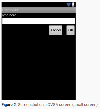

尽管系统屏幕的尺寸发生了改变,但是它的子View之间的空间关系还是通过RelativeLayout.LayoutParams已经指定好了。
使用尺寸限定
此处的限定词主要是指在编写布局文件时,将布局文件存放在类似large、sw600dp等这样限定词的文件夹中,以此来告诉系统根据屏幕选择对应的布局文件。比如下面例子中的layout-large文件夹。
我们知道如何编写灵活的布局或者相对布局,它们都能通过拉伸或者填充控件来适应不同的屏幕,但是它们却不能为每个不同屏幕尺寸提供最好的用户体验。因此,你的应用不应该只是实现灵活的布局,同时也应该为不同的屏幕配置提供几种不同的布局方式。
You do so by using configuration qualifiers, which allows the runtime to automatically select the appropriate resource based on the current device’s configuration (such as a different layout design for different screen sizes). 可以通过配置限定(Configuration Qualifies)来做这件事情,它能在运行时根据你当前设备的配置(比如:不同的屏幕尺寸设计了不同的布局)来选择合适的布局资源。
比如,很多应用都为大屏幕实现了“两个窗格”模式(应用可能在一个窗格中实现一个list的item,另外一个则实现list的content),平板和电视都是大到能在一个屏幕上适应两个窗格,但是手机屏幕却只能分别显示。
res/layout/main.xml for single-pane(default) layout
<LinearLayout xmlns:android="http://schemas.android.com/apk/res/android"

    android:orientation="vertical"

    android:layout_width="match_parent"

    android:layout_height="match_parent">

    <fragment android:id="@+id/headlines"

              android:layout_height="fill_parent"

              android:name="com.example.android.newsreader.HeadlinesFragment"

              android:layout_width="match_parent" />

</LinearLayout>
res/layout-large/main.xml for two-pane layout
<LinearLayout xmlns:android="http://schemas.android.com/apk/res/android"

    android:layout_width="fill_parent"

    android:layout_height="fill_parent"

    android:orientation="horizontal">

    <fragment android:id="@+id/headlines"

              android:layout_height="fill_parent"

              android:name="com.example.android.newsreader.HeadlinesFragment"

              android:layout_width="400dp"

              android:layout_marginRight="10dp"/>

    <fragment android:id="@+id/article"

              android:layout_height="fill_parent"

              android:name="com.example.android.newsreader.ArticleFragment"

              android:layout_width="fill_parent" />

</LinearLayout>
注意第二个布局文件的目录名字“large”限定词,在大尺寸的设备屏幕时(比如7寸平板或者其他大屏幕的设备)就会选择该布局文件,而其他比较小的设备则会选择没有限定词的另一个布局(也就是第一个布局文件)。
使用最小宽度限定
在Android 3.2之前,开发者还有一个困难,那就是Android设备的“large”屏幕尺寸,其中包括Dell Streak(设备名称),老版Galaxy Tab和一般的7寸平板,有很多的应用都想针对这些不同的设备(比如5和7寸的设备)定义不同的布局,但是这些设备都被定义为了large尺寸屏幕。也是因为这个,所以Android在3.2的时候开始使用最小宽度限定词。最小宽度限定词允许你根据设备的最小宽度(dp单位)来指定不同布局。比如,传统的7寸平板最小宽度为600dp,如果你希望你的UI能够在这样的屏幕上显示两个窗格(不是一个窗格显示在小屏幕上),你可以使用上节中提到的使用同样的两个布局文件。不同的是,使用sw600来指定两个方框的布局使用在最小宽度为600dp的设备上。
将上述大屏幕文件名修改为:res/layout-sw600dp/main.xml
这样意味着当你的设备的最小宽度等于600dp或者更大时,系统选择layout-sw600dp/main.xml(两个窗格)的布局,而小一点的屏幕则会选择layout/main.xml(单个窗格)的布局。 然而,在3.2之前的设备上,这样做并不是很好的选择。因为3.2之前还没有将sw600dp作为一个限定词出现,所以,你还是需要使用large限定词来做。因此,你还是应该要有一个布局文件名为res/layout-large/main.xml,和res/layout-sw600dp/main.xml一样。
使用布局别名
The smallest-width qualifier is available only on Android 3.2 and above.
为匹配不同尺寸屏幕,一般的做法如下:
res/layout/main.xml --> single-pane layout
res/layout-large --> multi-pane layout
res/layout-sw600dp --> multi-pane layout
为了便于文件的维护工作,可以使用文件别名(相当于使用文件选择器)
比如先定义两个文件,如下:
res/layout/main.xml, single-pane layout
res/layout/main_twopanes.xml, two-pane layout
如上,是在两个相同的文件夹下的文件。
为了使用文件选择器,可以定义以下文件:res/values-large/layout.xml
<resources>

    <item name="main" type="layout">@layout/main_twopanes</item>

</resources>
同时增加以下文件:res/values-sw600dp/layout.xml
<resources>

    <item name="main" type="layout">@layout/main_twopanes</item>

</resources>
其中上述的main_twopanes是相同的文件,但只是将main_twopanes设置成为了别名main,分别处在large和sw600dp选择器中,它们能够适配Android任何版本的平板和电视(在3.2之前平板和电视可以直接匹配large,而3.2或者以上的系统则匹配sw600dp)
系统会根据不同系统属性选择不同布局文件,若选择values-large资源容器,则选择layout/中的main_twopanes.xml;若选择values-sw600dp资源容器,则也会选择layout/中的main_twopanes.xml。但所有的布局文件都使用main.xml名字。
使用方向限定
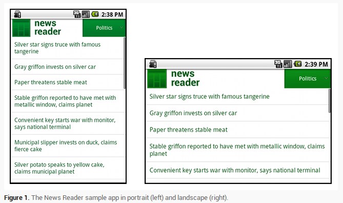
在某个栗子中布局在不同屏幕尺寸和方向的行为如下:
small screen, portrait   --> single pane, with logo

small screen, landscape  --> single pane, with logo

7" tablet, portrait      --> single pane, with action bar

7" tablet, landscape     --> dual pane, wide, with action bar

10" tablet, portrait     --> dual pane, narrow, with action bar

10" tablet, landscape    --> dual pane, wide, with action bar

TV, landscape            --> dual pane, wide, with action bar
根据上述行为,总结出了四种不同的布局情况:
res/layout/onepane.xml
<LinearLayout xmlns:android="http://schemas.android.com/apk/res/android"

    android:orientation="vertical"

    android:layout_width="match_parent"

    android:layout_height="match_parent">

    <fragment android:id="@+id/headlines"

              android:layout_height="fill_parent"

              android:name="com.example.android.newsreader.HeadlinesFragment"

              android:layout_width="match_parent" />

</LinearLayout>
res/layout/onepane_with_bar.xml
<LinearLayout xmlns:android="http://schemas.android.com/apk/res/android"

    android:orientation="vertical"

    android:layout_width="match_parent"

    android:layout_height="match_parent">

    <LinearLayout android:layout_width="match_parent"

                  android:id="@+id/linearLayout1"

                  android:gravity="center"

                  android:layout_height="50dp">

        <ImageView android:id="@+id/imageView1"

                   android:layout_height="wrap_content"

                   android:layout_width="wrap_content"

                   android:src="@drawable/logo"

                   android:paddingRight="30dp"

                   android:layout_gravity="left"

                   android:layout_weight="0" />

        <View android:layout_height="wrap_content"

              android:id="@+id/view1"

              android:layout_width="wrap_content"

              android:layout_weight="1" />

        <Button android:id="@+id/categorybutton"

                android:background="@drawable/button_bg"

                android:layout_height="match_parent"

                android:layout_weight="0"

                android:layout_width="120dp"

                style="@style/CategoryButtonStyle"/>

    </LinearLayout>

    <fragment android:id="@+id/headlines"

              android:layout_height="fill_parent"

              android:name="com.example.android.newsreader.HeadlinesFragment"

              android:layout_width="match_parent" />

</LinearLayout>
res/layout/twopanes.xml
<LinearLayout xmlns:android="http://schemas.android.com/apk/res/android"

    android:layout_width="fill_parent"

    android:layout_height="fill_parent"

    android:orientation="horizontal">

    <fragment android:id="@+id/headlines"

              android:layout_height="fill_parent"

              android:name="com.example.android.newsreader.HeadlinesFragment"

              android:layout_width="400dp"

              android:layout_marginRight="10dp"/>

    <fragment android:id="@+id/article"

              android:layout_height="fill_parent"

              android:name="com.example.android.newsreader.ArticleFragment"

              android:layout_width="fill_parent" />

</LinearLayout>
res/layout/twopanes_narrow.xml
<LinearLayout xmlns:android="http://schemas.android.com/apk/res/android"

    android:layout_width="fill_parent"

    android:layout_height="fill_parent"

    android:orientation="horizontal">

    <fragment android:id="@+id/headlines"

              android:layout_height="fill_parent"

              android:name="com.example.android.newsreader.HeadlinesFragment"

              android:layout_width="200dp"

              android:layout_marginRight="10dp"/>

    <fragment android:id="@+id/article"

              android:layout_height="fill_parent"

              android:name="com.example.android.newsreader.ArticleFragment"

              android:layout_width="fill_parent" />

</LinearLayout>
剩下的问题就是使用方向限定词来匹配对应的布局
res/values/layouts.xml
<resources>

    <item name="main_layout" type="layout">@layout/onepane_with_bar</item>

    <bool name="has_two_panes">false</bool>

</resources>
res/values-sw600dp-land/layouts.xml
<resources>

    <item name="main_layout" type="layout">@layout/twopanes</item>

    <bool name="has_two_panes">true</bool>

</resources>
res/values-sw600dp-port/layouts.xml
<resources>

    <item name="main_layout" type="layout">@layout/onepane</item>

    <bool name="has_two_panes">false</bool>

</resources>
res/values-large-land/layouts.xml
<resources>

    <item name="main_layout" type="layout">@layout/twopanes</item>

    <bool name="has_two_panes">true</bool>

</resources>
res/values-large-port/layouts.xml
<resources>

    <item name="main_layout" type="layout">@layout/twopanes</item>

    <bool name="has_two_panes">true</bool>

</resources>
此外,对于支持不同尺寸屏幕可以使用Nine-patch图片。
主题二:支持不同屏幕密度
使用独立分辨率
对于不同屏幕密度的设备,我们能够做的是提供不同的资源和使用独立分辨率以提供支持。
使用像素单位来定义布局大小是有问题的。因为不同的屏幕有不同的像素密度,同样单位的像素在不同的设备上会有不同的物理尺寸。“dp”代表一个密度独立像素,也就相当于在160dpi的一个像素的物理尺寸;“sp”也是一个基本的单位,不过它主要是用在文本尺寸上(它也是一种尺寸规格独立的像素),所以在定义文本尺寸的时候应该使用这种规格单位。
当我们在定义两个View之间的距离时,使用下述实践:
<Button android:layout_width="wrap_content"

    android:layout_height="wrap_content"

    android:text="@string/clickme"

    android:layout_marginTop="20dp" />
当我们定义文本大小时,使用下述实践:
<TextView android:layout_width="match_parent"

    android:layout_height="wrap_content"

    android:textSize="20sp" />
提供可供选择的图片
因为Android能运行在很多不同屏幕密度的设备上,所以,你应该针对不同的设备密度提供不同的bitmap资源:小屏幕(low),medium(中),high(高)以及超高(extra-high)密度。这将能帮助你在所有的屏幕密度中得到非常好的图形质量和性能。
为了提供更好的用户体验,你应该使用以下几种规格来缩放图片大小,为不同的屏幕密度提供相应的位图资源:
xhdpi: 2.0

hdpi: 1.5

mdpi: 1.0 (baseline)

ldpi: 0.75
This means that if you generate a 200x200 image for xhdpi devices, you should generate the same resource in 150x150 for hdpi, 100x100 for mdpi and finally a 75x75 image for ldpi devices.这也就意味着如果在xhdpi设备上你需要一个200x200的图片,那么你则需要一张150x150的图片用于hdpi,100x100的用于mdpi以及75x75的用户ldpi设备。然后将这些图片资源放到res/对应的目录下面,系统会自动根据当前设备屏幕密度自动去选择合适的资源进行加载。
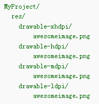
之后,系统在运行时的任何时候,需要使用到@drawable/awesomeimage资源,会自动根据当前屏幕分辨率进行选择最佳资源。
主题三:
Android应用程序支持不同屏幕(尺寸、密度)的更多相关文章
- 创建支持多种屏幕尺寸的Android应用
Android涉及各种各样的支持不同屏幕尺寸和密度的设备.对于应用程序,Android系统通过设备和句柄提供了统一的开发环境,大部分工作是校正每一个应用程序的用户界面到它显示的屏上.与此同时,系统提供 ...
- 创办支持多种屏幕尺寸的Android应用
创建支持多种屏幕尺寸的Android应用 Android涉及各种各样的支持不同屏幕尺寸和密度的设备.对于应用程序,Android系统通过设备和句柄提供了统一的开发环境,大部分工作是校正每一个应用程序的 ...
- 创建支持多种屏幕尺寸的apk
文章转至:http://hell0android.iteye.com/blog/1899605 创建对两种以上屏幕尺寸的多apk支持(Creating Multiple APKs with 2+ Di ...
- android.util.DisplayMetrics-获取当前屏幕尺寸信息
方法有两种一: DisplayMetrics metrics = new DisplayMetrics(); getWindowManager().getDefaultDisplay().getMet ...
- ym——Android怎样支持多种屏幕
转载请注明本文出自Cym的博客(http://blog.csdn.net/cym492224103),谢谢支持! 原文链接:http://developer.android.com/guide/pra ...
- Supporting Multiple Screens 翻译 支持各种屏幕(上)
Supporting Multiple Screens 支持各种各样的屏幕尺寸.屏幕密度 Android runs on a variety of devices that offer differe ...
- Android应用如何支持屏幕多尺寸多分辨率问题
作为Android应用程序开发者都知道android是一个“碎片化”的世界.多种系统版本.多种尺寸.多种分辨率.多种机型,还有不同的厂商定制的不同ROM,你开发的应用会在不可预期的手机上报错.这给开发 ...
- Android界面设计适配不同屏幕的尺寸和密度解读
Android是运行在各种提供不同的屏幕尺寸和密度的设备.Android系统提供跨设备的统一开发环境和处理大部分的工作,以调整每个应用程序的用户界面,以在其上显示的画面. 同时,该系统提供了API,允 ...
- android屏幕适配的全攻略--支持不同的屏幕尺寸适配平板和手机
一. 核心概念与单位详解 1. 什么是屏幕尺寸.屏幕分辨率.屏幕像素密度? 屏幕分辨率越大,手机越清晰 dpi就是dot per inch dot意思是点,就是每英寸上面的像素点数 android原始 ...
随机推荐
- c51的学习
1.点亮发光二极管,8个发光管由上至下间隔1秒流动,其中每个管亮500没事, 灭500ms,亮时蜂鸣器响,灭时关闭蜂鸣器,一直重复下去 . #include<reg52.h>#includ ...
- vue组件中data为什么必须是个函数
<body> <div id="app"> <counter></counter> </div> <templat ...
- shell 脚本实现定时备份mysql数据库
首先要知道直接在脚本中输入mysql的密码是不被允许的,但是我们可以曲线救国 1. 在新建一个文件专门用来存储用户密码 如: vim ./.mysql.conf [mysqldump] user=yo ...
- nginx反向代理配置两个不同服务器
1.什么是反向代理通常的代理服务器,只用于代理内部网络对Internet的连接请求,客户机必须指定代理服务器,并将本来要直接发送到Web服务器上的http请求发送到代理服务器中由代理服务器向Inter ...
- 产品研发不等待 i.MX6Q全新推出增强版本 官方店铺下单双重优惠
迅为全新推出PLUS版本的i.MX6Q方案,版本介绍:它是NXP公司全新推出的i.MX6Q增强版新品,显著增强了图形和存储器性能,面向较高图形性能的先进消费电子.汽车和工业多媒体应用的多核平台.
- Ansible-----循环
with_dict迭代字典项 使用"with_dict"可以迭代字典项.迭代时,使用"item.key"表示字典的key,"item.value&qu ...
- [Kubernetes]深入理解StatefulSet
前面我写的一系列博客,如果你能够耐心看到这一篇,那你应该对一个概念就不是太陌生了:Deployment. 为什么提这个概念呢,这就要说到Deployment的一个不足了.Deployment不足以覆盖 ...
- Hutool工具里,POST方法,body中传参的几种调用方法
接口说明: POSTMAN测试: JAVA代码: package com.provy.guard.api; import java.util.HashMap; import java.util.Map ...
- HTTP协议详解(二)
接着第一篇学习.... 5 头域(首部) 每个头域由一个域名,冒号(:)和域值三部分组成.域名是大小写无关的,域值前可以添加任何数量的空格符,头域可以被扩展为多行,在每行开始处,使用至少一个空格或制表 ...
- iframe 加form提交数据
<!DOCTYPE html> <html lang="en"> <head> <meta charset="UTF-8&quo ...