Flex布局的详细总结
Flex布局的详细总结
1.认识flex布局
flex布局(flexible布局,弹性布局),是目前web开发中使用的最多的布局方案。
- 两个重要概念:
- 开启flex布局的元素叫
flex container; flex container里面的直接子元素叫做flex items;
- 开启flex布局的元素叫
- 设置display属性为flex或者inline-flex可以成为flex container:
- flex:使得
flex container以块级形式存在; - inline-flex:使得
flex container以行内级形式存在;
- flex:使得
2.flex布局模型
当元素开启flex布局时,会沿着两个轴来进行布局。
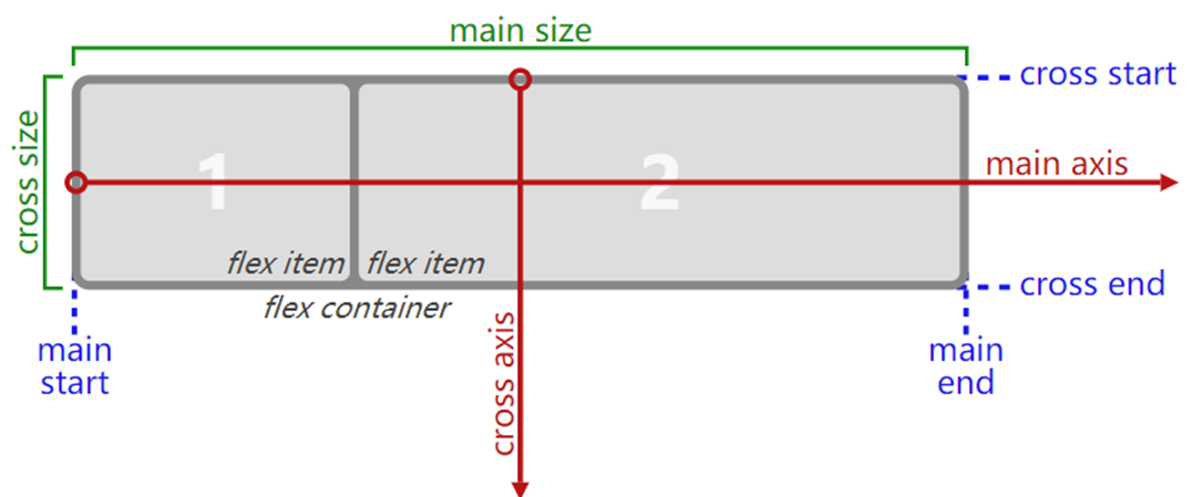
- 主轴(main axis):沿着flex元素放置的方向延伸的轴;
- 交叉轴(cross axis):垂直于flex元素放置方向的轴;
main start和main end:分别为主轴的开始位置和结束位置;cross start和cross end:分别为交叉轴的开始位置和结束位置;main size和cross size:分别为主轴的大小和交叉轴的大小;
3.flex相关的属性
| 应用在flex container上的属性 | 应用在flex items上的属性 |
|---|---|
| flex-flow | flex |
| flex-direction | flex-grow |
| flex-wrap | flex-basis |
| justify-content | flex-shrink |
| align-items | order |
| align-content | align-self |
4.flex container
4.1.flex-direction
flex items默认都是沿着main axis(主轴)从main start往main end方向进行排布;
flex-direction决定了main axis的方向,有以下四个取值:
- row(默认值)
- row-reverse
- column
- column-reverse

4.2.justify-content
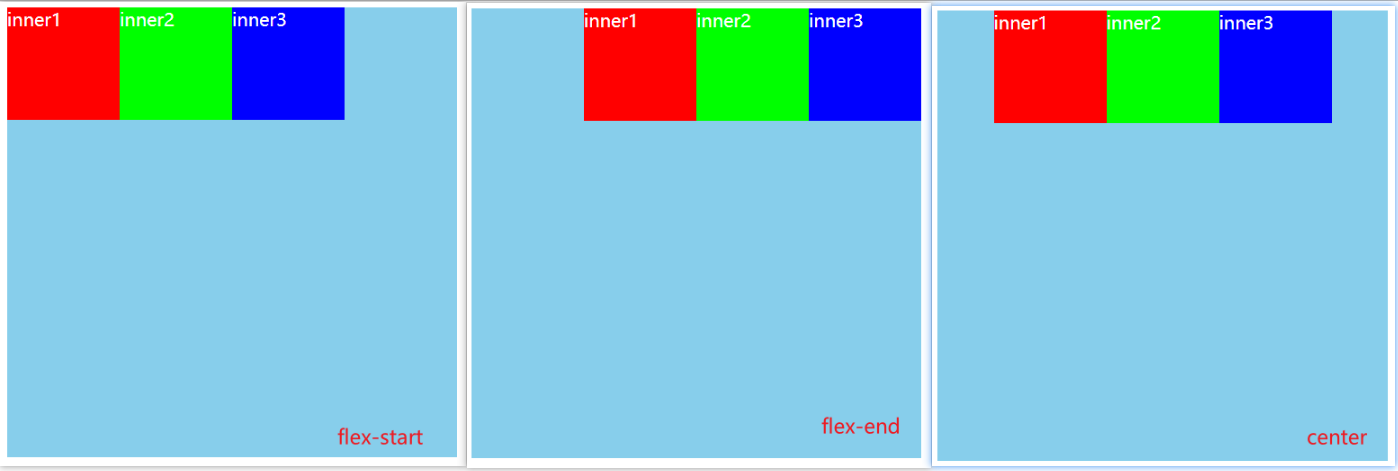
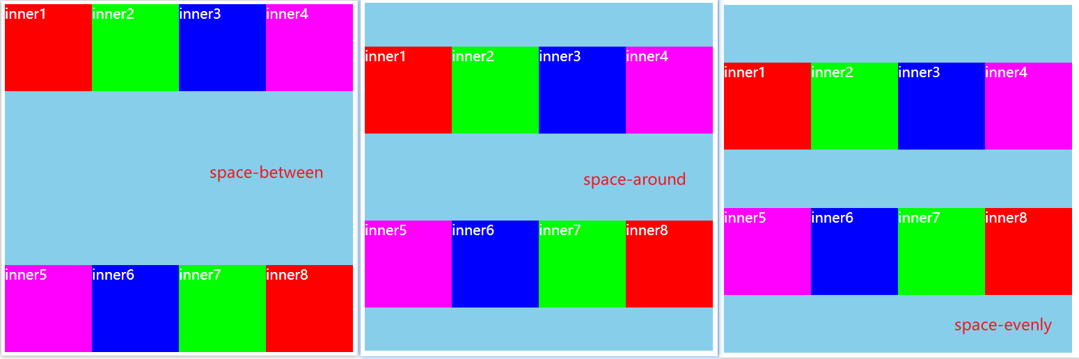
justify-content决定了flex items在main axis上的对齐方式,有以下取值:
- flex-start:默认值,与main start对齐;
- flex-end:与main end对齐;
- center:居中对齐;
- space-between:flex items之间的距离相等,与main start、main end两端对齐;
- space-evenly:flex items之间的距离相等,与main start、main end之间的距离等于flex items之间的距离;
- space-around:flex items之间的距离相等,与main start、main end之间的距离是flex items之间距离的一半;

4.3.align-items
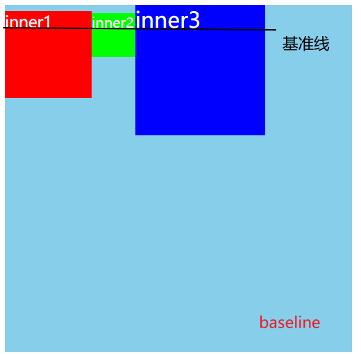
align-items决定了flex items在cross axis上的对其方式,有以下取值:
normal:在弹性布局中,效果和stretch一样;
stretch:当flex items在cross axis方向的size为auto时,会自动拉伸至填充flex container;

flex-start:与cross start对齐;
flex-end:与cross end对齐;
center:居中对齐;

- baseline:与基准线对齐;
4.4.flex-wrap
flex-wrap决定了flex container是单行还是多行,有以下取值:
- nowrap:默认值,单行;
- wrap:多行;
- wrap-reverse:多行(对比wrap,cross start和cross end相反);

4.5.flex-flow
- flex-flow是flex-direction | flex-wrap的简写;
- 可以省略,顺序任意;
4.6.align-content
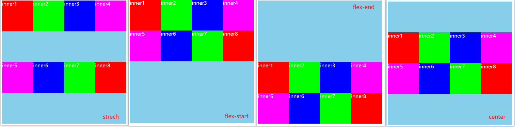
align-content决定了多行flex items在cross axis上的对齐方式,用法与justify-content类似,有以下取值:
- stretch:默认值;
- flex-start:与cross start对齐;
- flex-end:与cross end对齐;
- center:居中对齐;
- space-between:flex items之间的距离相等,与cross start、cross end两端对齐;
- space-around:flex items之间的距离相等,与cross start、cross end之间的距离是flex items之间距离的一半;
- space-evenly:flex items之间的距离相等,与cross start、cross end之间的距离等于flex items之间的距离;
5.flex items
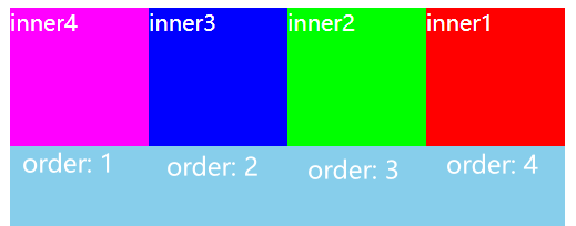
5.1.order
order决定了flex items的排布顺序。
- 可以设置任意整数(正整数、负整数、0),值越小就越排在前面;
- 默认值是0;
5.2.align-self
flex items可以通过align-self覆盖flex container设置的align-items属性。
- auto:默认值,使用flex container设置的align-items属性;
- stretch、flex-start、flex-end、center、baseline属性值效果跟align-items一致;
- 如果想单独某些items在cross axis上的对齐方式,就可以单独给某个flex item设置align-self;
5.3.flex-grow
- flex-grow决定了flex items如何扩展;
- 可以设置任意非负数字(正小数、正整数、0),默认值为0;
- 当flex container在main axis方向上有剩余的空间时,flex-grow属性才会生效;
- 如果所有flex items的flex-grow总和超过1,每个flex item扩展的size为:
flex container剩余size * 当前flex item的flex-grow值 / sum; - 如果所有flex items的flex-grow总和不超过1,每个flex item扩展的size为:
flex container剩余size * 当前flex item的flex-grow值; - 注意:flex itmes扩展后的最终size不能超过max-widht、max-height;
示例代码:
.box {

  display: flex;

  flex-wrap: wrap;

  width: 500px;

  height: 400px;

  background-color: skyblue;

  color: #fff;

}

.inner {

  width: 100px;

  height: 100px;

}

.inner1 {

  background-color: #f00;

  flex-grow: 0.1;

}

.inner2 {

  background-color: #0f0;

  flex-grow: 0.1;

}

.inner3 {

  background-color: #00f;

  flex-grow: 0.1;

}

.inner4 {

  background-color: #f0f;

  flex-grow: 0.1;

}
<div class="box">

  <div class="inner inner1">inner1</div>

  <div class="inner inner2">inner2</div>

  <div class="inner inner3">inner3</div>

  <div class="inner inner4">inner4</div>

</div>
运行结果:
如果给每个inner设置
flex-grow: 0.1;,在剩余的100px空间中,每个盒子各分100px * 0.1 = 10px的size;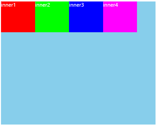
如果给每个inner设置
flex-grow: 1;,在剩余的100px中,每个盒子各分100px * 1 / 4 = 25px;
5.4.flex-shrink
- flex-shrink决定了flex items如何收缩;
- 可以设置任意非负数字(正小数、正整数、0),默认值是1;
- 当flex items在mian axis方向上超过了flex container的size,flex-shrink属性才会有效;
- 如果所有flex items的flex-shrink总和sum超过1,每个flex item收缩size为:
flex items超出flex container的size * 当前flex item的flex-shrink值 / sum; - 如果所有的flex items的flex-shrink总和sum不超过1,每个flex item收缩size为:
flex items超出flex container的size * sum * 收缩比例 / 所有flex items的收缩比例之和;收缩比例 = 当前item的flex-shrink * flex item的base size,base size就是flex item放入flex container之前的size;
- flex items收缩后的最终size不能小于min-width、min-height;
示例代码:设置flex container的大小为300px,每个flex items的大小为100px,一共4个超过了flex container的100px。
.box {

  display: flex;

  width: 300px;

  height: 400px;

  background-color: skyblue;

  color: #fff;

}

.inner {

  width: 100px;

  height: 100px;

}

.inner1 {

  background-color: #f00;

  flex-shrink: 1;

}

.inner2 {

  background-color: #0f0;

  flex-shrink: 1;

}

.inner3 {

  background-color: #00f;

  flex-shrink: 1;

}

.inner4 {

  background-color: #f0f;

  flex-shrink: 1;

}
<div class="box">

  <div class="inner inner1">inner1</div>

  <div class="inner inner2">inner2</div>

  <div class="inner inner3">inner3</div>

  <div class="inner inner4">inner4</div>

</div>
运行结果:
当设置
flex-shrink: 1,或者不设置(默认值为1),每个flex item的大小收缩:100px * 1 / 4 = 25px,最终大小为100px - 25px = 75px;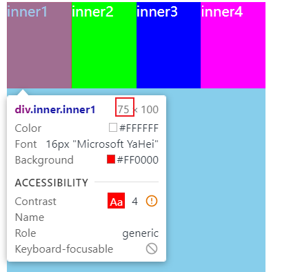
当设置
flex-shrink: 0.1;,每个flex item的大小收缩:100px * 0.4 * 100px * 0.1 / 40px = 10px,最终大小为100px - 10px = 90px
5.5.flex-basis
flex-basis用来设置flex items在main axis方向上的base size。
- auto:默认值;
- 设置具体的宽度数值:会覆盖之前给flex items设置的width;
决定flex items最终base size的因素,优先级高到低排列如下:
- max-width\max-height\min-width\min-height;
- flex-basis;
- width\height;
- 内容本身的size;
5.6.flex
flex是flex-grow | flex-shrink | flex-basis的简写属性,可以指定1、2或3个值。
- 指定1个值:
- 一个无单位数:会被当做
flex-grow的值; - 一个有效的宽度值:会被当做
flex-basis的值; - 关键字none、auto或initial;
- 一个无单位数:会被当做
- 指定2个值:
- 第一个值必须为一个无单位数,并且作为
flex-grow的值; - 第二个值必须为以下之一:
- 一个无单位数:会被当做
flex-shrink的值; - 一个有效的宽度值:会被当做
flex-basis的值;
- 一个无单位数:会被当做
- 第一个值必须为一个无单位数,并且作为
- 指定3个值:
- 第一个值必须为无单位数:会被当做
flex-grow的值; - 第二个值必须为无单位数:会被当做
flex-shrink的值; - 第三个值必须为有效宽度值:会被当做
flex-basis的值;
- 第一个值必须为无单位数:会被当做
Flex布局的详细总结的更多相关文章
- FLEX布局的一些问题和解决方法
前言 露珠最近研究了一下flex的布局方式,发现项w3c推出的这套布局解决方案对于日益复杂的前端开发布局来说是确实是一利器,并且在不同的屏幕上实现了真正的响应式布局:不再单纯地依赖百分比和float的 ...
- Flex 布局2
Flex 布局2 你会看到,不管是什么布局,Flex往往都可以几行命令搞定. 我只列出代码,详细的语法解释请查阅<Flex布局教程:语法篇>.我的主要参考资料是Landon Sch ...
- flex布局浅谈和实例
阿基米德曾说给我一个支点我可以撬动地球,而拥有flex基本可以撬动所有的布局. 1.flex布局基本介绍及效果展示 工欲善其事必先利其器,来来来,一起看下基础知识先(呵~,老掉牙,但是有用啊). ** ...
- Flex 布局教程:实例篇(转)
你会看到,不管是什么布局,Flex往往都可以几行命令搞定. 我只列出代码,详细的语法解释请查阅<Flex布局教程:语法篇>.我的主要参考资料是Landon Schropp的文章和Solve ...
- Flex布局实践
介绍常见布局的Flex写法. 你会看到,不管是什么布局,Flex往往都可以几行命令搞定. 我只列出代码,详细的语法解释请查阅<Flex布局教程:语法篇>.我的主要参考资料是Landon S ...
- 微信小程序前置课程:flex布局(二)
原文:http://www.ruanyifeng.com/blog/2015/07/flex-examples.html 上一篇文章介绍了Flex布局的语法,今天介绍常见布局的Flex写法. 你会看到 ...
- 学习flex布局(弹性布局)
Flex是Flexible Box的缩写,意为弹性布局.是W3C早期提出的一个新的布局方案.可以便捷的实现页面布局,目前较高版本的主流浏览器都能兼容,兼容情况如下: Flex在移动端开发上已是主流,比 ...
- flex盒模型 详细解析
flex盒模型 详细解析 移动端页面布局,采用盒模型布局,效果很好 /* ============================================================ ...
- css3 深入理解flex布局
一.简要介绍 css3最喜欢的新属性之一便是flex布局属性,用六个字概括便是简单.方便.快速. flex( flexible box:弹性布局盒模型),是2009年w3c提出的一种可以简洁.快速弹性 ...
随机推荐
- mysql 除法运算保留小数的用法
说明:刚开始用的round(值1/值2*100,1) 结果没出效果,才搜到decimal函数 在工作中会遇到计算小数而且需要显现出小数末尾的0,我们会用到DECIMAL这个函数,这是一个函数非常强悍: ...
- Shell 打印文件的最后5行
目录 Shell 打印文件的最后5行 题解-awk 题解-tail Shell 打印文件的最后5行 经常查看日志的时候,会从文件的末尾往前查看,于是请你写一个 bash脚本以输出一个文本文件 nowc ...
- Hadoop 相关知识点(一)
作业提交流程(MR执行过程) Mapreduce2.x Client:用来提交作业 ResourceManager:协调集群上的计算资源的分配 NodeManager:负责启动和监控集群上的计算容器( ...
- 2016广东工业大学新生杯决赛 A-pigofzhou的巧克力棒
题目:GDUTOJ | pigofzhou的巧克力棒 (gdutcode.cn) 之前看了大佬博客的题解,一直没懂(我太菜了),后来听了朋友@77的讲解,终于懂了. 和拆分出2的n次方不一样,这是一种 ...
- 容器之分类与各种测试(三)——stack
stack是栈,其实现也是使用了双端队列(只要不用双端队列的一端,仅用单端数据进出即完成单端队列的功能),由于queue和stack的实现均是使用deque,没有自己的数据结构和算法,所以这俩也被称为 ...
- 【Linux】【Basis】【Kernel】Linux常见系统调用
一,进程控制 1)getpid,getppid--获取进程识别号 #include <sys/types.h> #include <unistd.h> pid_t getpid ...
- 【Linux】【Basis】进程
1. 维基百科:https://zh.wikipedia.org/wiki/%E8%A1%8C%E7%A8%8B 进程的类型: 终端:硬件设备,关联一个用户接口 与终端相关:通过终端启动 与终端无关: ...
- 【Services】【Web】【LVS】lvs基础概念
1.简介 1.1. 作者:张文嵩,就职于阿里 1.2. LVS是基础四层路由.四层交换的软件,他根据请求报文的目标IP和目标PORT将其调度转发至后端的某主机: 1.3. IPTABLES的请求转发路 ...
- 走进Spring Boot源码学习之路和浅谈入门
Spring Boot浅聊入门 **本人博客网站 **IT小神 www.itxiaoshen.com Spring Boot官网地址:https://spring.io/projects/spring ...
- 【MySQL】学生成绩
统计每个人的总成绩排名 select stu.`name`,sum(stu.score) as totalscore from stu GROUP BY `name` order by totalsc ...