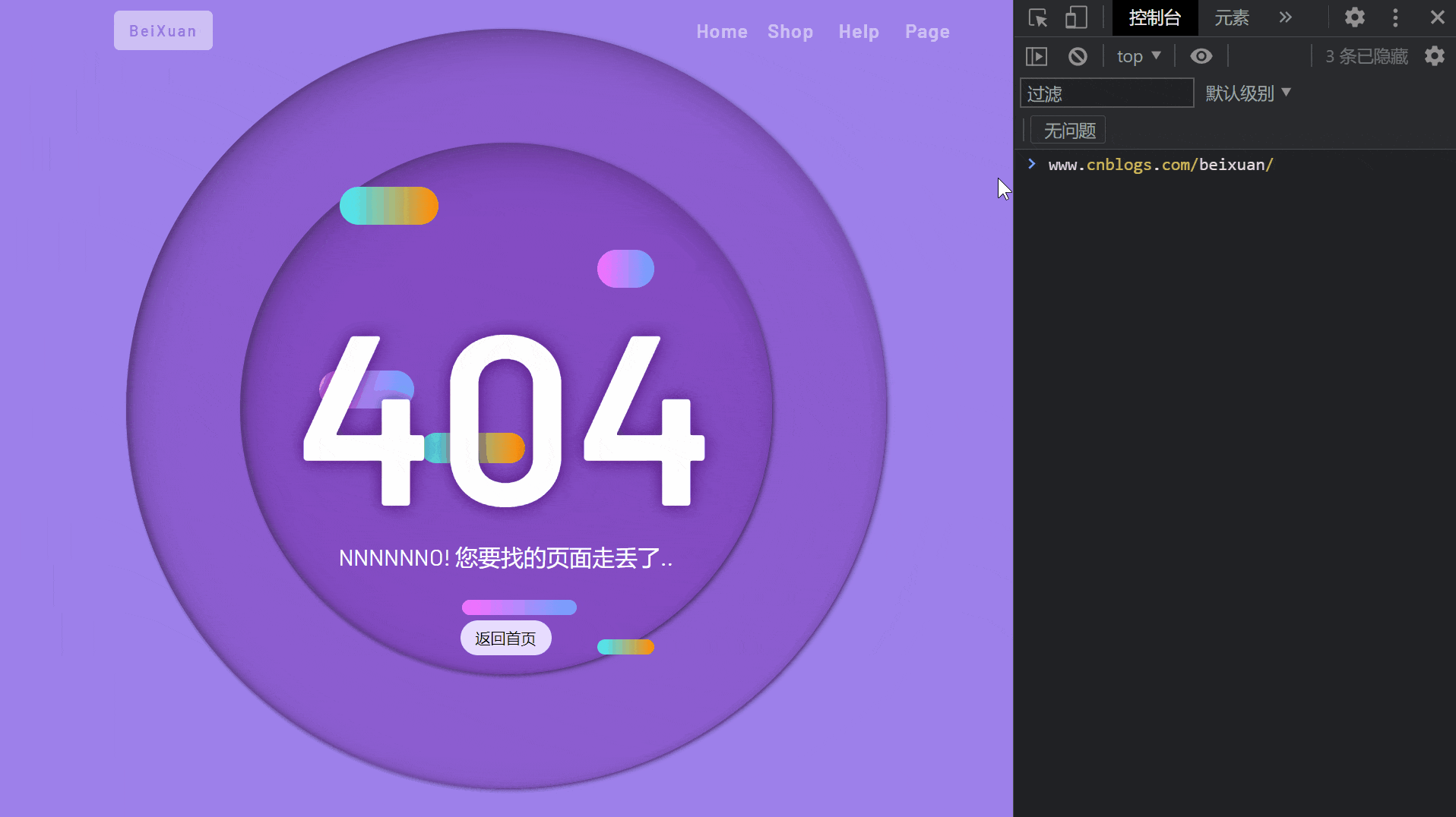
【全】CSS动画大全之404页面【a】
效果预览
代码
<!DOCTYPE html>

<html>

  <head>

    <meta charset="utf-8" />

    <meta name="author" content="https://www.cnblogs.com/beixuan">

    <meta name="version" content="1.0.0">

    <meta name="date" content="2021/12/02 21:00:26">

    <meta name="viewport" content="width=device-width, initial-scale=1">

    <title>CSS动画大全之404[a]</title>

  </head>

  <style type="text/css">

    <!-- 网络字体 -->

    @import url("https://fonts.googleapis.com/css?family=Barlow+Condensed:300,400,500,600,700,800,900|Barlow:300,400,500,600,700,800,900&display=swap");

    * {

      margin: 0;

      padding: 0;

    }

    body {

      background-color: #9e80ea;

      font-family: "Barlow", sans-serif;

    }

    a {

      text-decoration: none;

      color: #FFF;

    }

    .menu {

      position: absolute;

      width: 100%;

      height: 3.75rem;

      display: grid;

      grid-template-columns: 1fr 3fr;

      justify-items: center;

      align-items: center;

      z-index: 10;

      padding: 2% 5%;

      box-sizing: border-box;

    }

    .menu > .title > span {

      padding: 0.7rem 1rem;

      font-size: 1rem;

      letter-spacing: 2px;

      background-color: #FFF;

      border-radius: 6px;

      color: #8b70cc;

      font-weight: 600;

      opacity: 0.5;

      transition: opacity 0.5s ease;

      cursor: pointer;

    }

    .menu > .title > span:hover {

      opacity: 1;

    }

    .menu-list-wrapper {

      width: 100%;

      list-style: none;

      display: grid;

      justify-items: center;

      align-items: center;

      justify-content: end;

      grid-template-columns: 10% 10% 10% 10%;

    }

    .menu-list-wrapper > .menu-list-item {

      display: inline-block;

      width: 100%;

      text-align: center;

      opacity: 0.5;

      transition: opacity 0.5s ease;

    }

    .menu-list-wrapper:hover .menu-list-item {

      opacity: 1;

    }

    .menu-list-item > a {

      font-size: 1.25rem;

      font-weight: 600;

      letter-spacing: 1px;

      position: relative;

      transition: color 0.5s ease;

    }

    .menu-list-item > a:hover {

      color: #ff9b0f;

    }

    .menu-list-item > a::after {

      content: '';

      position: absolute;

      width: 0;

      height: 5px;

      left: 100%;

      bottom: -6px;

      border-radius: 3px;

      transition: all 0.5s ease;

      background: linear-gradient(to right, #e7dcff, #ff9b0f);

    }

    .menu-list-item > a:hover::after {

      width: 80%;

      left: 0;

    }

    .page-wrapper {

      position: relative;

      width: 100vw;

      height: 100vh;

      display: grid;

      justify-items: center;

      align-items: center;

      overflow: hidden;

    }

    .circle::after {

      border-radius: 50%;

    }

    .big-circle {

      width: 60%;

      height: 60%;

      position: absolute;

      top: 20%;

      left: 20%;

      animation: animeCircle 1s cubic-bezier(1, 0.06, 0.25, 1) both;

    }

    .big-circle::after {

      content: '';

      position: absolute;

      top: 50%;

      left: 50%;

      transform: translate(-50%, -50%);

      width: 50rem;

      height: 50rem;

      background-color: #793cb680;

      box-shadow:

        inset 5px 20px 40px rgb(54 24 79 / 25%),

        inset 5px 0px 5px rgb(50 36 62 / 30%),

        inset 5px 5px 20px rgb(50 36 62 / 25%),

        2px 2px 5px rgb(0 0 0 / 50%);

    }

    .smail-circle {

      width: 60%;

      height: 60%;

      position: absolute;

      top: 20%;

      left: 20%;

      animation-delay: 1s;

      animation: animeCircle 1.2s cubic-bezier(1, 0.06, 0.25, 1) both;

    }

    .smail-circle::after {

      content: '';

      position: absolute;

      top: 50%;

      left: 50%;

      transform: translate(-50%, -50%);

      width: 35rem;

      height: 35rem;

      background-color: #793cb680;

      box-shadow:

        inset 5px 20px 40px rgb(54 24 79 / 25%),

        inset 5px 0px 5px rgb(50 36 62 / 30%),

        inset 5px 5px 20px rgb(50 36 62 / 25%),

        2px 2px 5px rgb(0 0 0 / 50%);

    }

    .first {

      position: absolute;

      top: 50%;

      left: 50%;

      transform: translate(-50%, -50%);

      height: 60%;

      width: 12.5rem;

      animation: animeContent 0.8s cubic-bezier(1, 0.06, 0.25, 1) backwards;

    }

    .second {

      position: absolute;

      top: 50%;

      left: 50%;

      transform: translate(-50%, -50%);

      height: 60%;

      width: 12.5rem;

      animation: animeContent 0.8s cubic-bezier(1, 0.06, 0.25, 1) backwards;

    }

    .first > span {

      position: absolute;

      border-radius: 2rem;

      background: linear-gradient(90deg, #55e3ea 13.7%, #ff910b 94.65%);

      animation: pieceLeft 4s cubic-bezier(1, 0.06, 0.25, 1) infinite both;

    }

    .first > span:nth-child(1) {

      top: 5%;

      width: 9rem;

      right: -50%;

      animation-delay: 2.5s;

      animation-name: pieceRight;

      height: 2.5rem;

    }

    .first > span:nth-child(2) {

      top: 55%;

      left: -30%;

      width: 8rem;

      animation-delay: 2s;

      animation-name: pieceLeft;

      height: 2rem;

    }

    .first > span:nth-child(3) {

      bottom: 0;

      left: -50%;

      width: 7rem;

      animation-delay: 3s;

      animation-name: pieceLeft;

      height: 1rem;

    }

    .second > span {

      position: absolute;

      height: 2.5rem;

      border-radius: 2rem;

      background: linear-gradient(270deg, #7c9fff 13.7%, #f66fff 94.65%);

      animation: pieceRight 4s cubic-bezier(1, 0.06, 0.25, 1) infinite both;

    }

    .second > span:nth-child(1) {

      top: calc(10% + 40px);

      left: -50%;

      width: 7rem;

      animation-delay: 3s;

      animation-name: pieceLeft;

    }

    .second > span:nth-child(2) {

      top: calc(50% - 40px);

      right: -50%;

      width: 9rem;

      animation-delay: 3s;

      animation-name: pieceRight;

    }

    .second > span:nth-child(3) {

      bottom: calc(5% + 16px);

      right: -20%;

      width: 8rem;

      animation-delay: 2s;

      animation-name: pieceRight;

      height: 1rem;

    }

    .text {

      position: absolute;

      top: 50%;

      left: 50%;

      transform: translate(-50%, -50%);

      z-index: 2;

      font-size: 16rem;

      font-weight: 600;

      color: #FFF;

      animation-delay: 1s !important;

      animation: anime404 0.6s cubic-bezier(0.3, 0.8, 1, 1.05) both;

    }

    .text-bg {

      z-index: 1;

      color: #3f005f;

      filter: blur(10px);

      opacity: 0.8;

      animation-delay: 0.8s !important;

      animation: anime404 0.6s cubic-bezier(0.3, 0.8, 1, 1.05) both;

    }

    .detail {

      font-size: 24px;

      color: #fff;

      z-index: 3;

      transform: translateY(200px);

      text-align: center;

      height: 120px;

      position: relative;

    }

    .detail > .btn {

      font-size: 16px;

      border-radius: 50px;

      position: absolute;

      bottom: 0;

      left: 50%;

      transform: translateX(-50%);

      background: #E7DCFF;

      color: #000000;

      transition: all 0.6s ease;

      padding: 0.5rem 1rem;

      cursor: pointer;

    }

    .detail > .btn:hover {

      background: #ff496a;

      color: #ffffff;

      transform: translate(-50%, 8px);

    }

    @keyframes pieceLeft {

      50% {

        left: 100%;

        width: 30%;

      }

    }

    @keyframes pieceRight {

      50% {

        right: 100%;

        width: 50%;

      }

    }

    @keyframes anime404 {

      0% {

        opacity: 0;

        transform: scale(10) skew(20deg, 20deg);

      }

    }

    @keyframes animeCircle {

      0% {

        transform: scale(0);

      }

    }

    @keyframes animeContent {

      0% {

        width: 0;

      }

    }

    @media screen and (max-width: 960px) {

      .text {

        position: absolute;

        top: 50%;

        left: 50%;

        transform: translate(-50%, -50%);

        z-index: 2;

        font-size: 8rem;

        font-weight: 600;

        color: #FFF;

        animation-delay: 1s !important;

        animation: anime404 0.6s cubic-bezier(0.3, 0.8, 1, 1.05) both;

      }

      .big-circle::after {

        content: '';

        position: absolute;

        top: 50%;

        left: 50%;

        transform: translate(-50%, -50%);

        width: 25rem;

        height: 25em;

        background-color: #793cb680;

        box-shadow:

          inset 5px 20px 40px rgb(54 24 79 / 25%),

          inset 5px 0px 5px rgb(50 36 62 / 30%),

          inset 5px 5px 20px rgb(50 36 62 / 25%),

          2px 2px 5px rgb(0 0 0 / 50%);

      }

      .smail-circle::after {

        content: '';

        position: absolute;

        top: 50%;

        left: 50%;

        transform: translate(-50%, -50%);

        width: 15rem;

        height: 15rem;

        background-color: #793cb680;

        box-shadow:

          inset 5px 20px 40px rgb(54 24 79 / 25%),

          inset 5px 0px 5px rgb(50 36 62 / 30%),

          inset 5px 5px 20px rgb(50 36 62 / 25%),

          2px 2px 5px rgb(0 0 0 / 50%);

      }

      .menu-list-wrapper {

        display: none;

      }

      .smail-menu-list-wrapper {

        width: 100%;

        display: grid;

        justify-items: center;

        align-items: center;

        justify-content: end;

        grid-template-columns: 20%;

        position: relative;

      }

      .smail-menu-list-wrapper > div {

        position: absolute;

        right: 0;

        width: 40px;

        height: 40px;

        display: grid;

        justify-items: center;

        align-items: center;

        cursor: pointer;

      }

      .smail-menu-list-wrapper > div:hover span {

        background: #ff9410;

      }

      .smail-menu-list-wrapper > div:hover span::before {

        transform: translateY(-10px);

      }

      .smail-menu-list-wrapper > div:hover span::after {

        transform: translateY(10px);

      }

      .smail-menu-list-wrapper span {

        width: 24px;

        height: 2px;

        background: #FFF;

        position: absolute;

      }

      .smail-menu-list-wrapper span::before {

        content: '';

        transform: translateY(-8px);

        position: absolute;

        width: 100%;

        height: 100%;

        background: inherit;

        transition: all 0.4s ease;

      }

      .smail-menu-list-wrapper span::after {

        content: '';

        transform: translateY(8px);

        position: absolute;

        width: 100%;

        height: 100%;

        background: inherit;

        transition: all 0.4s ease;

      }

    }

  </style>

  <body>

    <!-- MENU -->

    <nav>

      <div class="menu">

        <div class="title">

          <span>BeiXuan</span>

        </div>

        <ul class="menu-list-wrapper">

          <li class="menu-list-item">

            <a href="#">Home</a>

          </li>

          <li class="menu-list-item">

            <a href="#">Shop</a>

          </li>

          <li class="menu-list-item">

            <a href="#">Help</a>

          </li>

          <li class="menu-list-item">

            <a href="#">Page</a>

          </li>

        </ul>

        <div class="smail-menu-list-wrapper">

          <div>

            <span></span>

          </div>

        </div>

      </div>

    </nav>

    <div class="page-wrapper">

      <!-- Big Circle -->

      <div class="big-circle circle"></div>

      <!-- Smail Circle -->

      <div class="smail-circle circle"></div>

      <!-- move box First -->

      <div class="first">

        <span></span>

        <span></span>

        <span></span>

      </div>

      <!-- move box Second -->

      <div class="second">

        <span></span>

        <span></span>

        <span></span>

      </div>

      <p class="text">404</p>

      <p class="text text-bg">404</p>

      <div class="detail">

        <p>NNNNNNO! 您要找的页面走丢了..</p>

        <span class="btn">返回首页</span>

      </div>

    </div>

  </body>

</html>
【全】CSS动画大全之404页面【a】的更多相关文章
- 如何利用 CSS 动画原理,在页面上表现日蚀现象
效果预览 在线演示 按下右侧的"点击预览"按钮可以在当前页面预览,点击链接可以全屏预览. https://codepen.io/comehope/pen/OELvrK 可交互视频教 ...
- 前端每日实战:36# 视频演示如何利用 CSS 动画原理,在页面上表现日蚀现象
效果预览 按下右侧的"点击预览"按钮可以在当前页面预览,点击链接可以全屏预览. https://codepen.io/comehope/pen/OELvrK 可交互视频教程 此视频 ...
- 36纯 CSS 动画原理,在页面上表现日蚀现象
原文地址:https://segmentfault.com/a/1190000015070543 感想: 动画,背景颜色 HTML code: <div class="sky" ...
- css3动画响应式404页面
PC端效果: 模拟触屏端效果: 兼容性:触屏端及桌面端(优雅降级至IE6) 模板下载: http://pan.baidu.com/s/1o67ftc2
- 【2016年特别福利】史上最全CSS学习资料大全
css学习篇 [2016年特别福利]史上最全CSS学习资料大全
- web前端学习(三)css学习笔记部分(5)-- CSS动画--页面特效、HTML与CSS3简单页面效果实例
CSS动画--页面特效部分内容目前仅仅观看了解内容,记录简单笔记,之后工作了进行内容的补充 7. CSS动画--页面特效 7.1 2D.3D转换 7.1.1 通过CSS3转换,我们能够对元素进行 ...
- CSS动画与GPU
写在前面 满世界的动画性能优化技巧,例如: 只允许改变transform.opacity,其它属性不要动,避免重新计算布局(reflow) 对动画元素应用transform: translate3d( ...
- 全新jquery多点滑动幻灯片——全屏动画animateSlide
首页banner的酷炫效果多来自全屏大图的幻灯片动画,下面提供一种完美兼容的jquery动画特效:全新jquery多点滑动幻灯片——全屏动画animateSlide(代码完全原创). 直接上代码,把h ...
- 这样使用 GPU 渲染 CSS 动画(转)
大多数人知道现代网络浏览器使用GPU来渲染部分网页,特别是具有动画的部分. 例如,使用transform属性的CSS动画看起来比使用left和top属性的动画更平滑. 但是如果你问,“我如何从GPU获 ...
- CSS动画原理及硬件加速
一.图层 图层即层叠上下文,具体概念和应用大家可以看我之前转自张鑫旭大神博客的<CSS层叠上下文和层叠顺序>,这里我们简单复习一下产生层叠上下文的原因. 1.根层叠上下文 指的是页面根元素 ...
随机推荐
- 3年Java阿里跳字节的面试心得总结
中厂->阿里->字节,成都->杭州->成都 系列文章目录和关于我 0.前言 笔者在不足两年经验的时候从成都一家金融科技中厂跳槽到杭州阿里淘天集团,又于今年5月份从杭州淘天跳槽到 ...
- uniapp 使用z-paging 分页组件 写在头部插槽内的单选按钮无法点击
这个问题是因为组件层级太低 <z-paging ref="paging" v-model="dataList" @query="queryLis ...
- k8s使用rbd作为存储
k8s使用rbd作为存储 如果需要使用rbd作为后端存储的话,需要先安装ceph-common 1. ceph集群创建rbd 需要提前在ceph集群上创建pool,然后创建image [root@ce ...
- 简单测下C++20 vector array lambda 的常数
某天打了一下 CF,遇到了一道 https://codeforces.com/contest/1806/problem/E 这里需要卡常. 于是在 C++20(64) 下测出来了一些神奇的结果. 结果 ...
- 创建docker
创建docker 准备实验环境 1. 安装前准备 Centos7 Linux 内核:官方建议 3.10 以上,3.8以上貌似也可. 1.1 查看当前的内核版本 uname -r 1.2 使用 root ...
- win10系统常用命令(netstat、ping、telnet、sc、netsh命令)
netstat命令 1. 查找端口占用 netstat -ano netstat -ano | findstr 5000 ping命令 ping 192.168.1.1 ping baidu.com ...
- 基于OMAPL138+FPGA核心板多核软件开发组件MCSDK开发入门(上)
本文测试板卡为创龙科技 SOM-TL138F 是一款基于 TI OMAP-L138(定点/浮点 DSP C674x + ARM9)+ 紫光同创 Logos/Xilinx Spartan-6 低功耗 F ...
- scala偏函数小栗子
package cn.beicaiqm.scala.day04 /** * Created by Administrator on 2018/6/1. * 被包在花括号内没有match的一组case语 ...
- JavaScript -- 数据类型 --手稿
- 学习Java的第一周总结
经历了一周关于Java的学习后,我想已经初步了解了Java.在这一周中我跟随黑马程序员的脚步初步学习,现在已经安装了jdk环境(当然它不只是一个运行环境,还附带了许多开发工具)并能够用它输出" ...