matplotlib-plot-style
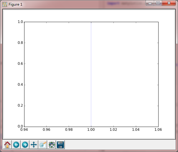
style
1.绘制x=1
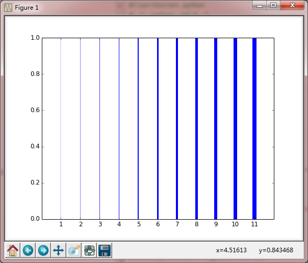
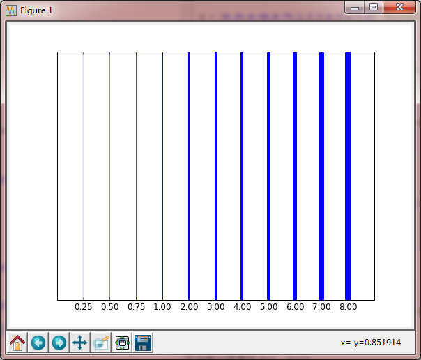
2.不同线宽
- enumerate(Widths)
3.线型(实线,虚线,点划线) - linestyle
- set_dashes
4.自动设置线颜色
5.点的显示形式 - marker
- markersize
- markeredgecolor
- markerfacecolor
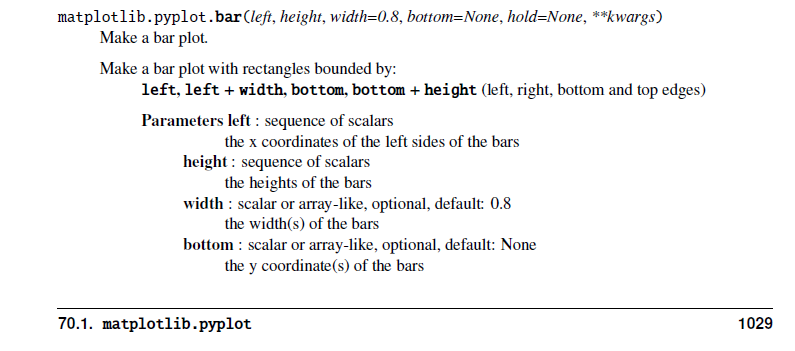
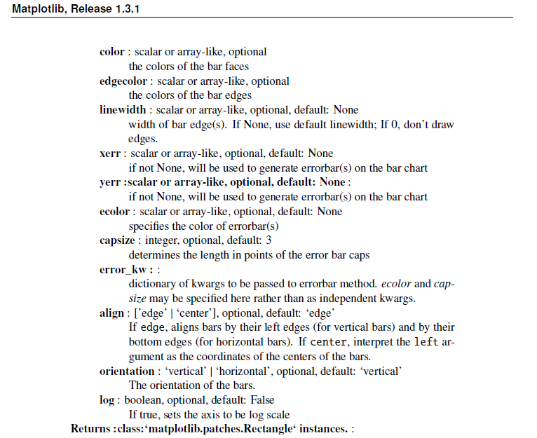
6.柱状图及其填充 - axes.bar
- axes.bar( .5+i, 1, hatch='/', color='white', edgecolor='blue',)
x=1
code
#!/usr/bin/env python

# -*- coding: utf-8 -*-

import numpy as np

import matplotlib

import matplotlib.pyplot as plt

#Data

Y=np.linspace(0,1,12)

X=np.ones(Y.size)

#figure

fig = plt.figure(figsize=(8,6), dpi=72, facecolor='white')

axes = plt.subplot(111)

#plot

axes.plot( (1+0)*X, Y, linewidth=0.25, color='blue')

plt.show()
Keypoints
axes.plot( (1+0)*X, Y, linewidth=0.25, color='blue')
X=[ 1. 1. 1. 1. 1. 1. 1. 1. 1. 1. 1. 1.]
Y=[ 0. 0.09090909 0.18181818 0.27272727 0.36363636 0.45454545
0.54545455 0.63636364 0.72727273 0.81818182 0.90909091 1. ]
Result
不同线宽
code
#!/usr/bin/env python

# -*- coding: utf-8 -*-

import numpy as np

import matplotlib

import matplotlib.pyplot as plt

# Data to be represented

Y = np.linspace(0,1,12)

print Y

X = np.ones(Y.size)

print X

W = [0.25,0.50,0.75,1,2,3,4,5,6,7,8]  #linewidth

print W

# Actual plotting

fig = plt.figure(figsize=(8,6), dpi=72, facecolor='white')

axes = plt.subplot(111)

for i,w in enumerate(W):

    axes.plot( (1+i)*X, Y, linewidth=w, color='blue')

# X,Y axes lable

axes.set_xlim(0,len(W)+1)

axes.set_yticks([])

axes.set_xticks(np.arange(1,len(W)+1))

axes.set_xticklabels(['%.2f' % w for w in W])

plt.show()
Keypoints
for i,w in enumerate(W):
axes.plot( (1+i)*X, Y, linewidth=w, color='blue')
绘制12条直线,X=1,...X=12
### Result
隐藏Y轴刻度,替换X轴标签后的图形
----
## 线型(实线,虚线,点划线)
### code
```python
#!/usr/bin/env python
# -*- coding: utf-8 -*-
import numpy as np
import matplotlib
import matplotlib.pyplot as plt
# Data to be represented
X = np.linspace(0,1,10)
Y = np.ones(X.size)
# Actual plotting
fig = plt.figure(figsize=(8,6), dpi=72, facecolor="white")
axes = plt.subplot(111,aspect=1)
axes.plot( X, Y*0.1, color = 'blue', linewidth=2, linestyle="-" )
axes.plot( X, Y*0.2, color = 'blue', linewidth=2, linestyle="--" )
axes.plot( X, Y*0.3, color = 'blue', linewidth=2, linestyle="-." )
axes.plot( X, Y*0.4, color = 'blue', linewidth=2, linestyle=":" )
line, = axes.plot( X, Y*0.5, color = 'blue', linewidth=2, linestyle="-" )
line.set_dashes([20,2])
line, = axes.plot( X, Y*0.6, color = 'blue', linewidth=2, linestyle="-" )
line.set_dashes([2,20])
line, = axes.plot( X, Y*0.7, color = 'blue', linewidth=2, linestyle="-" )
line.set_dashes((40,5,5,5))
line, = axes.plot( X, Y*0.8, color = 'blue', linewidth=2, linestyle="-" )
line.set_dashes((40,5,5,5,5,5))
line, = axes.plot( X, Y*0.9, color = 'blue', linewidth=2, linestyle="-" )

line.set_dashes((40,5,5,5,5,5,40,5))
axes.set_xlim(X.min(),X.max())
axes.set_ylim(0,1)
axes.set_xticks([])
axes.set_yticks(np.arange(1,10)/10.0)
axes.set_yticklabels(("-","--","-.",":",
"(20,2)", "(2,20)", "(40,5,5,5)",
"(40,5,5,5,5,5,5)", "(40,5,5,5,5,40)"))
plt.show()
Keypoints
axes.plot( X, Y*0.1, color = 'blue', linewidth=2, linestyle="-")
linestyle="-" 线型:
- --
- -.
- :
控制点划线的点,空格,划的长度:
line, = axes.plot( X, Y*0.9, color = 'blue', linewidth=2, linestyle="-" )
line.set_dashes((40,5,5,5,5,5,40,5))
40划5空格5点5空格5点5空格40划5空格
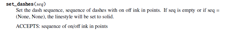
Result
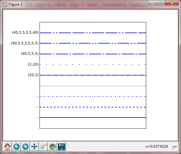
自动设置线颜色
code
#!/usr/bin/env python

# -*- coding: utf-8 -*-

import numpy as np

import matplotlib

import matplotlib.pyplot as plt

# Data to be represented

Y = np.linspace(0,1,12)

X = np.ones(Y.size)

# Actual plotting

fig = plt.figure(figsize=(8,6), dpi=72, facecolor="white")

axes = plt.subplot(111)

lineNumbers=9

for i in range(lineNumbers):

    axes.plot( (1+i)*X, Y, linewidth=4)

axes.set_xlim(0,lineNumbers+1)

axes.set_yticks([])

axes.set_xticks(np.arange(1,lineNumbers+1))

plt.show()
Keypoints
这里用循环绘制了9条直线,但是这里是自动填充颜色的?
Result
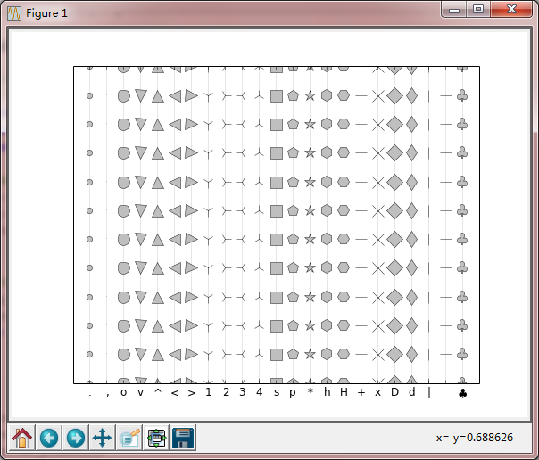
5. 点的显示形式
code
#!/usr/bin/env python
# -*- coding: utf-8 -*-
import numpy as np
import matplotlib
import matplotlib.pyplot as plt
# Data to be represented
Y = np.linspace(0,1,12)
X = np.ones(Y.size)
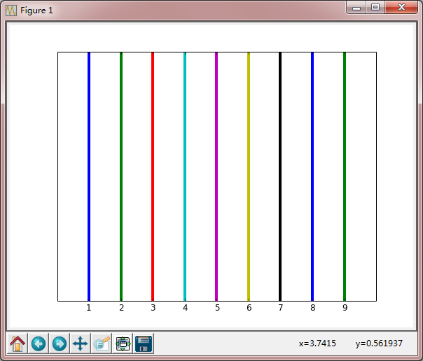
markers = ['.',',','o','v','^','<','>','1','2','3','4',
's','p','*','h','H','+','x','D','d','|','_', r'$\clubsuit$']
# Actual plotting
fig = plt.figure(figsize=(8,6), dpi=72, facecolor="white")
axes = plt.subplot(111)
for i,marker in enumerate(markers):
axes.plot( (1+i)*X, Y, color = '0.9', linewidth=1,
markersize = 13, marker=marker,
markeredgecolor = '0.10', markerfacecolor = '0.75')
axes.set_xlim(0,len(markers)+1)
axes.set_ylim(Y.min(),Y.max())
axes.set_yticks([])
axes.set_xticks(np.arange(1,len(markers)+1))
axes.set_xticklabels(markers)
plt.show()
Keypoints
   axes.plot( (1+i)*X, Y, color = '0.9', linewidth=1,

               markersize = 13, marker='x',

               markeredgecolor = '0.10', markerfacecolor = '0.75')
标记的大小,类型,边缘颜色,前景色
Resutl
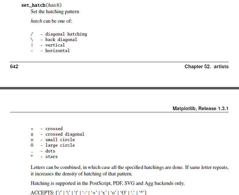
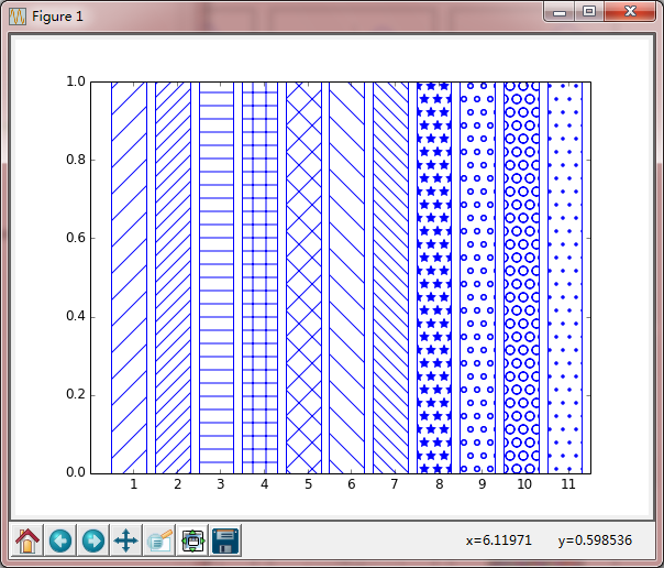
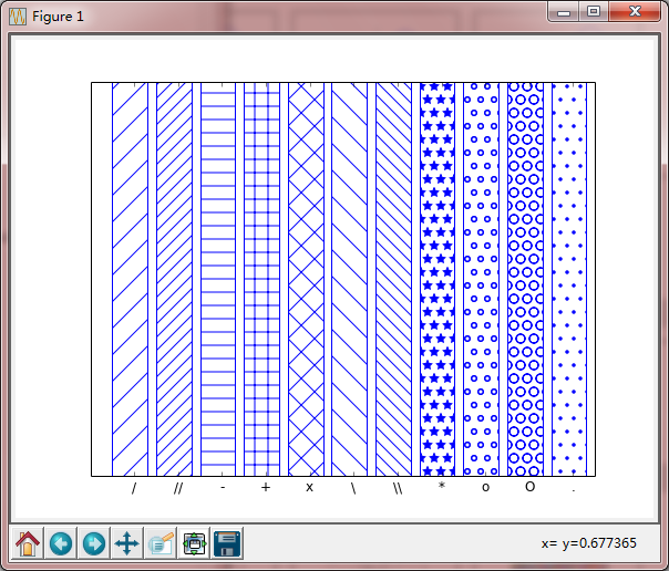
6. 柱状图及其填充
code
#!/usr/bin/env python

# -*- coding: utf-8 -*-

import numpy as np

import matplotlib

import matplotlib.pyplot as plt

# Data to be represented

X = np.linspace(0,1,10)

Y = np.ones(X.size)

patterns = ('/','//','-', '+', 'x', '\\', '\\\\', '*', 'o', 'O', '.')

# Actual plotting

fig = plt.figure(figsize=(8,6), dpi=72, facecolor="white")

axes = plt.subplot(111)

for i,pattern in enumerate(patterns):

    axes.bar( .5+i, 1, hatch=pattern, color='white', edgecolor='blue',)

axes.set_xlim(0,len(patterns)+.5)

axes.set_ylim(0,1)

axes.set_yticks([])

axes.set_xticks(np.arange(1,len(patterns)+1))

axes.set_xticklabels(patterns)

plt.show()
Keypoints
axes.bar( .5+i, 1, hatch=pattern, color='white', edgecolor='blue',)
hatch,柱状图的填充:
Result
matplotlib-plot-style的更多相关文章
- python matplotlib plot 数据中的中文无法正常显示的解决办法
转发自:http://blog.csdn.net/laoyaotask/article/details/22117745?utm_source=tuicool python matplotlib pl ...
- python matplotlib.plot画图显示中文乱码的问题
在matplotlib.plot生成的统计图表中,中文总是无法正常显示.在网上也找了些资料,说是在程序中指定字体文件,不过那样的话需要对plot进行很多设置,而且都是说的设置坐标轴标题为中文,有时候图 ...
- 用Python设置matplotlib.plot的坐标轴刻度间隔以及刻度范围
一.用默认设置绘制折线图 import matplotlib.pyplot as plt x_values=list(range(11)) #x轴的数字是0到10这11个整数 y_values=[x* ...
- matplotlib 可视化 —— style sheets
Customizing plots with style sheets Matplotlib Style Gallery 1. 常见 style ggplot: bmh:Bayesian Method ...
- matplotlib plot 绘图函数发生阻塞(block)时的解决方法
Is there a way to detach matplotlib plots so that the computation can continue? 在一般编辑器中: from matplo ...
- Python Matplotlib.plot Update image Questions
1. 最近在测试一款设备,采集了一些设备后需要一帧一帧显示图像,经常使用Python,所以选用了Matplotlib进行图像操作 数据结构: timesatamp polar_distance hor ...
- 05. Matplotlib 1 |图表基本元素| 样式参数| 刻度 注释| 子图
1.Matplotlib简介及图表窗口 Matplotlib → 一个python版的matlab绘图接口,以2D为主,支持python.numpy.pandas基本数据结构,运营高效且有较丰富的图表 ...
- python时间序列画图plot总结
画图从直觉上来讲就是为了更加清晰的展示时序数据所呈现的规律(包括趋势,随时间变化的规律(一周.一个月.一年等等)和周期性规律),对于进一步选择时序分析模型至关重要.下面主要是基于pandas库总结一下 ...
- matplotlib 画图
matplotlib 画图 1. 画曲线图 Tompson = np.array([0, 0, 0, 0, 0.011, 0.051, 0.15, 0.251, 0.35, 0.44, 0 ...
- 学机器学习,不会数据分析怎么行——数据可视化分析(matplotlib)
前言 前面两篇文章介绍了 python 中两大模块 pandas 和 numpy 的一些基本使用方法,然而,仅仅会处理数据还是不够的,我们需要学会怎么分析,毫无疑问,利用图表对数据进行分析是最容易的, ...
随机推荐
- Linux定时器工具
要使用crontab定时器工具,必须要启动cron服务: service cron start crontab的语法,以备日后救急 参见:http://blog.csdn.net/zlzlei/art ...
- Lomboz插件
2008年05月20日 星期二 下午 01:47 Lomboz是Eclipse的一个主要的开源插件(open-source plug-in),Lomboz插件能够使Java开发者更好的使用Eclips ...
- Oracle 12C -- 基于sequence的列的默认值
12C支持先创建一个sequence,然后再将该sequence指定为某个列的值的默认表达式. 和"identity column"具有以下不同点: ·对列的个数没有限制 ·seq ...
- [转]利用Docker构建开发环境
利用Docker构建开发环境 Posted by makewonder on 2014 年 4 月 2 日 最近接触PAAS相关的知识,在研发过程中开始使用Docker搭建了自己完整的开发环境, ...
- Windows键盘消息处理
原文链接: http://blog.sina.com.cn/s/blog_5f8817250100taab.html 本文大部分来自MSDN和网友的博客,我在实践的基础上再作了一些总结. 1,虚拟键( ...
- asp.net页面之间传值方法详解
asp.net中页面之间传值我们用得最多的就是get,post这两种了,其它的如session,appliction,cookie等这些相对来说少用也不是常用的,只是在特殊情况下在使用了. 1. Ge ...
- Java 8 – TemporalAdjusters examples
1. TemporalAdjusters Example to move a date to firstDayOfMonth, firstDayOfNextMonth, next Monday and ...
- StringBoot集成Rabbit Redis和ack机制双重保险,保障消息一定能够正确的消费
转: StringBoot集成Rabbit,根据业务返回ACK 原文链接 : http://www.jianshu.com/p/baed9ec92410 为了维护消息的有效性,当消费消息时候处理失败时 ...
- ganglia安装 by frank
作者是frank. 1.安装epelrpm -Uvh http://dl.fedoraproject.org/pub/epel/5/i386/epel-release-5-4.noarch.rpm2. ...
- struts2(三) 输入校验和拦截器
前面知道了struts2的架构图和struts2的自动封装表单参数和数据类型自动转换,今天来学struts2的第三第四个东西,输入校验和拦截器, --WH 一.输入校验 在以前我们写一个登录页面时,并 ...