自动改变html font-size,实现移动端rem适配
移动端采用rem适配非常方便
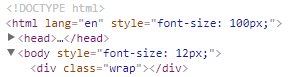
比如在iphone6尺寸下,将html font-size 设置为 100px,那么写css时,只要将尺寸/100 + rem 即可。
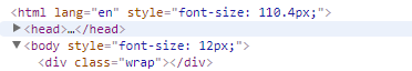
在iphone6Plus尺寸下,html font-size会自动调节,兼容多种尺寸的手机
以下是js代码,复制到你的项目中即可使用
(function(win) {

var ratio, scaleValue, renderTime,

    htmlEle = document.documentElement,

    vpMeta = document.querySelector('meta[name="viewport"]');

if (vpMeta) {

    var tempArr = vpMeta.getAttribute("content").match(/initial\-scale=(["']?)([\d\.]+)\1?/);

    if (tempArr) {

        scaleValue = parseFloat(tempArr[2]);

        ratio = parseInt(1 / scaleValue);

    }

} else {

    vpMeta = document.createElement("meta");

    vpMeta.setAttribute("name", "viewport");

    vpMeta.setAttribute("content", "width=device-width, initial-scale=0.5, user-scalable=no, minimal-ui");

    htmlEle.firstElementChild.appendChild(vpMeta);

    ratio = 2;

}

win.addEventListener("resize", function() {

    clearTimeout(renderTime);

    renderTime = setTimeout(initPage, 300);

}, false);

win.addEventListener("pageshow", function(e) {

    if(e.persisted){

        clearTimeout(renderTime);

        renderTime = setTimeout(initPage, 300)

    }

}, false);

if("complete" === document.readyState){

    document.body.style.fontSize = 12 * ratio + "px";

}else{

    document.addEventListener("DOMContentLoaded", function() {

        document.body.style.fontSize = 12 * ratio + "px";

    }, false);

}

initPage();

function initPage() {

    var htmlWidth = htmlEle.getBoundingClientRect().width;

    htmlWidth / ratio > 768 && (htmlWidth = 768 * ratio);

    win.rem = 100 * (htmlWidth / 375);

    htmlEle.style.fontSize = win.rem + "px";

}

})(window);
代码分析
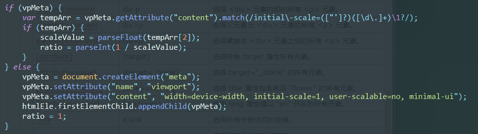
如果你设置了meta标签的视口属性,则获取initial-scale缩放比例,如果没设置,则自动添加。
一般initial-scale为1
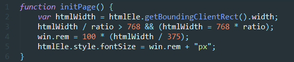
- line 2 获取屏幕宽度
- line 3 如果宽度超过768(ipad平板宽度),则不再进行调节
- line 4、5 设置rem,我以iphone6宽度375设置的,在该尺寸下,rem=100px,如果是其他尺寸,修改375即可
(htmlWidth/375)得到的是缩放比例,在IPHONE6下计算时,不用管html的font-size,直接px/100即算出rem
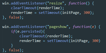
- 当页面改变尺寸,或者初次显示的时候,执行方法
persisted是pageshow事件的属性,检测浏览器是否读取缓存,是的话为true
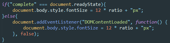
当页面渲染完后,设置body html-size,防止使用默认样式的元素出错
自动改变html font-size,实现移动端rem适配的更多相关文章
- 谈谈我的移动端rem适配方案
最近有点怀疑人生,毕竟一个人写前端,有时候会怀疑自己理解的一些东西包括用法有没有符合标准.趁着这阵子闲下来,翻了翻别人的rem适配博客,发现有点绕口,怪自己是个强迫症,啥都要自己去试试结果并从中理解, ...
- 07. 如何实现移动端rem适配
如何实现移动端rem适配 <!DOCTYPE html> <html> <head> <meta charset="UTF-8"> ...
- 移动端rem适配&iOS兼容
移动端rem适配js // 默认375,750设计稿请将375替换为750 (function (doc, win) { // 移动端适配 var docEl = doc.documentElemen ...
- H5 端 rem 适配方案与 viewport 适配
H5 端 rem 适配方案与 viewport 适配 rem rem 是 CSS3 新增的一个相对单位(root em,根 em) 只根据当前页面 HTML 页面的 font-size 设置,如果根目 ...
- 移动端rem适配屏幕
九月已成历史,十月如期而至...可能是九月工作比较清闲,周记就没怎么写,十月决不能这么堕落,立贴为证,至少保证5篇博客!!!如果没学到什么新知识,就对以往的那些工作中常用到的知识点做个总结...话不多 ...
- 移动端 rem适配方法
rem适配 一, 网易适配方法 屏幕宽度/设计稿rem宽度=页面动态font-size值(如:375/7.5=50) document.documentElement. ...
- H5移动端rem适配
/** * 移动端自适应 */ <meta name="viewport" content="width=device-width,user-scalable=no ...
- vue中使用第三方UI库的移动端rem适配方案
需求:使用vue-cli脚手架搭建项目,并且使用第三方的UI库(比如vant,mint ui)的时候,因为第三方库用的都是用px单位,无法使用rem适配不同设备的屏幕. 解决办法:使用px2rem-l ...
- 关于移动端rem适配
var num = 1 / window.devicePixelRatio; var fontSize = document.documentElement.clientWidth / 10; doc ...
随机推荐
- linux-配置字符串-grep
grep -rn "hello,world!" * * : 表示当前目录所有文件,也可以是某个文件名 -r 是递归查找 -n 是显示行号 -R 查找所有文件包含子目录 -i 忽略大 ...
- openfire源码修改后如何打包部署到linux服务器上
原文:http://blog.csdn.net/jinzhencs/article/details/50457152 1.linux版本的3.10.3解压部署启动(过程略,参考我的另一篇博文http: ...
- 【mybatis】mybatis中 的# 和 $的区别
mybatis中 的# 和 $的区别 参考地址:https://www.cnblogs.com/sxdcgaq8080/p/10869144.html
- SilverLight-3:目录
ylbtech-SilverLight-Index: 1.A,返回顶部 Layout The Layout Containers - The Panel Background Borders Si ...
- Vue表单和组件
一.表单 v-model 指令在表单控件元素上创建双向数据绑定,v-model 会根据控件类型自动选取正确的方法来更新元素. <input v-model="message" ...
- ieda常用快捷键
Ctrl+Shift + Enter,语句完成“!”,否定完成,输入表达式时按 “!”键Ctrl+E,最近的文件Ctrl+Shift+E,最近更改的文件Shift+Click,可以关闭文件Ctrl+[ ...
- Hive 性能调优
避免执行MR select * or select field1,field2 limit 10 where语句中只有分区字段或该表的本地字段 使用本地set hive.exec.mode.local ...
- JPEG编码(一)
JPEG编码介绍. 转自:http://blog.chinaunix.net/uid-20451980-id-1945156.html JPEG(Joint Photographic Experts ...
- ElasticSearch高级查询
ElasticSearch高级查询 https://www.imooc.com/video/15759/0 ElasticSearch查询 1,子条件查询:特定字段查询所指特定值 1.1query c ...
- node-表单验证
var http = require('http'); var url = require('url'); var fs = require('fs'); var querystring = requ ...