自动改变html font-size,实现移动端rem适配
移动端采用rem适配非常方便
比如在iphone6尺寸下,将html font-size 设置为 100px,那么写css时,只要将尺寸/100 + rem 即可。
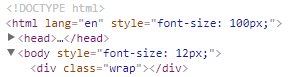
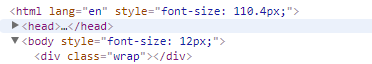
在iphone6Plus尺寸下,html font-size会自动调节,兼容多种尺寸的手机
以下是js代码,复制到你的项目中即可使用
(function(win) {

var ratio, scaleValue, renderTime,

    htmlEle = document.documentElement,

    vpMeta = document.querySelector('meta[name="viewport"]');

if (vpMeta) {

    var tempArr = vpMeta.getAttribute("content").match(/initial\-scale=(["']?)([\d\.]+)\1?/);

    if (tempArr) {

        scaleValue = parseFloat(tempArr[2]);

        ratio = parseInt(1 / scaleValue);

    }

} else {

    vpMeta = document.createElement("meta");

    vpMeta.setAttribute("name", "viewport");

    vpMeta.setAttribute("content", "width=device-width, initial-scale=0.5, user-scalable=no, minimal-ui");

    htmlEle.firstElementChild.appendChild(vpMeta);

    ratio = 2;

}

win.addEventListener("resize", function() {

    clearTimeout(renderTime);

    renderTime = setTimeout(initPage, 300);

}, false);

win.addEventListener("pageshow", function(e) {

    if(e.persisted){

        clearTimeout(renderTime);

        renderTime = setTimeout(initPage, 300)

    }

}, false);

if("complete" === document.readyState){

    document.body.style.fontSize = 12 * ratio + "px";

}else{

    document.addEventListener("DOMContentLoaded", function() {

        document.body.style.fontSize = 12 * ratio + "px";

    }, false);

}

initPage();

function initPage() {

    var htmlWidth = htmlEle.getBoundingClientRect().width;

    htmlWidth / ratio > 768 && (htmlWidth = 768 * ratio);

    win.rem = 100 * (htmlWidth / 375);

    htmlEle.style.fontSize = win.rem + "px";

}

})(window);
代码分析
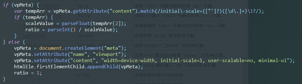
如果你设置了meta标签的视口属性,则获取initial-scale缩放比例,如果没设置,则自动添加。
一般initial-scale为1
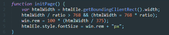
- line 2 获取屏幕宽度
- line 3 如果宽度超过768(ipad平板宽度),则不再进行调节
- line 4、5 设置rem,我以iphone6宽度375设置的,在该尺寸下,rem=100px,如果是其他尺寸,修改375即可
(htmlWidth/375)得到的是缩放比例,在IPHONE6下计算时,不用管html的font-size,直接px/100即算出rem
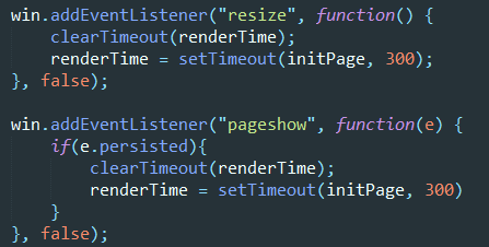
- 当页面改变尺寸,或者初次显示的时候,执行方法
persisted是pageshow事件的属性,检测浏览器是否读取缓存,是的话为true
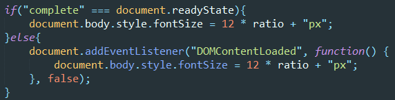
当页面渲染完后,设置body html-size,防止使用默认样式的元素出错
自动改变html font-size,实现移动端rem适配的更多相关文章
- 谈谈我的移动端rem适配方案
最近有点怀疑人生,毕竟一个人写前端,有时候会怀疑自己理解的一些东西包括用法有没有符合标准.趁着这阵子闲下来,翻了翻别人的rem适配博客,发现有点绕口,怪自己是个强迫症,啥都要自己去试试结果并从中理解, ...
- 07. 如何实现移动端rem适配
如何实现移动端rem适配 <!DOCTYPE html> <html> <head> <meta charset="UTF-8"> ...
- 移动端rem适配&iOS兼容
移动端rem适配js // 默认375,750设计稿请将375替换为750 (function (doc, win) { // 移动端适配 var docEl = doc.documentElemen ...
- H5 端 rem 适配方案与 viewport 适配
H5 端 rem 适配方案与 viewport 适配 rem rem 是 CSS3 新增的一个相对单位(root em,根 em) 只根据当前页面 HTML 页面的 font-size 设置,如果根目 ...
- 移动端rem适配屏幕
九月已成历史,十月如期而至...可能是九月工作比较清闲,周记就没怎么写,十月决不能这么堕落,立贴为证,至少保证5篇博客!!!如果没学到什么新知识,就对以往的那些工作中常用到的知识点做个总结...话不多 ...
- 移动端 rem适配方法
rem适配 一, 网易适配方法 屏幕宽度/设计稿rem宽度=页面动态font-size值(如:375/7.5=50) document.documentElement. ...
- H5移动端rem适配
/** * 移动端自适应 */ <meta name="viewport" content="width=device-width,user-scalable=no ...
- vue中使用第三方UI库的移动端rem适配方案
需求:使用vue-cli脚手架搭建项目,并且使用第三方的UI库(比如vant,mint ui)的时候,因为第三方库用的都是用px单位,无法使用rem适配不同设备的屏幕. 解决办法:使用px2rem-l ...
- 关于移动端rem适配
var num = 1 / window.devicePixelRatio; var fontSize = document.documentElement.clientWidth / 10; doc ...
随机推荐
- springboot 2.0+ 自定义拦截器
之前项目的springboot自定义拦截器使用的是继承WebMvcConfigurerAdapter重写常用方法的方式来实现的. 以下WebMvcConfigurerAdapter 比较常用的重写接口 ...
- SQL表操作习题3 11~13题
- 使用 SQL Server 的 uniqueidentifier 字段类型
原文:使用 SQL Server 的 uniqueidentifier 字段类型 SQL Server 自 2008 版起引入了 uniqueidentifier 字段,它存储的是一个 UUID, 或 ...
- virtualenv 和apache 搭建django时注意事项
在对应网站的xxx.conf中 WSGIDaemonProcess http://127.0.0.1:80 python-path=/home/user/my_blog_2:/home/user/ve ...
- DotnetBrowser高级教程-(4)使用MVC框架5-使用视图
mvc框架理所当然的要支持view了,我们看下前面上传文件的地方,在展示页面时,我们使用了如下的代码: public string UploadImgPage() { return "< ...
- Spark 2.0 DataFrame map操作中Unable to find encoder for type stored in a Dataset.问题的分析与解决
转载:http://blog.csdn.net/sparkexpert/article/details/52871000 随着新版本的spark已经逐渐稳定,最近拟将原有框架升级到spark 2.0. ...
- java学习之输入,输出流
输入流与输出流 1,流的分类:字节流和字符流 区别如下: 1,字节流(8位Unicode)在操作的时候本身是不会用到缓冲区(内存)的byte,是与文件本身直接操作的,而字符流(16位Unicode)在 ...
- [Algorithm] Heap data structure and heap sort algorithm
Source, git Heap is a data structure that can fundamentally change the performance of fairly common ...
- 倍福TwinCAT(贝福Beckhoff)基础教程1.2 TwinCAT安装配置
由于TC2和TC3都有可能用到,个人推荐都安装,但是注意必须是先安装的TwinCAT2,然后安装TwinCAT3,如果反了可能两个都没法用(打开TcSwitchRuntime提示Both TwinCA ...
- react native使用 mobx , can't find variable:Symbol
原因是因为 mobx的版本用的最新版本..用到了 Symbol部分es6的api特性. 解决问题办法 1. 把mobx降版本到 4.3.1 . mobx-react降版本到 5.1.0 即可. 或者 ...