Nuxt/Vue自定义导航栏Topbar+标签栏Tabbar组件
基于Vue.js实现自定义Topbar+Tabbar组件|仿咸鱼底部凸起导航
最近一直在倒腾Nuxt项目,由于Nuxt.js是基于Vue.js的服务端渲染框架,只要是会vue,基本能很快上手了。
一般移动端项目,顶部导航/底部Tab功能是少不了的。本想着使用Vant组件库,可是项目中有个类似咸鱼底部凸起导航功能,经过再三考虑还是自己造了个自定义Navbar+Tabbar组件。以便以后在其它Vue项目中也能使用。

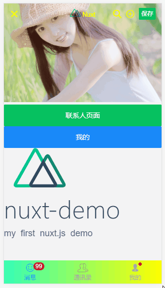
如上图:在Nuxt项目中应用效果
下面就开始进入Nuxt中创建自定义顶部导航条及底部标签栏的介绍。
◆ 开始
在components目录下新建 headerBar.vue 和 tabBar.vue 页面。

然后在 plugins 目录下的 componentsInstall.js 文件中引入即可。
◆ 自定义导航条headerBar
<template>

    <div class="header-bar" :class="{'fixed': fixed, 'transparent fixed': transparent}">

        <div class="header-bar__wrap flexbox flex-alignc" :style="{'background': bgcolor, 'color': color, 'z-index': zIndex}">

            <!-- >>返回 -->

            <div class="action hdbar-action__left isback" v-if="back && back!='false'" @click="$router.go(-1)">

                <slot name="backIco" /><slot name="backText" />

            </div>

            <!-- >>标题 -->

            <div class="hdbar-title" :class="{'center': center}">

                <slot name="title" />

            </div>

            <!-- >>搜索框 -->

            <div class="action hdbar-action__search">

                <slot name="search" />

            </div>

            <!-- >>右侧 -->

            <div class="action hdbar-action__right">

                <slot name="right" />

            </div>

        </div>

    </div>

</template>
/**

 * @Desc     Vue自定义导航条headerBar

 * @Time     andy by 2020-10-06

 * @About    Q:282310962  wx:xy190310

 */

<script>

    export default {

        props: {

            // 是否返回

            back: { type: [Boolean, String], default: true },

            // 标题

            title: { type: String, default: '' },

            // 标题颜色

            color: { type: String, default: '#fff' },

            // 背景颜色

            bgcolor: { type: String, default: '#22d59c' },

            // 标题是否居中

            center: { type: [Boolean, String], default: false },

            // 搜索框

            search: { type: [Boolean, String], default: false },

            // 是否固定

            fixed: { type: [Boolean, String], default: false },

            // 背景透明

            transparent: { type: [Boolean, String], default: false },

            // 设置层级

            zIndex: { type: [Number, String], default: '2021' },

        },

        data() {

            return {}

        },

        methods: {},

    }

</script>
支持自定义背景、颜色、左侧图标、标题居中、搜索栏,右侧按钮支持图标/文字/图片,还可以自定义圆点提示、事件处理等功能。


<header-bar :back="true" :bgcolor="linear-gradient(to right, #f726ff, #2acfff)" color="#ff0" center transparent>

    <template #backIco><i class="iconfont icon-close"></i></template>

    <div slot="title">

    <img src="~/assets/img/logo.png" height="16" /> <em>Nuxt</em>

    </div>

    <div slot="right" class="ml-20"><i class="iconfont icon-search"></i></div>

    <div slot="right" class="ml-20" @click="$toast('选择~~')"><i class="iconfont icon-choose"></i></div>

    <div slot="right" class="ml-20"><van-button type="primary" size="mini" @click="saveData">保存</van-button></div>

</header-bar>

<header-bar :back="true" bgcolor="linear-gradient(to right, #6126ff, #ff21ee)" color="#ff0" center>
<div slot="backIco"><i class="iconfont icon-close"></i></div>
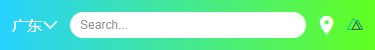
<div slot="search" class="flex-c flex1">
<input class="ipt flex1" placeholder="Search..." value="搜索关键字..." />
</div>
<div slot="right" class="ml-20"> <i class="iconfont icon-shoucang"></i></div>
<div slot="right" class="ml-20"> <i class="iconfont icon-female"></i></div>
</header-bar>
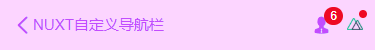
<header-bar :back="true" bgcolor="#fcd5ff" color="#c24cff" center>

    <div slot="backIco" class="flex-c"><i class="iconfont icon-arrL"></i> NUXT自定义导航栏</div>

    <div slot="right"><i class="iconfont icon-male"></i><em class="nuxt__badge">6</em></div>

    <div slot="right"><img src="~/assets/img/logo.png" height="12" /><em class="nuxt__badge-dot"></em></div>

</header-bar>
◆ 自定义底部导航tabBar
<template>

    <div class="tab-bar" :class="{'fixed': fixed}">

        <div class="tab-bar__wrap flexbox flex-alignc" :style="{'background': bgcolor}">

            <div v-for="(item,index) in tabs" :key="index" class="navigator" :class="currentTabIndex == index ? 'on' : ''" @click="switchTabs(index, item)">

                <div class="ico" :class="{'dock': item.dock}">

                    <i v-if="item.dock" class="dock-bg" :style="{'background': item.dockBg ? item.dockBg : activeColor}"></i>

                    <i v-if="item.icon" class="iconfont" :class="item.icon" :style="{'color': (currentTabIndex == index && !item.dock ? activeColor : color), 'font-size': item.iconSize}"></i>

                    <img v-if="item.iconImg" class="iconimg" :src="currentTabIndex == index && !item.dock ? item.selectedIconImg : item.iconImg" :style="{'font-size': item.iconSize}" />

                    <em v-if="item.badge" class="nuxt__badge">{{item.badge}}</em>

                    <em v-if="item.dot" class="nuxt__badge-dot"></em>

                </div>

                <div class="txt" :style="{'color': (currentTabIndex == index ? activeColor : color)}">{{item.text}}</div>

            </div>

        </div>

    </div>

</template>
<script>

  export default {

    props: {

        current: { type: [Number, String], default: 0 },

        // 背景颜色

        bgcolor: { type: String, default: '#fff' },

        // 颜色

        color: { type: String, default: '#999' },

        // 点击后颜色

        activeColor: { type: String, default: '#22d59c' },

        // 是否固定

        fixed: { type: [Boolean, String], default: false },

        // tab选项

        tabs: {

            type: Array,

            default: () => null

        }

    },

    data() {

      return {

          currentTabIndex: this.current

      }

    },

    created() {

        // 匹配当前页面

        const _pagePath = this.$route.path

        this.tabs.map((val, index) => {

            if(val.pagePath == _pagePath) {

                this.currentTabIndex = index

            }

        })

    },

    methods: {

        switchTabs(index, item) {

            this.currentTabIndex = index

            this.$emit('click', index)

            if(item.pagePath) {

                this.$router.push(item.pagePath)

            }

        }

    },

  }

</script>
支持自定义文字/图标、背景色、文字颜色/选中颜色、是否固定、点击事件(返回点击选项索引值) 等功能。
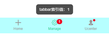
<tab-bar bgcolor="#b6ffff" @click="handleTabbar" :tabs="[

    {

        icon: 'icon-tianjia',

        text: 'Home',

    },

    {

        icon: 'icon-shezhi',

        text: 'Manage',

        badge: 1

    },

    {

        icon: 'icon-male',

        text: 'Ucenter',

        dot: true

    },

    ]"

/>
// tabbar点击事件

handleTabbar(index) {

    this.$toast('tabbar索引值:' + index);

},

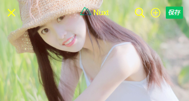
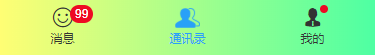
如上图:设置选项 dock: true 即可实现类似咸鱼凸起按钮效果。
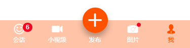
<tab-bar bgcolor="#7fa1ff" color="#fff" activeColor="#fb4e30" :tabs="[

    {

        icon: 'icon-face',

        text: 'Face',

        dot: true,

        iconSize: '24px',

    },

    {

        //icon: 'icon-tianjia',

        iconImg: 'https://gw.alicdn.com/tfs/TB1CoEwVrvpK1RjSZFqXXcXUVXa-185-144.png?getAvatar=1',

        text: '咸鱼',

        dock: true,

        dockBg: '#fb4e30',

        iconSize: '.64rem',

    },

    {

        icon: 'icon-search',

        text: '搜索',

    },

    ]"

/>
ok,基于Vue/Nuxt自定义顶部/底部导航组件就介绍到这里。希望对大家有所帮助哈!
Nuxt/Vue自定义导航栏Topbar+标签栏Tabbar组件的更多相关文章
- 分别用ToolBar和自定义导航栏实现沉浸式状态栏
一.ToolBar 1.在build.gradle中添加依赖,例如: compile 'com.android.support:appcompat-v7:23.4.0' 2.去掉应用的ActionBa ...
- iOS个人中心渐变动画、微信对话框、标签选择器、自定义导航栏、短信验证输入框等源码
iOS精选源码 简单的个人中心页面-自定义导航栏并予以渐变动画 程序员取悦女票的正确姿势---Tip1(iOS美容篇) iOS 前台重启应用和清除角标的问题 微信原生提醒对话框3.0 JHLikeBu ...
- iOS:自定义工具栏、导航栏、标签栏
工具栏为UIToolBar,导航栏UINavigationBar,标签栏UITabBar.它们的样式基本上时差不多的,唯一的一点区别就是,工具栏一般需要自己去创建,然后添加到视图中,而导航栏和标签栏不 ...
- Taro多端自定义导航栏Navbar+Tabbar实例
运用Taro实现多端导航栏/tabbar实例 (H5 + 小程序 + React Native) 最近一直在捣鼓taro开发,虽说官网介绍支持编译到多端,但是网上大多数实例都是H5.小程序,很少有支持 ...
- uni-app自定义导航栏按钮|uniapp仿微信顶部导航条
最近一直在学习uni-app开发,由于uniapp是基于vue.js技术开发的,只要你熟悉vue,基本上很快就能上手了. 在开发中发现uni-app原生导航栏也能实现一些顶部自定义按钮+搜索框,只需在 ...
- swift 自定义导航栏颜色
func setNavigationApperance(){ //自定义导航栏颜色 [self.navigationController?.navigationBar.barTintColor = U ...
- ios7以上自定义导航栏标题的字体大小及颜色的方法
自定义导航栏的字体和颜色,只需要自定义一个lable,然后将lable添加到导航栏的titleview中就可以了 代码如下 UILabel *label = [[UILabel alloc] init ...
- iOS 自定义导航栏笔记
一.UINavigationBar的结构 导航栏几乎是每个页面都会碰到的问题,一般两种处理方式:1.隐藏掉不显示 2.自定义 1. 添加导航栏 TestViewController * mainVC ...
- 微信小程序自定义导航栏
微信小程序需要自定义导航栏,特别是左上角的自定义设置,可以设置返回按钮,菜单按钮,配置如下: 1.在app.json的window属性中增加: navigationStyle:custom 顶部导航栏 ...
随机推荐
- Forward Rendering VS Deferred Rendering
http://gad.qq.com/article/detail/32731 Forward Rendering Deferred Rendering
- Spark3.0YarnCluster模式任务提交流程源码分析
1.通过spark-submit脚本提交spark程序 在spark-submit脚本里面执行了SparkSubmit类的main方法 2.运行SparkSubmit类的main方法 3.调用doSu ...
- 跟着兄弟连系统学习Linux-【day09】
day10-20200609 p29.软件包管理-rpm命令管理-安装升级与卸载 [rpm -ivh 包全名]安装 -i(安装) -v (显示详细信息)-h (显示安装进度) 会一步步依赖,比较麻烦, ...
- 跟着兄弟连系统学习Linux-【day08】
day08-20200605 p27.软件包管理简 windows 和 linux 软件是不同的版本. Linux源码包,开源的.绝大部分都是C语言写的.源码包安装速度比较慢.需要先编译后再安装.脚本 ...
- shell小技巧(2)查找文件时,排除几种类型文件
代码: find -type f ! -name "*.jpg" ! -name "*.png" ! -name "*.jpeg" ! -n ...
- C#的TextBox的四种禁止编辑方法
前言 一般而言,Textbox中有两个属性可以对其进行防止编辑的设定,这是最基础的知识,也是我要提出的前两种方法.而后两种方法实际为一种,但可以应用于不同环境中. 一.ReadOnly属性 这样设置, ...
- taro-script 0.4 发布,基于Taro v3的js解释器组件
taro-script Github地址 基于Taro v3开发,支持多端小程序动态加载远程 JavaScript 脚本并执行,支持 ES5 语法 最近更新内容 新增useScriptContext获 ...
- JumpServer 架构浅解
Jumpserver 是一款由python编写开源的跳板机(堡垒机)系统,实现了跳板机应有的功能.基于ssh协议来管理,客户端无需安装agent.完全开源,GPL授权 设计思路 设计一个跳转网关,所有 ...
- JS -- 基础语法1
一.document.write() 输出内容 document.write() 可用于直接在网页中输出内容. 方式1:输出内容用""括起,直接输出""号内的内 ...
- redis加固:修改默认端口6379、密码不为空、内网服务器访问
一.windows下redis加固: 1.修改redis密码+修改redis端口 1.1.找到服务当中redis的属性配置文件是哪个 这个是我的"D:\Program Files\Red ...