用Flex实现常见的几种布局
用Flex实现常见的几种布局
1.水平,垂直居中。
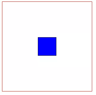
<style type="text/css">

      .container{

          display: flex;

          width: 300px;

          height: 300px;

          border: 1px solid red;

          align-items: center;     /* 垂直居中*/

          justify-content: center; /* 水平居中*/

      }

      .item{

          width: 60px;

          height: 60px;

                border: 1px solid black;

                text-align: center;

                background: blue;

      }

</style>

<div class="container">

    <div class="item item1"></div>

</div>
2. 左边固定宽度,右边占满宽度

<style type="text/css">

      .container{

          display: flex;

          width: %;

          height: 300px;

          border: 1px solid red;

      }

      .item1{

          width: 100px;

          background: blue;

      }

      .item2{

          flex: ;

      }

</style>

<div class="container">

    <div class="item item1"></div>

    <div class="item item2"></div>

</div>
3.顶部固定高度,下部占满剩余高度
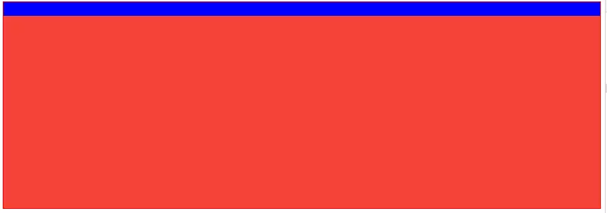
<style type="text/css">

      .container{

          display: flex;

          width: %;

          height: 300px;

          border: 1px solid red;

          flex-direction: column;

      }

      .item1{

          width: %;

          height: 20px;

          background: blue;

      }

      .item2{

          width: %;

          flex: ;

          background: #F44336;

      }

</style>

<div class="container">

    <div class="item item1"></div>

    <div class="item item2"></div>

</div>
4.顶部,底部固定高度,中间占满剩余高度
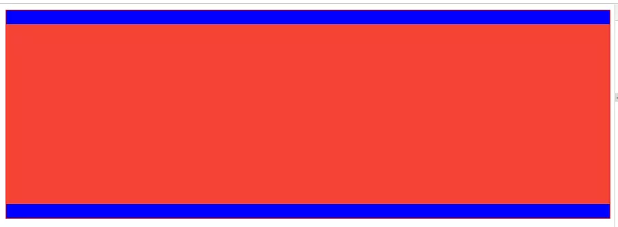
<style type="text/css">

      .container{

          display: flex;

          width: %;

          height: 300px;

          border: 1px solid red;

          flex-direction: column;

      }

      .item1{

          width: %;

          height: 20px;

          background: blue;

      }

      .item2{

          width: %;

          flex: ;

          background: #F44336;

      }

      .item3{

          width: %;

          height: 20px;

          background: blue;

      }

</style>

<div class="container">

    <div class="item item1"></div>

    <div class="item item2"></div>

    <div class="item item3"></div>

</div>
5.中部占满剩余高度,此元素内部采用"左边固定宽度,右边占满剩余宽度"
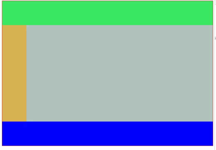
<style type="text/css">

      .container{

          display: flex;

          width: %;

          height: 600px;

          border: 1px solid red;

          flex-direction: column;

      }

      .header{

          height: 100px;

          width: %;

          background: #3be662;

      }

      .body{

          flex: ;

          width: %;

          background: red;

          display: flex;

          flex-direction: row;

      }

      .footer{

          width: %;

          height: 100px;

          background: blue;

      }

      .left{

          width: 100px;

        background: #d7b052;

      }

      .right{

          flex: ;

        background: #b1c2bd;

      }

</style>

<div class="container">

    <div class="header"></div>

    <div class="body">

      <div class="left"></div>

      <div class="right"></div>

    </div>

    <div class="footer"></div>

</div>
Flex兼容性写法
1.盒子的兼容性写法:
.box{

    display: -webkit-flex;  /* 新版本语法: Chrome 21+ */

    display: flex;          /* 新版本语法: Opera 12.1, Firefox 22+ */

    display: -webkit-box;   /* 老版本语法: Safari, iOS, Android browser, older WebKit browsers. */

    display: -moz-box;      /* 老版本语法: Firefox (buggy) */

    display: -ms-flexbox;   /* 混合版本语法: IE 10 */

}
2.子元素的兼容性写法:
.flex1 {

    -webkit-flex: ;        /* Chrome */

    -ms-flex:              /* IE 10 */

    flex: ;                /* Spec - Opera 12.1, Firefox 20+ */

    -webkit-box-flex:      /* 老版本语法 - iOS 6-, Safari 3.1-6 */

    -moz-box-flex: ;       /* 老版本语法 - Firefox 19- */

}
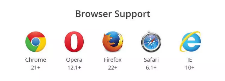
最后附上各个浏览器对Flex的支持程度:
用Flex实现常见的几种布局的更多相关文章
- HTML的三种布局:DIV+CSS、FLEX、GRID
Div+css布局 也就是盒子模型,有W3C盒子模型,IE盒子模型.盒子模型由四部分组成margin.border.padding.content. 怎么区别这两种模型呢,区别在于w3c中的width ...
- Android开发之基本控件和详解四种布局方式
Android中的控件的使用方式和iOS中控件的使用方式基本相同,都是事件驱动.给控件添加事件也有接口回调和委托代理的方式.今天这篇博客就总结一下Android中常用的基本控件以及布局方式.说到布局方 ...
- 常见div+css网页布局(float,absolute)
网页布局-常见 1, float布局 (1)常规方法 <div id="warp"> <div id="column&quo ...
- 【转】Android UI 五种布局
在一个Android应用中,Layout是开发中的一个很重要环节,Layout是组成UI不可缺少的一部分. ## Android UI 核心类 在Android应用构建UI的方法有以下几种: 单纯使用 ...
- Extjs--12种布局方式
按照Extjs的4.1的文档来看,extjs的布局方式大致有12种,下面一一介绍,有些代码就是文档中的. 1.Border 边界布局 border布局,最多可以将页面分割为"东南西北中&qu ...
- CSS 常见的8种选择器 和 文本溢出问题
<!DOCTYPE html><html> <head> <meta charset="UTF-8"> <title>c ...
- 精华阅读第 13 期 |常见的八种导致 APP 内存泄漏的问题
本期是移动开发精英俱乐部的第13期文章,都是以技术为主,所以这里就不过多的进行赘述了,我们直接看干货内容吧!本文系ITOM管理平台OneAPM整理. 实际项目中的MVVM(积木)模式–序章 导读:开篇 ...
- Android-基本控件和详解四种布局方式
转自:https://www.cnblogs.com/ludashi/p/4883915.html 一.常用基本控件 1.TextView 看到Android中的TextView, 我不禁的想到了iO ...
- Flex元素布局规则总结,以及布局和容器
一.Flex中的元素分类从功能层面可以把Flex中的元素分为组件(Components)和容器(Containers)两大类:组件 - 是指那类具有明确交互或数据展示功能的元素,例如Button.Ch ...
随机推荐
- ajax请求不能下载文件(转载)
最近在做文件下载,后台写了个控制层,直接走进去应该就可以下载文件,各种文件图片,excel等 但是起初老是下载失败,并且弹出下面的乱码: 前台请求代码: $('#fileexcel').unbind( ...
- java实现发送邮件功能
项目中实现发送邮件功能,先书写一个小Demo,记录如下: POM.XML中导入依赖 <!-- start java 提供的支持邮件发送相关业务的类 --> <dependency&g ...
- touch: cannot touch ‘/var/jenkins_home/copy_reference_file.log’: Permission denied Can not write to /var/jenkins_home/copy_reference_file.log. Wrong volume permissions?
问题:在从 https://c.163.com/hub#/m/repository/?repoId=3093 下载镜像 docker pull hub.c.163.com/library/jenkin ...
- 设计工具-MindManager(思维导图)
1,百度百科 http://baike.baidu.com/view/30054.htm?from_id=7153629&type=syn&fromtitle=MindManager& ...
- git fetch 的简单用法:更新远程代码到本地仓库及冲突处理
Git中从远程的分支获取最新的版本到本地方式如下,如何更新下载到代码到本地,请参阅ice的博客基于Github参与eoe的开源项目指南方式一1. 查看远程仓库 1 2 3 4 5 6 $ git re ...
- Linux 内核参数 和 Oracle相关参数调整
Linux 内核参数 和 Oracle相关参数调整 分类: Oracle Basic Knowledge2009-10-14 12:23 9648人阅读 评论(0) 收藏 举报 oraclelinux ...
- 乌云主站所有漏洞综合分析&乌云主站漏洞统计
作者:RedFree 最近的工作需要将乌云历史上比较有含金量的漏洞分析出来,顺便对其它的数据进行了下分析:统计往往能说明问题及分析事物的发展规律,所以就有了此文.(漏洞数据抓取自乌云主站,漏洞编号从1 ...
- HDU 3917 Road constructions(最小割---最大权闭合)
题目地址:HDU 3917 这题简直神题意... 题目本身就非常难看懂不说..即使看懂了.也对这题意的逻辑感到无语...无论了.. 就依照那题意上说的做吧... 题意:给你n个城市,m个公司.若干条可 ...
- 获取取并下载tuku的漫画的爬虫
代码地址如下:http://www.demodashi.com/demo/12842.html 概述 一个简单的爬虫,实现是爬取tuku网站的漫画.并下载到脚本的文件夹中,下载的漫画按照章节名放在各自 ...
- (一)Activiti之——简介、插件安装及BPMN元素
1. 工作流概念 工作流(Workflow):就是“业务过程的部分或整体在计算机应用环境下的自动化”,它主要解决的是“使在多个参与者之间按照某种预定义的规则传递文档.信息或任务的过程自动进行,从而实现 ...