Android SeekBar自定义使用图片和颜色显示
案例使用的图片如下:


1.在res/drawable目录下新增一个xml风格文件,seekbar_define_style.xml
|
1
2
3
4
5
6
7
8
9
10
11
12
13
14
15
|
<?xml version="1.0" encoding="utf-8"?><layer-list xmlns:android="http://schemas.android.com/apk/res/android"> <!-- 未选中 --> <item android:id="@android:id/background" android:drawable="@drawable/hou"/> <!-- 中 --> <item android:id="@android:id/progress" android:drawable="@drawable/qian"/> <item android:id="@android:id/secondaryProgress" android:drawable="@drawable/qian"/></layer-list> |
2.在res/drawable下定义个seekbar_thumb.xml文件
|
1
2
3
4
5
6
7
8
9
10
11
12
13
14
15
16
17
18
19
20
21
22
23
|
<?xml version="1.0" encoding="utf-8"?><selector xmlns:android="http://schemas.android.com/apk/res/android"> <!-- 按下状态--> <item android:state_focused="true" android:state_pressed="true" android:drawable="@drawable/ic_launcher" /> <!-- 普通无焦点状态 -拖动按钮--> <item android:state_focused="false" android:state_pressed="false" android:drawable="@drawable/orbino_icon_pack_006" /> <!-- 有焦点状态--> <item android:state_focused="true" android:state_pressed="false" android:drawable="@drawable/ios" /> <!-- 有焦点 --> <item android:state_focused="true" android:drawable="@drawable/ios"/></selector> |
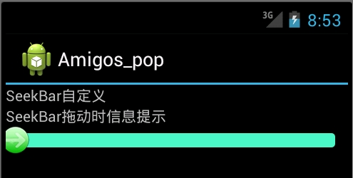
3.在res/layut下定义布局资源文件seekbar_define.xml
|
1
2
3
4
5
6
7
8
9
10
11
12
13
14
15
16
17
18
19
20
21
22
23
24
25
26
27
28
29
30
31
32
33
34
35
36
|
<?xml version="1.0" encoding="utf-8"?><ScrollView xmlns:android="<a href="http://schemas.android.com/apk/res/android" rel="nofollow">http://schemas.android.com/apk/res/android</a>" android:layout_width="fill_parent" android:layout_height="fill_parent" > <LinearLayout android:layout_width="fill_parent" android:layout_height="fill_parent" android:orientation="vertical" > <TextView android:id="@+id/seekbar_tetview_one" android:layout_width="wrap_content" android:layout_height="wrap_content" android:text="SeekBar自定义" /> <TextView android:id="@+id/seekbar_tetview_two" android:layout_width="wrap_content" android:layout_height="wrap_content" android:text="SeekBar拖动时信息提示" /> <SeekBar android:layout_width="321px" android:layout_height="wrap_content" android:layout_centerInParent="true" android:maxHeight="20px" android:minHeight="20px" android:paddingLeft="18px" android:paddingRight="18px" android:max="100" android:progressDrawable="@drawable/seekbar_define_style" android:thumb="@drawable/seekbar_thumb" android:id="@+id/seekBar"/> </LinearLayout></ScrollView> |
4.定义java文件通过 引用布局文件:
|
1
2
3
4
5
6
7
8
9
10
11
12
13
14
15
16
17
18
19
20
21
22
23
24
25
26
27
28
29
30
31
32
33
34
35
36
37
38
39
40
41
42
43
44
45
46
47
48
49
50
51
52
53
54
55
56
57
58
59
60
61
62
63
64
65
66
67
68
69
70
71
72
73
74
75
76
77
78
79
80
81
82
83
84
85
86
|
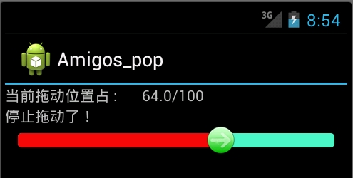
package com.test;import android.R.integer;import android.app.Activity;import android.os.Bundle;import android.os.Handler;import android.os.Message;import android.widget.SeekBar;import android.widget.SeekBar.OnSeekBarChangeListener;import android.widget.TextView;public class SeekBarDemo_DefineDemo extends Activity { private SeekBar seekBar; private TextView textView_one, textView_two; @Override protected void onCreate(Bundle savedInstanceState) { super.onCreate(savedInstanceState); setContentView(R.layout.seekbar_define); seekBar = (SeekBar) findViewById(R.id.seekBar); textView_one = (TextView) findViewById(R.id.seekbar_tetview_one); textView_two = (TextView) findViewById(R.id.seekbar_tetview_two); seekBar.setOnSeekBarChangeListener(seekbarChangeListener); } private OnSeekBarChangeListener seekbarChangeListener = new OnSeekBarChangeListener() { // 停止拖动时执行 @Override public void onStopTrackingTouch(SeekBar seekBar) { // TODO Auto-generated method stub textView_two.setText("停止拖动了!"); } // 在进度开始改变时执行 @Override public void onStartTrackingTouch(SeekBar seekBar) { // TODO Auto-generated method stub textView_two.setText("进度开始改变"); } // 当进度发生改变时执行 @Override public void onProgressChanged(SeekBar seekBar, int progress, boolean fromUser) { textView_two.setText("正在进行拖动操作,还没有停下来一直再拖动"); Message message = new Message(); Bundle bundle = new Bundle();// 存放数据 float pro = seekBar.getProgress(); float num = seekBar.getMax(); float result = (pro / num) * 100; bundle.putFloat("key", result); message.setData(bundle); message.what = 0; handler.sendMessage(message); } }; /** * 用Handler来更新UI */ private Handler handler = new Handler() { @Override public void handleMessage(Message msg) { textView_one.setText("当前拖动位置占 : " + msg.getData().getFloat("key") + "/100"); } };} |
最后执行效果:

二:使用颜色显示,和尚面是一样的,只有我们定义颜色资源来替代图片资源文件seekbar_define_color_style.xml:如下:
|
1
2
3
4
5
6
7
8
9
10
11
12
13
14
15
16
17
18
19
20
21
22
23
24
25
26
27
28
29
30
31
32
33
|
<?xml version="1.0" encoding="UTF-8"?> <layer-list xmlns:android="http://schemas.android.com/apk/res/android"> <item android:id="@android:id/background" android:paddingTop="3px" android:paddingBottom="3px"> <shape> <corners android:radius="10dip" /> <gradient android:startColor="#ffffffff" android:centerColor="#ff000000" android:endColor="#ff808A87" android:centerY="0.45" android:angle="270"/> </shape> </item> <item android:id="@android:id/progress" android:paddingTop="3px" android:paddingBottom="3px" > <clip> <shape> <corners android:radius="10dip" /> <gradient android:startColor="#ffffffff" android:centerColor="#ffFFFF00" android:endColor="#ffAABD00" android:centerY="0.45" android:angle="270"/> </shape> </clip> </item> </layer-list> |
之后再SeekBar标签使用如下属性进行引入:其他保持不变
|
1
|
android:progressDrawable="@drawable/seekbar_define_color_style" |
执行效果:
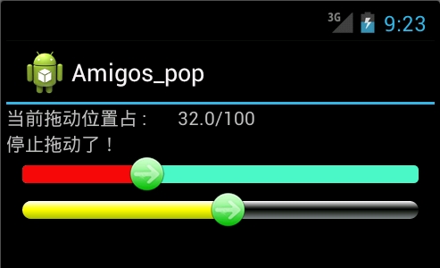
由于SeekBar的属性thumb引入了自定义的seekbar_thumb.xml文件,拖动图标是我们自定义的图片:除去这个属性
|
1
|
android:thumb="@drawable/seekbar_thumb" |
就回复系统默认状态效果最后效果如下:

我们可以通过颜色值再次休息seekbar_thumb.xml文件,使拖动按钮设置成自定义颜色:
Android SeekBar自定义使用图片和颜色显示的更多相关文章
- Android SeekBar 自定义thumb,thumb旋转动画效果
简介 某些音乐播放或者视频播放的界面上,资源还在加载时,进度条的原点(thumb)会显示一个转圈的效果. 资源加载完成后,又切换回静态效果.这个效果增强了用户体验. 一般来说有美术人员负责设计和切图. ...
- Android——SeekBar(拖动条)相关知识总结贴
Android进度条(ProgressBar)拖动条(SeekBar)星级滑块(RatingBar)的例子 http://www.apkbus.com/android-51326-1-1.html A ...
- Android 三档自定义滑动开关,禁止点击功能的实现,用默认的seekbar组件实现
android三档自定义滑动开关,禁止点击功能的实现,普通开关网上有很多例子,三档滑动开关的则找了整天都没有相关例子,开始用普通开关的源码修改了自己实现了一个类,但效果不如人意,各种边界情况的算法很难 ...
- Android实现自定义带文字和图片的Button
Android实现自定义带文字和图片的Button 在Android开发中经常会需要用到带文字和图片的button,下面来讲解一下常用的实现办法. 一.用系统自带的Button实现 最简单的一种办法就 ...
- 自定义漂亮的Android SeekBar样式
系统自带的SeekBar真是太难看了,不能容忍! 只能自己做了,先来张效果图 第1个Seekbar 背景是颜色,thumb是图片,上代码: <SeekBar android:id="@ ...
- Android 自定义圆形图片 CircleImageView
1.效果预览 1.1.布局中写自定义圆形图片的路径即可 1.2.然后看一看图片效果 1.3.原图是这样的 @mipmap/ic_launcher 2.使用过程 2.1.CircleImageView源 ...
- android progressbar 自定义图片匀速旋转
项目中需要使用圆形进度条进行数据加载的显示,所以需要两个步骤 1:自定义progressbar滚动图片 2:匀速旋转图片 步骤一:自定义progressbar图片 <ProgressBar an ...
- Android RatingBar 自定义样式
Android RatingBar 自定义样式 1.先定义Style: <style name="RadingStyle" parent="@android:sty ...
- 【转】Android之自定义Adapter的ListView
http://www.cnblogs.com/topcoderliu/archive/2011/05/07/2039862.html 在开发中,我们经常使用到ListView这个控件.Android的 ...
随机推荐
- ES6的promise对象研究
ES6的promise对象研究 什么叫promise? Promise对象可以理解为一次执行的异步操作,使用promise对象之后可以使用一种链式调用的方式来组织代码:让代码更加的直观. 那我们为什么 ...
- 关于Java类加载双亲委派机制的思考(附一道面试题)
预定义类加载器和双亲委派机制 JVM预定义的三种类型类加载器: 启动(Bootstrap)类加载器:是用本地代码实现的类装入器,它负责将 <Java_Runtime_Home>/lib下面 ...
- 【初级为题,大神绕道】The app icon set named "AppIcon" did not have any applicable content 错误#解决方案#
The app icon set named "AppIcon" did not have any applicable content 错误,怎样解决 按照您的错误提示您应该 ...
- wordpress自定义后台用户联系方式 添加qq、微博、微信
在 WordPress 后台,个人设置(Profile)中,可以设置电子邮件和 Website,如何添加国人常用的 QQ, 微博,微信呢? <?php /* Plugin Name: Custo ...
- 序列化.to_sym
<%= link_to t('links.list'), showable_paths[@subchannel_item.showable_type.to_sym], target: '_bla ...
- haartraining生成.xml过程
继续向大神学习http://www.cnblogs.com/tornadomeet/archive/2012/03/28/2420936.html
- Linux下列格式化工具 - column
[root@localhost ~]# mount/dev/sda2 on / type ext4 (rw)proc on /proc type proc (rw)sysfs on /sys type ...
- 66. 有序数组构造二叉搜索树[array to binary search tree]
[本文链接] http://www.cnblogs.com/hellogiser/p/array-to-binary-search-tree.html [题目] 编写一个程序,把一个有序整数数组放到二 ...
- 字母排列_next_permutation_字典序函数_待解决
问题 B: 字母排列 时间限制: 1 Sec 内存限制: 64 MB提交: 19 解决: 5[提交][状态][讨论版] 题目描述 当给出一串字符时,我们逐个可以变换其字符,形成新的字符串.假如对这 ...
- image warping