
Flutter AppBar 自定义顶部导航按钮 图标、颜色 以及 TabBar 定义顶部 Tab 切换
Flutter AppBar 自定义顶部按钮图 标、颜色
|
属性 |
描述 |
|
leading |
在标题前面显示的一个控件,在首页通常显示应用 的 logo;在其他界面通常显示为返回按钮 |
|
title |
标题,通常显示为当前界面的标题文字,可以放组 件 |
|
actions |
通常使用 IconButton 来表示,可以放按钮组 |
|
bottom |
通常放 tabBar,标题下面显示一个 Tab 导航栏 |
|
backgroundColor |
导航背景颜色 |
|
iconTheme |
图标样式 |
|
textTheme |
文字样式 |
|
centerTitle |
标题是否居中显示 |
import 'package:flutter/material.dart';

class AppBarDemoPage extends StatelessWidget {

  const AppBarDemoPage({Key key}) : super(key: key);

  @override

  Widget build(BuildContext context) {

    return Scaffold(

      appBar: AppBar(

        title:Text("AppBarDemoPage"),

        // backgroundColor: Colors.red,

        centerTitle:true,

        leading: IconButton(

          icon: Icon(Icons.menu),

          onPressed: (){

            print('menu');

          },

        ),

        actions: <Widget>[

          IconButton(

            icon: Icon(Icons.search),

            onPressed: (){

              print('search');

            },

          ),

          IconButton(

            icon: Icon(Icons.settings),

            onPressed: (){

              print('settings');

            },

          )

        ],

      ),

      body: Text('内容'),

    );

  }

}
Flutter AppBar 中自定义 TabBar 实 现顶部 Tab 切换
TabBar 常见属性:
|
属性 |
描述 |
|
tabs |
显示的标签内容,一般使用 Tab 对象,也可以是其他 的 Widget |
|
controller |
TabController 对象 |
|
isScrollable |
是否可滚动 |
|
indicatorColor |
指示器颜色 |
|
indicatorWeight |
指示器高度 |
|
indicatorPadding |
底部指示器的 Padding |
|
indicator |
指示器 decoration,例如边框等 |
|
indicatorSize |
指示器大小计算方式,TabBarIndicatorSize.label 跟文 字等宽,TabBarIndicatorSize.tab 跟每个 tab 等宽 |
|
labelColor |
选中 label 颜色 |
|
labelStyle |
选中 label 的 Style |
|
labelPadding |
每个 label 的 padding 值 |
|
unselectedLabelColor |
未选中 label 颜色 |
|
unselectedLabelStyle |
未选中 label 的 Style |
import 'package:flutter/material.dart';

class AppBarDemoPage extends StatelessWidget {

  const AppBarDemoPage({Key key}) : super(key: key);

  @override

  Widget build(BuildContext context) {

    return DefaultTabController(

      length:2 ,

      child: Scaffold(

          appBar: AppBar(

            title:Text("AppBarDemoPage"),

            // backgroundColor: Colors.red,

            centerTitle:true,

            bottom: TabBar(

              tabs: <Widget>[

                Tab(text: "热门"),

                Tab(text: "推荐")

              ],

            ),

          ),

          body: TabBarView(

            children: <Widget>[

              ListView(

                children: <Widget>[

                  ListTile(

                    title:Text("第一个tab")

                  ),

                  ListTile(

                    title:Text("第一个tab")

                  ),

                  ListTile(

                    title:Text("第一个tab")

                  )

                ],

              ),

               ListView(

                children: <Widget>[

                  ListTile(

                    title:Text("第二个tab")

                  ),

                  ListTile(

                    title:Text("第二个tab")

                  ),

                  ListTile(

                    title:Text("第二个tab")

                  )

                ],

              )

            ],

          ),

        ),

    );

  }

}
import 'package:flutter/material.dart';

class CategoryPage extends StatefulWidget {

  CategoryPage({Key key}) : super(key: key);

  _CategoryPageState createState() => _CategoryPageState();

}

class _CategoryPageState extends State<CategoryPage> {

  @override

  Widget build(BuildContext context) {

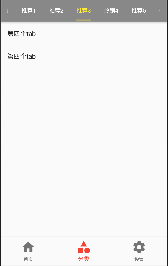
    return DefaultTabController(

      length: 4,

      child: Scaffold(

        appBar: AppBar(

          backgroundColor: Colors.black26,

          title: Row(

            mainAxisAlignment: MainAxisAlignment.center,

            children: <Widget>[

              Expanded(

                  child:TabBar(

                    indicatorColor:Colors.blue,

                    labelColor:Colors.blue,

                    unselectedLabelColor: Colors.white,

                    indicatorSize:TabBarIndicatorSize.label ,

                    tabs: <Widget>[

                      Tab(text: "热销"),

                      Tab(text: "推荐"),

                      Tab(text: "热门"),

                      Tab(text: "视频")

                    ],

               ) ,

              )

            ],

          ),

        ),

        body:TabBarView(

          children: <Widget>[

            ListView(

                children: <Widget>[

                  ListTile(

                    title:Text("第一个tab")

                  ),

                  ListTile(

                    title:Text("第一个tab")

                  ),

                  ListTile(

                    title:Text("第一个tab")

                  )

                ],

              ),

            ListView(

                children: <Widget>[

                  ListTile(

                    title:Text("第二个tab")

                  ),

                  ListTile(

                    title:Text("第二个tab")

                  ),

                  ListTile(

                    title:Text("第二个tab")

                  )

                ],

              ),

              ListView(

                children: <Widget>[

                  ListTile(

                    title:Text("第3个tab")

                  ),

                  ListTile(

                    title:Text("第3个tab")

                  ),

                  ListTile(

                    title:Text("第一个tab")

                  )

                ],

              ),

            ListView(

                children: <Widget>[

                  ListTile(

                    title:Text("第4个tab")

                  ),

                  ListTile(

                    title:Text("第二个tab")

                  ),

                  ListTile(

                    title:Text("第二个tab")

                  )

                ],

              )

          ],

        )

      ),

    );

  }

}
Flutter AppBar 中自定义 TabBar 实 现 Tabs 的另一种方法--TabController
import 'package:flutter/material.dart';

class TabBarControllerPage extends StatefulWidget {

  TabBarControllerPage({Key key}) : super(key: key);

  _TabBarControllerPageState createState() => _TabBarControllerPageState();

}

class _TabBarControllerPageState extends State<TabBarControllerPage> with SingleTickerProviderStateMixin {

  TabController _tabController;

  @override

  void dispose() {   //生命周期函数

    // TODO: implement dispose

    super.dispose();

    _tabController.dispose();

  }

  @override

  void initState() {   //生命周期函数

    // TODO: implement initState

    super.initState();

    _tabController=new TabController(

      vsync: this,

      length: 2

    );

    //可以监听一些方法

    // _tabController.addListener((){

    //   print(_tabController.index);

    // });

  }

  @override

  Widget build(BuildContext context) {

    return Scaffold(

      appBar: AppBar(

        title: Text("TabBarControllerPage"),

        bottom: TabBar(

          controller: this._tabController,  //注意

          tabs: <Widget>[

            Tab(text:"热销"),

            Tab(text:"推荐"),

          ],

        ),

      ),

      body: TabBarView(

        controller: this._tabController,  //注意

        children: <Widget>[

          Center(child: Text("热销")),

          Center(child: Text("推荐"))

        ],

      ),

    );

  }

}

Flutter AppBar 自定义顶部导航按钮 图标、颜色 以及 TabBar 定义顶部 Tab 切换的更多相关文章
- AppBar 自定义顶部导航按钮 图标、颜色 以及 TabBar 定义顶部 Tab 切换
一.Flutter AppBar 自定义顶部按钮图标.颜色 leading 在标题前面显示的一个控件,在首页通常显示应用的 logo:在其他界面通常显示为返回按钮 title 标题,通常显示为当 ...
- 15 Flutter BottomNavigationBar自定义底部导航条 以及实现页面切换 以及模块化
效果: /** * Flutter BottomNavigationBar 自定义底部导航条.以及实现页面切换: * BottomNavigationBar是底部导航条,可以让我们定义底部Tab ...
- 富文本编辑器UEditor自定义工具栏(三、自定义工具栏功能按钮图标及工具栏样式简单修改)
导读 富文本编辑器UEditor提供丰富了定制配置项,如果想设置个性化的工具栏按钮图标有无办法呢?答案是肯定的!前两篇博文简要介绍了通过将原工具栏隐藏,在自定义的外部按钮上,调用UEditor各命令实 ...
- jQuery 顶部导航尾随滚动,固定浮动在顶部
jQuery 顶部导航尾随滚动.固定浮动在顶部 演示 XML/HTML Code <section> <article class="left"> < ...
- 19 Flutter 自定义AppBar 定义顶部Tab切换 底部Tab结合顶部Tab实现类似头条页面布局(27分36秒)
Flutter AppBar自定义顶部导航按钮图标.颜色以及TabBar定义顶部Tab切换. leading:在标题前面显示的一个控件,在首页通常显示应用的logo:在其他界面通常显示为付汇按钮. t ...
- BottomNavigationBar 自定义 底部导航条
在flutter中,BottomNavigationBar 是底部导航条,可以让我们定义底部 Tab 切换,bottomNavigationBar是 Scaffold 组件的参数. BottomNav ...
- tab 切换 和 BottomNavigationBar 自定义 底部导航条
BottomNavigationBar 组件 BottomNavigationBar 是底部导航条,可以让我们定义底部 Tab 切换,bottomNavigationBar是 Scaffold ...
- uni-app自定义导航栏按钮|uniapp仿微信顶部导航条
最近一直在学习uni-app开发,由于uniapp是基于vue.js技术开发的,只要你熟悉vue,基本上很快就能上手了. 在开发中发现uni-app原生导航栏也能实现一些顶部自定义按钮+搜索框,只需在 ...
- 自定义iOS7导航栏背景,标题和返回按钮文字颜色
在iOS7下,默认导航栏背景,颜色是这样的,接下来我们就进行自定义,如果你仅仅是更改一下背景和颜色,代码会很简单,不需要很复杂的自定义View来替代leftBarItem 更改导航栏的背景和文字Col ...
随机推荐
- raw镜像与qcw2镜像互相转换
qcow2是最小使用,raw是置零使用 . raw格式是原始镜像,会直接当作一个块设备给虚拟机来使用,至于文件里面的空洞,则是由宿主机的文件系统来管理的,linux下的文件系统可以很好的支持空洞的特性 ...
- 怎样制作一个 Python Egg
from:http://liluo.org/blog/2012/08/how-to-create-python-egg/ 制作打包一个 Python Egg 并部署整个过程还蛮有意思的,下面小教程(这 ...
- 非正常卸载Chrome浏览器导致无法重新安装
昨晚在使用selenium的时候,Chrome浏览器和Chromedriver.exe不兼容,前几天使用的时候都没问题,查看浏览器版本后发现浏览器已经自动升级为67版本(我之前安装的是61版本). 于 ...
- 火狐谷歌webdriver驱动地址
ChormeDrive下载 打开百度搜索Chromedriver官网下载,点击进入这个页面,链接为:http://npm.taobao.org/mirrors/chromedriver/2.41/ ...
- 使用笔记:TF辅助工具--tensorflow slim(TF-Slim)
如果抛开Keras,TensorLayer,tfLearn,tensroflow 能否写出简介的代码? 可以!slim这个模块是在16年新推出的,其主要目的是来做所谓的“代码瘦身” 一.简介 slim ...
- 七.搭建基本的FTP服务
1.安装vsftpd软件包 ]# yum -y install vsftpd 2.重起vsftpd服务 ]# systemctl restart vsftpd ]# systemctl enable ...
- 汇编知识之EIP寄存器
eip寄存器存储着我们cpu要读取指令的地址,没有了它,cpu就无法读取下面的指令(通俗点讲cpu就无法执行.每次相应汇编指令执行完相应的eip值就会增加. 因为80386 cpu的寻址范围是4GB. ...
- 百度UEditor富文本插件的使用
这个富文本还是功能挺全的. 官方文档地址 下载地址 常用接口 较完整代码仓库 UEditor下载后直接运行即可访问,但在上传文件时需要单独再做配置. [很详细的SpringBoot整合UEditor教 ...
- Nginx 安装配置【必须把文件到放到机器上】
[必须把所有下载的gz文件到放到机器上:编译] 1.安装nginx之前的编译软件 yum -y install make zlib zlib-devel gcc-c++ libtool openss ...
- js 常见数组算法
数组方法概述 1.不改变原数组,返回新数组 concat() 连接两个或多个数组,两边的原始数组都不会变化,返回被连接数组的一个副本. join() 把数组中所有元素放入一个字符串中,返回字符串. s ...