
前端常见loading动画
loading动画是前端页面加载时必不可少的元素,好看合适的加载动画会极大的提升用户体验与系统的交互效果。下面为大家提供几种简单的加载动画效果,如果帮助到你了请点赞评论。
1.无限循环的圆圈
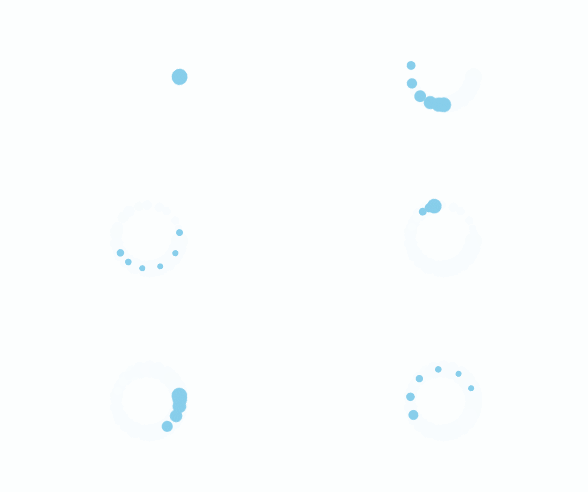
<div class="chase-wrapper">

    <div class="chase-item"></div>

    <div class="chase-item"></div>

    <div class="chase-item"></div>

    <div class="chase-item"></div>

    <div class="chase-item"></div>

    <div class="chase-item"></div>

</div>
.chase-wrapper {

  width: 60px;

  height: 60px;

  display: inline-block;

  animation: chase-loader 2.5s infinite linear both;

  margin: 50px;

}

.chase-item {

  width: 100%;

  height: 100%;

  position: absolute;

  top: 0;

  left: 0;

  animation: chase-dot 2s infinite ease-in-out both;

}

.chase-item:before {

  content: "";

  display: block;

  width: 25%;

  height: 25%;

  background-color: skyBlue;

  border-radius: 100%;

  animation: chase-dot-before 2s infinite ease-in-out both;

}

.chase-item:nth-child(1),

.chase-item:nth-child(1):before {

  animation-delay: -1.1s;

}

.chase-item:nth-child(2),

.chase-item:nth-child(2):before {

  animation-delay: -1s;

}

.chase-item:nth-child(3),

.chase-item:nth-child(3):before {

  animation-delay: -0.9s;

}

.chase-item:nth-child(4),

.chase-item:nth-child(4):before {

  animation-delay: -0.8s;

}

.chase-item:nth-child(5),

.chase-item:nth-child(5):before {

  animation-delay: -0.7s;

}

.chase-item:nth-child(6),

.chase-item:nth-child(6):before {

  animation-delay: -0.6s;

}

@keyframes chase-loader {

  100% {

    transform: rotate(1turn);

  }

}

@keyframes chase-dot {

  80%,

  100% {

    transform: rotate(360deg);

  }

}

@keyframes chase-dot-before {

  50% {

    transform: scale(0.4);

  }

  100%,

  0% {

    transform: scale(1);

  }

}
2.若隐若现的方块

<div class="cube-wrapper">

    <div class="cube cube1"></div>

    <div class="cube cube2"></div>

    <div class="cube cube3"></div>

    <div class="cube cube4"></div>

    <div class="cube cube5"></div>

    <div class="cube cube6"></div>

    <div class="cube cube7"></div>

    <div class="cube cube8"></div>

    <div class="cube cube9"></div>

</div>
.cube-wrapper {

  width: 60px;

  height: 60px;

  display: inline-block;

  margin: 50px;

}

.cube {

  width: 33%;

  height: 33%;

  float: left;

  background: skyBlue;

  animation: cube-loader 1.3s infinite ease-in-out;

  animation-delay: 0.2s;

}

.cube1 {

  animation-delay: 0.2s;

}

.cube2 {

  animation-delay: 0.3s;

}

.cube3 {

  animation-delay: 0.4s;

}

.cube4 {

  animation-delay: 0.1s;

}

.cube5 {

  animation-delay: 0.2s;

}

.cube6 {

  animation-delay: 0.3s;

}

.cube7 {

  animation-delay: 0s;

}

.cube8 {

  animation-delay: 0.1s;

}

@keyframes cube-loader {

  0%,

  70%,

  100% {

    transform: scale3D(1, 1, 1);

  }

  35% {

    transform: scale3D(0, 0, 1);

  }

}
3.闪转腾挪的方块

<div class="plane-wrapper"></div>
.plane-wrapper {

  width: 60px;

  height: 60px;

  background-color: skyBlue;

  display: inline-block;

  animation: plane-loader 1.2s infinite ease-in-out;

  margin: 50px;

}

@keyframes plane-loader {

  0% {

    transform: perspective(120px);

  }

  50% {

    transform: perspective(120px) rotateY(180deg);

  }

  100% {

    transform: perspective(120px) rotateY(180deg) rotateX(180deg);

  }

}
4.左右交互的方圆
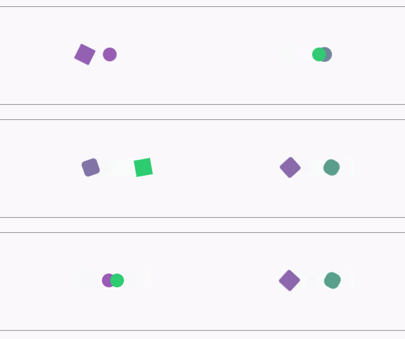
<div class="preloader-wrapper"></div>
.preloader-wrapper {

  position: relative;

  display: inline-block;

  width: 20px;

  height: 20px;

  margin: 50px;

}

.preloader-wrapper:before {

  width: 20px;

  height: 20px;

  border-radius: 20px;

  background: blue;

  content: "";

  position: absolute;

  background: #9b59b6;

  animation: preloader_before 2s infinite ease-in-out;

}

.preloader-wrapper:after {

  width: 20px;

  height: 20px;

  border-radius: 20px;

  background: blue;

  content: "";

  position: absolute;

  background: #2ecc71;

  left: 22px;

  animation: preloader_after 1.5s infinite ease-in-out;

}

@keyframes preloader_before {

  0% {

    transform: translateX(0px) rotate(0deg);

  }

  50% {

    transform: translateX(50px) scale(1.2) rotate(260deg);

    background: #2ecc71;

    border-radius: 0px;

  }

  100% {

    transform: translateX(0px) rotate(0deg);

  }

}

@keyframes preloader_after {

  0% {

    transform: translateX(0px);

  }

  50% {

    transform: translateX(-50px) scale(1.2) rotate(-260deg);

    background: #9b59b6;

    border-radius: 0px;

  }

  100% {

    transform: translateX(0px);

  }

}
5.一闪一闪的圆圈
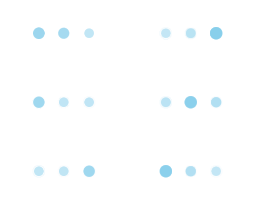
<div class="pulse-wrapper">

    <div class="pulse-item one"></div>

    <div class="pulse-item two"></div>

    <div class="pulse-item three"></div>

</div>
.pulse-wrapper {

  margin: 50px;

}

.pulse-item {

  width: 20px;

  height: 20px;

  border-radius: 50%;

  background-color: skyBlue;

  animation: pulse-loader 0.4s ease 0s infinite alternate;

  position: relative;

  display: inline-block;

}

.two {

  margin: 0 15px;

  animation: pulse-loader 0.4s ease 0.2s infinite alternate;

}

.three {

  animation: pulse-loader 0.4s ease 0.4s infinite alternate;

}

@keyframes pulse-loader {

  0% {

    opacity: 1;

    transform: scale(1);

  }

  100% {

    opacity: 0.5;

    transform: scale(0.75);

  }

}
6.高低起伏的音符
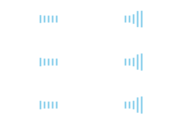
  <div class="rect-wrapper">

      <div class="rect-item rect1"></div>

      <div class="rect-item rect2"></div>

      <div class="rect-item rect3"></div>

      <div class="rect-item rect4"></div>

      <div class="rect-item rect5"></div>

    </div>
.rect-wrapper {

  margin: 50px;

}

.rect-item {

  width: 6px;

  height: 60px;

  background-color: skyBlue;

  display: inline-block;

  margin: 0 4px;

  animation: rect-loader 1.2s infinite ease-in-out;

}

.rect2 {

  animation-delay: -1.1s;

}

.rect3 {

  animation-delay: -1s;

}

.rect4 {

  animation-delay: -0.9s;

}

.rect5 {

  animation-delay: -0.8s;

}

@keyframes rect-loader {

  0%,

  40%,

  100% {

    transform: scaleY(0.4);

  }

  20% {

    transform: scaleY(1);

  }

}
后续我也会继续分享精美的loading动画,你也可以继续优化,选择适合你的方案。
前端常见loading动画的更多相关文章
- 【常见】CSS3进度条Loading动画
现在,GIF 格式的进度条已经越来越少,CSS 进度条如雨后春笋般涌现.CSS3的崛起,更使得动态效果得以轻松实现,未来,必定是CSS3的天下,所以今天我就来分享一下几个常见的CSS3进度条Loadi ...
- 分享web前端七款HTML5 Loading动画特效集锦
以前我们大部分的Loading动画都是利用gif图片实现的,这种图片实现Loading动画的方法虽然也很不错,但是作为HTML5开发者来说,如果能利用HTML5和CSS3实现这些超酷的Loading动 ...
- 【动画消消乐 】仿ios、android中常见的一个loading动画 074
前言 Hello!小伙伴! 非常感谢您阅读海轰的文章,倘若文中有错误的地方,欢迎您指出- 自我介绍 ଘ(੭ˊᵕˋ)੭ 昵称:海轰 标签:程序猿|C++选手|学生 简介:因C语言结识编程,随后转入计 ...
- 纯css3 加载loading动画特效
最近项目中要实现当页面还没有加载完给用户提示正在加载的loading,本来是想做个图片提示的,但是图片如果放大电脑的分辨率就会感觉到很虚,体验效果很不好.于是就采用css3+js实现这个loading ...
- CSS3效果:animate实现点点点loading动画效果(一)
实现如图所示的点点点loading效果: 一:CSS3 animation实现代码 html代码: 提交订单中<span class="ani_dot">...< ...
- 几个单元素Loading动画解构
这个账号建了也有1个多月,拖延症患者终于下定决心开始写博.做前端从前至后差不多1年时间,如果文中有什么纰漏欢迎指出,未来的路还很长~ 第一篇文章用来解构几个挺不错的单元素Loading动画.效果图如下 ...
- 开源分享三(炫酷的Android Loading动画)
开源分享三(炫酷的Android Loading动画) 分享GitHub上的一些Loading,为了提升产品用户体验,一个好的Loading必然是不可缺少的,对于一些耗时需要用户等待的页面来说会转移用 ...
- electron-vue 项目添加启动loading动画问题
前言 electron-vue脚手架搭建的项目,在开发阶段可能你注意不到项目启动慢的问题,但是在build 生成的exe可执行文件,启动后,要反应很久才能进入到app.vue 中加载的页面,体验性很差 ...
- 超酷!!HTML5 Canvas 水流样式 Loading 动画
今天我们要分享另外一款基于HTML5 Canvas的液体流动样式Loading加载动画,这款Loading动画在加载时会呈现液体流动的动画效果,并且由于和背景颜色的对比,也略微呈现发光的动画效果. 效 ...
随机推荐
- C++ 调用 Python(通过Boost.Python)
本文将用一个小的示例来展示如何通过Boost.Python 来实现 C++/Python 混合编程从而将两种语言的优势整合到一起. 1. CMakeLists.txt cmake_minimum_re ...
- 新增一个Redis 从节点为什么与主节点的key数量不一样呢?
在日常的 Redis 运维过程中,经常会发生重载 RDB 文件操作,主要情形有: 主从架构如果主库宕机做高可用切换,原从库会挂载新主库重新获取数据 主库 QPS 超过10万,需要做读写分离,重新添加从 ...
- winform,获取http服务状态
/// <summary> /// 获取http服务状态 /// </summary> /// <returns></returns> protecte ...
- java~springboot(2022之后)~目录索引
回到占占推荐博客索引 最近写了不过关于java,spring,微服务的相关文章,今天把它整理一下,方便大家学习与参考. java~springboot(2022之前)~目录索引 java~spring ...
- LVGL 虚拟键盘使用
一.使用例程 二.使用方式 函数的详细说明请看 lv_keyboard.h 文件 创建对象 lv_obj_t * lv_keyboard_create(lv_obj_t * parent); lv_o ...
- 使用nginx代理nexus,不是/根路径
location /nexus/ { proxy_pass http://192.168.0.218:8081/; proxy_set_header Host $host:$server_port; ...
- Docker镜像仓库Harbor之Swagger REST API整合配置
转载自:https://cloud.tencent.com/developer/article/1010618 1.Swagger 介绍 Swagger 是一个规范和完整的框架,用于生成.描述.调用和 ...
- js基础知识--BOM
之前说过,在js的 运行环境为浏览器时,js就主要有三部分组成: ECMAScript核心语法.BOM.DOM.今天就和大家详细说一下BOM的一些基础知识. BOM BOM通常被称为浏览器对象模型,主 ...
- Java实现6种常见排序
1.冒泡排序(Bubble Sort) 第0轮 3 1 4 1 5 9 2 6 5 3 5 8 9 第1轮 1 3 1 4 5 2 6 5 3 5 8 9 9 第2轮 1 1 3 4 2 5 5 3 ...
- 【持久层框架】- SpringData - JPA
SpringData - JPA 生命不息,写作不止 继续踏上学习之路,学之分享笔记 总有一天我也能像各位大佬一样 一个有梦有戏的人 @怒放吧德德 分享学习心得,欢迎指正,大家一起学习成长! JPA简 ...