纯CSS3实现的图片滑块程序 效果非常酷
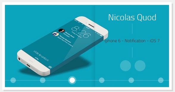
之前我们经常会看到很多利用jQuery实现的焦点图插件,种类太多了,今天我想给大家分享一款利用纯CSS3实现的图片滑块应用,完全是利用CSS3的相关特性,没有使用JS,个人觉得还是挺不错的,先来看看效果图:
看上去挺不错的吧,简洁、清新、大气。
当然我们也可以在这里查看DEMO演示。
接下来我们一起来分析一下源码,首先是HTML代码,非常简单:
<div id="gal">
<nav class="galnav">
<ul>
<li><input type="radio" name="btn" value="one" checked="checked" />
<label for="btn"></label>
<figure>
<img src="data:images/01_Fabio_Basile.jpg" />
<figcaption>
<h4>Fabio Basile</h4>
<nav role='navigation'>
<p>iPhone 6 Infinity</p>
<ul>
<li><a href="#" class="entypo-dribbble">
</a></li>
<li><a href="#" class="entypo-twitter"></a>
</li>
</ul>
</nav>
</figcaption>
</figure>
</li>
<li><input type="radio" name="btn" value="two" /> <label for="btn">
</label>
<figure class="entypo-forward">
<img src="data:images/08_Brian_Miller.jpg" />
<figcaption>
<h4>Brian Miller</h4>
<nav role='navigation'>
<p>TypeTi.me</p>
<ul>
<li><a href="#" class="entypo-dribbble"></a>
</li>
<li><a href="#" class="entypo-twitter"></a>
</li>
</ul>
</nav>
</figcaption>
</figure>
</li>
<li><input type="radio" name="btn" value="three" /> <label for="btn">
</label>
<figure class="entypo-forward">
<img src="data:images/05_Nicolas_Quod.jpg" />
<figcaption>
<h4>Nicolas Quod</h4>
<nav role='navigation'>
<p>Iphone 6 - Notification - iOS 7</p>
<ul>
<li>
<a href="#" class="entypo-dribbble">
</a></li>
<li>
<a href="#" class="entypo-twitter">
</a></li>
</ul>
</nav>
</figcaption>
</figure>
</li>
<li><input type="radio" name="btn" value="four" /> <label for="btn">
</label>
<figure class="entypo-forward">
<img src="data:images/04_Joffrey.jpg" />
<figcaption>
<h4>Joffrey</h4>
<nav role='navigation'>
<p>鈻?/p> </p>
<ul>
<li><a href="#" class="entypo-dribbble">
</a></li>
<li><a href="#" class="entypo-twitter">
</a></li>
</ul>
</nav>
</figcaption>
</figure>
</li>
<li><input type="radio" name="btn" value="five" /> <label for="btn">
</label>
<figure class="entypo-forward">
<img src="data:images/09_Jared_Long.jpg" />
<figcaption>
<h4>Jared Long</h4>
<nav role='navigation'>
<p>Don't drop your iPhone Infinity</p>
<ul>
<li>
<a href="#" class="entypo-dribbble">
</a></li>
<li>
<a href="#" class="entypo-behance">
</a></li>
</ul>
</nav>
</figcaption>
</figure>
</li>
<li><input type="radio" name="btn" value="six" /> <label for="btn">
</label>
<figure class="entypo-forward">
<img src="data:images/02_Charles_Treece.jpg" />
<figcaption>
<h4>Charles Treece</h4>
<nav role='navigation'>
<p>iPhone 6 Infinity Side Status Bar</p>
<ul>
<li>
<a href="#" class="entypo-dribbble">
</a></li>
<li>
<a href="#" class="entypo-twitter">
</a></li>
</ul>
</nav>
</figcaption>
</figure>
</li>
</ul>
</nav>
</div>
这些HTML代码只是构造了几张图片,等一下可以切换。另外,每张图片都放置一个radio,这个radio来充当切换按钮。
接下来就是CSS代码了:
*, *:before, *:after {

  margin:;

  padding:;

  -webkit-box-sizing:border-box;

  -moz-box-sizing:border-box;

  box-sizing:border-box;

}

#gal {

  position:relative;

  width:600px;

  height:300px;

  margin:0 auto;

  top:100px;

  background:white;

  -webkit-box-shadow:0px 0px 0px 10px white,

             5px 5px 0px 10px rgba(0,0,0,0.1);

  -moz-box-shadow:0px 0px 0px 10px white,

             5px 5px 0px 10px rgba(0,0,0,0.1);

  box-shadow:0px 0px 0px 10px white,

             5px 5px 0px 10px rgba(0,0,0,0.1);

  -webkit-transform:translate3d(0, 0, 0);

  -moz-transform:   translate3d(0, 0, 0);

  -ms-transform:    translate3d(0, 0, 0);

  -o-transform:     translate3d(0, 0, 0);

  transform:        translate3d(0, 0, 0);

}

#gal:after {

  content:'';

  position:absolute;

  bottom:24px;

  right:;

  left:;

  width:100%;

  height:1px;

  background:rgba(255,255,255,0.35);

  z-index:;

}

#gal ul {list-style-type:none;}

input[type="radio"], input[type="radio"] + label {

  position:absolute;

  bottom:15px;

  display:block;

  width:20px;

  height:20px;

  -webkit-border-radius:50%;

  -moz-border-radius:50%;

  border-radius:50%;

  cursor:pointer;

}

input[type="radio"] {

  opacity:;

  z-index:;

}

input[value="one"], input[value="one"] + label {left:20px;}

input[value="two"], input[value="two"] + label {left:128px;}

input[value="three"], input[value="three"] + label {left:236px;}

input[value="four"], input[value="four"] + label {left:344px;}

input[value="five"], input[value="five"] + label {left:452px;}

input[value="six"], input[value="six"] + label {right:20px;}

input[type="radio"] + label {

  background:rgba(255,255,255,0.35);

  z-index:;

  -webkit-box-shadow:0px 0px 0px 0px rgba(255,255,255,0.15);

  -moz-box-shadow:0px 0px 0px 0px rgba(255,255,255,0.15);

  box-shadow:0px 0px 0px 0px rgba(255,255,255,0.15);

  -webkit-transition:all .3s;

  -moz-transition:all .3s;

  -o-transition:all .3s;

  transition:all .3s;

}

[class*="entypo-"]:before {

  position:absolute;

  font-family: 'entypo', sans-serif;

}

figure[class*="entypo-"]:before {

  left:10px;

  top:5px;

  font-size:2rem;

  color:rgba(255,255,255,0);

  z-index:;

  -webkit-transition:color .1s;

  -moz-transition:color .1s;

  -o-transition:color .1s;

  transition:color .1s;

}

a[class*="entypo-"]:before {

  top:8px;

  left:9px;

  font-size:1.5rem;

  color:white;

}

a:hover[class*="entypo-"]:before {

  color:white;

}

figure, figure img, figcaption {

  position:absolute;

  top:;

  right:;

}

figure {

  bottom:;

  left:;

  width:600px;

  height:300px;

  display:block;

  overflow:hidden;

}

figure img {

  bottom:;

  left:;

  display:block;

  width:600px;

  height:300px;

  z-index:;

  -webkit-transform:translateX(600px);

  -moz-transform:translateX(600px);

  -ms-transform:translateX(600px);

  -o-transform:translateX(600px);

  transform:translateX(600px);

  -webkit-transition:all .15s .15s, z-index 0s;

  -moz-transition:all .15s .15s, z-index 0s;

  -o-transition:all .15s .15s, z-index 0s;

  transition:all .15s .15s, z-index 0s;

}

figcaption {

  display:block;

  width:270px;

  height:300px;

  padding-top:20px;

  background-image:radial-gradient(rgba( 255,255,255,0.3), transparent);

  background-size:600px 600px;

  background-repeat:no-repeat;

  background-position:-300px -150px;

  text-align:center;

  z-index:;

  -webkit-box-shadow:-5px 0px 20px rgba(0,0,0,0.1);

  -moz-box-shadow:-5px 0px 20px rgba(0,0,0,0.1);

  box-shadow:-5px 0px 20px rgba(0,0,0,0.1);

  -webkit-transform:translateX(300px);

  -moz-transform:translateX(300px);

  -ms-transform:translateX(300px);

  -o-transform:translateX(300px);

  transform:translateX(300px);

  -webkit-transition:all .35s;

  -moz-transition:all .35s;

  -o-transition:all .35s;

  transition:all .35s;

}

h4 {

  display:inline-block;

  padding:0 15px;

  color:white;

  font-family: 'Titillium Web', sans-serif;

  font-weight:;

  font-size:2rem;

}

figcaption nav ul {display:block;padding-top:10px;}

figcaption nav ul li {display:inline-block;margin-left:5px;}

figcaption nav ul li a {

  position:relative;

  display:block;

  width:40px;

  height:40px;

  background:rgba(255,255,255,0.2);

  text-decoration:none;

  color:white;

  -webkit-border-radius:50%;

  -moz-border-radius:50%;

  border-radius:50%;

  -webkit-box-shadow:inset 0px 0px 0px 0px rgba(255,255,255,0);

  -moz-box-shadow:inset 0px 0px 0px 0px rgba(255,255,255,0);

  box-shadow:inset 0px 0px 0px 0px rgba(255,255,255,0);

  -webkit-transition:all .15s;

  -moz-transition:all .15s;

  -o-transition:all .15s;

  transition:all .15s;

}

figcaption nav ul li a:hover {

  background:rgba(255,255,255,0);

  -webkit-box-shadow:inset 0px 0px 0px 2px rgba(255,255,255,1);

  -moz-box-shadow:inset 0px 0px 0px 2px rgba(255,255,255,1);

  box-shadow:inset 0px 0px 0px 2px rgba(255,255,255,1);

}

figcaption p {

  padding:50px 15px;

  font-family:'Titillium Web', sans-serif;

  font-weight:;

  color:#333;

  background-image:-webkit-gradient(linear, 0 0, 0 100%, from(rgba(255,255,255,0.35)), color-stop(0.3, rgba(255,255,255,0.35)), color-stop(0.3, transparent), color-stop(0.7, transparent), color-stop(0.7, rgba(255,255,255,0.35)), to(rgba(255,255,255,0.35)));

  background-image:-webkit-linear-gradient(rgba(255,255,255,0.35) 0%, rgba(255,255,255,0.35) 30%, transparent 30%, transparent 70%, rgba(255,255,255,0.35) 70%, rgba(255,255,255,0.35) 100%);

  background-image:-moz-linear-gradient(rgba(255,255,255,0.35) 0%, rgba(255,255,255,0.35) 30%, transparent 30%, transparent 70%, rgba(255,255,255,0.35) 70%, rgba(255,255,255,0.35) 100%);

  background-image:-o-linear-gradient(rgba(255,255,255,0.35) 0%, rgba(255,255,255,0.35) 30%, transparent 30%, transparent 70%, rgba(255,255,255,0.35) 70%, rgba(255,255,255,0.35) 100%);

  background-image:linear-gradient(rgba(255,255,255,0.35) 0%, rgba(255,255,255,0.35) 30%, transparent 30%, transparent 70%, rgba(255,255,255,0.35) 70%, rgba(255,255,255,0.35) 100%);

  background-size:1px 100%;

  background-repeat:no-repeat;

  background-position:50% 0%;

}

input[type="radio"]:hover + label {

  background:rgba(255,255,255,0.6);

}

input[type="radio"]:checked + label {

  background:rgba(255,255,255,1);

  -webkit-box-shadow:0px 0px 0px 5px rgba(255,255,255,0.3);

  -moz-box-shadow:0px 0px 0px 5px rgba(255,255,255,0.3);

  box-shadow:0px 0px 0px 5px rgba(255,255,255,0.3);

}

input[type="radio"]:checked + label:before {}

input[type="radio"]:checked ~ figure img {

  z-index:;

  -webkit-transform:translatex(0px);

  -moz-transform:translatex(0px);

  -ms-transform:translatex(0px);

  -o-transform:translatex(0px);

  transform:translatex(0px);

  -webkit-transition:all .15s, z-index 0s;

  -moz-transition:all .15s, z-index 0s;

  -o-transition:all .15s, z-index 0s;

  transition:all .15s, z-index 0s;

}

input[type="radio"]:checked ~ figure[class*="entypo-"]:before {

  z-index:;

  color:rgba(255,255,255,0.5);

  -webkit-transition:color .5s;

  -moz-transition:color .5s;

  -o-transition:color .5s;

  transition:color .5s;

}

input[type="radio"]:checked ~ figure figcaption {

  z-index:;

  -webkit-transform:translateX(0px);

  -moz-transform:translateX(0px);

  -ms-transform:translateX(0px);

  -o-transform:translateX(0px);

  transform:translateX(0px);

  -webkit-transition:all .35s, .7s;

  -moz-transition:all .35s, .7s;

  -o-transition:all .35s, .7s;

  transition:all .35s, .7s;

}

h2 {

  margin-top:150px;

  text-align:center;

  font-family: 'Titillium Web', sans-serif;

  font-weight:;

  font-size:1.2rem;

}

h2 a {

  position:relative;

  color:tomato;

  text-decoration:none;

}

h2 a:after {

  content:'';

  position:absolute;

  bottom:-2px;

  left:;

  width:;

  height:1px;

  background:tomato;

  -webkit-transition:width .1s;

  -moz-transition:width .1s;

  -o-transition:width .1s;

  transition:width .1s;

}

h2 a:hover:after {

  width:100%;

}

body {background:#f0f0f0;}

html, body {

  width:100%;

  height:100%;

}
这个CSS代码相对比较复杂,重点在这个地方:
利用label重写radio的样式,但是又能完成点击label就像点击radio一样的效果,核心代码如下:
input[type="radio"], input[type="radio"] + label {

  position:absolute;

  bottom:15px;

  display:block;

  width:20px;

  height:20px;

  -webkit-border-radius:50%;

  -moz-border-radius:50%;

  border-radius:50%;

  cursor:pointer;

}

input[type="radio"] {

  opacity:;

  z-index:;

}

input[value="one"], input[value="one"] + label {left:20px;}

input[value="two"], input[value="two"] + label {left:128px;}

input[value="three"], input[value="three"] + label {left:236px;}

input[value="four"], input[value="four"] + label {left:344px;}

input[value="five"], input[value="five"] + label {left:452px;}

input[value="six"], input[value="six"] + label {right:20px;}

input[type="radio"] + label {

  background:rgba(255,255,255,0.35);

  z-index:;

  -webkit-box-shadow:0px 0px 0px 0px rgba(255,255,255,0.15);

  -moz-box-shadow:0px 0px 0px 0px rgba(255,255,255,0.15);

  box-shadow:0px 0px 0px 0px rgba(255,255,255,0.15);

  -webkit-transition:all .3s;

  -moz-transition:all .3s;

  -o-transition:all .3s;

  transition:all .3s;

}
最后,源代码上传过来,大家可以自己去学习一下。下载地址>>
纯CSS3实现的图片滑块程序 效果非常酷的更多相关文章
- 纯CSS3实现的图片滑块程序,效果非常酷
接下来我们一起来分析一下源码,首先是HTML代码,非常简单: <div id="gal"> <nav class="galnav"> & ...
- 使用 CSS3 实现 3D 图片滑块效果【附源码下载】
使用 CSS3 的3D变换特性,我们可以通过让元素在三维空间中变换来实现一些新奇的效果. 这篇文章分享的这款 jQuery 立体图片滑块插件,利用了 3D transforms(变换)属性来实现多种不 ...
- 一款纯css3实现的图片3D翻转幻灯片
之前介绍了好多款网页幻灯片,今天要给大家再带来一款纯css3实现的图片3D翻转幻灯片.这款幻灯片图片轮播采用了3D翻转的形式,效果非常不错.一起看下效果图: 在线预览 源码下载 实现的代码. ht ...
- css3伪放大镜(图片放大动画)效果(鼠标移入圆形区域放大图片)
源码: <!DOCTYPE html><html lang="en"><head> <meta charset="UTF-8&q ...
- 使用CSS3实现3D图片滑块效果
使用 CSS3 的3D变换特性,我们可以通过让元素在三维空间中变换来实现一些新奇的效果. 这篇文章分享的这款 jQuery 立体图片滑块插件,利用了 3D transforms(变换)属性来实现多种不 ...
- 使用 CSS3 实现 3D 图片滑块效果
Slicebox – A fresh 3D image slider with graceful fallback 英文原文地址:http://tympanus.NET/codrops/2011/09 ...
- 纯CSS3实现GIF图片动画效果
在线演示 本地下载
- 纯CSS3制作卡通场景汽车动画效果
前言 今天分享一下我昨晚做的CSS3动画效果——卡通场景汽车动画.在接触CSS3动画之前,我之前实现一些简单的动画效果都是使用flash完成的.但是自从CSS3横空出世,在移动端对CSS3动画的运用越 ...
- 纯css3鼠标经过图片显示描述特效
http://***/Article/5582 今天给大家带来的是用css3技术实现鼠标经过图片,显示图片描述的动画效果.鼠标经过图片时,图片动画缩小并渐变显示描述.我们一起看看效果图: 在线预览 ...
随机推荐
- HDU1163 Eddy's digital Roots【九剩余定理】
Eddy's digital Roots Time Limit: 2000/1000 MS (Java/Others) Memory Limit: 65536/32768 K (Java/Oth ...
- 程序员之---C语言细节22(函数返回指针注意事项<悬空指针>、查看进程能够分配的内存大小)
主要内容:函数返回指针注意事项<悬空指针>.查看进程能够分配的内存大小 #include <stdio.h> char * favorite_fruit() { static ...
- enumerateObjectsUsingBlock、enumerateObjectsWithOptions、enumerateObjectsAtIndexes、makeObjectsPerfor使用
OC至 NSArray它提供了一个方便的遍历block,以下具体说明 第一.enumerateObjectsUsingBlock NSArray *array=@[@"aa",@& ...
- Swift语法学习之 类和结构体
类和结构体 本页包括内容: 类和结构体对照 结构体和枚举是值类型 类是引用类型 类和结构体的选择 集合(collection)类型的赋值与复制行为 与其他编程语言所不同的是,Swift 并不要求你为自 ...
- skyeye安装+arm-elf-gdb安装+模拟s3c44b0x+执行ucos4skyeye
[假设你要引用.请阅读所有,这里是我的为期两天的过程只是一个记录] skyeye安装:ubuntu12.0432 llvm2.8 skyeye1.3.3 http://blog.chinaunix.n ...
- OCP-1Z0-051-题目解析-第14题
14. Using the CUSTOMERS table, you need to generate a report that shows 50% of each credit a ...
- TCP/IP 网络精讲:开宗明义及第一课
内容简介 1.课程大纲 2.第一部分第一课:互联网历史 3.第一部分第二课预告:互联网的创立,OSI七层模型 课程大纲 我们将带大家一起来学习很多网络方面的技能,向大家介绍TCP/IP的基础知识点.你 ...
- 【Android进阶】获取Android软件的版本信息
PackageInfo pinfo = getPackageManager().getPackageInfo("com.andbase", PackageManager.GET_C ...
- 【Android进阶】Android程序与JavaScript之间的简单调用
本篇将讲解一个简单的Android与JavaScript之间的简单调用的小程序 效果图 工程结构 HTMLActivity.java代码 package com.example.javatojs; i ...
- Android+NDK+OpenGLES开发环境配置
1.资源 (1).Android的eclipse开发环境 我用adt-bundle-windows-x86.官方主页就能下载.这是一个打包的版本号,直接执行eclipse.exe你可以开始 (2).N ...