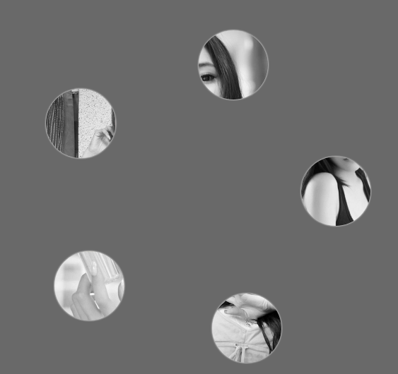
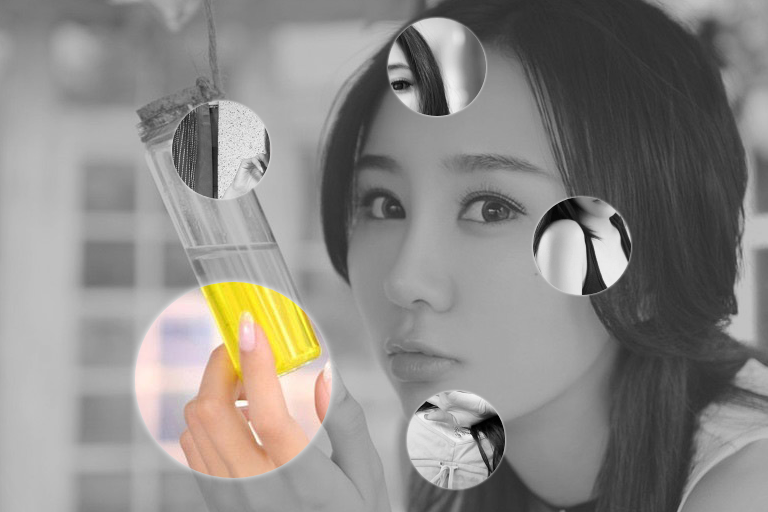
css3伪放大镜(图片放大动画)效果(鼠标移入圆形区域放大图片)
源码:
<!DOCTYPE html>
<html lang="en">
<head>
<meta charset="UTF-8">
<title>css3伪放大镜(图片放大动画)效果</title>
<style>
.gallery{list-style:none}
.gallery:before,.gallery__item:last-child{position:fixed;top:50%;left:50%;margin:-31.25em;width:62.5em;height:62.5em}
.gallery:before{z-index:-1;border-radius:50%;content:'';box-shadow:inset 0 0 5em dimgrey,0 0 0 50vw dimgrey}
.gallery__item{background-blend-mode:luminosity;transition:-webkit-transform .5s cubic-bezier(0.175,0.885,0.32,1.275),background-image .5s}
.gallery__item:not(:last-child){position:absolute;top:50%;left:50%;width:32vmin;height:32vmin;border-radius:50%;box-shadow:0 0 .5em white}
.gallery__item:nth-child(1){margin:13.87457vmin -4.53223vmin;-webkit-transform:scale(0.5);background:url("images/1.jpg") 50% 50% fixed whitesmoke}
.gallery__item:nth-child(1):hover{-webkit-transform:scale(1);background-blend-mode:normal;cursor:pointer}
.gallery__item:nth-child(1):hover ~:last-child{background:url("images/1.jpg") 50% 50% fixed dimgray}
.gallery__item:nth-child(1):hover ~:last-child:after{opacity:.001}
.gallery__item:nth-child(2){margin:4.13825vmin -40.86867vmin;-webkit-transform:scale(0.5);background:url("images/2.jpg") 50% 50% fixed whitesmoke}
.gallery__item:nth-child(2):hover{-webkit-transform:scale(1);background-blend-mode:normal;cursor:pointer}
.gallery__item:nth-child(2):hover ~:last-child{background:url("images/2.jpg") 50% 50% fixed dimgray}
.gallery__item:nth-child(2):hover ~:last-child:after{opacity:.001}
.gallery__item:nth-child(3){margin:-33.42845vmin -42.83746vmin;-webkit-transform:scale(0.5);background:url("images/3.jpg") 50% 50% fixed whitesmoke}
.gallery__item:nth-child(3):hover{-webkit-transform:scale(1);background-blend-mode:normal;cursor:pointer}
.gallery__item:nth-child(3):hover ~:last-child{background:url("images/3.jpg") 50% 50% fixed dimgray}
.gallery__item:nth-child(3):hover ~:last-child:after{opacity:.001}
.gallery__item:nth-child(4){margin:-46.90963vmin -7.71779vmin;-webkit-transform:scale(0.5);background:url("images/4.jpg") 50% 50% fixed whitesmoke}
.gallery__item:nth-child(4):hover{-webkit-transform:scale(1);background-blend-mode:normal;cursor:pointer}
.gallery__item:nth-child(4):hover ~:last-child{background:url("images/4.jpg") 50% 50% fixed dimgray}
.gallery__item:nth-child(4):hover ~:last-child:after{opacity:.001}
.gallery__item:nth-child(5){margin:-17.67475vmin 15.95615vmin;-webkit-transform:scale(0.5);background:url("images/5.jpg") 50% 50% fixed whitesmoke}
.gallery__item:nth-child(5):hover{-webkit-transform:scale(1);background-blend-mode:normal;cursor:pointer}
.gallery__item:nth-child(5):hover ~:last-child{background:url("images/5.jpg") 50% 50% fixed dimgray}
.gallery__item:nth-child(5):hover ~:last-child:after{opacity:.001}
.gallery__item:last-child{z-index:-2}
.gallery__item:last-child:after{position:absolute;top:0;right:0;bottom:0;left:0;opacity:.999;background:dimgrey;transition:opacity 2s;content:''}
</style>
</head>
<body>
<!--代码部分begin-->
<ul class="gallery">
<li class="gallery__item"></li>
<li class="gallery__item"></li>
<li class="gallery__item"></li>
<li class="gallery__item"></li>
<li class="gallery__item"></li>
<li class="gallery__item"></li>
</ul>
<div style="text-align: center;"></div>
<!--代码部分end-->
</body>
</html>
css3伪放大镜(图片放大动画)效果(鼠标移入圆形区域放大图片)的更多相关文章
- jQuery演示10种不同的切换图片列表动画效果以及tab动画演示 2
很常用的一款特效纯CSS完成tab实现5种不同切换对应内容效果 实例预览 下载地址 实例代码 1 2 3 4 5 6 7 8 9 10 11 12 13 14 15 16 17 18 19 20 21 ...
- 推荐9款使用CSS3实现的超酷动画效果
大家都知道,在网页制作时使用CSS技术,可以有效地对页面的布局.字体.颜色.背景和其它效果实现更加精确的控制.只要对相应的代码做一些简单的修改,就可以改变同一页面的不同部分,或者页数不同的网页的外观和 ...
- 实用CSS3的transform实现多种动画效果
查看效果:http://keleyi.com/a/bjad/b6x9q8gs.htm 以下是代码: <!DOCTYPE HTML PUBLIC "-//W3C//DTD HTML 4. ...
- jQuery演示10种不同的切换图片列表动画效果
经常用到的图片插件演示jQuery十种不同的切换图片列表动画效果 在线演示 下载地址 实例代码 <!DOCTYPE html> <html lang="en" c ...
- html5+css3第一屏滚屏动画效果
详细内容请点击 在线预览立即下载 html5+css3第一屏滚屏动画效果. 转载自:http://tympanus.net/codrops/2014/05/22/inspiration-for-art ...
- 【iOS开发】关于显示一连串图片组成动画效果UIImageView的使用
关于使用UIImageView显示一串图片组成动画效果的总结: 1>创建装这一串图片的容器,使用NSArray NSMutableArray *images = [NSMutableArray ...
- JS框架_(JQuery.js)动画效果鼠标跟随
百度云盘 传送门 密码 :4n9u 火狐浏览器上纯CSS_动画效果鼠标跟随效果: (作者:lily_lcj 传送门) <!DOCTYPE html PUBLIC "-//W3C//DT ...
- 纯CSS3制作卡通场景汽车动画效果
前言 今天分享一下我昨晚做的CSS3动画效果——卡通场景汽车动画.在接触CSS3动画之前,我之前实现一些简单的动画效果都是使用flash完成的.但是自从CSS3横空出世,在移动端对CSS3动画的运用越 ...
- [web前端] css3 transition属性实现3d动画效果
cp from : https://www.cnblogs.com/chrxc/p/5123375.html transition属性是一个很强大的3d动画属性,我动手试了一下,很多在网上很火的网页动 ...
随机推荐
- shell 输出文件内容
cat $filepath | while read line; do echo $line ; done #!/bin/bash #filepath=/opt/jenkins_home/worksp ...
- SQL Server的差异备份还原
在SQL Server中还原差异备份,需要先还原在差异备份时间点之前的一个完整备份,在还原完整备份时要加上NORECOVERY参数,示例SQL语句如下: RESTORE DATABASE [数据库名称 ...
- opencv学习笔记——minMaxIdx函数的含义及用法
opencv中有时需要对Mat数据需要对其中的数据求取最大值和最小值.opencv提供了直接的函数 CV_EXPORTS_W void minMaxLoc(InputArray src, CV_OUT ...
- Nginx + Tomcat 负载均衡配置详解
Nginx常用操作指南一.Nginx 与 Tomcat 安装.配置及优化1. 检查和安装依赖项 yum -y install gcc pcre pcre-devel zlib zlib-devel o ...
- LAMP开发(1)
apache web服务器软件,最近款的有7兆大小,工作:监听端口,接收请求,解析HTTP协议,转发给PHP比如:当一个客户端的请求发过来的时候,通常客户端(浏览器),请求发送给某一台IP,这个IP肯 ...
- flask源码剖析--请求流程
想了解这篇里面的内容,请先去了解我另外一篇博客Flask上下文 在了解flask之前,我们需要了解两个小知识点 偏函数 import functools def func(a1,a2): print( ...
- (1.4)DML增强功能-Output
Output在CRUD的区别 1.对于INSERT,可以引用inserted表以查询新行的属性.在insert into table output . 2.对于DELETE,可以引用deleted表以 ...
- 001-ant design安装及快速入门【基于纯antd的基本项目搭建】
一.安装使用 1.1.安装 推荐使用 npm 或 yarn 的方式进行开发 npm install antd --save yarn add antd 1.2.浏览器引入 在浏览器中使用 script ...
- adb shell top 命令
原文地址https://blog.csdn.net/kittyboy0001/article/details/38562515 原文地址https://blog.csdn.net/u010503912 ...
- 5.7 Components — Sending Actions From Components to Your Application
一.概述 1. 当一个组件在模板中被使用时,它具有发送action到这个模板的controller和routes的能力.当重大事件发生的时候,这些允许组件通知application,比如点击组件一个特 ...