
css:常见布局问题
一、单列布局
1. 水平居中
1.1 使用inline-block和text-align
  .parent{text-align:center;}
  .child{display:inline-block;}
1.2 使用margin:0 auto实现
.child{width:200px;margin:0 auto;}
1.3 使用绝对定位实现
.parent{position:relative;} .child{position:absolute;left:50%;margin-left:-100px;width:200px;} /*margin-left的负值为盒子宽度的一半*/
1.4 使用flex布局实现
.parent{display:flex;justify-content:center;}
2. 垂直居中
2.1 使用vertical-align
  .parent{line-height:100px}
  .child{display:inline-block;vertical-align:middle;}
2.2 使用绝对定位实现
  .parent{position:relative;}
  .child{position:absolute;top:50%;margin-top:-100px;height:200px;}  /*margin-top的负值为盒子高度的一半*/
2.3 使用flex实现
.parent{display:flex;align-items:center;}
3. 水平垂直居中
3.1 使用inline-block,text-align和vertical-align
  .parent{line-height:100px;text-align:center;}
  .child{display:inline-block;vertical-align:middle}
3.2 使用绝对定位实现
  .parent{position:relative;}
  .child{position:absolute;top:50%;left:50%;margin-top:-100px;margin-left:-100px;width:200px;height:200px;}  /*margin-top的负值为盒子高度的一半,margin-left的负值为盒子宽度的一半*/
3.3 使用flex实现
.parent{display:flex;justify-content:center;align-items:center;}
二、多列布局
1. 圣杯布局:三列布局,左右定宽,中间宽度自适应;中间栏要在浏览器中优先展示渲染;允许任意列的高度最高。
HTML:
 <div class="header">header</div>
 <div class="container">
    <div class="main">main</div>    <!--中间栏优先展示渲染,放在前面-->
    <div class="left">left</div>
    <div class="right">right</div>
 </div>
 <div class="footer">footer</div>
(1) 基础样式
*{margin:0;padding:0}body{min-width:800px;}
.header,.footer{
   border: 1px solid #333;
   background: #aaa;
   text-align: center;
}
.container{
   border:2px solid yellow;
}
.left{
   width:200px;
   background:skyblue; }
 .right{
   width:200px;
   background:pink;
 }
 .main{
   width:100%;
   background:tomato;
 }
.main,.left,.right{
   min-height:100px;
 }

(2) 三列均设置左浮动
.left,.main,.right{
    float:left;
}
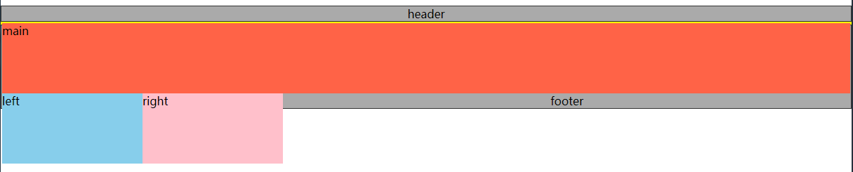
(3) 清除浮动
.container{
   zoom:1;
}
.container:after{
   content:"";
   display:block;
   clear:both;}
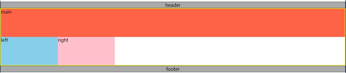
(4) 让left和right上移
.left{
     margin-left:-100%;   /*利用margin-left的负值,将left列移动到上一行的开头*/
     width:200px;
     background:skyblue;
}
.right{
     margin-left:-200px;  /*利用margin-left的负值,将right列移动到上一行的末尾*/
     width:200px;
     background:pink;
}

left列和right列已经上移,但是可以看见,此时main已被遮盖。
(5) 解决遮盖问题
给.containter左右内边距,大小分别为left列的宽和right列的宽。
.container{
   padding:0px 200px;
   border:2px solid yellow;
   zoom:1;
}

然后利用相对定位,将left列和right列定位到两侧空白处。
.left{
    position:relative;
    left:-200px;
    margin-left:-100%;
    width:200px;
    background:skyblue;
}
.right{
    position:relative;
    right:-200px;
    margin-left:-200px;
    width:200px;
    background:pink;
}

遮挡问题已解决,main可见啦。
至此,圣杯布局已完成,中间列宽度自适应。
2. 双飞翼布局:三列布局,左右定宽,中间宽度自适应;中间栏要在浏览器中优先展示渲染;允许任意列的高度最高。
双飞翼布局和圣杯布局基本一样,不同之处在于解决遮盖问题的方式不同。
双飞翼布局在main元素中添加了一个子元素content,并给这个子元素设置margin-left和margin-right,以至于content里的内容不被遮盖。
HTML:
<div class="header">header</div>
<div class="container">
   <div class="main">
      <div class="content">content</div>
   </div>
   <div class="left">left</div>
   <div class="right">right</div>
</div>
<div class="footer">footer</div>
CSS:
.content{margin:0 200px}

双飞翼布局也完成了,个人感觉比圣杯布局更简洁;完整代码就不上了,很简单的,不熟悉的可以动手试试哦。
css:常见布局问题的更多相关文章
- css常见布局方式
CSS常见布局方式 以下总结一下CSS中常见的布局方式.本人才疏学浅,如有错误,请留言指出. 如需转载,请注明出处:CSS常见布局方式 目录: 使用BFC隐藏属性 float + margin abs ...
- CSS常见布局问题整理
实现div的水平居中和垂直居中 多元素水平居中 实现栅格化布局 1. 实现div的水平居中和垂直居中 实现效果: 这大概是最经典的一个题目了,所以放在第一个. 方法有好多, 一一列来 主要思路其实就是 ...
- css CSS常见布局解决方案
CSS常见布局解决方案说起css布局,那么一定得聊聊盒模型,清除浮动,position,display什么的,但本篇本不是讲这些基础知识的,而是给出各种布局的解决方案.水平居中布局首先我们来看看水平居 ...
- 前端进阶系列(二):css常见布局解决方案
水平居中布局 margin+定宽 <div class="parent"> <div class="child">Demo</di ...
- <转载>div+css布局教程之div+css常见布局结构定义
在使用div+css布局时,首先应该根据网页内容进行结构设计,仔细分析和规划你的页面结构,你可能得到类似这样的几块: 页面层容器.页面头部.标志和站点名称.站点导航(主菜单).主页面内容.子菜单.搜索 ...
- CSS常见布局解决方案
最近要准备移动端项目,大半年没好好写过CSS了,今天恶补了一下CSS的一些布局,下面做一些分享. 水平居中布局 1.margin + 定宽 <div class="parent&quo ...
- CSS常见布局
一.单列布局 1. 水平居中 1.1 使用inline-block和text-align .parent{text-align:center;} .child{display:inline-block ...
- css常见布局问题
1.如何实现一个盒子在页面中上下左右居中 方法一:(盒子宽高固定时) .box{ width:400px; height:200px; background:#000; position:absolu ...
- 学习微信小程序之css16常见布局
<!DOCTYPE html> <html lang="en"> <head> <meta charset="UTF-8&quo ...
- 纯CSS实现移动端常见布局——高度和宽度挂钩的秘密
纯CSS实现移动端常见布局--高度和宽度挂钩的秘密 不踩坑不回头.之前我在一个项目中大量使用css3的calc计算属性.写代码的时候真心不要太爽啊-可是在项目上线之后,才让我崩溃了,原因非常easy, ...
随机推荐
- Python2入门(1)
一.基础语法1 - 输出语句 print "hello world",print默认输出换行,如果需要实现不换行需在变量末尾加上逗号,; 2 - python合法标识符 3 - 字 ...
- 关于手贱--npm 误改全局安装路径
1.通过 npm config set prefix "目录路径" 来设置.通过 npm config get prefix 来获取当前设置的目录. 2.npm config se ...
- L2-023. 图着色问题*
L2-023. 图着色问题 参考博客 #include <iostream> #include <cstring> #include <set> using nam ...
- phpcms 路由配置
这是一个由apache多站点配置引发的"血案",本以为是本地多站点配置的问题,结果找了半天没找到相关配置,最后还是问的大腿,同时也了解一些关于c盘hosts文件的映射作用以及使用 ...
- 《从Lucene到Elasticsearch:全文检索实战》学习笔记一
今天,我主要给大家讲一下信息检索概念. 信息检索: 互联网时代的飞速发展使人们进入了信息爆炸时代,据统计全球的互联网用户已达到30亿,在各个网站及移动app在每个分钟 产生的数据量是巨大的,从而导致数 ...
- Python开发 標準內建方法 (未完代補)
abs(number) 絕對值 The abs() method takes a single argument: num - number whose absolute value is to ...
- Django项目在linux系统中虚拟环境部署
1.在linux系统下,安装virtualenv 命令:pip install virtualenv 2.项目部署前的准备 1. Django web project deployment 1.1. ...
- oracle-ords
oracle rest data service ORDS Perforce adv. 一定,必须:必然地pagination n. 标记页数:页码,分页Online documentat ...
- 第0章 概述及常见dos命令
计算机发展史 计算机的发展历史有多长?真正意义上的计算机诞生,距今也只有80多年的时间.80年,对于每一个人来说,是很长的时间,但对于整个历史来说,只是短短的一瞬间. 从第一代电子计算机的发明,到今天 ...
- 安装包安装npm
在阿里云机器上centos7安装npm可以直接yum安装,然后基于镜像的时候安装不了,直接使用安装包安装,记录一下: 官网下载地址:https://nodejs.org/en/download/ #! ...