第100天:CSS3中animation动画详解
CSS3属性中有关于制作动画的三个属性:Transform,Transition,Animation;
一、Animation定义动画
CSS3的Animation是由“keyframes”这个属性来实现这样的效果,keyframes就是关键帧。下面先来看看Keyframes:
Keyframes语法规则:
@keyframes 动画名 {
     from{开始状态}
      to{结束状态}
  }
  调用
  animation: 动画名称 持续时间 执行次数(infinite无限) alternate(来回) 运动曲线(linear线性) 延迟时间;
定义有两种方式,from......to和百分比。具体方法如下:
 <style>

         div{

             width: 200px;

             height: 200px;

             background-color: green;

             margin: 100px;

             /*调用动画:动画名 持续时间 执行次数(数字或无限) alternate(来回) 线性 延迟*/

           /*  animation: move 2s infinite alternate linear 1s;*/

             animation: move2 4s infinite 1s;

         }

         /*定义动画*/

        @keyframes move {

             from{

                 transform: translateX(100px) rotate(0deg);

             }

             to{

                 transform: translateX(800PX) rotate(360deg);

             }

         }

         /*定义多组动画*/

         @keyframes move2 {

             0%{

                 transform: translate(100px,100px);

                 background-color: green;

                 border-radius: 0;

             }

             25%{

                 transform: translate(600px,100px);

                 background-color: yellow;

             }

             50%{

                 transform: translate(600px,600px);

                 background-color: blue;

             }

             75%{

                 transform: translate(100px,600px);

                 background-color: orange;

             }

             100%{

                 transform: translate(100px,100px);

                 background-color: red;

                 border-radius: 50%;

             }

         }

     </style>
二、动画属性
- animation-name: move;/*动画名称*/
- animation-duration: 2s; /*持续时间*/
- animation-iteration-count:3 ; /*动画执行次数 无数次:infinite*/
- animation-direction: alternate;/*动画方向 normal 正常,alternate 反向*/
- animation-delay: 1s;/*动画延迟*/
- animation-fill-mode: forwards;/*设置动画结束后盒子的状态 forwards:动画结束后的状态 backwards:保持动画开始前的状态*/
- animation-timing-function: steps(3);/*运动曲线 linear线性 ease减速 ease-in 加速 ease-in-out先加速后减速 帧动画 steps()*/
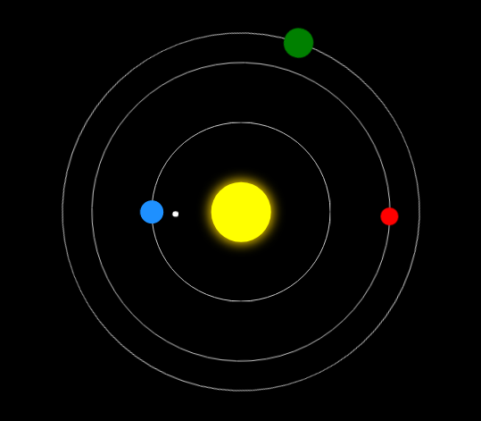
三、案例
 <!DOCTYPE html>

 <html lang="en">

 <head>

     <meta charset="UTF-8">

     <title>太阳系</title>

     <style>

         body{

             background-color: #000;

         }

         .sun{

             width: 100px;

             height: 100px;

             position: absolute;

             left:50%;

             top:50%;

             transform: translate(-50%,-50%);

             background-color: yellow;

             box-shadow: 0 0 30px 3px gold;

             border-radius: 50%;

         }

         .earth{

             width: 300px;

             height: 300px;

             position: absolute;

             left:50%;

             top:50%;

             transform: translate(-50%,-50%);

             border: 1px solid #ccc;

             border-radius: 50%;

         }

         .earth::before{

             content: '';

             width: 40px;

             height: 40px;

             position: absolute;

             left:0;

             top:50%;

             transform: translate(-50%,-50%);

             background-color: dodgerblue;

             border-radius: 50%;

         }

         .moon{

             width: 80px;

             height: 80px;

             position: absolute;

             left:0;

             top:50%;

             transform: translate(-50%,-50%);

             border-radius: 50%;

             animation: rot 2s infinite linear;

         }

         .moon::before{

             content: '';

             width: 10px;

             height: 10px;

             position: absolute;

             left:0;

             top:50%;

             transform: translate(-50%,-50%);

             background-color: #fff;

             border-radius: 50%;

         }

         .venus{

             width: 500px;

             height: 500px;

             position: absolute;

             left:50%;

             top:50%;

             transform: translate(-50%,-50%);

             border: 1px solid #ccc;

             border-radius: 50%;

             animation: rot 6s infinite linear;

         }

         .venus::before{

             content: '';

             width: 30px;

             height: 30px;

             position: absolute;

             left:0;

             top:50%;

             transform: translate(-50%,-50%);

             background-color: red;

             border-radius: 50%;

         }

         .mars{

             width: 600px;

             height: 600px;

             position: absolute;

             left:50%;

             top:50%;

             transform: translate(-50%,-50%);

             border: 1px solid #ccc;

             border-radius: 50%;

             animation: rot 10s infinite linear;

         }

         .mars::before{

             content: '';

             width: 50px;

             height: 50px;

             position: absolute;

             left:0;

             top:50%;

             transform: translate(-50%,-50%);

             background-color: green;

             border-radius: 50%;

         }

         @keyframes rot {

             0%{

                 transform:translate(-50%,-50%) rotate(0deg);

             }

             100%{

                 transform:translate(-50%,-50%) rotate(360deg);

             }

         }

     </style>

 </head>

 <body>

     <div class="sun"></div>

     <div class="earth">

         <div class="moon"></div>

     </div>

     <div class="venus"></div>

     <div class="mars"></div>

 </body>

 </html>

运行效果:
第100天:CSS3中animation动画详解的更多相关文章
- [转]超级强大的SVG SMIL animation动画详解
超级强大的SVG SMIL animation动画详解 本文花费精力惊人,具有先驱前瞻性,转载规则以及申明见文末,当心予以追究.本文地址:http://www.zhangxinxu.com/wordp ...
- Android中的动画详解系列【4】——Activity之间切换动画
前面介绍了Android中的逐帧动画和补间动画,并实现了简单的自定义动画,这一篇我们来看看如何将Android中的动画运用到实际开发中的一个场景--Activity之间跳转动画. 一.定义动画资源 如 ...
- Android Animation动画详解(二): 组合动画特效
前言 上一篇博客Android Animation动画详解(一): 补间动画 我已经为大家介绍了Android补间动画的四种形式,相信读过该博客的兄弟们一起都了解了.如果你还不了解,那点链接过去研读一 ...
- [转]Animation 动画详解(一)——alpha、scale、translate、rotate、set的xml属性及用法
转载:http://blog.csdn.net/harvic880925/article/details/39996643 前言:这几天做客户回访,感触很大,用户只要是留反馈信息,总是一种恨铁不成钢的 ...
- 超级强大的SVG SMIL animation动画详解
本文花费精力惊人,具有先驱前瞻性,转载规则以及申明见文末,当心予以追究.本文地址:http://www.zhangxinxu.com/wordpress/?p=4333 //zxx: 本文的SVG在有 ...
- Android Animation动画详解(一): 补间动画
前言 你有没有被一些APP中惊艳的动画效果震撼过,有没有去思考,甚至研究过这些动画是如何实现的呢? 啥?你没有思考,更没有研究过? 好吧,那跟着我一起来学习下如何去实现APP中那些让我们惊羡的动画特效 ...
- Animation 动画详解(一)——alpha、scale、translate、rotate、set的xml属性及用法
一.概述 Android的animation由四种类型组成:alpha.scale.translate.rotate,对应android官方文档地址:<Animation Resources&g ...
- 第98天:CSS3中transform变换详解
transform变换详解 本文主要介绍变形transform. Transform字面上就是变形,改变的意思.在CSS3中transform主要包括以下几种:旋转rotate.扭曲skew.缩放sc ...
- css3中transition属性详解
css3中通过transition属性可以实现一些简单的动画过渡效果~ 1.语法 transition: property duration timing-function delay; transi ...
随机推荐
- WPF使用IDataErrorInfo接口进行数据校验 - 简书
原文:WPF使用IDataErrorInfo接口进行数据校验 - 简书 class ValidationBindableBase : BindableBase, IDataErrorInfo { pu ...
- day6 网络 HTML模板
1.HTML模板 HTML模板 baidu一下 http://www.cssmoban.com/ http://www.cnblogs.com/web-d/archive/2010/04/16/171 ...
- 查询系统日期和时间(mysql)
select current_date --不带时间select sysdate() 或 SELECT NOW(); --带时间
- XAF-如何在详细视图界面显示按钮(含示例项目下载)
默认情况下,指定了按钮的Category后,将在对应的按钮容器显示按钮.有时候,我们需要将按钮显示在详细视图中. 本示例源码 创建一个控制器,并填加按钮.设置好了所有ID.Caption后,给Cate ...
- vs2010(vs2012)好用的扩展插件介绍
一直以来只使用番茄vs助手(https://www.wholetomato.com/downloads/default.asp)辅助写代码,也都忘了是谁介绍的,不过确实好用. 相比原始的vs,它提供了 ...
- const与readonly常量
const与readonly常量 const与readonly都是用来定义常量,但是它们有什么区别呢? 下面我们来简要的说明一下: const修饰的常量是编译时常量,如:public const St ...
- ython进阶06 循环对象
这一讲的主要目的是为了大家在读Python程序的时候对循环对象有一个基本概念. 循环对象的并不是随着Python的诞生就存在的,但它的发展迅速,特别是Python 3x的时代,循环对象正在成为循环的标 ...
- Vue学习计划基础笔记(四) - 事件处理
事件处理 目标: 熟练掌握事件监听的方式,熟悉事件处理方式以及各类事件修饰符 理解在html中监听事件的意义 监听事件(v-on) 类似普通的on,例如v-on:click或@click就相当于普通的 ...
- day09,10 函数
一.函数 什么是函数 函数: 对代码块和功能的封装和定义 定义一个事情或者功能. 等到需要的时候直接去用就好了. 那么这里定义的东西就是一个函数. 语法: def 函数名(形参): 函数体 函数名(实 ...
- DX孟虎点评新兴市场:巴西俄罗斯火爆背后
[亿邦动力网讯]4月3日消息,在第九届中国中小企业电子商务大会暨2014中国(河南)跨境贸易电子商务峰会上,DX公司CEO孟虎对新兴市场做了详细的分析,指出在当今的跨境电商环境下,北美.西欧作为电商成 ...