python数据可视化——matplotlib 用户手册入门:pyplot 画图
参考matplotlib官方指南:
https://matplotlib.org/tutorials/introductory/pyplot.html#sphx-glr-tutorials-introductory-pyplot-py
pyplot是常用的画图模块,功能非常强大,下面就来见识下它的能力吧
1.快速画出常见图形
2.使用关键字字符串作图
3.使用类别变量画图
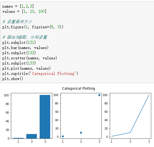
4.创建多图
import matplotlib.pyplot as plt
%matplotlib inline
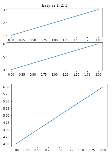
plt.figure(1) # the first figure
plt.subplot(211) # the first subplot in the first figure
plt.plot([1, 2, 3])
plt.subplot(212) # the second subplot in the first figure
plt.plot([4, 5, 6]) plt.figure(2) # a second figure
plt.plot([4, 5, 6]) # creates a subplot(111) by default plt.figure(1) # figure 1 current; subplot(212) still current
plt.subplot(211) # make subplot(211) in figure1 current
plt.title('Easy as 1, 2, 3') # subplot 211 title
 import matplotlib.pyplot as plt

 import numpy as np

 np.random.seed(19680801)

 data = np.random.randn(2, 100)

 fig, axs = plt.subplots(2, 2, figsize=(5, 5))

 axs[0, 0].hist(data[0])

 axs[1, 0].scatter(data[0], data[1])

 axs[0, 1].plot(data[0], data[1])

 axs[1, 1].hist2d(data[0], data[1])

 plt.show()

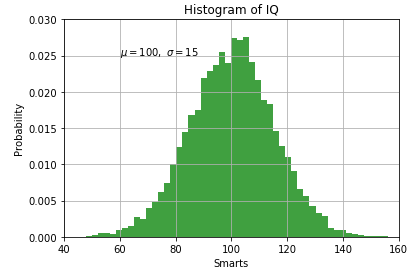
5.添加文本:轴线标签,属性标签
 import matplotlib.pyplot as plt

 import numpy as np

 mu, sigma = 100, 15

 x = mu + sigma * np.random.randn(10000)

 # the histogram of the data

 n, bins, patches = plt.hist(x, 50, normed=True, facecolor='g', alpha=0.75)

 plt.xlabel('Smarts')

 plt.ylabel('Probability')

 plt.title('Histogram of IQ')

 plt.text(60, .025, r'$\mu=100,\ \sigma=15$')   # 支持 LaTex格式

 plt.axis([40, 160, 0, 0.03])

 plt.grid(True)

 plt.show()
python数据可视化——matplotlib 用户手册入门:pyplot 画图的更多相关文章
- python数据可视化——matplotlib 用户手册入门:使用指南
参考matplotlib官方指南: https://matplotlib.org/tutorials/introductory/usage.html#sphx-glr-tutorials-introd ...
- python数据可视化-matplotlib入门(7)-从网络加载数据及数据可视化的小总结
除了从文件加载数据,另一个数据源是互联网,互联网每天产生各种不同的数据,可以用各种各样的方式从互联网加载数据. 一.了解 Web API Web 应用编程接口(API)自动请求网站的特定信息,再对这些 ...
- Python数据可视化matplotlib和seaborn
Python在数据科学中的地位,不仅仅是因为numpy, scipy, pandas, scikit-learn这些高效易用.接口统一的科学计算包,其强大的数据可视化工具也是重要组成部分.在Pytho ...
- Python数据可视化--matplotlib
抽象化|具体化: 如盒形图 | 现实中的图 功能性|装饰性:没有装饰和渲染 | 包含艺术性美学上的装饰 深度表达|浅度表达:深入层次的研究探索数据 | 易于理解的,直观的表示 多维度|单一维度:数据的 ...
- python数据可视化-matplotlib入门(6)-从文件中加载数据
前几篇都是手动录入或随机函数产生的数据.实际有许多类型的文件,以及许多方法,用它们从文件中提取数据来图形化. 比如之前python基础(12)介绍打开文件的方式,可直接读取文件中的数据,扩大了我们的数 ...
- python数据可视化-matplotlib入门(5)-饼图和堆叠图
饼图常用于统计学模块,画饼图用到的方法为:pie( ) 一.pie()函数用来绘制饼图 pie(x, explode=None, labels=None, colors=None, autopct=N ...
- Python数据可视化Matplotlib——Figure画布背景设置
之前在今日头条中更新了几期的Matplotlib教学短视频,在圈内受到了广泛好评,现应大家要求,将视频中的代码贴出来,方便大家学习. 为了使实例图像显得不单调,我们先将绘图代码贴上来,此处代码对Fig ...
- Python数据可视化——使用Matplotlib创建散点图
Python数据可视化——使用Matplotlib创建散点图 2017-12-27 作者:淡水化合物 Matplotlib简述: Matplotlib是一个用于创建出高质量图表的桌面绘图包(主要是2D ...
- 【数据科学】Python数据可视化概述
注:很早之前就打算专门写一篇与Python数据可视化相关的博客,对一些基本概念和常用技巧做一个小结.今天终于有时间来完成这个计划了! 0. Python中常用的可视化工具 Python在数据科学中的地 ...
随机推荐
- AWR报告分析
AWR报告分析 awr报告是oracle 10g下提供的一种性能收集和分析工具,它能提供一个时间段内整个系统资源使用情况的报告,通过这个报告,我们就可以了解一个系统的整个运行情况,这就像一个人全面的体 ...
- HDU 1165 Eddy's research II(给出递归公式,然后找规律)
- Eddy's research II Time Limit:2000MS Memory Limit:32768KB 64bit IO Format:%I64d & %I64 ...
- 用HTML编写漫威页面
<!DOCTYPE html><html><head lang="en"> <meta charset="UTF-8" ...
- Hive 的collect_set使用详解
Hive 的collect_set使用详解 https://blog.csdn.net/liyantianmin/article/details/48262109 对于非group by字段,可以 ...
- pThread多线程demo
#import "ViewController.h" #import <pthread.h> @interface ViewController () @end @im ...
- Caused by: java.lang.ClassNotFoundException: org.springframework.boot.bind.RelaxedPropertyResolver
Caused by: java.lang.ClassNotFoundException: org.springframework.boot.bind.RelaxedPropertyResolver 这 ...
- #leetcode刷题之路32-最长有效括号
给定一个只包含 '(' 和 ')' 的字符串,找出最长的包含有效括号的子串的长度. 示例 1:输入: "(()"输出: 2解释: 最长有效括号子串为 "()"示 ...
- 01.centos7环境准备
博客为日常工作学习积累总结: 1.环境准备: 系统版本:CentOS-7-x86_64-Minimal-1810.iso 运行环境:虚拟机windows上的VM 15 系统安装:参照老男孩运维要求 2 ...
- Uncaught SyntaxError: Unexpected token : 开发遇到的跨域问题
先描述一下,这个问题,是如何遇到的 在ajax调用远程服务的时候,报了一个Origin xxxxxx is not allowed by Access-Control-Allow-Origin 的错误 ...
- 关于iOS启动页launchImage无法显示解决办法
在没有美工的时候,往往项目开发到一半,才拿到icon和launchImage图片,这时在添加对应图片之后发现并没有正常显示,这就蛋疼了,以下列出几种解决方式. 关于设置launchImage: 工程配 ...