基于uni-app全端弹框组件uaPopup「兼容h5+小程序+app端|nvue」
uniapp兼容多端自定义模态弹框组件UAPopup
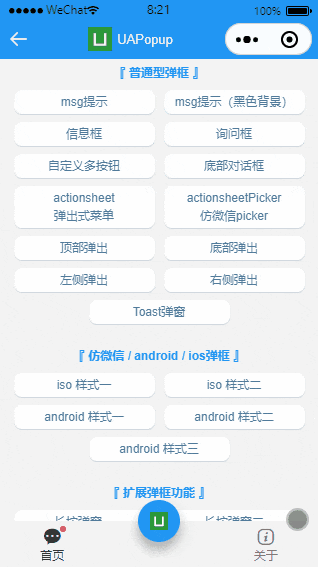
ua-popup 一款轻量级的uniapp自定义弹窗组件。汇集了android、ios和微信弹窗效果(msg消息、alert提示框、dialog对话框、actionsheet底部动作框、toast轻提示、长按定位菜单)等功能。
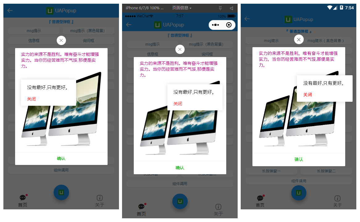
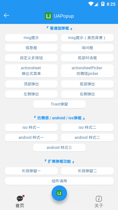
如下图:H5+App端+小程序效果,亲测多端运行一致。
◆ 引入使用
▍在main.js中引入uapopup弹框组件
// 引入自定义弹框组件

import uaPopup from './components/ua-popup/index.vue'

Vue.component('ua-popup', uaPopup)
说明:自HBuilderX 2.5.5起支持easycom组件模式。只要组件在components目录,并且符合 components/ua-popup/ua-popup.vue 结构。则无需引入组件,直接在页面使用即可。
UApopup支持标签组件式+函数式两种调用方式。
- 标签式
<!-- msg提示(自定义背景) -->

<ua-popup

    v-model="showMsgBg"

    anim="footer"

    content="hello uniapp"

    shade="false"

    time="2"

    :custom-style="{'backgroundColor': 'rgba(0,0,0,.6)', 'color': '#fff'}"

/>

<!-- 询问框 -->

<ua-popup v-model="showConfirm" shadeClose="false" title="标题" xclose z-index="2001"

    content="<div style='color:#ff557f;padding:20px 40px;'>一切都将一去杳然,任何人都无法将其捕获。</div>"

    :btns="[

        {text: '取消', click: hideConfirm},

        {text: '确定', style: 'color:#00aa00;', click: handleInfo},

    ]"

/>
- 函数式
<script>
export default {
methods: {
// 函数式嵌套调用
handleInfo() {
let $ua = this.$refs.uapopup
let $toast = this.$refs.uatoast
$ua.open({
content: '人生漫漫,且行且珍惜',
customStyle: {'background-color': 'rgba(170, 0, 127, 0.6)', 'color': '#fff'},
time: 3,
onClose() {
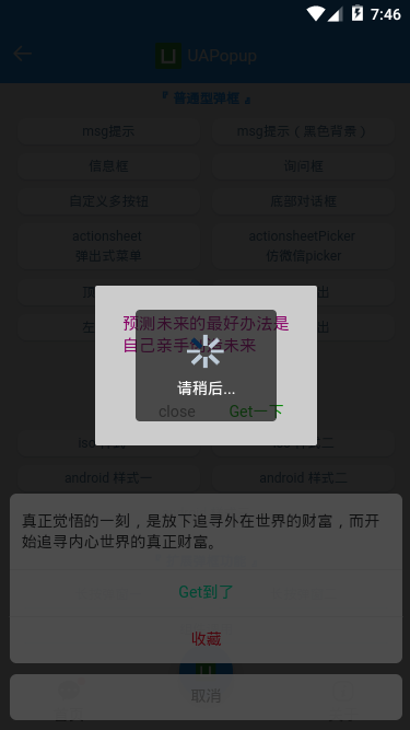
$ua.open({
type: 'android',
content: '<div style="color:#aa007f">预测未来的最好办法是自己亲手创造未来</div>',
customStyle: {'width': '200px'},
btns: [
{
text: 'close', click() {
$ua.close()
}
},
{
text: 'Get一下',
style: 'color:#00aa00;',
click() {
$toast.open({
type: 'toast',
icon: 'loading',
content: '请稍后...',
opacity: .2,
time: 2,
})
}
}
]
})
}
})
},
}
}
</script>
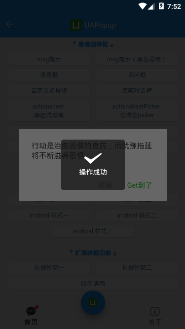
说明:一些简单的提示使用函数式调用足以,如果复杂的模板展示,则推荐使用组件式调用(支持slot插槽)
- 简单消息提示
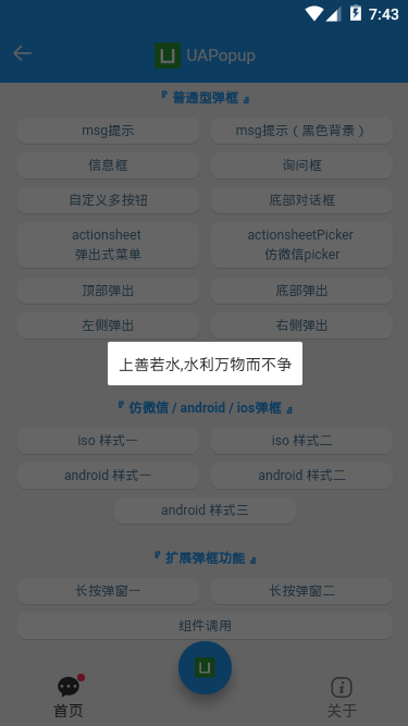
<ua-popup v-model="showMsg" anim="fadeIn" content="上善若水,水利万物而不争" shadeClose="false" time="3" />
- 底部弹框效果
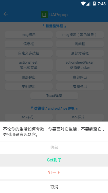

<!-- 底部对话框 -->

<ua-popup v-model="showFooter" anim="footer" type="footer" :shadeClose="false"

    content="真正觉悟的一刻,是放下追寻外在世界的财富,而开始追寻内心世界的真正财富。"

    :btns="[

        {text: 'Get到了', style: 'color:#00e0a1;', click: handleInfo},

        {text: '收藏', style: 'color:#ee0a24;'},

        {text: '取消', style: 'color:#a9a9a9;', click: hideFooter},

    ]"

/>

<!-- ActionSheet底部弹出式菜单 -->

<ua-popup v-model="showActionPicker" anim="footer" type="actionsheetPicker" round title="标题"

    :btns="[

        {text: '取消'},

        {text: '确定', style: 'color:#00aa00;', click: handleInfo},

    ]"

>

    <!-- 自定义内容 -->

    <ul class="list" style="padding:50px;">

        <li>只要不失去方向,就不会失去自我</li>

        <li>别问别人为什么,多问自己凭什么</li>

        <li>不要等待机会,而要创造机会</li>

    </ul>

</ua-popup>
- 轻提示loading
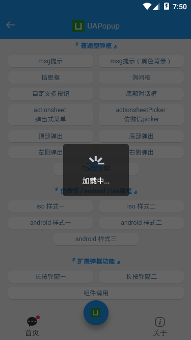
<ua-popup v-model="showToast" type="toast" icon="loading" time="2" content="加载中..." />

<!-- <ua-popup v-model="showToast" type="toast" icon="success" shade="false" time="2" content="成功提示" /> -->

<!-- <ua-popup v-model="showToast" type="toast" icon="fail" shade="false" time="2" content="失败提示" /> -->

<!-- <ua-popup v-model="showToast" type="toast" icon="warn" shade="false" time="2" content="警告提示" /> -->

<!-- <ua-popup v-model="showToast" type="toast" icon="info" shade="false" time="2" content="普通提示" /> -->
- 长按菜单效果
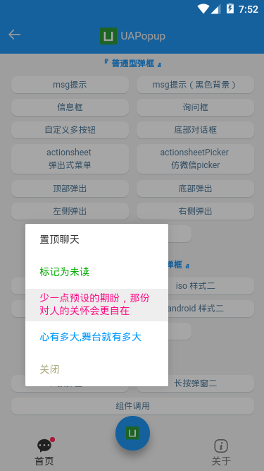
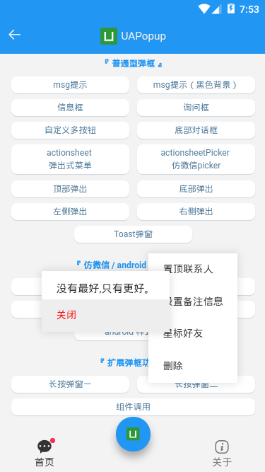
<!-- 长按弹窗1 -->

<ua-popup v-model="showContextMenu1" type="contextmenu" :follow="follow1" opacity=".35"

    :btns="[

        {text: '置顶聊天', click: handleContextPopup},

        {text: '标记为未读', style: 'color:#00aa00;'},

        {text: '少一点预设的期盼,那份对人的关怀会更自在', style: 'color:#ff007f;'},

        {text: '心有多大,舞台就有多大', style: 'color:#09f;'},

        {text: '关闭', style: 'color:#aaaa7f;', click: hideContextMenu1},

    ]"

>

</ua-popup>

<!-- 长按弹窗2 -->

<ua-popup v-model="showContextMenu2" type="contextmenu" :follow="follow2" opacity="0"

    :btns="[

        {text: '置顶联系人', click: handleContextPopup},

        {text: '设置备注信息'},

        {text: '星标好友'},

        {text: '删除', click: hideContextMenu1},

    ]"

>

</ua-popup>
注意:需要传入follow坐标点参数。
// 长按菜单操作

handleContextMenu1(e) {

    this.showContextMenu1 = true;

    this.follow1 = [e.touches[0].clientX, e.touches[0].clientY]

},
very nice! 是不是觉得这款插件还不错,也是倒腾了几个通宵搞出来的。尤其调试nvue页面,简直让人有点抓狂~~
◆ UApopup编码实现
- 支持20+参数配置
props: {

    // 接收父组件中v-model的值

    value: { type: Boolean, default: false },

    title: String,

    content: String,

    type: String,

    customStyle: { type: Object, default: null },

    icon: String,

    shade: { type: [Boolean, String], default: true },

    shadeClose: { type: [Boolean, String], default: true },

    opacity: { type: [Number, String], default: '' },

    round: Boolean,

    xclose: Boolean,

    xposition: { type: String, default: 'right' },

    xcolor: { type: String, default: '#333' },

    anim: { type: String, default: 'scaleIn' },

    position: String,

    follow: { type: Array, default: null },

    time: { type: [Number, String], default: 0 },

    zIndex: { type: [Number, String], default: '202107' },

    btns: {

        type: Array, default: null

    },

    // 打开弹框回调

    onOpen: { type: Function, default: null },

    // 关闭弹框回调

    onClose: { type: Function, default: null },

},
- 弹框模板
<template>

    <!-- #ifdef APP-NVUE -->

    <view v-if="opts.visible" class="ua__popup" :class="{'ua__popup-closed': closeAnim}">

    <!-- #endif -->

    <!-- #ifndef APP-NVUE -->

    <view v-show="opts.visible" class="ua__popup" :class="{'ua__popup-closed': closeAnim}">

    <!-- #endif -->

        <!-- 遮罩层 -->

        <view v-if="opts.shade && opts.shade!='false'" class="uapopup__overlay" @touchstart="handleShadeClick" :style="{'opacity': opts.opacity >= 0 ? opts.opacity : '', 'z-index': oIndex-1}"></view>

        <!-- 窗口层 -->

        <view class="uapopup__wrap" :style="{'z-index': oIndex}">

            <view class="uapopup__child" :id="'uapopup-'+uuid" :class="['anim-'+opts.anim, opts.type&&'popui__'+opts.type, opts.round&&'round', opts.position]" :style="[opts.follow&&positionStyle, opts.customStyle]">

                <!-- //标题 -->

                <view v-if="opts.title || $slots.title" class="uapopup__title">

                    <template v-if="$slots.title"><slot name="title" /></template>

                    <rich-text v-else :nodes="opts.title"></rich-text>

                </view>

                <!-- //toast -->

                <!-- <view v-if="opts.type=='toast'&&opts.icon" class="toast__icons" :class="['toast__icons-'+opts.icon]" :style="{'background-image': `url(${toastIcon[opts.icon]})`}"></view> -->

                <image v-if="opts.type=='toast'&&opts.icon" class="toast__icons" :class="['toast__icons-'+opts.icon]" :src="toastIcon[opts.icon]" mode="widthFix"></image>

                <!-- //内容 -->

                <view v-if="opts.content || $slots.content" class="uapopup__content">

                    <template v-if="$slots.content"><slot name="content" /></template>

                    <rich-text v-else :nodes="opts.content"></rich-text>

                </view>

                <slot />

                <!-- //按钮组 -->

                <view v-if="opts.btns" class="uapopup__actions">

                    <rich-text v-for="(btn,index) in opts.btns" :key="index" class="btn" :class="{'disabled': btn.disabled}" :style="btn.style" @click="handleBtnClick($event, index)" :nodes="btn.text"></rich-text>

                </view>

                <!-- //关闭按钮 -->

                <view v-if="opts.xclose" class="uapopup__xclose" :class="opts.xposition" :style="{'color': opts.xcolor}" @click="close"></view>

            </view>

        </view>

    </view>

</template>

/**

 * @Desc     uniapp全端自定义弹框组件

 * @Time     andy by 2021/7/10

 * @About    Q:282310962  wx:xy190310

 */

<script>

    let index = 0

    export default {

        ...

        data() {

            return {

                // 混入props参数,处理函数式调用

                opts: {

                    visible: false,

                },

                toastIcon: {

                    ...

                },

                closeAnim: false,

                oIndex: 202107,

                timer: null,

                // 长按定位初始化(避免弹框跳动闪烁)

                positionStyle: { position: 'absolute', left: '-999px', top: '-999px' },

            }

        },

        watch: {

            value(val) {

                const type = val ? 'open' : 'close'

                this[type]()

            }

        },

        computed: {

            uuid() {

                return Math.floor(Math.random() * 10000)

            },

        },

        methods: {

            // 打开弹框

            open(options) {

                if(this.opts.visible) return

                this.opts = Object.assign({}, this.$props, options)

                this.opts.visible = true

                // nvue 的各组件在安卓端默认是透明的,如果不设置background-color,可能会导致出现重影的问题

                // #ifdef APP-NVUE

                if(!this.opts.customStyle['background'] && !this.opts.customStyle['background-color']) {

                    this.opts.customStyle['background'] = '#fff'

                }

                // #endif

                let _index = ++index

                this.oIndex = _index + parseInt(this.opts.zIndex)

                this.$emit('open')

                typeof this.opts.onOpen === 'function' && this.opts.onOpen()

                // 长按处理

                if(this.opts.follow) {

                    ...

                }

                ...

            },

            // 关闭弹框

            close() {

                if(!this.opts.visible) return

                this.closeAnim = true

                setTimeout(() => {

                    this.opts.visible = false

                    this.closeAnim = false

                    this.$emit('input', false)

                    this.$emit('close')

                    typeof this.opts.onClose === 'function' && this.opts.onClose()

                    this.timer && clearTimeout(this.timer)

                    delete this.timer

                }, 200)

            },

            ...

            // 获取dom宽高

            getDom(id) {

                return new Promise((resolve, inject) => {

                    uni.createSelectorQuery().in(this).select('#uapopup-' + id).fields({

                        size: true,

                    }, data => {

                        resolve(data)

                    }).exec()

                })

            },

            // 自适应坐标点

            getPos(x, y, ow, oh, winW, winH) {

                let l = (x + ow) > winW ? x - ow : x;

                let t = (y + oh) > winH ? y - oh : y;

                return [l, t];

            },

        }

    }

</script>
最后是运行在video页面效果图,完美的兼容性。
好了,基于uni-app开发多端自定义弹窗组件就分享到这里。希望对大家有点帮助哈!✍
最后附上vue3+electron实例项目
electron+vue3跨端仿QQ聊天:https://www.cnblogs.com/xiaoyan2017/p/14454624.html
electron+vite2后台管理系统:https://www.cnblogs.com/xiaoyan2017/p/14776441.html
基于uni-app全端弹框组件uaPopup「兼容h5+小程序+app端|nvue」的更多相关文章
- 基于uniapp自定义Navbar+Tabbar组件「兼容H5+小程序+App端Nvue」
uni-app跨端自定义navbar+tabbar组件|沉浸式导航条|仿咸鱼凸起标签栏 在跨端项目开发中,uniapp是个不错的框架.采用vue.js和小程序语法结构,使得入门开发更容易.拥有非常丰富 ...
- vue3系列:vue3.0自定义弹框组件V3Popup|vue3.x手机端弹框组件
基于Vue3.0开发的轻量级手机端弹框组件V3Popup. 之前有分享一个vue2.x移动端弹框组件,今天给大家带来的是Vue3实现自定义弹框组件. V3Popup 基于vue3.x实现的移动端弹出框 ...
- svelte组件:Svelte自定义弹窗Popup组件|svelte移动端弹框组件
基于Svelte3.x自定义多功能svPopup弹出框组件(组件式+函数式) 前几天有分享一个svelte自定义tabbar+navbar组件,今天继续带来svelte自定义弹窗组件. svPopup ...
- 自己写的基于bootstrap风格的弹框插件
自己写的一款基于bootstrap风格的弹框插件,暂时只有确认框.提示框.后续功能扩展.bug修改再更新. ;(function($){ //默认参数 var PARAMS; var DEFAULTP ...
- 移动端(H5)弹框组件--简单--实用--不依赖jQuery
俗话说的好,框架是服务与大家的,包含的功能比较多,代码多.在现在追求速度的年代.应该根据自己的需求去封装自己所需要的组件. 下边就给大家介绍一下自己封装的一个小弹框组件,不依赖与jQuery,代码少, ...
- VUE2.0增删改查附编辑添加model(弹框)组件共用
Vue实战篇(增删改查附编辑添加model(弹框)组件共用) 前言 最近一直在学习Vue,发现一份crud不错的源码 预览链接 https://taylorchen709.github.io/vue- ...
- 解决关闭app权限弹框后无法识别页面对象问题
在使用appium进行安卓端app的自动化测试,我碰到这样下面这几个问题: 1.每次启动我的待测app时总会提示app权限 2.关闭完权限后,无法识别页面对象 第一个问题的解决,我更换不同的真机进行测 ...
- uniapp自定义顶部搜索框兼容微信小程序
zhuanzai: uniapp自定义顶部搜索框兼容微信小程序 自定义组件 navbarvue (胶囊底部高度 - 状态栏的高度) + (胶囊顶部高度 - 状态栏内的高度) = 导航栏的高度 < ...
- 微信小程序APP(商超营销类)经验总结
项目介绍 这是一款主打门店营销的小程序.包括首页.门店.营销.个人设置.登录.数据统计展示.营销设置等. 本来要独立完成整个项目,包括前后端一套的,有些意外因素,项目临时收尾(说明:只完成了前端的部分 ...
随机推荐
- 查看当前目录下文件个数: $find ./ | wc -l
2.1. 创建和删除 创建:mkdir 删除:rm 删除非空目录:rm -rf file目录 删除日志 rm *log (等价: $find ./ -name "*log" -ex ...
- HDFS 高可用(HA)环境搭建
步骤一:修改公共属性配置 core-site.xml 文件 [root@node-01 ~]# cd /root/apps/hadoop-3.2.1/etc/hadoop [root@node-01 ...
- IT菜鸟之总结(Du teacher)
初次接触云计算,从以前对计算机的一窍不通,经过这三周的学习,起码是通了一窍了:哈哈,至少是对计算机的组成及系统的安装都有了认识,也初次学习了Linux系统,对其的发展和使用有了认识,也学到了一些基础的 ...
- elk搜集日志,实现logstash根据message中结构不同动态创建索引并扩展功能,区分message中json和非json数据简单方式
搜集日志,但是框架本身也会打印很多日志是字符串的.我们自己希望的日志用json,但是又需要json字段可以扩展,logstash收集日志后都放在了message字段中,我们自定义打印的是json串,s ...
- centos更换损坏硬盘uuid改变导致系统不能正常启动处理
1.因为挂载磁盘uuid错误导致,而系统在启动的时候,会读取fstab文件.来加载预设的硬盘到指定的分区目录,但读取到需要挂载的UUID的磁盘不存在,中断文件的读取,然后提示文件系统错误,不能解析UU ...
- Failed to start component [StandardEngine[Tomcat].StandardHost[localhost].StandardContext[]] 错误(Day_25)
错误: 在maven项目,web启动的时候报这个错误 Failed to start component [StandardEngine[Tomcat].StandardHost[localho ...
- Docker Registry 简化版
目录 Docker Registry 为什么要使用Registry 依赖 启动 Configuring a registry 配置认证 Docker Registry https://docs.doc ...
- VMware vRealize Network Insight 6.2 发布 - 网络和安全可视化分析
发现.优化应用安全性和网络连接解决方案并对其进行故障排除 VMware vRealize Network Insight 可帮助您跨混合和多云环境构建经过优化且高度可用的安全网络基础架构.它提供了网络 ...
- ubuntu 20.04 编译安装 p 详解
事情的起因 实验需要安装 p4 环境 我考虑到我自己的电脑性能不足,因此打算在本机安装 github上官方仓库的安装教程老旧,都是在 ubuntu14.04或者ubuntu16.04 我长时间用的li ...
- libevent中的事件机制
libevent是事件驱动的网络库,事件驱动是他的核心,所以理解事件驱动对于理解整个网络库有很重要的意义. 本着从简入繁,今天分析下单线程最简单的事件触发.通过sample下的event- ...