
Material Designer的低版本兼容实现(二)—— Theme
Theme
material主题可以定义为如下形式:
- @android:style/Theme.Material
- @android:style/Theme.Material.Light
- @android:style/Theme.Material.Light.DarkActionBar
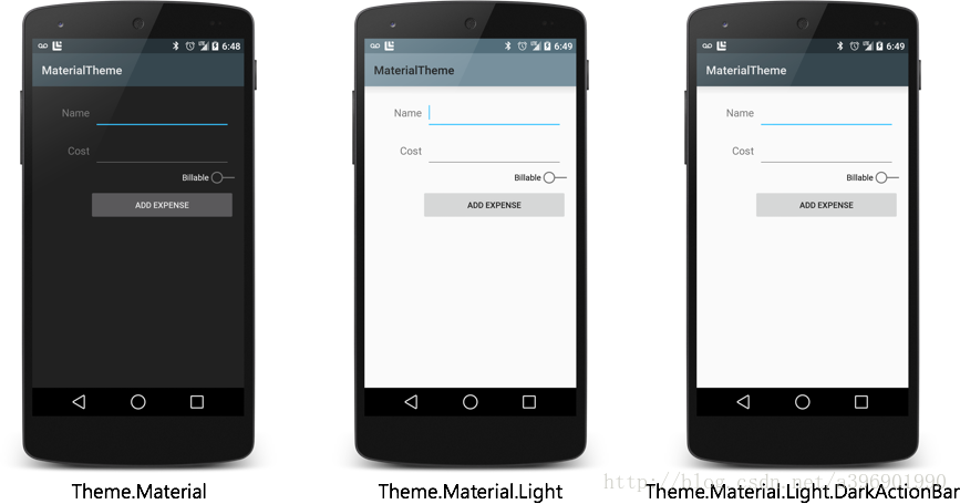
我们可以在vlues-v21中的styles.xml文件中继承这些主题,然后定制一些属性。在v21中可以做如下修改
<resources>

  <!-- inherit from the material theme -->

  <style name="AppTheme" parent="android:Theme.Material">

    <!-- Main theme colors -->

    <!--   your app's branding color (for the app bar) -->

    <item name="android:colorPrimary">@color/primary</item>

    <!--   darker variant of colorPrimary (for status bar, contextual app bars) -->

    <item name="android:colorPrimaryDark">@color/primary_dark</item>

    <!--   theme UI controls like checkboxes and text fields -->

    <item name="android:colorAccent">@color/accent</item>

  </style>

</resources>
这里设置了几个主题颜色
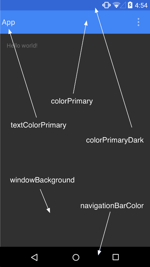
注:
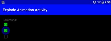
<item name="android:colorAccent">#00FF00</item>
colorAccent是设置像是CheckBox的颜色
接下来,我们主要来看看在低版本中应该如何设置
color.xml
<?xml version="1.0" encoding="utf-8"?>

<resources>

    <color name="colorPrimaryDark">#3367d6</color>

    <color name="colorPrimary">#4285f4</color>

    <color name="windowBackground">#eeeeee</color>

</resources>
styles.xml
<resources xmlns:android="http://schemas.android.com/apk/res/android">

    <!--

        Base application theme, dependent on API level. This theme is replaced

        by AppBaseTheme from res/values-vXX/styles.xml on newer devices.

    -->

    <style name="AppBaseTheme" parent="Theme.AppCompat">

        <!--

            Theme customizations available in newer API levels can go in

            res/values-vXX/styles.xml, while customizations related to

            backward-compatibility can go here.

        -->

    </style>

    <!-- Application theme. -->

    <style name="AppTheme" parent="AppBaseTheme">

        <!-- All customizations that are NOT specific to a particular API-level can go here. -->

        <item name="colorPrimary">@color/colorPrimary</item>

        <item name="colorPrimaryDark">@color/primary_material_light</item>

        <item name="android:textColorPrimary">@android:color/white</item>

        <item name="android:windowNoTitle">true</item>

        <item name="windowActionBar">false</item>

    </style>

</resources>
这样我们就设置好了类似于下面的效果:

现在我们终于在高版本上能改变status bar的颜色了,这个在以前是不可能的。话说4.4也支持这个。下面我们来详细看看在低版本中我们如何让自己的主题完美工作。
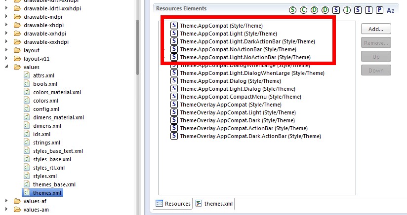
1.首先继承一个Compat的主题
在compat包中我们可以看到有很多主题,我们找到给activity用的,发现也就下面红框里这么几个,看名字就能知道是什么了。
<resources>

    <!-- Themes in the "Theme.AppCompat" family will contain an action bar by default.

         If Holo themes are available on the current platform version they will be used.

         A limited Holo-styled action bar will be provided on platform versions older

         than 3.0. (API 11)

         These theme declarations contain any version-independent specification. Items

         that need to vary based on platform version should be defined in the corresponding

         "Theme.Base" theme. -->

    <!-- Platform-independent theme providing an action bar in a dark-themed activity. -->

    <style name="Theme.AppCompat" parent="Base.Theme.AppCompat" />

    <!-- Platform-independent theme providing an action bar in a light-themed activity. -->

    <style name="Theme.AppCompat.Light" parent="Base.Theme.AppCompat.Light" />

    <!-- Platform-independent theme providing an action bar in a dark-themed activity. -->

    <style name="Theme.AppCompat.Light.DarkActionBar" parent="Base.Theme.AppCompat.Light.DarkActionBar" />

    <style name="Theme.AppCompat.NoActionBar">

        <item name="windowActionBar">false</item>

        <item name="android:windowNoTitle">true</item>

    </style>

    <style name="Theme.AppCompat.Light.NoActionBar">

        <item name="windowActionBar">false</item>

        <item name="android:windowNoTitle">true</item>

    </style>
继承Theme.AppCompat,效果↓
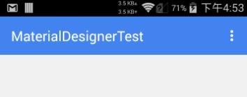
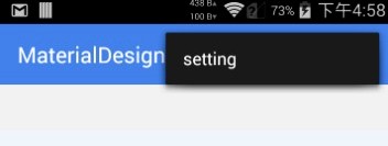
继承Theme.AppCompat.Light效果↓
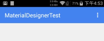
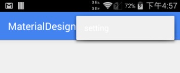
继承Theme.AppCompat.Light.DarkActionBar效果↓
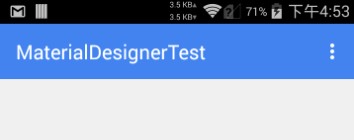
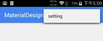
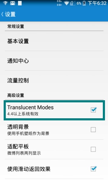
此外,在Android的4.4添加了View.SYSTEM_UI_FLAG_IMMERSIVE和View.SYSTEM_UI_FLAG_IMMERSIVE_STICKY。这两个标记可以实现所谓的沉浸式状态栏,个人感觉翻译的不好,应该叫做一种状态栏模式。这些标记的作用是在应用(比如视频)在需要全屏时抹去状态栏,但是在退出视频时又能回来。准确来说是叫:ImmersiveMode或者是Translucent Modes,总之是一种模式。
详细可以看这篇文章:http://www.tuicool.com/articles/RVRneq
在Smooth中已经实现了4.4上的效果,具体如下:

总之呢,在之前的版本上状态栏上面还是不能由我们随意定制的,4.4除外。但也有好消息,那就是ActionBar可以被我们再一次定制了,而且可以兼容之前的设备,利用的是ToolBar这个新控件。关于Toolbar的使用,我们以后会讲到。
Material Designer的低版本兼容实现(二)—— Theme的更多相关文章
- Material Designer的低版本兼容实现(一)—— 简介 & 目录
很长一段时间没写东西了,其实是因为最近在研究Material Designer这个东西,熬夜熬的身体也不是很好了.所以就偷懒没写东西,这回开的这个系列文章是讲如何将Material Designer在 ...
- Material Designer的低版本兼容实现(五)—— ActivityOptionsCompat
extends:http://www.cnblogs.com/tianzhijiexian/p/4087917.html 本文是对API中的方法做了介绍,如果想要看如何让这些方法兼容4.x或2.x可以 ...
- Material Designer的低版本兼容实现(三)——Color
在Material Designer中,色彩再一次被摆到了重要的位置上.官方文档中竟然给出了500种配色方案进行选择.就是为了给不同的手机.电视.手表上带来一直的用户体验. 更多用于控制色彩的属性,可 ...
- Material Designer的低版本兼容实现(十)—— CheckBox & RadioButton
ChekBox的用途我们就不必多说了,算是一个很古老的控件了,何其类似的还有RadioButton,这个东西因为我目前还没写出来,所以用了别人的一个lib,这下面会说到.顺便说一句,如果你的app是在 ...
- Material Designer的低版本兼容实现(十二)—— Slider or SeekBar
Slider,我更喜欢叫他SeekBar,其实是一个东西啦,就是拖动条.5.0的拖动条和4.x上的HOLO风格完全不同,平添了一些精致.此外还加入了数值指示器,让用户在滑动的时候就能知道现在到了什么位 ...
- Material Designer的低版本兼容实现(十四)—— CardView
今天说的又是一个5.0中才有的新控件——CardView(卡片视图).这个东东其实我们早就见过了,无论是微博还是人人客户端,它都有出现.通常我们都是通过自定义一个背景图片,然后通过给layout进行设 ...
- Material Designer的低版本兼容实现(十三)—— ProgressBar
进度条我们都很常见了,新的设计规范中提出了各式各样的进度条,本篇就会介绍大部分进度条的实现.实现方式和规范的示例图可能略有差异,还是那句话根据具体需求进行改变吧. PS:本文较长 参考文档:http: ...
- Material Designer的低版本兼容实现(十一)—— Switch
5.0中的switch和之前完全不同了,漂亮不漂亮咱们另说,总之4.x上是没有这样的效果了.实现方式有两种,一种是用这个兼容包来做类似的效果,一种是用传统的checkbox来代替.我感觉兼容包的效果是 ...
- Material Designer的低版本兼容实现(九)—— Float Button & Small Float Button
5.0一个新特性就是出现了这么一个圆形的悬浮指示按钮,这个按钮可以用来体现一个全局的重要功能,比如添加账户什么的.这个按钮有两种大小,一种是正常的按钮大小,一种是小型的按钮.官方文档中介绍的是小心的按 ...
随机推荐
- Java List 转 String
JAVA中List转换String,String转换List,Map转换String,String转换Map之间的转换工具类(调优)https://www.cnblogs.com/cn-wxw/p/6 ...
- appium入门级教程(3)—— 安装 Android SDK
前言 搭建Android平台不是必须的,如果你不想使用 Android 模拟器运行测试的话可以跳过,不过,建议安装:原生 Android 好折腾!关键是它自带的一些工具是做 appium 测试必须要用 ...
- 自主搭建CNN训练时遇到的问题
1.训练太慢 用nimibatch代替fullbatch https://www.cnblogs.com/guoyaohua/p/8724433.html 2.过拟合 最直接的解决过拟合问题的办法是增 ...
- Javascript中Object常用方法学习
1.Object.assign 函数(对象)(JavaScript) 将来自一个或多个源对象中的值复制到一个目标对象.语法: Object.assign(target, ...sources ); 此 ...
- Orleans介绍
一.介绍 Orleans是一个框架,提供了一个直接的方法来构建分布式高规模计算应用程序 默认可扩展 -> Orleans处理构建分布式系统的复杂性,使您的应用程序能够扩展到数百台服务器.低延迟 ...
- Android Socket
Android Socket 参考资料 菜鸟教程 怎么理解TCP的面向连接和UDP的无连接 https://www.cnblogs.com/xiaomayizoe/p/5258754.html htt ...
- Ubuntu 编译安装 nDPI
1.安装gcc 和 build-essential sudo apt-get install gccsudo apt-get install build-essential 2.安装必要的软件 sud ...
- QQ和微信一键加群加好友代码
QQ和微信一键加群加好友链接代码实现. 1.QQ加群加好友链接(借助腾讯QQ群推广链接和加好友链接实现) (1).加群技术链接: http://qun.qq.com/join.html (2).加好友 ...
- KVM磁盘镜像qcow2、raw、vmdk等格式区别(转)
raw(default) the raw format is a plain binary image of the disc image, and is very portable. On file ...
- spring-boot 速成(10) -【个人邮箱/企业邮箱】发送邮件
发邮件是一个很常见的功能,代码本身并不复杂,有坑的地方主要在于各家邮件厂家的设置,下面以qq个人邮箱以及腾讯企业邮箱为例,讲解如何用spring-boot发送邮件: 一.添加依赖项 compile ' ...