Material Designer的低版本兼容实现(十)—— CheckBox & RadioButton
ChekBox的用途我们就不必多说了,算是一个很古老的控件了,何其类似的还有RadioButton,这个东西因为我目前还没写出来,所以用了别人的一个lib,这下面会说到。顺便说一句,如果你的app是在5.0环境下编译的,那么你用传统的checkbox时,你会发现checkbox在低版本机子上运行出来的样子和以前不同了,虽然没有动画效果,但样子和5.0以上的checkbox还是很像的。
最小尺寸
48 x 48
开源lib中对于不同的屏幕做了不同大小的对勾图片,应该能满足高清屏的要求。至于不可用状态目前还没做,其实也就是继承下isEnable()方法,但是因为做出来的效果我不是很满意,所以就仅仅试了试,没真的放出来。
一、导入到自己的工程中
要用这个控件还是得添加开源项目的支持,开源项目地址:
我维护的:https://github.com/shark0017/MaterialDesignLibrary
原版本:https://github.com/navasmdc/MaterialDesignLibrary
大家可以选择一个下载,反正两个版本都是我和原作者融合后的东西,差别不大。
添加lib支持后我们就可以用这个控件了,放入布局文件前还是要写命名空间的。
xmlns:app="http://schemas.android.com/apk/res-auto"

    <com.gc.materialdesign.views.CheckBox

                android:layout_width="wrap_content"

                android:layout_height="wrap_content"

                android:layout_gravity="center_horizontal" />
由于我没有做可视化的效果,所以在编译器中没办法实时显示状态,默认就是一个透明的view。如果大家想在编译器中看个大概的样子,可以给它通过background=“#xxxxxx”添加个背景颜色。
真实运行的效果:

二、在布局文件中设定各种属性
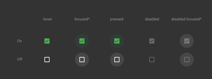
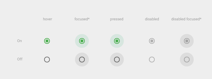
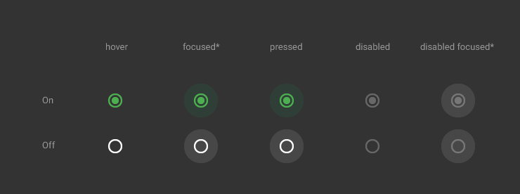
app:checked="true" 是否被选中,默认没被选中

android:background="#ff0000" 设定checkbox的颜色,默认是绿色

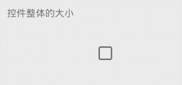
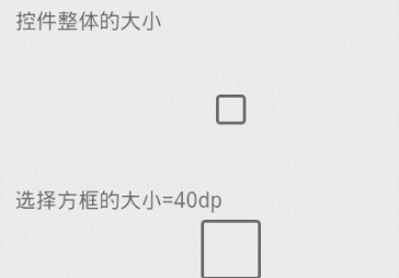
android:layout_width="100dp" 设定checkbox这个view整体的大小,和里面的方框无关。注意看图中按压时阴影的大小
android:layout_height="100dp"
app:checkBoxSize="40dp" 设定checkbox里面方框的大小
三、通过代码设定各种属性
public class CheckBoxTest extends ActionBarActivity {

    @Override

    protected void onCreate(Bundle savedInstanceState) {

        super.onCreate(savedInstanceState);

        setContentView(R.layout.checkbox);

        CheckBox checkBox = (CheckBox)findViewById(R.id.checkBox01);

        checkBox.setChecked(true);// 设定初始为选中的状态

        checkBox.setBackgroundColor(0xffff0000);// 设置checkbox的颜色

        checkBox.setBackgroundColor(getResources().getColor(R.color.orange));// 设置背景色

        checkBox.setCheckBoxSize(35.5f);// 设置方框的大小

        // 监听选中的事件

        checkBox.setOncheckListener(new OnCheckListener() {

            @Override

            public void onCheck(boolean isChecked) {

                // TODO 自动生成的方法存根

                System.out.println("isChecked = "+ checkBox05.isChecked());

                Toast.makeText(CheckBoxTest.this, "checkbox status = "+isChecked, 0).show();

            }

        });

    }

}
四、补充:RadioButton
这个控件是从另一个开源项目中得到的,那个lib中其他的控件都做的不好,就这个做的十分精细。具体的测试和修改我没去做,下面仅仅给出源码,由大家自行修改吧,其实可以修改的地方还是蛮多的。
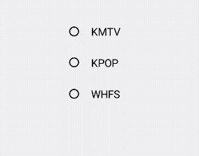
lib地址:https://github.com/keithellis/MaterialWidget
源码如下:
dimen.xml
这里是默认的属性,包括长宽啥的,这些值照理说都应该可以在java代码中定制的。
<?xml version="1.0" encoding="utf-8"?>

<resources>

    <!-- RadioButton Default -->

    <dimen name="radio_width">48dp</dimen>

    <dimen name="radio_height">48dp</dimen>

    <dimen name="radio_border_radius">10dp</dimen>

    <dimen name="radio_thumb_radius">6dp</dimen>

    <dimen name="radio_ripple_radius">24dp</dimen>

    <dimen name="radio_stroke_width">2dp</dimen>

    <color name="radio_color">#6d6d6d</color>

    <color name="radio_checked_color">#55b03d</color>

</resources>
可以定制的属性,这里就两个,蛮少的。请大家自行添加修改吧~
        <!-- RadioButton Attribute -->

    <declare-styleable name="RadioButton">

        <attr name="radio_color" format="color"/>

        <attr name="radio_checked_color" format="color"/>

    </declare-styleable>
RadioButton.java
从中我们可以看到,这个控件都是被画出来的,和上面控件用到的lib的构建思路不同。因为是画出来的,所以我们可以定制的东西更多,扩展性更强,值得细细品味这个类的写法。
package com.gc.materialdesign.views;

import android.content.Context;

import android.content.res.TypedArray;

import android.graphics.Canvas;

import android.graphics.Color;

import android.graphics.Paint;

import android.graphics.Rect;

import android.util.AttributeSet;

import android.view.MotionEvent;

import android.widget.CompoundButton;

import com.gc.materialdesign.R;

/**

 * Created by IntelliJ IDEA.

 * User: keith.

 * Date: 14-10-8.

 * Time: 15:48.

 */

public class RadioButton extends CompoundButton {

    private static final long ANIMATION_DURATION = 200;// 动画持续的时间

    private static final int StateNormal = 1;

    private static final int StateTouchDown = 2;

    private static final int StateTouchUp = 3;

    private int mState = StateNormal;

    private long mStartTime;

    private int mColor;

    private int mCheckedColor;

    private int mRadioWidth;// 宽度

    private int mRadioHeight;// 高度

    private int mBorderRadius;

    private int mThumbRadius;

    private int mRippleRadius;

    private int mStrokeWidth;

    private Rect mFingerRect;

    private boolean mMoveOutside;

    private Paint borderPaint = new Paint(Paint.ANTI_ALIAS_FLAG);

    private Paint thumbPaint = new Paint(Paint.ANTI_ALIAS_FLAG);

    private Paint ripplePaint = new Paint(Paint.ANTI_ALIAS_FLAG);

    public RadioButton(Context context) {

        this(context, null);

    }

    public RadioButton(Context context, AttributeSet attrs) {

        this(context, attrs, 0);

    }

    public RadioButton(Context context, AttributeSet attrs, int defStyle) {

        super(context, attrs, defStyle);

        TypedArray attributes = context.obtainStyledAttributes(attrs, R.styleable.RadioButton);

        mColor = attributes.getColor(R.styleable.RadioButton_radio_color, getResources().getColor(R.color.radio_color));

        mCheckedColor = attributes.getColor(R.styleable.RadioButton_radio_checked_color, getResources().getColor(R.color.radio_checked_color));

        attributes.recycle();

        mRadioWidth = getResources().getDimensionPixelSize(R.dimen.radio_width);

        mRadioHeight = getResources().getDimensionPixelSize(R.dimen.radio_height);

        mBorderRadius = getResources().getDimensionPixelSize(R.dimen.radio_border_radius);

        mThumbRadius = getResources().getDimensionPixelSize(R.dimen.radio_thumb_radius);

        mRippleRadius = getResources().getDimensionPixelSize(R.dimen.radio_ripple_radius);

        mStrokeWidth = getResources().getDimensionPixelSize(R.dimen.radio_stroke_width);

        thumbPaint.setColor(mCheckedColor);

    }

    @Override

    protected void onMeasure(int widthMeasureSpec, int heightMeasureSpec) {

        widthMeasureSpec = MeasureSpec.makeMeasureSpec(measureWidth(widthMeasureSpec), MeasureSpec.EXACTLY);

        heightMeasureSpec = MeasureSpec.makeMeasureSpec(measureHeight(heightMeasureSpec), MeasureSpec.EXACTLY);

        super.onMeasure(widthMeasureSpec, heightMeasureSpec);

    }

    private int measureWidth(int measureSpec) {

        int result;

        int specMode = MeasureSpec.getMode(measureSpec);

        int specSize = MeasureSpec.getSize(measureSpec);

        if (specMode == MeasureSpec.EXACTLY) {

            if (specSize < mRadioWidth) {

                result = mRadioWidth;

            } else {

                result = specSize;

            }

        } else {

            result = mRadioWidth;

        }

        return result;

    }

    private int measureHeight(int measureSpec) {

        int result;

        int specMode = MeasureSpec.getMode(measureSpec);

        int specSize = MeasureSpec.getSize(measureSpec);

        if (specMode == MeasureSpec.EXACTLY) {

            if (specSize < mRadioHeight) {

                result = mRadioHeight;

            } else {

                result = specSize;

            }

        } else {

            result = mRadioHeight;

        }

        return result;

    }

    @Override

    public boolean onTouchEvent(MotionEvent event) {

        if (isEnabled()) {

            switch (event.getAction()) {

                case MotionEvent.ACTION_DOWN:

                    mMoveOutside = false;

                    mState = StateTouchDown;

                    mFingerRect = new Rect(getLeft(), getTop(), getRight(), getBottom());

                    mStartTime = System.currentTimeMillis();

                    invalidate();

                    break;

                case MotionEvent.ACTION_MOVE:

                    if (!mFingerRect.contains(getLeft() + (int) event.getX(), getTop() + (int) event.getY())) {

                        mMoveOutside = true;

                        mState = StateNormal;

                        mStartTime = System.currentTimeMillis();

                        invalidate();

                    }

                    break;

                case MotionEvent.ACTION_UP:

                    if (!mMoveOutside) {

                        mState = StateTouchUp;

                        setChecked(!isChecked());

                        mStartTime = System.currentTimeMillis();

                        invalidate();

                    }

                    break;

                case MotionEvent.ACTION_CANCEL:

                    mState = StateNormal;

                    invalidate();

                    break;

            }

        }

        return true;

    }

    private int rippleColor(int color) {

        int alpha = Math.round(Color.alpha(color) * 0.2f);

        int red = Color.red(color);

        int green = Color.green(color);

        int blue = Color.blue(color);

        return Color.argb(alpha, red, green, blue);

    }

    @Override

    protected void onDraw(Canvas canvas) {

        super.onDraw(canvas);

        int rippleRadius = 0;

        int thumbRadius = isChecked() ? mThumbRadius : 0;

        long elapsed = System.currentTimeMillis() - mStartTime;

        switch (mState) {

            case StateNormal:

                break;

            case StateTouchDown:

                ripplePaint.setAlpha(255);

                if (elapsed < ANIMATION_DURATION) {

                    rippleRadius = Math.round(elapsed * mRippleRadius / ANIMATION_DURATION);

                } else {

                    rippleRadius = mRippleRadius;

                }

                postInvalidate();

                break;

            case StateTouchUp:

                if (elapsed < ANIMATION_DURATION) {

                    int alpha = Math.round((ANIMATION_DURATION - elapsed) * 255 / ANIMATION_DURATION);

                    ripplePaint.setAlpha(alpha);

                    rippleRadius = Math.round((ANIMATION_DURATION - elapsed) * mRippleRadius / ANIMATION_DURATION);

                    if (isChecked()) {

                        thumbRadius = Math.round(elapsed * mThumbRadius / ANIMATION_DURATION);

                    } else {

                        thumbRadius = Math.round((ANIMATION_DURATION - elapsed) * mThumbRadius / ANIMATION_DURATION);

                    }

                } else {

                    mState = StateNormal;

                    rippleRadius = 0;

                    ripplePaint.setAlpha(0);

                }

                postInvalidate();

                break;

        }

        if (isChecked()) {

            ripplePaint.setColor(rippleColor(mCheckedColor));

            borderPaint.setColor(mCheckedColor);

            borderPaint.setStyle(Paint.Style.STROKE);

            borderPaint.setStrokeWidth(mStrokeWidth);

        } else {

            ripplePaint.setColor(rippleColor(mColor));

            borderPaint.setColor(mColor);

            borderPaint.setStyle(Paint.Style.STROKE);

            borderPaint.setStrokeWidth(mStrokeWidth);

        }

        canvas.drawCircle(getWidth() / 2, getHeight() / 2, rippleRadius, ripplePaint);

        canvas.drawCircle(getWidth() / 2, getHeight() / 2, mBorderRadius, borderPaint);

        canvas.drawCircle(getWidth() / 2, getHeight() / 2, thumbRadius, thumbPaint);

    }

}
Material Designer的低版本兼容实现(十)—— CheckBox & RadioButton的更多相关文章
- Material Designer的低版本兼容实现(一)—— 简介 & 目录
很长一段时间没写东西了,其实是因为最近在研究Material Designer这个东西,熬夜熬的身体也不是很好了.所以就偷懒没写东西,这回开的这个系列文章是讲如何将Material Designer在 ...
- Material Designer的低版本兼容实现(五)—— ActivityOptionsCompat
extends:http://www.cnblogs.com/tianzhijiexian/p/4087917.html 本文是对API中的方法做了介绍,如果想要看如何让这些方法兼容4.x或2.x可以 ...
- Material Designer的低版本兼容实现(二)—— Theme
Theme material主题可以定义为如下形式: @android:style/Theme.Material @android:style/Theme.Material.Light @androi ...
- Material Designer的低版本兼容实现(三)——Color
在Material Designer中,色彩再一次被摆到了重要的位置上.官方文档中竟然给出了500种配色方案进行选择.就是为了给不同的手机.电视.手表上带来一直的用户体验. 更多用于控制色彩的属性,可 ...
- Material Designer的低版本兼容实现(十二)—— Slider or SeekBar
Slider,我更喜欢叫他SeekBar,其实是一个东西啦,就是拖动条.5.0的拖动条和4.x上的HOLO风格完全不同,平添了一些精致.此外还加入了数值指示器,让用户在滑动的时候就能知道现在到了什么位 ...
- Material Designer的低版本兼容实现(十四)—— CardView
今天说的又是一个5.0中才有的新控件——CardView(卡片视图).这个东东其实我们早就见过了,无论是微博还是人人客户端,它都有出现.通常我们都是通过自定义一个背景图片,然后通过给layout进行设 ...
- Material Designer的低版本兼容实现(十三)—— ProgressBar
进度条我们都很常见了,新的设计规范中提出了各式各样的进度条,本篇就会介绍大部分进度条的实现.实现方式和规范的示例图可能略有差异,还是那句话根据具体需求进行改变吧. PS:本文较长 参考文档:http: ...
- Material Designer的低版本兼容实现(十一)—— Switch
5.0中的switch和之前完全不同了,漂亮不漂亮咱们另说,总之4.x上是没有这样的效果了.实现方式有两种,一种是用这个兼容包来做类似的效果,一种是用传统的checkbox来代替.我感觉兼容包的效果是 ...
- Material Designer的低版本兼容实现(九)—— Float Button & Small Float Button
5.0一个新特性就是出现了这么一个圆形的悬浮指示按钮,这个按钮可以用来体现一个全局的重要功能,比如添加账户什么的.这个按钮有两种大小,一种是正常的按钮大小,一种是小型的按钮.官方文档中介绍的是小心的按 ...
随机推荐
- Using NHibernate with SQLite
The most convenient method to add NHibernate and SQLite for C# project is using NuGet. You can check ...
- .NetCore关于Cap(RabbitMQ)结合MySql使用出现MySql相关类冲突问题解决办法
问题还原 引用了 DotNetCore.CAP.MySql MySql.Data.EntityFrameworkCore 在使用MySql相关对象的时候会出现如下冲突,在命名空间加入伪空间名称是不能解 ...
- Z字形变换
将字符串 "PAYPALISHIRING" 以 Z 字形排列成给定的行数: P A H N A P L S I I G Y I R 之后从左往右,逐行读取字符:"PAHN ...
- 【AtCoder】CADDi 2018
C - Product and GCD 题解 直接分解质因数,然后gcd每次多一个质因数均摊到每个\(N\)上的个数 代码 #include <bits/stdc++.h> #define ...
- 【LOJ】#2493. 「BJOI2018」染色
题面 题解 推结论大题--然而我推不出什么结论 奇环显然是NO 如果一个联通块里有两个分离的环,也是NO 如果一个联通块里,点数为n,边数为m m <= n的时候,是YES m >= n ...
- laravel Tinker报错 BadMethodCallException with message 'Call to undefined method Illuminate\Database\Query\Builder
进行模型关联操作, php artisan tinker 执行 $user = App\Models\User::find(1) $user->followings()->attach([ ...
- Ansible专题整理
Ansible 专题文章总览 Ansible小手册,仅供参考 文章如未明确说明实验环境,默认如下: OS:Centos 6.7 x86_64 Ansible: 2.1.2.0 Python: 2.6. ...
- JedisConnectionException: java.net.ConnectException: Connection refused
出现问题 我遇到的一个问题,在连接redis的时候出现了错误!错误如下: JedisConnectionException: java.net.ConnectException: Connection ...
- 玩转SpringCloud(F版本) 二.服务消费者(1)ribbon+restTemplate
上一篇博客有人问我,Springcloud系列会不会连载 ,大家可以看到我的标签分类里已经开设了SpringCloud专题,所以当然会连载啦,本人最近也是买了本书在学习SpringCloud微服务框架 ...
- 子类 父类强转 HttpServlet service实现
相当于 走父类 临时走了一趟 HttpServletRequest ->ServletRequets -> HttpServeltRequest /* */ public void ser ...