element-ui switch组件源码分析整理笔记(二)
源码如下:
<template>

  <div

    class="el-switch"

    :class="{ 'is-disabled': switchDisabled, 'is-checked': checked }"

    role="switch"

    :aria-checked="checked"

    :aria-disabled="switchDisabled"

    @click="switchValue"

  >

    <input

      class="el-switch__input"

      type="checkbox"

      @change="handleChange"

      ref="input"

      :id="id"

      :name="name"

      :true-value="activeValue"

      :false-value="inactiveValue"

      :disabled="switchDisabled"

      @keydown.enter="switchValue"

    >

    <span

      :class="['el-switch__label', 'el-switch__label--left', !checked ? 'is-active' : '']"

      v-if="inactiveIconClass || inactiveText">

      <i :class="[inactiveIconClass]" v-if="inactiveIconClass"></i>

      <span v-if="!inactiveIconClass && inactiveText" :aria-hidden="checked">{{ inactiveText }}</span>

    </span>

    <span class="el-switch__core" ref="core" :style="{ 'width': coreWidth + 'px' }"></span>

    <span

      :class="['el-switch__label', 'el-switch__label--right', checked ? 'is-active' : '']"

      v-if="activeIconClass || activeText">

      <i :class="[activeIconClass]" v-if="activeIconClass"></i>

      <span v-if="!activeIconClass && activeText" :aria-hidden="!checked">{{ activeText }}</span>

    </span>

  </div>

</template>

<script>

  import Focus from 'element-ui/src/mixins/focus';

  import Migrating from 'element-ui/src/mixins/migrating';

  export default {

    name: 'ElSwitch',

    mixins: [Focus('input'), Migrating],

    //  注入elForm对象,防止不和el-form使用时对象不存在的问题。

    inject: {

      elForm: {

        default: ''

      }

    },

    props: {

      value: {

        type: [Boolean, String, Number],

        default: false

      },

      disabled: { //是否禁用

        type: Boolean,

        default: false

      },

      width: { //switch 的宽度(像素)

        type: Number,

        default: 40

      },

      activeIconClass: { //switch 打开时所显示图标的类名,设置此项会忽略 active-text

        type: String,

        default: ''

      },

      inactiveIconClass: { //switch 关闭时所显示图标的类名,设置此项会忽略 inactive-text

        type: String,

        default: ''

      },

      activeText: String, //switch 打开时的文字描述

      inactiveText: String, //switch 关闭时的文字描述

      activeColor: { //switch 打开时的背景色

        type: String,

        default: ''

      },

      inactiveColor: { //switch 关闭时的背景色

        type: String,

        default: ''

      },

      activeValue: { //switch 打开时的值

        type: [Boolean, String, Number],

        default: true

      },

      inactiveValue: { //switch 关闭时的值

        type: [Boolean, String, Number],

        default: false

      },

      name: { //switch 对应的 name 属性

        type: String,

        default: ''

      },

      id: String

    },

    data() {

      return {

        coreWidth: this.width

      };

    },

    created() {

      if (!~[this.activeValue, this.inactiveValue].indexOf(this.value)) {

        this.$emit('input', this.inactiveValue);

      }

    },

    computed: {

        //当前的开关组件的状态

        checked() {

            //父组件中v-model绑定的值是否等于switch 打开时的值

            return this.value === this.activeValue;

        },

        //当前组件是否被禁用

      switchDisabled() {

        return this.disabled || (this.elForm || {}).disabled;

      }

    },

    watch: {

      checked() {

        this.$refs.input.checked = this.checked;

        //在用户设置了active-color和inactive-color时,通过setBackgroundColor设置开关的背景色

        if (this.activeColor || this.inactiveColor) {

          this.setBackgroundColor();

        }

      }

    },

    methods: {

      handleChange(event) {

        //!this.checked为true,则表示当前是this.value === this.inactiveValue,即为关着的状态;需要切换为开着的状态,返回this.activeValue

        this.$emit('input', !this.checked ? this.activeValue : this.inactiveValue);

        this.$emit('change', !this.checked ? this.activeValue : this.inactiveValue);

        this.$nextTick(() => {

            //修改value值并不是立即生效,而且为了防止父组件未修改值,这里进行了重复赋值

          this.$refs.input.checked = this.checked;

        });

      },

      //在用户设置了active-color和inactive-color时,点击切换开关时,根据this.checked的值设置开关的背景颜色

      setBackgroundColor() {

        //如果 this.checked为true,即当前switch是打开,开关返回打开时设置的背景色

        let newColor = this.checked ? this.activeColor : this.inactiveColor;

        this.$refs.core.style.borderColor = newColor;

        this.$refs.core.style.backgroundColor = newColor;

      },

      switchValue() {

        //在不禁用的状态下才能点击

        !this.switchDisabled && this.handleChange();

      },

      getMigratingConfig() {

        return {

          props: {

            'on-color': 'on-color is renamed to active-color.',

            'off-color': 'off-color is renamed to inactive-color.',

            'on-text': 'on-text is renamed to active-text.',

            'off-text': 'off-text is renamed to inactive-text.',

            'on-value': 'on-value is renamed to active-value.',

            'off-value': 'off-value is renamed to inactive-value.',

            'on-icon-class': 'on-icon-class is renamed to active-icon-class.',

            'off-icon-class': 'off-icon-class is renamed to inactive-icon-class.'

          }

        };

      }

    },

    mounted() {

      /* istanbul ignore if */

      this.coreWidth = this.width || 40;

      if (this.activeColor || this.inactiveColor) {

        this.setBackgroundColor();

      }

      this.$refs.input.checked = this.checked;

    }

  };

</script>
解析:
(1)组件的html结构
<div class="el-switch">

        <input class="el-switch__input" type="checkbox">

        <!--显示左边的标签-->

        <span class="el-switch__label el-switch__label--left">

             <i></i>

             <span></span>

        </span>

        <!--中间的开关-->

        <span class="el-switch__core"></span>

        <!--显示右边的标签-->

        <span class="el-switch__label el-switch__label--right">

            <i></i>

            <span></span>

         </span>

</div>
input标签被隐藏掉了,css部分代码如下:
.el-switch__input {

    position: absolute;

    width: 0;

    height: 0;

    opacity: 0;

    margin: 0;

}
如果把上面的样式代码注释掉,如图所示:
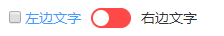
通过 <input type="checkbox"> 的checked属性来控制文字显示以及开关的状态切换。最外层包裹的div是为了能够通过点击文字也能切换开关状态。
(2)混入的 mixins: [Focus('input'), Migrating]
主要是migrating.js,该文件主要是用于开发环境下提示一些迁移或者即将修改的属性和方法的。
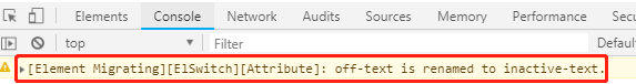
示例:我用的element-ui v2.4.9,我按下面这样写,off-text属性在我当前的版本中已经被改为inactive-text
<el-switch v-model="value2" off-text="关着"></el-switch>当我运行之后在控制台输出:
所有迁移的属性在组件的getMigratingConfig()方法中:
 getMigratingConfig() {

        return {

          props: {

            'on-color': 'on-color is renamed to active-color.',

            'off-color': 'off-color is renamed to inactive-color.',

            'on-text': 'on-text is renamed to active-text.',

            'off-text': 'off-text is renamed to inactive-text.',

            'on-value': 'on-value is renamed to active-value.',

            'off-value': 'off-value is renamed to inactive-value.',

            'on-icon-class': 'on-icon-class is renamed to active-icon-class.',

            'off-icon-class': 'off-icon-class is renamed to inactive-icon-class.'

          }

        };

      }
(3)created方法
 created() {

    //如果用户传入的v-model的值既不是activeValue也不是inactiveValue时,将inactiveValue传递出去,开关处于关状态

      if (!~[this.activeValue, this.inactiveValue].indexOf(this.value)) {

        this.$emit('input', this.inactiveValue);

      }

    },
~代表按位非运算符,如果[this.activeValue, this.inactiveValue].indexOf(this.value)为-1,则按位非后变为0。
参考博文:https://juejin.im/post/5b861db0e51d4538aa1b5630
http://www.zhuyuntao.cn/2018/10/24/element-ui-focus-js和migrating.js文件源码学习
element-ui switch组件源码分析整理笔记(二)的更多相关文章
- element-ui 组件源码分析整理笔记目录
element-ui button组件 radio组件源码分析整理笔记(一) element-ui switch组件源码分析整理笔记(二) element-ui inputNumber.Card .B ...
- element-ui button组件 radio组件源码分析整理笔记(一)
Button组件 button.vue <template> <button class="el-button" @click="handleClick ...
- element-ui input组件源码分析整理笔记(六)
input 输入框组件 源码: <template> <div :class="[ type === 'textarea' ? 'el-textarea' : 'el-in ...
- element-ui MessageBox组件源码分析整理笔记(十二)
MessageBox组件源码,有添加部分注释 main.vue <template> <transition name="msgbox-fade"> < ...
- element-ui Message组件源码分析整理笔记(八)
Message组件源码: main.js import Vue from 'vue'; import Main from './main.vue'; import { PopupManager } f ...
- element-ui Steps步骤条组件源码分析整理笔记(九)
Steps步骤条组件源码: steps.vue <template> <!--设置 simple 可应用简洁风格,该条件下 align-center / description / ...
- element-ui Rate组件源码分析整理笔记(十三)
Rate组件源码比较简单,有添加部分注释 main.vue <template> <!--valuenow当前的评分 valuetext当前显示的文本--> <div c ...
- Element UI table组件源码分析
本文章从如下图所示的最基本的table入手,分析table组件源代码.本人已经对table组件原来的源码进行削减,源码点击这里下载.本文只对重要的代码片段进行讲解,推荐下载代码把项目运行起来,跟着文章 ...
- element-ui inputNumber、Card 、Breadcrumb组件源码分析整理笔记(三)
inputNumber组件 <template> <!--@dragstart.prevent禁止input中数字的拖动--> <div @dragstart.preve ...
随机推荐
- Angular使用总结 --- 搜索场景中使用rxjs的操作符
在有input输入框的搜索/过滤业务中,总会考虑如何减少发起请求频率,尽量使每次的请求都是有效的.节流和防抖是比较常见的做法,这类函数的实现方式也不难,不过终归还是需要自己封装.rxjs提供了各种操作 ...
- Java Web(四) 一次性验证码的代码实现
其实实现代码的逻辑非常简单,真的超级超级简单. 1.在登录页面上login.jsp将验证码图片使用标签<img src="xxx">将绘制验证码图片的url给它 2.在 ...
- MYSQL基础语法的使用
喜欢的朋友可以关注下,粉丝也缺. MYSQL介绍 MySQL是一个关系型数据库管理系统,由瑞典MySQL AB 公司开发,目前属于 Oracle 旗下产品.MySQL 是最流行的关系型数据库管理系统之 ...
- tcpdump命令抓包参数
在 Linux 命令行中使用 tcpdump 抓包 通过实例学习tcpdump命令 聊聊 tcpdump 与 Wireshark 抓包分析 tcpdump常用参数 -n 显示IP地址和端口号 -v 显 ...
- odoo开发笔记:Server+Action服务器动作自动触发执行
Odoo的市场定位是SME(中小型企业),这个市场的ERP产品,多如牛毛,产品各具特色.不过,Odoo的自动化处理机制,可以睥睨天下,无人能及.包括一些大型国产软件,如用友.金蝶也不具备 ...
- opencv2函数学习之threshold:实现图像阈值化
在opencv2中,threshold函数可以进行阈值化操作. double threshold( const Mat& src, Mat& dst, double thresh,do ...
- (转)Python3之os模块
原文:https://www.cnblogs.com/wang-yc/p/5623981.html 一:简介 os模块主要用于提供系统高级别的操作. 二:常用方法 1 2 3 4 5 6 7 8 9 ...
- 计算机网络 之 TCP协议报文结构
前言:上学期实训课,由于要做一个网络通信的应用,期间遇到各种问题,让我深感计算机网络知识的薄弱.于是上网查找大量的资料,期间偶然发现了roc大神的博客,很喜欢他简明易懂的博文风格.本文受roc的< ...
- MongoDB作为windows服务来安装
首先区官网下载对应版本的安装文件,我本地的环境是win7 bit64 我下载的版本是:mongodb-win32-x86_64-2.4.6 ok, 文件下载后,开始安装,这里要说一下,如果直接启动Mo ...
- Apple Pay 支付集成
Refer:https://open.unionpay.com/ajweb/product/detail?id=80 交易步骤: 1.浏览并选购商品:用户通过手机客户端与商户系统交互浏览选购商品,客户 ...