css3D动画
css3D动画
前言
最近玩了玩用css来构建3D效果,写了几个demo,所以博客总结一下。 在阅读这篇博客之前,请先自行了解一下css 3D的属性,例如:transform-style,transform-origin,transform, perspective。
写一个简单的立方体
1、我们先用css实现一个长方体,一个长方体有6个边,我们写6个li,并用一个ul包裹起来,根据我写3D动画的经验,最好有一个父元素来包裹
<div class="parent">
<ul>
<li>1</li>
<li>2</li>
<li>3</li>
<li>4</li>
<li>5</li>
<li>6</li>
</ul>
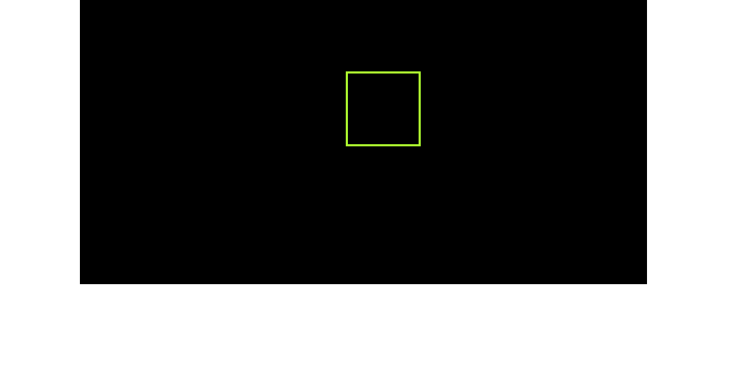
</div>2、先给.parent设置宽高,并且给他设置视距和基点位置。
.parent{

            width: 800px;

            height: 400px;

            border: 1px solid #000;

            margin: 0 auto;

            perspective: 2000px;

            perspective-origin: -40% -80%;

            background: #000;

        }
3、给ul设置宽高以及preserve-3d属性保留子元素3d转换,子元素li全部绝对定位
        ul{

            width: 50px;

            position: relative;

            margin: 100px auto;

            transform-style : preserve-3d;

        }

         li{

            width: 100px;

            height: 100px;

            background:  rgba(255, 255, 0, 0.3);

            position: absolute;

            text-align: center;

            border: 3px solid greenyellow;

        }
效果如下图所示:
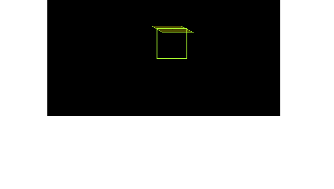
4、先写一个面,给他的背景设置 background: rgba(255, 255, 0, 0.3);
 li:nth-child(1){

            background:  rgba(255, 255, 0, 0.3);

            transform:  translateY(50px) rotateX(90deg);

        }
效果如下图所示:
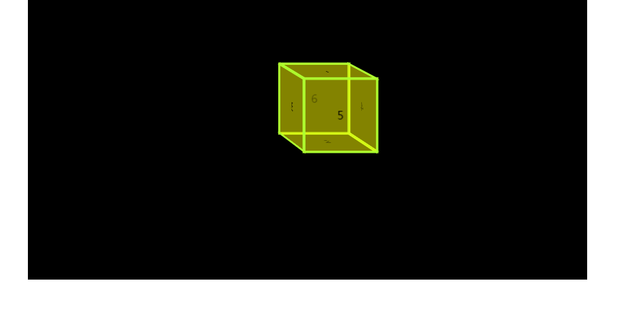
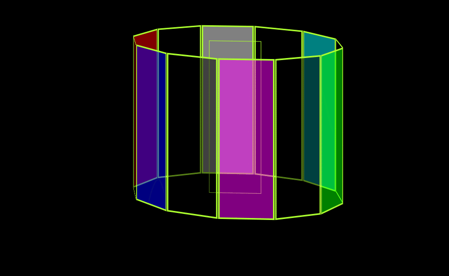
5、我们写好了第一个面,然后我们在将其他6个面调整好,变成下图所示。关于rotate的旋转方向这里不解释,不懂的朋友可以自行查看其他文档。
        /*上面*/

         li:nth-child(1){

            transform: translateY(-50px) rotateX(90deg);

        }

        /*下面*/

        li:nth-child(2){

            transform:  translateY(50px) rotateX(90deg);

        }

        /*左面*/

        li:nth-child(3){

            transform: translateX(-50px) rotateY(90deg);

        }

        /*右面*/

        li:nth-child(4){

            transform: translateX(50px) rotateY(90deg);

        }

        /*前面*/

        li:nth-child(5){

            transform: translateZ(50px);

        }

        /*后面*/

        li:nth-child(6){

            transform: translateZ(-50px);

        }
效果如下图所示:
下面是一些我写的css3D+动画的效果
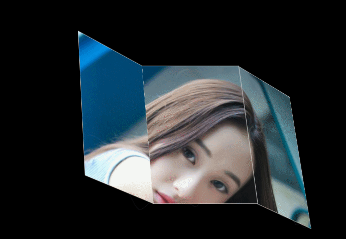
demo01
代码如下:
<!DOCTYPE html>

<html lang="en">

<head>

    <meta charset="UTF-8">

    <meta name="viewport" content="width=device-width, initial-scale=1.0">

    <meta http-equiv="X-UA-Compatible" content="ie=edge">

    <title>书页2</title>

    <style>

        .container{

            width: 1000px;

            height: 650px;

            background: #000;

            perspective: 2000px;

            border: 1px solid transparent;

            overflow: hidden;

            margin: 0 auto;

            perspective-origin: 10% 20%;

        }

        .cube{

            width: 200px;

            height: 300px;

            transform-style: preserve-3d;

            margin:100px auto;

            position: relative;

            transform: rotateX(30deg);

            border-radius: 50%;

            padding: 60px;

        }

        .mian{

            width: 200px;

            height: 300px;

            background-image: url(1.jpg);

            background-position:400px 0;

            position: absolute;

            border: 1px solid #ccc;

            transition: 2s;

        }

        /* .mian1:hover{

            transform-origin: right;

            transform: rotateY(-60deg);

        } */

        .mian1{

            transform-origin: right;

            transform: translateX(-200px) rotateY(45deg);

            background-position: 0 0;

        }

        .mian3{

            transform-origin: left;

            transform: translateX(200px) rotateY(45deg);

            background-position: 200px 0;

        }

        .mian3:hover{

            transform: translateX(200px) rotateY(0deg);

        }

        .mian1:hover{

            transform: translateX(-200px) rotateY(0deg);

        }

    </style>

</head>

<body>

    <div class="container">

        <div class="cube">

            <div class="mian mian1"></div>

            <div class="mian mian2"></div>

            <div class="mian mian3"></div>

        </div>

    </div>

</body>

</html>
效果如下图:
demo02
代码如下:
<!DOCTYPE html>

<html lang="en">

<head>

    <meta charset="UTF-8">

    <meta name="viewport" content="width=device-width, initial-scale=1.0">

    <meta http-equiv="X-UA-Compatible" content="ie=edge">

    <title>立方体</title>

    <style>

        *{

            margin: 0;

            padding: 0;

            list-style: none;

        }

        .parent{

            width: 1000px;

            margin:  0 auto;

            height: 600px;

            background: black;

            perspective: 5000px;

            perspective-origin: -40% -120%;

            border: 1px solid #000;

        }

        ul{

            width: 100px;

            height: 300px;

            position: relative;

            margin:100px auto;

            transform-style: preserve-3d;

            animation: zuan 3s linear infinite;

            border: 1px solid greenyellow;

        }

        li{

            width: 100px;

            height: 300px;

            background:  rgba(0, 0, 0, 0.5);

            position: absolute;

            text-align: center;

            line-height: 100px;

            border: 3px solid greenyellow;

        }

        li:nth-child(1){

            transform: rotateY(30deg) translateZ(-200px);

        }

        li:nth-child(2){

            transform: rotateY(60deg) translateZ(-200px);

            background:  rgba(255, 0, 0, 0.5);

        }

        li:nth-child(3){

            transform: rotateY(90deg) translateZ(-200px);

        }

        li:nth-child(4){

            transform: rotateY(120deg) translateZ(-200px);

            background:  rgba(0, 0, 255, 0.5);

        }

        li:nth-child(5){

            transform: rotateY(150deg) translateZ(-200px);

        }

        li:nth-child(6){

            transform: rotateY(180deg) translateZ(-200px);

            background:  rgba(255, 0, 255, 0.5);

        }

        li:nth-child(7){

            transform: rotateY(210deg) translateZ(-200px);

        }

        li:nth-child(8){

            transform: rotateY(240deg) translateZ(-200px);

            background:  rgba(0, 255, 0, 0.5);

        }

        li:nth-child(9){

            transform: rotateY(270deg) translateZ(-200px);

        }

        li:nth-child(10){

            transform: rotateY(300deg) translateZ(-200px);

            background:  rgba(0, 255, 255, 0.5);

        }

        li:nth-child(11){

            transform: rotateY(330deg) translateZ(-200px);

        }

        li:nth-child(12){

            transform: rotateY(360deg) translateZ(-200px);

            background:  rgba(255, 255, 255, 0.5);

        }

        @keyframes zuan{

            0%{

                transform: rotateY(0deg);

            }

            100%{

                transform: rotateY(360deg);

            }

        }

    </style>

</head>

<body>

    <div class="parent">

        <ul>

            <li></li>

            <li></li>

            <li></li>

            <li></li>

            <li></li>

            <li></li>

            <li></li>

            <li></li>

            <li></li>

            <li></li>

            <li></li>

            <li></li>

        </ul>

    </div>

</body>

</html>
效果如下图:
持续更新,欢迎大家指教!
css3D动画的更多相关文章
- CSS3D动画制作一个3d旋转的筛子
希望这个demo能让大家理解CSS3的3d空间动画(其实是个假3D) 首先给一个3d的解剖图,x/y/z轴线轴线已经标出 下面附上添加特效的动画旋转 可以根据demo并参考上面解剖图进行理解 < ...
- CSS-3D动画笔记
3D 在2d的基础上添加 z 轴的变化 3D 位移:在2d的基础上添加 translateZ(),或者使用translate3d() translateZ():以方框中心为原点,变大 3D 缩放:在2 ...
- CSS3实现小黄人动画
转载请注明出处,谢谢! 每次看到CSS3动画就心痒痒想试一下,记得一个多月前看了白树哥哥的一篇博客,突然开窍,于是拿他提供的demo试了一下,感觉很棒!下图为demo提供的动画帧设计稿. 自己也想说搞 ...
- Bootstrap中的less基础
在线编译 因为 less 的语法毕竟相对简单,所以一些在线工具可以很轻松的做到.比如 http://less.cnodejs.net http://www.ostools.net/less 一般都有 ...
- css3-d ,动画,圆角
一.3D 开启元素3D transform-style: preserve-3d; Z轴 正数 屏幕外,反之屏幕内 近大远小 perspective: length (必须大于等于0) -- 在3D元 ...
- 简单的转盘抽奖——CSS动画优化
前言 前两天去一家公司面试,被问到一些小游戏的东西.面试官提到了刷红包还有抽奖这些怎么实现,当时简单说了下思路,回来之后想想还是说的太轻描淡写了,干说不做就是耍流氓,所以就做了一个(Demo & ...
- CSS3D效果
效果如本博客中右边呢个浅色框框,来自webpack首页(IE绕路0_0) github地址:http://wjf444128852.github.io/demo02/css3/css3d/ 思路: 1 ...
- css3D的魅力
前言: 最近玩了玩用css来构建3D效果,写了几个demo,所以博客总结一下. 在阅读这篇博客之前,请先自行了解一下css 3D的属性,例如:transform-style,transform-or ...
- 学习笔记 第十四章 使用CSS3动画
第14章 使用CSS3动画 [学习重点] 设计2D动画 设计3D动画 设计过渡动画 设计帧动画 能够使用CSS3动画功能设计页面特效样式 14.1 设计2D动画 CSS2D Transform表 ...
随机推荐
- vue-slot的使用
父组件在子组件内套的内容,是不显示的:vue有一套内容分发的的API,<slot>作为内容分发的出口,假如父组件需要在子组件内放一些DOM,那么这些DOM是显示.不显示.在哪个地方显示.如 ...
- 【ABAP系列】SAP ABAP基础-数据更新至数据库操作解析
公众号:SAP Technical 本文作者:matinal 原文出处:http://www.cnblogs.com/SAPmatinal/ 原文链接:[ABAP系列]SAP ABAP基础-数据更新至 ...
- Windows系统CVE整理
CVE-2018-8420(RCE) 受影响版本: Microsoft Windows 10 Version 1607 for 32-bit Systems Microsoft Windows 10 ...
- Rest接口单元测试
Get请求url不超过4000字节 Rest成熟度:level 0:使用http作为传输方式,leve 1:引入资源概念,每个资源有对应的url,level 2:使用http方法进行不同操作,使用ht ...
- spring-第九篇之高级依赖关系配置
1.关于配置文件一些使用 组件与组件之间的耦合,采用依赖注入管理:基本类型的成员变量值,应该直接在代码中设置. 2.获取其他bean的属性值 PorpertyPathFactoryBean用来获取目标 ...
- Codeforces 1148C(思维)
题面 给出一个长度为n的排列a,每次可以交换序列的第i个和第j个元素,当且仅当\(2 \times |i-j| \geq n\),求一种交换方案,让序列从小到大排好序 分析 重点是考虑我们怎么把第x个 ...
- Codeforces Round #535 E2-Array and Segments (Hard version)
Codeforces Round #535 E2-Array and Segments (Hard version) 题意: 给你一个数列和一些区间,让你选择一些区间(选择的区间中的数都减一), 求最 ...
- AJAX 获取Servlet文件路径
下面均不行: xmlRes.open("get","edu/hust/ajax/TestServlet",true); xmlRes.open("ge ...
- react学习笔记_01-jsx
const element = <h1>Hello, world!</h1>; 首先我们看到声明了一个element元素,而他的内容并非字符串或者html. 它被称为 JSX, ...
- rsync之expect脚本shell
r_expect.sh: #!/bin/expect -f set timeout 30 #spawn rsync -avz --delete --exclude-from=exclude.list ...