CSS3_动画 animation
在项目中,颜色,图片,等等数据都保存在数组中
动画
使元素从一种样式逐渐变化到另一种样式的
animation: name ;
无顺序要求,但是必须先写 持续时间 ,再写 延迟时间
- 原理
人眼在看到画面的0.34 秒内,画面不会消失
在一幅画面还没消失之前,播放下一张画面
- 关键帧 @keyframes
           /* 动画的名称 */
@keyframes animationname {

    keyframes-selector {    /* (关键帧的选择器,动画持续时间的百分比,参照花费的总时间) 或者 (from 代表 0%,to 代表 100%%) */

        /* cssStyles; */

    }

}

/**** 实例 ****/
#box {
    width: 200px;
    height: 200px;
    background-color: olive;

    animation-name: yidong;    /* 1. 动画的名称 */

    animation-duration: 10s;    /* 2. 动画持续时间 */

    animation-delay: 3s;    /* 4. 动画执行前等待的时间 */

    animation-fill-mode: both;    /* 8. 设置动画外的状态 ,① 动画执行前的状态 backwards
                                                        ② 动画执行完以后的 to 状态 forwards
                                                        ③ 元素开始时与 from 状态一致,结束与 to 状态一致 both */

    /* 检测的是关键帧的区间(0%-50%,50%-100%) */
    animation-timing-function: linear;    /* 3. 设置动画的类型
                                                (默认值 ease,
                                                  还有 linear,
                                                      贝塞尔曲线cubic-bezier(0.07, 1.4, 0.86, 1.47),
                                                      1个区间跳2次 steps(2)) */
    animation-iteration-count: 2;    /* 5. 动画执行次数,无限次 infinite 或者 具体次数 */

    animation-direction: alternate;    /* 6. 设置对象动画运动方向,默认值正常 normal,
                                                             相反方向,从结束向开始动画 reverse,
                                                             先正常运动,再反向运动____钟摆动画 alternate 需配合 infinite,
                                                             先反向运动,再正常运动 alternate-reverse 需配合 infinite*/
    animation-play-state: running;    /* 7. 设置对象状态: 运行 running / 暂停 paused */
}

#box {
    animation-play-state: paused;    /* 当鼠标悬浮时,动画暂停 */
}

@keyframes yidong {
    0% { transform: translateX(0px); }    /* 等同于 from {} */

    50% { transform: translateX(20px); }

    100% { transform: translateX(20px); }    /* 等同于 to {} */
}
用来控制动画变化的关键位置(而非所有位置)
- 编写位置
- 帧函数 编写在 控制元素样式的 外面
- animation 的属性 编写在 控制元素样式里面
- animation-name: yidong; /* 1. 动画的名称 */
- animation-duration: 10s; /* 2. 动画持续时间 */
- animation-timing-function: linear; /* 3. 设置动画的类型
- ease 默认值
- linear
- cubic-bezier(0.07, 1.4, 0.86, 1.47) 贝塞尔曲线
- steps(2) 1个区间跳2次
- animation-delay: 3s; /* 4. 动画执行前等待的时间 */
- animation-iteration-count: 2; /* 5. 动画执行次数
- infinite 无限次
- 具体次数 */
- animation-direction: alternate; /* 6. 设置对象动画运动方向
- normal 默认值正常
- reverse 相反方向,从结束向开始动画
- alternate 先正常运动,再反向运动____钟摆动画 需配合 infinite
- alternate-reverse 先反向运动,再正常运动 需配合 infinite
- animation-play-state: running; /* 7. 设置对象状态
- running 运行
- paused 暂停
- animation-fill-mode: both; /* 8. 设置动画外的状态
- backwards 动画执行前的状态
- forwards 动画执行完以后的 to 状态
- both 元素开始时与 from 状态一致,结束与 to 状态一致
- 动画执行完以后,立刻恢复原来状态。
兔斯基动画 (精灵图 steps infinite)

<!DOCTYPE html>

<html>

    <head>

        <meta charset="UTF-8" />

        <title>Crazy Rabbit</title>

        <style type="text/css">

            body {

                width: 100%;

                color: #000;

                background: #96b377;

                font: 14px Helvetica, Arial, sans-serif;

                padding-top: 300px;

                padding-left: 300px;

            }

            /**** rabbit ****/

            #running_box {

                width: 48px;

                height: 48px;

                background: url("./img/rabbit.png") no-repeat;

                background-position: 0px 0px;

                animation: crazyRabbit 340ms steps(12) 0s infinite alternate;

            }

            @keyframes crazyRabbit {

                from {

                    background-position-x: 0px;

                }

                to {

                    background-position-x: -576px;

                }

            }

            #running_box:hover {

                animation: paused;

            }

        </style>

    </head>

    <body>

        <div id="running_box">

        </div>

    </body>

</html>
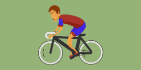
自行车动画
<!DOCTYPE html>

<html>

    <head>

        <meta charset="UTF-8" />

        <title>Running Bike</title>

        <style type="text/css">

            body {

                width: 100%;

                color: #000;

                background: #96b377;

                font: 14px Helvetica, Arial, sans-serif;

                padding: 300px 0 0 300px;

            }

            /**** Running Bike  ****/

            #bike_box {

                width: 130px;

                height: 130px;

                background: url("./img/bike.png") no-repeat;

                animation: bike 1s steps(32) infinite;

            }

            @keyframes bike {

                from {background-position: 0px 0px}

                to {background-position: 0px -4160px}

            }

            #bike_box:hover {

                animation: paused;

            }

        </style>

    </head>

    <body>

        <div id="bike_box">

        </div>

    </body>

</html>
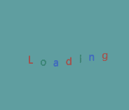
开机动画
<!DOCTYPE html>

<html>

    <head>

        <meta charset="UTF-8"/>

        <title></title>

        <meta http-equiv="X-UA-Compatible" content="ie=edge"/>

        <meta name="viewport"

              content="user-scalable=no,

                       width=device-width,

                       initial-scale=1.0,

                       minimum-scale=1.0,

                       maximum-scale=1.0"/>

        <script type="text/javascript" src="./js/kjfFunctions.js"></script>

        <style rel="stylesheet" type="text/css">

            html, body, div, ul, li {

                margin: 0;

                padding: 0;

            }

            html, body {

                width: 100%;

                height: 100%;    /* 参照屏幕区域的高 */

                min-width: 600px;

                overflow: hidden;

            }

            #wrap {

                width: 100%;

                min-height: 100%;

                background: cadetblue;

            }

            #content {

                width: 100%;

                padding-bottom: 50px;

                font-size: 14px;

                background: darkgrey;

            }

            #footer {

                width: 100%;

                height: 50px;

                margin-top: -50px;

                background: chocolate;

                text-align: center;

                line-height: 50px;

            }

            #loading_animation {

                position: absolute;

                top: 50%;

                left: 50%;

                transform: translate(-50%, -50%);

                list-style: none;

                background-color: #bbb0;

            }

            #loading_animation li {

                float: left;

                margin-right: 10px;

                animation: jumpLetter 1s infinite alternate;

            }

            @keyframes jumpLetter {

                from {

                    transform: translateY(0px);

                }

                to {

                    transform: translateY(-15px);

                }

            }

        </style>

    </head>

    <body>

        <!-- 模拟屏幕区域 -->

        <div id="wrap">

            <!-- 内容区域 -->

            <div id="content">

                <ul id="loading_animation">

                    <li>L</li>

                    <li>o</li>

                    <li>a</li>

                    <li>d</li>

                    <li>i</li>

                    <li>n</li>

                    <li>g</li>

                </ul>

            </div>

        </div>

        <!-- 底部区域 -->

        <div id="footer">

        </div>

        <script type="text/javascript" src="./js/index.js"></script>

        <script type="text/javascript">

            var lis = document.querySelectorAll("#loading_animation li");

            var colorArr = ["red", "green", "blue"];

            var i = 0;

            for(i=0; i<lis.length; i++){

                lis[i].style.color = colorArr[i%3];

                lis[i].style.animationDelay = i*100+"ms";

            }

        </script>

    </body>

</html>
CSS3_动画 animation的更多相关文章
- 动画animation的三个应用(漂浮的白云、旋转的星球、正方体合成)
× 目录 [1]漂浮的白云 [2]旋转的星球 [3]正方体合成 前面的话 前面介绍过动画animation的详细用法,本文主要介绍动画animation的三个效果 漂浮的白云 [效果演示] [简要介绍 ...
- CSS3的变形transform、过渡transition、动画animation学习
学习CSS3动画animation得先了解一些关于变形transform.过渡transition的知识 这些新属性大多在新版浏览器得到了支持,有些需要添加浏览器前缀(-webkit-.-moz-.- ...
- 精灵动画Animation对话框组成Idle动画的各精灵
精灵动画Animation对话框组成Idle动画的各精灵 1.3 精灵动画 场景中已经添加了精灵,现在是时候让让它动起来了.读者也许已经从精灵图集中,各精灵的命名中看出来了,这个精灵一共有两种动画状 ...
- Qt-4.6动画Animation快速入门三字决
Qt-4.6动画Animation快速入门三字决 Qt-4.6新增了Animation Framework(动画框架),让我们能够方便的写一些生动的程序.不必像以前的版本一样,所有的控件都枯燥的呆在伟 ...
- css3 动画(animation)-简单入门
css3之动画(animation) css3中我们可以使用动画,由于取代以前的gif图片,flash动画,以及部分javascript代码(相信有很多同学都用过jquery中的animate方法来做 ...
- Android 动画animation 深入分析
转载请注明出处:http://blog.csdn.net/farmer_cc/article/details/18259117 Android 动画animation 深入分析 前言:本文试图通过分析 ...
- View 动画 Animation 运行原理解析
这次想来梳理一下 View 动画也就是补间动画(ScaleAnimation, AlphaAnimation, TranslationAnimation...)这些动画运行的流程解析.内容并不会去分析 ...
- CSS3动画属性:动画(animation)
一:动画(animation)的参数详解 由于上面用到了animation动画,这里详细介绍下这个animation的参数. 简介 CSS动画(Animations)简单说就是在一段固定的动画时间内暗 ...
- 《The Cg Tutorial》阅读笔记——动画 Animation
这段时间阅读了英文版的NVidia官方的<The Cg Tutorial>,借此来学习基本的图形学知识和着色器编程. 在此做一个阅读笔记. 本文为大便一箩筐的原创内容,转载请注明出处,谢谢 ...
随机推荐
- burp suite 基础入门超详细教程
介绍: 都是我个人了解到的信息,,分享给大家 欢迎指正 burp suite 被誉为web安全工具中的瑞士军刀. 大家知道,瑞士军刀,都是体积小,功能强悍,.西方军队的标配.说这么多,只是想强调这款工 ...
- 移动端click事件300ms延迟
移动端click 事件延迟300ms 一般情况下,如果没有经过特殊处理,移动端浏览器在派发点击事件的时候,通常会出现300ms左右的延迟.也就是说,当我们点击页面的时候移动端浏览器并不是立即作出反应, ...
- excel生成数据地图
在数据分析过程中,图表是一个十分重要的部分,通过图表可以清晰明了的说明一些数字特征.在众多数据分析图表中,数据地图是常用的一中分析图.在一般的数据分析中,excel已经可以满足绝大部分功能.在本文中, ...
- C++设计模式——观察者模式
观察者模式 在GOF的<设计模式:可复用面向对象软件的基础>一书中对观察者模式是这样说的:定义对象间的一种一对多的依赖关系,当一个对象的状态发生改变时,所有依赖于它的对象都得到通知并被自动 ...
- 【原创】大数据基础之Hive(1)Hive SQL执行过程之代码流程
hive 2.1 hive执行sql有两种方式: 执行hive命令,又细分为hive -e,hive -f,hive交互式: 执行beeline命令,beeline会连接远程thrift server ...
- Android的路接下来该怎么走?
其实想写这篇文章好久了,很多小伙伴们也经常在群里探讨android移动开发者的走向,一部分人都想多快好省,间歇性踌躇满志.持续性混吃等死 ,只想用CV的开发模式们快速完成工作,然后回家王者农药.其实这 ...
- All about Using Burp Suite
1.how to use burpsuite I can't thank them enough for allowing us to test web application ,making su ...
- windows下的node环境搭建
node环境的搭建过程: 1.首先在nodejs.org官网上下载一个msi安装文件,安装(过程很简单,基本上是一路next) 2.安装完成后,简单测试下是否安装成功,在cmd下输入两个命令: nod ...
- vue项目关闭eslint检查
前言 vue项目在用旧版本的vue-cli创建的时候,会询问是否添加eslint的检查, 后来的版本在创建的时候是直接添加了eslint检查. 有时候我们开发习惯不是那么严格的时候, 会不在意这些缩进 ...
- Swift 统计项目中所有按钮的点击次数
class Swizzle: NSObject { override class func load() { UIButton.xxx_swizzleSendAction() } } extensio ...