
Cys_Control(六) MTreeView
说明:由于Cefsharp浏览器项目需要各类控件,故之后的一些定义控件样式会参照Edge浏览器深色主题样式开发
一、查看TreeView原样式
1、通过Blend查看TreeView原有样式


<Style x:Key="TreeViewStyle1" TargetType="{x:Type TreeView}">

    <Setter Property="Background" Value="{DynamicResource {x:Static SystemColors.WindowBrushKey}}"/>

    <Setter Property="BorderBrush" Value="{StaticResource ListBorder}"/>

    <Setter Property="BorderThickness" Value="1"/>

    <Setter Property="Padding" Value="1"/>

    <Setter Property="Foreground" Value="{DynamicResource {x:Static SystemColors.ControlTextBrushKey}}"/>

    <Setter Property="ScrollViewer.HorizontalScrollBarVisibility" Value="Auto"/>

    <Setter Property="ScrollViewer.VerticalScrollBarVisibility" Value="Auto"/>

    <Setter Property="ScrollViewer.PanningMode" Value="Both"/>

    <Setter Property="Stylus.IsFlicksEnabled" Value="False"/>

    <Setter Property="VerticalContentAlignment" Value="Center"/>

    <Setter Property="Template">

        <Setter.Value>

            <ControlTemplate TargetType="{x:Type TreeView}">

                <Border x:Name="Bd" BorderThickness="{TemplateBinding BorderThickness}" BorderBrush="{TemplateBinding BorderBrush}" SnapsToDevicePixels="true">

                    <ScrollViewer x:Name="_tv_scrollviewer_" Background="{TemplateBinding Background}" CanContentScroll="false" Focusable="false" HorizontalScrollBarVisibility="{TemplateBinding ScrollViewer.HorizontalScrollBarVisibility}" Padding="{TemplateBinding Padding}" SnapsToDevicePixels="{TemplateBinding SnapsToDevicePixels}" VerticalScrollBarVisibility="{TemplateBinding ScrollViewer.VerticalScrollBarVisibility}">

                        <ItemsPresenter/>

                    </ScrollViewer>

                </Border>

                <ControlTemplate.Triggers>

                    <Trigger Property="IsEnabled" Value="false">

                        <Setter Property="Background" TargetName="Bd" Value="{DynamicResource {x:Static SystemColors.ControlBrushKey}}"/>

                    </Trigger>

                    <Trigger Property="VirtualizingPanel.IsVirtualizing" Value="true">

                        <Setter Property="CanContentScroll" TargetName="_tv_scrollviewer_" Value="true"/>

                    </Trigger>

                </ControlTemplate.Triggers>

            </ControlTemplate>

        </Setter.Value>

    </Setter>

    <Style.Triggers>

        <Trigger Property="VirtualizingPanel.IsVirtualizing" Value="true">

            <Setter Property="ItemsPanel">

                <Setter.Value>

                    <ItemsPanelTemplate>

                        <VirtualizingStackPanel/>

                    </ItemsPanelTemplate>

                </Setter.Value>

            </Setter>

        </Trigger>

    </Style.Triggers>

</Style>
原始样式由外边框Border、内部可滚动容器ScrollViewer以及子集呈现部分ItemsPresenter组成
这三部分组成了TreeView的外部结构, 如下图中的树形结构样式由TreeViewItem决定
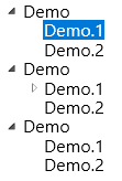
接着查看TreeViewItem的组成及样式
2、查看TreeViewItem原有样式
通过Blend编辑TreeViewItem模板副本生成如下三部分样式ExpandCollapseToggleStyle(小三角)、FocusVisualStyle(键盘焦点样式)、TreeViewItemStyle(自身样式)

ExpandCollapseToggleStyle
<Style x:Key="ExpandCollapseToggleStyle" TargetType="{x:Type ToggleButton}">

    <Setter Property="Focusable" Value="False"/>

    <Setter Property="Width" Value="16"/>

    <Setter Property="Height" Value="16"/>

    <Setter Property="Template">

        <Setter.Value>

            <ControlTemplate TargetType="{x:Type ToggleButton}">

                <Border Background="Transparent" Height="16" Padding="5,5,5,5" Width="16">

                    <Path x:Name="ExpandPath" Data="{StaticResource TreeArrow}" Fill="{StaticResource TreeViewItem.TreeArrow.Static.Fill}" Stroke="{StaticResource TreeViewItem.TreeArrow.Static.Stroke}">

                        <Path.RenderTransform>

                            <RotateTransform Angle="135" CenterY="3" CenterX="3"/>

                        </Path.RenderTransform>

                    </Path>

                </Border>

                <ControlTemplate.Triggers>

                    <Trigger Property="IsChecked" Value="True">

                        <Setter Property="RenderTransform" TargetName="ExpandPath">

                            <Setter.Value>

                                <RotateTransform Angle="180" CenterY="3" CenterX="3"/>

                            </Setter.Value>

                        </Setter>

                        <Setter Property="Fill" TargetName="ExpandPath" Value="{StaticResource TreeViewItem.TreeArrow.Static.Checked.Fill}"/>

                        <Setter Property="Stroke" TargetName="ExpandPath" Value="{StaticResource TreeViewItem.TreeArrow.Static.Checked.Stroke}"/>

                    </Trigger>

                    <Trigger Property="IsMouseOver" Value="True">

                        <Setter Property="Stroke" TargetName="ExpandPath" Value="{StaticResource TreeViewItem.TreeArrow.MouseOver.Stroke}"/>

                        <Setter Property="Fill" TargetName="ExpandPath" Value="{StaticResource TreeViewItem.TreeArrow.MouseOver.Fill}"/>

                    </Trigger>

                    <MultiTrigger>

                        <MultiTrigger.Conditions>

                            <Condition Property="IsMouseOver" Value="True"/>

                            <Condition Property="IsChecked" Value="True"/>

                        </MultiTrigger.Conditions>

                        <Setter Property="Stroke" TargetName="ExpandPath" Value="{StaticResource TreeViewItem.TreeArrow.MouseOver.Checked.Stroke}"/>

                        <Setter Property="Fill" TargetName="ExpandPath" Value="{StaticResource TreeViewItem.TreeArrow.MouseOver.Checked.Fill}"/>

                    </MultiTrigger>

                </ControlTemplate.Triggers>

            </ControlTemplate>

        </Setter.Value>

    </Setter>

</Style>
FocusVisualStyle
<Style x:Key="TreeViewItemFocusVisual">

    <Setter Property="Control.Template">

        <Setter.Value>

            <ControlTemplate>

                <Rectangle/>

            </ControlTemplate>

        </Setter.Value>

    </Setter>

</Style>
TreeViewItemStyle
<Style x:Key="TreeViewItemStyle1" TargetType="{x:Type TreeViewItem}">

    <Setter Property="Background" Value="Transparent"/>

    <Setter Property="HorizontalContentAlignment" Value="{Binding HorizontalContentAlignment, RelativeSource={RelativeSource AncestorType={x:Type ItemsControl}}}"/>

    <Setter Property="VerticalContentAlignment" Value="{Binding VerticalContentAlignment, RelativeSource={RelativeSource AncestorType={x:Type ItemsControl}}}"/>

    <Setter Property="Padding" Value="1,0,0,0"/>

    <Setter Property="Foreground" Value="{DynamicResource {x:Static SystemColors.ControlTextBrushKey}}"/>

    <Setter Property="FocusVisualStyle" Value="{StaticResource TreeViewItemFocusVisual}"/>

    <Setter Property="Template">

        <Setter.Value>

            <ControlTemplate TargetType="{x:Type TreeViewItem}">

                <Grid>

                    <Grid.ColumnDefinitions>

                        <ColumnDefinition MinWidth="19" Width="Auto"/>

                        <ColumnDefinition Width="Auto"/>

                        <ColumnDefinition Width="*"/>

                    </Grid.ColumnDefinitions>

                    <Grid.RowDefinitions>

                        <RowDefinition Height="Auto"/>

                        <RowDefinition/>

                    </Grid.RowDefinitions>

                    <ToggleButton x:Name="Expander" ClickMode="Press" IsChecked="{Binding IsExpanded, RelativeSource={RelativeSource TemplatedParent}}" Style="{StaticResource ExpandCollapseToggleStyle}"/>

                    <Border x:Name="Bd" Background="{TemplateBinding Background}" BorderThickness="{TemplateBinding BorderThickness}" BorderBrush="{TemplateBinding BorderBrush}" Grid.Column="1" Padding="{TemplateBinding Padding}" SnapsToDevicePixels="true">

                        <ContentPresenter x:Name="PART_Header" ContentSource="Header" HorizontalAlignment="{TemplateBinding HorizontalContentAlignment}" SnapsToDevicePixels="{TemplateBinding SnapsToDevicePixels}"/>

                    </Border>

                    <ItemsPresenter x:Name="ItemsHost" Grid.ColumnSpan="2" Grid.Column="1" Grid.Row="1"/>

                </Grid>

                <ControlTemplate.Triggers>

                    <Trigger Property="IsExpanded" Value="false">

                        <Setter Property="Visibility" TargetName="ItemsHost" Value="Collapsed"/>

                    </Trigger>

                    <Trigger Property="HasItems" Value="false">

                        <Setter Property="Visibility" TargetName="Expander" Value="Hidden"/>

                    </Trigger>

                    <Trigger Property="IsSelected" Value="true">

                        <Setter Property="Background" TargetName="Bd" Value="{DynamicResource {x:Static SystemColors.HighlightBrushKey}}"/>

                        <Setter Property="Foreground" Value="{DynamicResource {x:Static SystemColors.HighlightTextBrushKey}}"/>

                    </Trigger>

                    <MultiTrigger>

                        <MultiTrigger.Conditions>

                            <Condition Property="IsSelected" Value="true"/>

                            <Condition Property="IsSelectionActive" Value="false"/>

                        </MultiTrigger.Conditions>

                        <Setter Property="Background" TargetName="Bd" Value="{DynamicResource {x:Static SystemColors.InactiveSelectionHighlightBrushKey}}"/>

                        <Setter Property="Foreground" Value="{DynamicResource {x:Static SystemColors.InactiveSelectionHighlightTextBrushKey}}"/>

                    </MultiTrigger>

                    <Trigger Property="IsEnabled" Value="false">

                        <Setter Property="Foreground" Value="{DynamicResource {x:Static SystemColors.GrayTextBrushKey}}"/>

                    </Trigger>

                </ControlTemplate.Triggers>

            </ControlTemplate>

        </Setter.Value>

    </Setter>

    <Style.Triggers>

        <Trigger Property="VirtualizingPanel.IsVirtualizing" Value="true">

            <Setter Property="ItemsPanel">

                <Setter.Value>

                    <ItemsPanelTemplate>

                        <VirtualizingStackPanel/>

                    </ItemsPanelTemplate>

                </Setter.Value>

            </Setter>

        </Trigger>

    </Style.Triggers>

</Style>
这里我们着重看下TreeViewItemStyle的ControlTemplate部分
<ControlTemplate TargetType="{x:Type TreeViewItem}">

    <Grid>

        <Grid.ColumnDefinitions>

            <ColumnDefinition MinWidth="19" Width="Auto"/>

            <ColumnDefinition Width="Auto"/>

            <ColumnDefinition Width="*"/>

        </Grid.ColumnDefinitions>

        <Grid.RowDefinitions>

            <RowDefinition Height="Auto"/>

            <RowDefinition/>

        </Grid.RowDefinitions>

        <ToggleButton x:Name="Expander" ClickMode="Press" IsChecked="{Binding IsExpanded, RelativeSource={RelativeSource TemplatedParent}}" Style="{StaticResource ExpandCollapseToggleStyle}"/>

        <Border x:Name="Bd" Background="{TemplateBinding Background}" BorderThickness="{TemplateBinding BorderThickness}" BorderBrush="{TemplateBinding BorderBrush}" Grid.Column="1" Padding="{TemplateBinding Padding}" SnapsToDevicePixels="true">

            <ContentPresenter x:Name="PART_Header" ContentSource="Header" HorizontalAlignment="{TemplateBinding HorizontalContentAlignment}" SnapsToDevicePixels="{TemplateBinding SnapsToDevicePixels}"/>

        </Border>

        <ItemsPresenter x:Name="ItemsHost" Grid.ColumnSpan="2" Grid.Column="1" Grid.Row="1"/>

    </Grid>

</ControlTemplate>
如上代码可知控件由 ToggleButton (小三角) 、ContentPresenter (头部)、ItemsPresenter (子菜单)三部分组成。
下面改变ControlTemplate 样式
二、创建 CustomControl
这里我们模拟Edge收藏夹TreeView部分
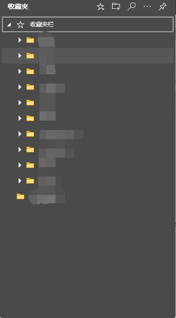
1、新建CustomControl MTreeView
public class MTreeView : System.Windows.Controls.TreeView

{

    static MTreeView()

    {

        DefaultStyleKeyProperty.OverrideMetadata(typeof(MTreeView), new FrameworkPropertyMetadata(typeof(MTreeView)));

    }

}
MTreeView资源文件如下
<ResourceDictionary xmlns="http://schemas.microsoft.com/winfx/2006/xaml/presentation"

                    xmlns:x="http://schemas.microsoft.com/winfx/2006/xaml"

                    xmlns:local="clr-namespace:Cys_CustomControls.Controls">

    <Style  TargetType="{x:Type local:MTreeView}">

        <Setter Property="Background" Value="#4A4A4A"/>

        <Setter Property="BorderBrush" Value="#4A4A4A"/>

        <Setter Property="BorderThickness" Value="1"/>

        <Setter Property="Padding" Value="1"/>

        <Setter Property="Foreground" Value="{DynamicResource {x:Static SystemColors.ControlTextBrushKey}}"/>

        <Setter Property="ScrollViewer.HorizontalScrollBarVisibility" Value="Auto"/>

        <Setter Property="ScrollViewer.VerticalScrollBarVisibility" Value="Auto"/>

        <Setter Property="ScrollViewer.PanningMode" Value="Both"/>

        <Setter Property="Stylus.IsFlicksEnabled" Value="False"/>

        <Setter Property="VerticalContentAlignment" Value="Center"/>

        <Setter Property="Template">

            <Setter.Value>

                <ControlTemplate TargetType="{x:Type local:MTreeView}">

                    <Border x:Name="Bd" BorderThickness="{TemplateBinding BorderThickness}" BorderBrush="{TemplateBinding BorderBrush}" SnapsToDevicePixels="true">

                        <ScrollViewer x:Name="_tv_scrollviewer_" Background="{TemplateBinding Background}" CanContentScroll="false" Focusable="false" HorizontalScrollBarVisibility="{TemplateBinding ScrollViewer.HorizontalScrollBarVisibility}" Padding="{TemplateBinding Padding}" SnapsToDevicePixels="{TemplateBinding SnapsToDevicePixels}" VerticalScrollBarVisibility="{TemplateBinding ScrollViewer.VerticalScrollBarVisibility}">

                            <ItemsPresenter/>

                        </ScrollViewer>

                    </Border>

                    <ControlTemplate.Triggers>

                        <Trigger Property="IsEnabled" Value="false">

                            <Setter Property="Background" TargetName="Bd" Value="{DynamicResource {x:Static SystemColors.ControlBrushKey}}"/>

                        </Trigger>

                        <Trigger Property="VirtualizingPanel.IsVirtualizing" Value="true">

                            <Setter Property="CanContentScroll" TargetName="_tv_scrollviewer_" Value="true"/>

                        </Trigger>

                    </ControlTemplate.Triggers>

                </ControlTemplate>

            </Setter.Value>

        </Setter>

        <Style.Triggers>

            <Trigger Property="VirtualizingPanel.IsVirtualizing" Value="true">

                <Setter Property="ItemsPanel">

                    <Setter.Value>

                        <ItemsPanelTemplate>

                            <VirtualizingStackPanel/>

                        </ItemsPanelTemplate>

                    </Setter.Value>

                </Setter>

            </Trigger>

        </Style.Triggers>

    </Style>

</ResourceDictionary>
2、新建CustomControl MTreeViewItem
public class MTreeViewItem : TreeViewItem

{

    static MTreeViewItem()

    {

        DefaultStyleKeyProperty.OverrideMetadata(typeof(MTreeViewItem), new FrameworkPropertyMetadata(typeof(MTreeViewItem)));

    }

}
MTreeViewItem资源文件如下
    <Style x:Key="ExpandCollapseToggleStyle" TargetType="{x:Type ToggleButton}">

        <Setter Property="Focusable" Value="False"/>

        <Setter Property="Width" Value="16"/>

        <Setter Property="Height" Value="16"/>

        <Setter Property="Template">

            <Setter.Value>

                <ControlTemplate TargetType="{x:Type ToggleButton}">

                    <Border Background="Transparent" Height="16" Padding="3" Width="16">

                        <Path x:Name="ExpandPath" Data="M0,0 L0,8 L8,0 z" Fill="#FFFFFF">

                            <Path.RenderTransform>

                                <RotateTransform Angle="135" CenterY="4" CenterX="4"/>

                            </Path.RenderTransform>

                        </Path>

                    </Border>

                    <ControlTemplate.Triggers>

                        <Trigger Property="IsChecked" Value="True">

                            <Setter Property="RenderTransform" TargetName="ExpandPath">

                                <Setter.Value>

                                    <RotateTransform Angle="180" CenterY="4" CenterX="4"/>

                                </Setter.Value>

                            </Setter>

                        </Trigger>

                    </ControlTemplate.Triggers>

                </ControlTemplate>

            </Setter.Value>

        </Setter>

    </Style>

    <Style TargetType="{x:Type local:MTreeViewItem}">

        <Setter Property="Background" Value="Transparent"/>

        <Setter Property="HorizontalContentAlignment" Value="Stretch"/>

        <Setter Property="VerticalContentAlignment" Value="{Binding VerticalContentAlignment, RelativeSource={RelativeSource AncestorType={x:Type ItemsControl}}}"/>

        <Setter Property="Padding" Value="1,0,0,0"/>

        <Setter Property="Foreground" Value="#FFFFFF"/>

        <Setter Property="FocusVisualStyle" Value="{x:Null}"/>

        <Setter Property="Template">

            <Setter.Value>

                <ControlTemplate TargetType="{x:Type local:MTreeViewItem}">

                    <Grid>

                        <Grid.RowDefinitions>

                            <RowDefinition Height="Auto"/>

                            <RowDefinition/>

                        </Grid.RowDefinitions>

                        <Border x:Name="Bd" Background="{TemplateBinding Background}" HorizontalAlignment="Stretch" VerticalAlignment="Center" BorderThickness="{TemplateBinding BorderThickness}" BorderBrush="{TemplateBinding BorderBrush}"  Padding="{TemplateBinding Padding}" SnapsToDevicePixels="true">

                          <StackPanel Orientation="Horizontal">

                              <ToggleButton x:Name="Expander" ClickMode="Press" IsChecked="{Binding IsExpanded, RelativeSource={RelativeSource TemplatedParent}}" Style="{StaticResource ExpandCollapseToggleStyle}"/>

                              <Grid VerticalAlignment="Center" Height="35">

                                  <ContentPresenter VerticalAlignment="Center" x:Name="PART_Header" ContentSource="Header" HorizontalAlignment="{TemplateBinding HorizontalContentAlignment}" SnapsToDevicePixels="{TemplateBinding SnapsToDevicePixels}"/>

                              </Grid>

                            </StackPanel>

                        </Border>

                        <Grid Grid.Row="1">

                            <ItemsPresenter x:Name="ItemsHost" Margin="10,0,0,0"/>

                        </Grid>

                    </Grid>

                    <ControlTemplate.Triggers>

                        <Trigger Property="IsExpanded" Value="false">

                            <Setter Property="Visibility" TargetName="ItemsHost" Value="Collapsed"/>

                        </Trigger>

                        <Trigger Property="HasItems" Value="false">

                            <Setter Property="Visibility" TargetName="Expander" Value="Hidden"/>

                        </Trigger>

                        <Trigger Property="IsSelected" Value="true">

                            <Setter Property="Background" TargetName="Bd" Value="#575757"/>

                        </Trigger>

                        <MultiTrigger>

                            <MultiTrigger.Conditions>

                                <Condition Property="IsSelected" Value="true"/>

                                <Condition Property="IsSelectionActive" Value="false"/>

                            </MultiTrigger.Conditions>

                            <Setter Property="Foreground" Value="{DynamicResource {x:Static SystemColors.InactiveSelectionHighlightTextBrushKey}}"/>

                        </MultiTrigger>

                        <Trigger Property="IsEnabled" Value="false">

                            <Setter Property="Foreground" Value="{DynamicResource {x:Static SystemColors.GrayTextBrushKey}}"/>

                        </Trigger>

                    </ControlTemplate.Triggers>

                </ControlTemplate>

            </Setter.Value>

        </Setter>

        <Style.Triggers>

            <Trigger Property="VirtualizingPanel.IsVirtualizing" Value="true">

                <Setter Property="ItemsPanel">

                    <Setter.Value>

                        <ItemsPanelTemplate>

                            <VirtualizingStackPanel/>

                        </ItemsPanelTemplate>

                    </Setter.Value>

                </Setter>

            </Trigger>

        </Style.Triggers>

    </Style>
效果如下
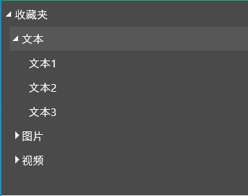
与Edge菜单对比缺少图标
3、为MTreeViewItem增加 Icon
分别创建依赖属性Icon(未展开时图标)、IsExpandedIcon(展开后图标)、IconForeground(图标颜色)我们这里采用阿里字体图标
依赖属性如下:
/// <summary>

/// Icon

/// </summary>

public static readonly DependencyProperty IconProperty = DependencyProperty.Register("Icon", typeof(string), typeof(MTreeViewItem));

public string Icon

{

    get => (string)GetValue(IconProperty);

    set => SetValue(IconProperty, value);

}

/// <summary>

/// IsExpanded

/// </summary>

public static readonly DependencyProperty IsExpandedIconProperty = DependencyProperty.Register("IsExpandedIcon", typeof(string), typeof(MTreeViewItem));

public string IsExpandedIcon

{

    get => (string)GetValue(IsExpandedIconProperty);

    set => SetValue(IsExpandedIconProperty, value);

}

/// <summary>

/// IconForeground

/// </summary>

public static readonly DependencyProperty IconForegroundProperty = DependencyProperty.Register("IconForeground", typeof(Brush), typeof(MTreeViewItem));

public Brush IconForeground

{

    get => (Brush)GetValue(IconForegroundProperty);

    set => SetValue(IconForegroundProperty, value);

}
Xaml修改如下:
<Style TargetType="{x:Type local:MTreeViewItem}">
<Setter Property="Background" Value="Transparent"/>
<Setter Property="HorizontalContentAlignment" Value="Stretch"/>
<Setter Property="VerticalContentAlignment" Value="{Binding VerticalContentAlignment, RelativeSource={RelativeSource AncestorType={x:Type ItemsControl}}}"/>
<Setter Property="Padding" Value="1,0,0,0"/>
<Setter Property="Foreground" Value="#FFFFFF"/>
<Setter Property="FocusVisualStyle" Value="{x:Null}"/>
<Setter Property="Icon" Value=""/>
<Setter Property="IsExpandedIcon" Value=""/>
<Setter Property="IconForeground" Value="#FFCD2C"/>
<Setter Property="Template">
<Setter.Value>
<ControlTemplate TargetType="{x:Type local:MTreeViewItem}">
<Grid>
<Grid.RowDefinitions>
<RowDefinition Height="Auto"/>
<RowDefinition/>
</Grid.RowDefinitions>
<Border x:Name="Bd" Background="{TemplateBinding Background}" HorizontalAlignment="Stretch" VerticalAlignment="Center" BorderThickness="{TemplateBinding BorderThickness}" BorderBrush="{TemplateBinding BorderBrush}" Padding="{TemplateBinding Padding}" SnapsToDevicePixels="true">
<StackPanel Orientation="Horizontal">
<ToggleButton x:Name="Expander" ClickMode="Press" IsChecked="{Binding IsExpanded, RelativeSource={RelativeSource TemplatedParent}}" Style="{StaticResource ExpandCollapseToggleStyle}"/>
<TextBlock x:Name ="PART_Icon" Text="{TemplateBinding Icon}" Foreground="{TemplateBinding IconForeground}" VerticalAlignment="Center" Margin="5,0"/>
<Grid VerticalAlignment="Center" Height="35">
<ContentPresenter VerticalAlignment="Center" x:Name="PART_Header" ContentSource="Header" HorizontalAlignment="{TemplateBinding HorizontalContentAlignment}" SnapsToDevicePixels="{TemplateBinding SnapsToDevicePixels}"/>
</Grid>
</StackPanel>
</Border>
<Grid Grid.Row="1">
<ItemsPresenter x:Name="ItemsHost" Margin="10,0,0,0"/>
</Grid>
</Grid>
<ControlTemplate.Triggers>
<Trigger Property="IsExpanded" Value="false">
<Setter Property="Visibility" TargetName="ItemsHost" Value="Collapsed"/>
</Trigger>
<Trigger Property="IsExpanded" Value="True">
<Setter Property="Text" TargetName="PART_Icon" Value="{Binding RelativeSource={RelativeSource AncestorType=local:MTreeViewItem}, Path=IsExpandedIcon}"/>
</Trigger>
<Trigger Property="HasItems" Value="false">
<Setter Property="Visibility" TargetName="Expander" Value="Hidden"/>
</Trigger>
<Trigger Property="IsSelected" Value="true">
<Setter Property="Background" TargetName="Bd" Value="#575757"/>
</Trigger>
<MultiTrigger>
<MultiTrigger.Conditions>
<Condition Property="IsSelected" Value="true"/>
<Condition Property="IsSelectionActive" Value="false"/>
</MultiTrigger.Conditions>
<Setter Property="Foreground" Value="{DynamicResource {x:Static SystemColors.InactiveSelectionHighlightTextBrushKey}}"/>
</MultiTrigger>
<Trigger Property="IsEnabled" Value="false">
<Setter Property="Foreground" Value="{DynamicResource {x:Static SystemColors.GrayTextBrushKey}}"/>
</Trigger>
</ControlTemplate.Triggers>
</ControlTemplate>
</Setter.Value>
</Setter>
<Style.Triggers>
<Trigger Property="VirtualizingPanel.IsVirtualizing" Value="true">
<Setter Property="ItemsPanel">
<Setter.Value>
<ItemsPanelTemplate>
<VirtualizingStackPanel/>
</ItemsPanelTemplate>
</Setter.Value>
</Setter>
</Trigger>
</Style.Triggers>
</Style>
Xaml中增加了一个TextBlock用于显示字体图标
在控件中引用MTreeView如下:
<baseControl:MTreeView>
<baseControl:MTreeViewItem Header="收藏夹" Icon="" IsExpandedIcon="" IconForeground="#FFFFFF">
<baseControl:MTreeViewItem Header="文本" Icon="">
<baseControl:MTreeViewItem Header="文本1">
</baseControl:MTreeViewItem>
<baseControl:MTreeViewItem Header="文本2">
</baseControl:MTreeViewItem>
<baseControl:MTreeViewItem Header="文本3">
</baseControl:MTreeViewItem>
</baseControl:MTreeViewItem>
<baseControl:MTreeViewItem Header="图片">
<baseControl:MTreeViewItem Header="图片1">
</baseControl:MTreeViewItem>
<baseControl:MTreeViewItem Header="图片2">
</baseControl:MTreeViewItem>
<baseControl:MTreeViewItem Header="图片3">
</baseControl:MTreeViewItem>
</baseControl:MTreeViewItem>
<baseControl:MTreeViewItem Header="视频">
<baseControl:MTreeViewItem Header="视频1">
</baseControl:MTreeViewItem>
<baseControl:MTreeViewItem Header="视频2">
</baseControl:MTreeViewItem>
<baseControl:MTreeViewItem Header="视频3">
</baseControl:MTreeViewItem>
</baseControl:MTreeViewItem>
</baseControl:MTreeViewItem>
</baseControl:MTreeView>
运行效果如下:

三、源码地址
gitee地址:https://gitee.com/sirius_machao/Cys_Controls/tree/dev/
Cys_Control(六) MTreeView的更多相关文章
- 如何一步一步用DDD设计一个电商网站(六)—— 给购物车加点料,集成售价上下文
阅读目录 前言 如何在一个项目中实现多个上下文的业务 售价上下文与购买上下文的集成 结语 一.前言 前几篇已经实现了一个最简单的购买过程,这次开始往这个过程中增加一些东西.比如促销.会员价等,在我们的 ...
- MVVM模式解析和在WPF中的实现(六) 用依赖注入的方式配置ViewModel并注册消息
MVVM模式解析和在WPF中的实现(六) 用依赖注入的方式配置ViewModel并注册消息 系列目录: MVVM模式解析和在WPF中的实现(一)MVVM模式简介 MVVM模式解析和在WPF中的实现(二 ...
- 【原】AFNetworking源码阅读(六)
[原]AFNetworking源码阅读(六) 本文转载请注明出处 —— polobymulberry-博客园 1. 前言 这一篇的想讲的,一个就是分析一下AFSecurityPolicy文件,看看AF ...
- CRL快速开发框架系列教程六(分布式缓存解决方案)
本系列目录 CRL快速开发框架系列教程一(Code First数据表不需再关心) CRL快速开发框架系列教程二(基于Lambda表达式查询) CRL快速开发框架系列教程三(更新数据) CRL快速开发框 ...
- 【微信小程序开发•系列文章六】生命周期和路由
这篇文章理论的知识比较多一些,都是个人观点,描述有失妥当的地方希望读者指出. [微信小程序开发•系列文章一]入门 [微信小程序开发•系列文章二]视图层 [微信小程序开发•系列文章三]数据层 [微信小程 ...
- 我的MYSQL学习心得(六) 函数
我的MYSQL学习心得(六) 函数 我的MYSQL学习心得(一) 简单语法 我的MYSQL学习心得(二) 数据类型宽度 我的MYSQL学习心得(三) 查看字段长度 我的MYSQL学习心得(四) 数据类 ...
- 我的MYSQL学习心得(十六) 优化
我的MYSQL学习心得(十六) 优化 我的MYSQL学习心得(一) 简单语法 我的MYSQL学习心得(二) 数据类型宽度 我的MYSQL学习心得(三) 查看字段长度 我的MYSQL学习心得(四) 数据 ...
- ASP.NET MVC Model绑定(六)
ASP.NET MVC Model绑定(六) 前言 前面的篇幅对于IValueProvider的使用做个基础的示例讲解,但是没并没有对 IValueProvider类型的实现做详细的介绍,然而MVC框 ...
- redis成长之路——(六)
redis配置 为了码农在代码上只关心业务以及代码上的统一性,wenli.drive.redis内部使用配置来完成那些不同的场景,也就是说随便填填配置就能适应不同的场景! 当然配置多了码农也会受不了, ...
随机推荐
- 20191209_Centos7.2使用yum安装mysql
1. 下载mysql的rpm包 [root@izwz91qnvovd6suufon1ccz ~]# wget http://dev.mysql.com/get/mysql57-community-re ...
- 老猿学5G专栏完结说明
老猿学5G是因为工作原因促成的,主要目的是为了研究5G的计费架构相关内容,到今天为止,基本上达成目标,因此这个专栏基本上告一段落了. 回想这2个多月的日子,从一个对5G相关知识完全不熟悉的小白,到现在 ...
- MoviePy v2.0.0.dev1尚不成熟,不建议大家使用
☞ ░ 前往老猿Python博文目录 ░ 在<重要消息:MoviePy v2.0.0.dev1预发布版本已经可以下载安装使用>之后老猿就安装了MoviePy v2.0.0.dev1这个版本 ...
- 关于open函数文件打开模式的有意思的一个现象
老猿前阵子学习了文件IO,最近正在回顾及进行各种验证和总结,老猿在对文件进行打开后的返回值检查属性时,发现文件打开返回的文件对象的读写模式与打开文件的模式并不完全相同,如下案例: fp1 = open ...
- 转1:Python字符编码详解
Python27字符编码详解 声明 一 字符编码基础 1 抽象字符清单ACR 2 已编码字符集CCS 3 字符编码格式CEF 31 ASCII初创 311 ASCII 312 EASCII 32 MB ...
- PyQt程序执行时报错:AttributeError: 'winTest' object has no attribute 'setCentralWidget'的解决方法
用QtDesigner设计了一个UI界面,保存在文件Ui_wintest.ui中,界面中使用了MainWindow窗口,窗口名字也叫MainWindow,用PyUIC将其转换成了 Ui_wintest ...
- upload 注意php远程安全模式屏蔽函数
进来:上传一个一句话php,果然不行:改成jpg后缀,上传成功:接着写一个.htaccess文件去把.jpg解析成.php,如下: AddType application/x-httpd-php .j ...
- ASP.NET Log4net数据库日志新增记录客户端ip
LOG4数据库记录器XML配置 1 <appender name="ADONetAppender" type="log4net.Appender.ADONetApp ...
- 从HBase底层原理解析HBASE列族不能设计太多的原因?
在之前的文章<深入探讨HBASE>中,笔者详细介绍了: HBase基础知识(包括简介.表结构).系统架构.数据存储 WAL log和HBase中LSM树的应用 HBase寻址机制 mino ...
- 六、Jmeter测试元件-测试计划
启动Jmeter时,会默认建好一个测试计划,启动一个Jmeter只有个测试计划 测试用到的源码下载地址 https://www.cnblogs.com/fanfancs/p/13557062.html ...