R:ggplot2数据可视化——进阶(2)
Part 2: Customizing the Look and Feel,
更高级的自定义化,比如说操作图例、注记、多图布局等
# Setup
options(scipen=999)
library(ggplot2)
data("midwest", package = "ggplot2")
theme_set(theme_bw())
# midwest <- read.csv("http://goo.gl/G1K41K") # bkup data source # Add plot components --------------------------------
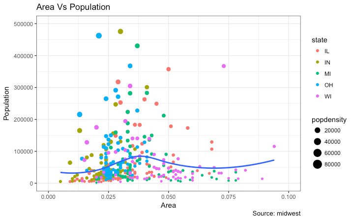
gg <- ggplot(midwest, aes(x=area, y=poptotal)) +
geom_point(aes(col=state, size=popdensity)) +
geom_smooth(method="loess", se=F) + xlim(c(0, 0.1)) + ylim(c(0, 500000)) +
labs(title="Area Vs Population", y="Population", x="Area", caption="Source: midwest") # Call plot ------------------------------------------
plot(gg)
传递给 theme() 的参数要求使用特定的 element_type() 函数来设置. 主要有四种类型
element_text(): Since the title, subtitle and captions are textual itemselement_line(): Likewiseelement_line()is use to modify line based components such as the axis lines, major and minor grid lines, etc.element_rect(): Modifies rectangle components such as plot and panel background.element_blank(): Turns off displaying the theme item.清除主题展示
1 添加图形和轴标题
theme() 函数接受四个 element_type() 函数之一作为实参 由于标题是文本 使用element_text()修饰
library(ggplot2)

# Base Plot

gg <- ggplot(midwest, aes(x=area, y=poptotal)) +

  geom_point(aes(col=state, size=popdensity)) +

  geom_smooth(method="loess", se=F) + xlim(c(0, 0.1)) + ylim(c(0, 500000)) +

  labs(title="Area Vs Population", y="Population", x="Area", caption="Source: midwest")

# Modify theme components -------------------------------------------

gg + theme(plot.title=element_text(size=20,

                                    face="bold",

                                    family="American Typewriter",

                                    color="tomato",

                                    hjust=0.5,

                                    lineheight=1.2),  # title

            plot.subtitle=element_text(size=15,

                                       family="American Typewriter",

                                       face="bold",

                                       hjust=0.5),  # subtitle

            plot.caption=element_text(size=15),  # caption

            axis.title.x=element_text(vjust=10,

                                      size=15),  # X axis title

            axis.title.y=element_text(size=15),  # Y axis title

            axis.text.x=element_text(size=10,

                                     angle = 30,

                                     vjust=.5),  # X axis text

            axis.text.y=element_text(size=10))  # Y axis text

vjust, controls the vertical spacing between title (or label) and plot. 行距hjust, controls the horizontal spacing. Setting it to 0.5 centers the title. 间距family, 字体face, sets the font face (“plain”, “italic”, “bold”, “bold.italic”)
?theme
2 修改图例
aesthetics are static, a legend is not drawn by default.
aesthetics (fill, size, col, shape or stroke) base on another column, as in geom_point(aes(col=state, size=popdensity)), a legend is automatically drawn.
改变标题
Method 1: Using labs()
library(ggplot2)

# Base Plot

gg <- ggplot(midwest, aes(x=area, y=poptotal)) +

  geom_point(aes(col=state, size=popdensity)) +

  geom_smooth(method="loess", se=F) + xlim(c(0, 0.1)) + ylim(c(0, 500000)) +

  labs(title="Area Vs Population", y="Population", x="Area", caption="Source: midwest")

gg + labs(color="State", size="Density")  # modify legend title
Method 2: Using guides()
library(ggplot2)

# Base Plot

gg <- ggplot(midwest, aes(x=area, y=poptotal)) +

  geom_point(aes(col=state, size=popdensity)) +

  geom_smooth(method="loess", se=F) + xlim(c(0, 0.1)) + ylim(c(0, 500000)) +

  labs(title="Area Vs Population", y="Population", x="Area", caption="Source: midwest")

gg <- gg + guides(color=guide_legend("State"), size=guide_legend("Density"))  # modify legend title

plot(gg)
Method 3: Using scale_aesthetic_vartype() format
scale_aestheic_vartype() 可以关闭指定变量的图例,其余保持不变 通过设置 guide=FALSE
基于连续变量的点的大小的图例, 使用 scale_size_continuous() 函数
library(ggplot2)

# Base Plot

gg <- ggplot(midwest, aes(x=area, y=poptotal)) +

  geom_point(aes(col=state, size=popdensity)) +

  geom_smooth(method="loess", se=F) + xlim(c(0, 0.1)) + ylim(c(0, 500000)) +

  labs(title="Area Vs Population", y="Population", x="Area", caption="Source: midwest")

# Modify Legend

gg + scale_color_discrete(name="State") + scale_size_continuous(name = "Density", guide = FALSE)  # turn off legend for size

改变图例标签和点的颜色(针对不同类型)
使用对应的 scale_aesthetic_manual() 函数 新的图例标签作为一个字符向量 (labels argument)
通过 values 实参改变颜色
library(ggplot2)

# Base Plot

gg <- ggplot(midwest, aes(x=area, y=poptotal)) +

  geom_point(aes(col=state, size=popdensity)) +

  geom_smooth(method="loess", se=F) + xlim(c(0, 0.1)) + ylim(c(0, 500000)) +

  labs(title="Area Vs Population", y="Population", x="Area", caption="Source: midwest")

gg + scale_color_manual(name="State",

                        labels = c("Illinois",

                                   "Indiana",

                                   "Michigan",

                                   "Ohio",

                                   "Wisconsin"), #可以改变图例标签的顺序

                        values = c("IL"="blue",

                                   "IN"="red",

                                   "MI"="green",

                                   "OH"="brown",

                                   "WI"="orange"))

改变图例的顺序
guides()
library(ggplot2)

# Base Plot

gg <- ggplot(midwest, aes(x=area, y=poptotal)) +

  geom_point(aes(col=state, size=popdensity)) +

  geom_smooth(method="loess", se=F) + xlim(c(0, 0.1)) + ylim(c(0, 500000)) +

  labs(title="Area Vs Population", y="Population", x="Area", caption="Source: midwest")

gg + guides(colour = guide_legend(order = 1),

            size = guide_legend(order = 2))
改变图例标题 文本 背景的样式
图例的 key 是一个像元素的图形 , 使用 element_rect() 函数设置
library(ggplot2)

# Base Plot

gg <- ggplot(midwest, aes(x=area, y=poptotal)) +

  geom_point(aes(col=state, size=popdensity)) +

  geom_smooth(method="loess", se=F) + xlim(c(0, 0.1)) + ylim(c(0, 500000)) +

  labs(title="Area Vs Population", y="Population", x="Area", caption="Source: midwest")

gg + theme(legend.title = element_text(size=12, color = "firebrick"),

           legend.text = element_text(size=10),

           legend.key=element_rect(fill='springgreen')) +

  guides(colour = guide_legend(override.aes = list(size=2, stroke=1.5)))

删除图例和改变图例位置
可以使用 theme()函数设置图例的位置 如果想把图例放在图形内部,可以使用 legend.justification 调整图例的铰接点
legend.position 是图例在图形中的坐标 其中(0,0)是左下 (1,1)是右上 legend.justification 指图例内的铰接点
library(ggplot2)

# Base Plot

gg <- ggplot(midwest, aes(x=area, y=poptotal)) +

  geom_point(aes(col=state, size=popdensity)) +

  geom_smooth(method="loess", se=F) + xlim(c(0, 0.1)) + ylim(c(0, 500000)) +

  labs(title="Area Vs Population", y="Population", x="Area", caption="Source: midwest")

# No legend --------------------------------------------------

gg + theme(legend.position="None") + labs(subtitle="No Legend")

# Legend to the left -----------------------------------------

gg + theme(legend.position="left") + labs(subtitle="Legend on the Left")

# legend at the bottom and horizontal ------------------------

gg + theme(legend.position="bottom", legend.box = "horizontal") + labs(subtitle="Legend at Bottom")

# legend at bottom-right, inside the plot --------------------

gg + theme(legend.title = element_text(size=12, color = "salmon", face="bold"),

           legend.justification=c(1,0),

           legend.position=c(0.95, 0.05),

           legend.background = element_blank(),

           legend.key = element_blank()) +

  labs(subtitle="Legend: Bottom-Right Inside the Plot")

# legend at top-left, inside the plot -------------------------

gg + theme(legend.title = element_text(size=12, color = "salmon", face="bold"),

           legend.justification=c(0,1),

           legend.position=c(0.05, 0.95),

           legend.background = element_blank(),

           legend.key = element_blank()) +

  labs(subtitle="Legend: Top-Left Inside the Plot")


添加文本 标签
对人口数超过 300K的县标记 首先创建一个切出来符合条件的数据框 (midwest_sub)
然后用这个数据框作为数据源去画 geom_text 和 geom_label
推荐使用ggrepel包为点添加文本或者标签 因为不会遮盖点
library(ggplot2)

# Filter required rows.

midwest_sub <- midwest[midwest$poptotal > 300000, ]

midwest_sub$large_county <- ifelse(midwest_sub$poptotal > 300000, midwest_sub$county, "")

# Base Plot

gg <- ggplot(midwest, aes(x=area, y=poptotal)) +

  geom_point(aes(col=state, size=popdensity)) +

  geom_smooth(method="loess", se=F) + xlim(c(0, 0.1)) + ylim(c(0, 500000)) +

  labs(title="Area Vs Population", y="Population", x="Area", caption="Source: midwest")

# Plot text and label ------------------------------------------------------

gg + geom_text(aes(label=large_county), size=2, data=midwest_sub) + labs(subtitle="With ggplot2::geom_text") + theme(legend.position = "None")   # text 设置data参量

gg + geom_label(aes(label=large_county), size=2, data=midwest_sub, alpha=0.25) + labs(subtitle="With ggplot2::geom_label") + theme(legend.position = "None")  # label 是有外边框的

# Plot text and label that REPELS eachother (using ggrepel pkg) ------------

library(ggrepel)

gg + geom_text_repel(aes(label=large_county), size=2, data=midwest_sub) + labs(subtitle="With ggrepel::geom_text_repel") + theme(legend.position = "None")   # text

gg + geom_label_repel(aes(label=large_county), size=2, data=midwest_sub) + labs(subtitle="With ggrepel::geom_label_repel") + theme(legend.position = "None")   # label


添加注记
使用 annotation_custom() 函数 需要一个 grob 作为参数
创建一个包含你想展示的文本的grob
library(ggplot2)

# Base Plot

gg <- ggplot(midwest, aes(x=area, y=poptotal)) +

  geom_point(aes(col=state, size=popdensity)) +

  geom_smooth(method="loess", se=F) + xlim(c(0, 0.1)) + ylim(c(0, 500000)) +

  labs(title="Area Vs Population", y="Population", x="Area", caption="Source: midwest")

# Define and add annotation -------------------------------------

library(grid)

my_text <- "This text is at x=0.7 and y=0.8!" #文本

my_grob = grid.text(my_text, x=0.7,  y=0.8, gp=gpar(col="firebrick", fontsize=14, fontface="bold")) #文本位置 样式

gg + annotation_custom(my_grob)

4 翻转x y轴
交换x y轴
coord_flip()
library(ggplot2)

# Base Plot

gg <- ggplot(midwest, aes(x=area, y=poptotal)) +

  geom_point(aes(col=state, size=popdensity)) +

  geom_smooth(method="loess", se=F) + xlim(c(0, 0.1)) + ylim(c(0, 500000)) +

  labs(title="Area Vs Population", y="Population", x="Area", caption="Source: midwest", subtitle="X and Y axis Flipped") + theme(legend.position = "None")

# Flip the X and Y axis -------------------------------------------------

gg + coord_flip()
逆转坐标轴的范围顺序
library(ggplot2)

# Base Plot

gg <- ggplot(midwest, aes(x=area, y=poptotal)) +

  geom_point(aes(col=state, size=popdensity)) +

  geom_smooth(method="loess", se=F) + xlim(c(0, 0.1)) + ylim(c(0, 500000)) +

  labs(title="Area Vs Population", y="Population", x="Area", caption="Source: midwest", subtitle="Axis Scales Reversed") + theme(legend.position = "None")

# Reverse the X and Y Axis ---------------------------

gg + scale_x_reverse() + scale_y_reverse()


5 切面:在一个图形中画多图
library(ggplot2)

data(mpg, package="ggplot2")  # load data

# mpg <- read.csv("http://goo.gl/uEeRGu")  # alt data source

g <- ggplot(mpg, aes(x=displ, y=hwy)) +

      geom_point() +

      labs(title="hwy vs displ", caption = "Source: mpg") +

      geom_smooth(method="lm", se=FALSE) +

      theme_bw()  # apply bw theme

plot(g)

我们得到一个简单的 highway mileage (hwy) 和 engine displacement (displ) 的图,但是如果想研究不同类型车辆这两个变量之间的关系呢?
Facet Wrap
所有的图形在x和y轴的缩放比例默认相同 可以通过设置 scales='free' 解除约束 但是这样难以比较不同组之间的差异
library(ggplot2)

# Base Plot

g <- ggplot(mpg, aes(x=displ, y=hwy)) +

      geom_point() +

      geom_smooth(method="lm", se=FALSE) +

      theme_bw()  # apply bw theme

# Facet wrap with common scales

g + facet_wrap( ~ class, nrow=3) + labs(title="hwy vs displ", caption = "Source: mpg", subtitle="Ggplot2 - Faceting - Multiple plots in one figure")  # Shared scales

# Facet wrap with free scales

g + facet_wrap( ~ class, scales = "free") + labs(title="hwy vs displ", caption = "Source: mpg", subtitle="Ggplot2 - Faceting - Multiple plots in one figure with free scales")  # Scales free


Facet Grid
facet_grid() 用来把一个大图按照不同种类拆分成许多小图 将一个 formula作为主要参数 ~ 左边构成行 而~右边构成列
标题行会占用很多空间 facet_grid() 会清理这些标题 facet_grid 不能选择行数与列数
library(ggplot2)

# Base Plot

g <- ggplot(mpg, aes(x=displ, y=hwy)) +

      geom_point() +

      labs(title="hwy vs displ", caption = "Source: mpg", subtitle="Ggplot2 - Faceting - Multiple plots in one figure") +

      geom_smooth(method="lm", se=FALSE) +

      theme_bw()  # apply bw theme

# Add Facet Grid

g1 <- g + facet_grid(manufacturer ~ class)  # manufacturer in rows and class in columns

plot(g1)

把这些图放到一个面板中
# Draw Multiple plots in same figure.

library(gridExtra)

gridExtra::grid.arrange(g1, g2, ncol=2)

6 修改背景 主要次要坐标轴
改变背景
library(ggplot2)

# Base Plot

g <- ggplot(mpg, aes(x=displ, y=hwy)) +

      geom_point() +

      geom_smooth(method="lm", se=FALSE) +

      theme_bw()  # apply bw theme

# Change Plot Background elements -----------------------------------

g + theme(panel.background = element_rect(fill = 'khaki'),

          panel.grid.major = element_line(colour = "burlywood", size=1.5),

          panel.grid.minor = element_line(colour = "tomato",

                                          size=.25,

                                          linetype = "dashed"),

          panel.border = element_blank(),

          axis.line.x = element_line(colour = "darkorange",

                                     size=1.5,

                                     lineend = "butt"),

          axis.line.y = element_line(colour = "darkorange",

                                     size=1.5)) +

    labs(title="Modified Background",

         subtitle="How to Change Major and Minor grid, Axis Lines, No Border")

# Change Plot Margins -----------------------------------------------

g + theme(plot.background=element_rect(fill="salmon"),

          plot.margin = unit(c(2, 2, 1, 1), "cm")) +  # top, right, bottom, left

    labs(title="Modified Background", subtitle="How to Change Plot Margin")


删除主要次要格网 改变边界 轴标题 文本和刻度
library(ggplot2)

# Base Plot

g <- ggplot(mpg, aes(x=displ, y=hwy)) +

      geom_point() +

      geom_smooth(method="lm", se=FALSE) +

      theme_bw()  # apply bw theme

g + theme(panel.grid.major = element_blank(),

          panel.grid.minor = element_blank(),

          panel.border = element_blank(),

          axis.title = element_blank(),

          axis.text = element_blank(),

          axis.ticks = element_blank()) +

  labs(title="Modified Background", subtitle="How to remove major and minor axis grid, border, axis title, text and ticks")

在背景中添加图片
library(ggplot2)

library(grid)

library(png)

img <- png::readPNG("screenshots/Rlogo.png")  # source: https://www.r-project.org/

g_pic <- rasterGrob(img, interpolate=TRUE)

# Base Plot

g <- ggplot(mpg, aes(x=displ, y=hwy)) +

      geom_point() +

      geom_smooth(method="lm", se=FALSE) +

      theme_bw()  # apply bw theme

g + theme(panel.grid.major = element_blank(),

          panel.grid.minor = element_blank(),

          plot.title = element_text(size = rel(1.5), face = "bold"),

          axis.ticks = element_blank()) +

  annotation_custom(g_pic, xmin=5, xmax=7, ymin=30, ymax=45)

Inheritance Structure of Theme Components
主题组分的继承结构

参考:
http://r-statistics.co/Complete-Ggplot2-Tutorial-Part2-Customizing-Theme-With-R-Code.html
R:ggplot2数据可视化——进阶(2)的更多相关文章
- R:ggplot2数据可视化——进阶(1)
,分为三个部分,此篇为Part1,推荐学习一些基础知识后阅读~ Part 1: Introduction to ggplot2, 覆盖构建简单图表并进行修饰的基础知识 Part 2: Customiz ...
- R:ggplot2数据可视化——进阶(3)
Part 3: Top 50 ggplot2 Visualizations - The Master List, 结合进阶1.2内容构建图形 有效的图形是: 不扭曲事实 传递正确的信息 简洁优雅 美观 ...
- R:ggplot2数据可视化——基础知识
1 安装 # 获取ggplot2 最容易的就是下载整个tidyverse: install.packages("tidyverse") # 也可以选择只下载ggplot2: ins ...
- 最棒的7种R语言数据可视化
最棒的7种R语言数据可视化 随着数据量不断增加,抛开可视化技术讲故事是不可能的.数据可视化是一门将数字转化为有用知识的艺术. R语言编程提供一套建立可视化和展现数据的内置函数和库,让你学习这门艺术.在 ...
- 第一篇:R语言数据可视化概述(基于ggplot2)
前言 ggplot2是R语言最为强大的作图软件包,强于其自成一派的数据可视化理念.当熟悉了ggplot2的基本套路后,数据可视化工作将变得非常轻松而有条理. 本文主要对ggplot2的可视化理念及开发 ...
- 第三篇:R语言数据可视化之条形图
条形图简介 数据可视化中,最常用的图非条形图莫属,它主要用来展示不同分类(横轴)下某个数值型变量(纵轴)的取值.其中有两点要重点注意: 1. 条形图横轴上的数据是离散而非连续的.比如想展示两商品的价格 ...
- 第六篇:R语言数据可视化之数据分布图(直方图、密度曲线、箱线图、等高线、2D密度图)
数据分布图简介 中医上讲看病四诊法为:望闻问切.而数据分析师分析数据的过程也有点相似,我们需要望:看看数据长什么样:闻:仔细分析数据是否合理:问:针对前两步工作搜集到的问题与业务方交流:切:结合业务方 ...
- 第五篇:R语言数据可视化之散点图
散点图简介 散点图通常是用来表述两个连续变量之间的关系,图中的每个点表示目标数据集中的每个样本. 同时散点图中常常还会拟合一些直线,以用来表示某些模型. 绘制基本散点图 本例选用如下测试数据集: 绘制 ...
- 第四篇:R语言数据可视化之折线图、堆积图、堆积面积图
折线图简介 折线图通常用来对两个连续变量的依存关系进行可视化,其中横轴很多时候是时间轴. 但横轴也不一定是连续型变量,可以是有序的离散型变量. 绘制基本折线图 本例选用如下测试数据集: 绘制方法是首先 ...
随机推荐
- BlockingQueu 阻塞队列
java.util.concurrent public interface BlockingQueue<E> extends Queue<E> 简介 当阻塞队列插入数据时: 如 ...
- delphi xe10 网络文件传送
//网络传送文件(类似Server/Client) TTetheringManager|设备管理.TTetheringAppProfile|文件发送 待补充
- Optimal Marks SPOJ - OPTM
传送门 一个无向图,每个点有点权,某些点点权确定了,某些点由你来确定,边权为两个点的异或和,要使边权和最小. 这不是一道按位做最小割的大水题么 非常开心地打了,还非常开心地以为有spj,然后非常开心地 ...
- PMP-49个过程快速导览
启动过程组 名正言顺 人鬼佛神 01 -4.1制定项目章程 -授权PM,启动项目 ● 编写一份正式批准项目并授权项目经理在项目活动中使用组织资源的文件的过程 ● 明确项目与组织战略目标之间的联系,确立 ...
- Spring随笔-核心知识DI与AOP
DI 依赖注入,使得相互依赖的组件松耦合. AOP 面向切面编程,使各种功能分离出来,形成可重用的组件.
- nginx启停脚本
安装nginx时,源码包中未带官方的启动脚本,也就无法使用service nginxd start这种启动方式,查了下资料自己写了一个: #!/bin/bash #@version: #@author ...
- 剑指offer——21正则表达式匹配
题目描述 请实现一个函数用来匹配包括'.'和'*'的正则表达式.模式中的字符'.'表示任意一个字符,而'*'表示它前面的字符可以出现任意次(包含0次). 在本题中,匹配是指字符串的所有字符匹配整个模式 ...
- eclipse导入别人项目配置tomcat和jdk
1.file--import--General--Existing Projiect into Workspace-- 2.导入项目成功后,项目会有错误,需重新进行tomcat及jdk的配置 项目名右 ...
- CSS Sprites(CSS图像拼合技术)教程、工具集合
本集合是有一位国外设计师收集整合,并由 oncoding翻译成中文的,感谢他们的辛苦贡献.CSS Sprites技术在国外并不是什么新技术,只不过近两年(尤其08年开始)中国开始流行这个词,大家也开始 ...
- Docker学习の更改Docker的目录
一.更改虚拟磁盘的目录 虚拟机的默认存储位置是C:\Users\Administrator\.docker\machine\machines ,后期docke镜像文件会不断增加,为了给系统盘减负,最好 ...