linear-gradient----渐变
CSS3 渐变(gradient)可以让你在两个或多个指定的颜色之间显示平稳的过渡。 以前,你必须使用图像来实现这些效果,现在通过使用 CSS3 的渐变(gradients)即可实现。此外,渐变效果的元素在放大时看起来效果更好,因为渐变(gradient)是由浏览器生成的。
1、语法
background: linear-gradient(direction, color-stop1, color-stop2, ...);
direction(角度),默认是to bottm,即从上到下的渐变。
stop,颜色的分布位置,默认是均匀分布,比如有三个颜色渐变,每个颜色的stop值为33.3%。
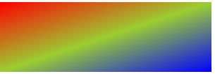
举个栗子:
.smallbox{
    width:300px;
    height:100px;
    background-image:linear-gradient(to right,red,yellowgreen,blue);
}
效果:

direction的值自然还有其他三个,分别是to top 、to left 、 to bottom(默认)。
但是这仅仅是常规方向,比如你想斜着渐变,可以这样调整角度,比如从左上角向右下角渐变,可以:
.smallbox{
    width:300px;
    height:100px;
    background-image:linear-gradient(to right bottom,red,yellowgreen,blue);
}
效果:
类似值,还有,to right top、to left top、to left bottom。
可以使用具体角度值表示角度,单位deg:
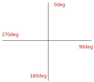
举个栗子,比如90deg(也就是to right):
.smallbox{
    width:300px;
    height:100px;
    background-image:linear-gradient(90deg,red,yellowgreen);
}
效果:

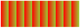
重复性渐变:repeating-linear-gradient
.smallbox{
    width:300px;
    height:100px;
    background-image: repeating-linear-gradient(90deg,red 10%,yellowgreen 20%);
}
效果:
渐变到透明:rgba
.smallbox{
    width:300px;
    height:100px;
    background-image: linear-gradient(to right, rgba(255, 0 ,0, 1), rgba(255, 0 ,0 , 0));
}
效果:

linear-gradient----渐变的更多相关文章
- CSS3 Gradient 渐变
转载自:http://www.w3cplus.com/content/css3-gradient CSS3发布很久了,现在在国外的一些页面上常能看到他的身影,这让我羡慕已久,只可惜在国内为了兼容IE, ...
- FCC---Create a Gradual CSS Linear Gradient
Applied Visual Design: Create a Gradual CSS Linear Gradient background: linear-gradient(gradient_dir ...
- CSS 3 属性学习 —— 1. Gradient 渐变
CSS3 中渐变分为: 线性渐变(linear-gradient)和径向渐变(radial-gradient)两种. 1. 线性渐变 参数: <linear-gradient> = li ...
- gradient渐变IE兼容处理
根据caniuse(http://caniuse.com/#search=gradient),rgba兼容性为IE10以及以上浏览器. 实例代码: <!doctype html> < ...
- CSS gradient渐变之webkit核心浏览器下的使用以及实例
一.关于渐变 渐变是一种应用于平面的视觉效果,可以从一种颜色逐渐地转变成另外一种颜色,故可以创建类似于彩虹的效果渐变可以应用在任何可以使用图片的地方.例如,您可以指定一个这么一个渐变:顶部的颜色是红色 ...
- CSS gradient渐变之webkit核心浏览器下的使用
一.关于渐变 渐变是一种应用于平面的视觉效果,可以从一种颜色逐渐地转变成另外一种颜色,故可以创建类似于彩虹的效果渐变可以应用在任何可以使用图片的地方.例如,您可以指定一个这么一个渐变:顶部的颜色是红色 ...
- gradient 渐变
看了大漠 写的关于 Gradient 的文章,我也想写点以便加深记忆. 首先gradient 分为linear-gradient (线性渐变) 和 radial-gradient(径向渐变),渐变是作 ...
- CSS3 Gradient 渐变还能这么玩
浏览器支持两种类型的渐变:线性渐变 (linear-gradient),径向渐变 (radial-gradient) 渐变在 CSS 中属于一种 Image 类型,可以结合 background-im ...
- java实现渐变效果工具
[html] view plain copy package gradient; import java.awt.Color; import java.awt.Dimension; import ja ...
- css 条纹背景
先介绍文章用到的二个知识点 background-size 属性 语法 background-size: length|percentage|cover|contain; css线性渐变 linear ...
随机推荐
- C# 如何用多个字符串来切分字符串并去除空格
using System; using System.Collections.Generic; using System.Linq; using System.Text; using System.D ...
- 后台动态生成GridView列和模版
考虑到很多数据源是不确定的,所以这时无法在前台设置gridview的表头,需要在后台动态指定并绑定数据. 前台代码如下: <%@ Page Title="主页" Langua ...
- Android入门(二):Android工程目录结构
首先我们来看看Android工程的目录结构,如下图: 下面我们来看看每个文件夹都是用来做什么的? 1.src:这个不用多说,它就是保存Java源文件的目录: 2.gen:该文件夹用来保存自动生成的R. ...
- Educational Codeforces Round 12 E Beautiful Subarrays
先转换成异或前缀和,变成询问两个数异或≥k的方案数. 分治然后Trie树即可. #include<cstdio> #include<algorithm> #define N 1 ...
- 有限状态机(FSM)
在游戏开发中,AI是个永恒不变的话题,如果你要的AI只是很简单的一个逻辑 那么有限状态机是一个很好的解决方案,尽管在实际开发中,AI的设计并不是一个简单的逻辑, 如果用有限状态机,维护起来会非常麻烦, ...
- jQuery 利用 parent() parents() 寻找父级 或祖宗元素
$(this).parent().parent().parent().parent().parent().remove(); //此方法通过parent()一级一级往上找 $(this).pare ...
- 对于amqplib的使用心得
最近在nodejs使用了amqplib--rabbitmq的nodejs客户端.封装在了express中,先来代码. var amqp = require('amqplib/callback_api' ...
- windows 安装MySql
转载:http://blog.csdn.net/longyuhome/article/details/7913375 Win7系统安装MySQL5.5.21图解 大家都知道MySQL是一款中.小型关系 ...
- 关于box-shadow属性的一点心得
一般我用到box-shadow都是用于诸如按钮,文本块,某些图标,css类似为: box-shadow: 1px 1px 5px rgba(0, 0, 0, .8); 这样,样式看上去会更加柔和,或者 ...
- TweenMax参数说明
TweenMax 建立在 TweenLite 和 TweenFilterLite 基础之上,因此,又揉合了这二者的功能,使得功能更加的齐备,但是如果说易用性,觉得还是 TweenLite 来得方便一些 ...