
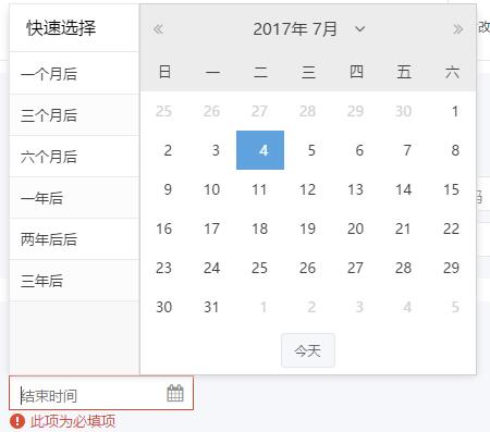
ux.form.field.GridDate 支持快速选择日期的日期控件
效果如图,亲测6.2.1版本可用
 /**

  *支持快速选择日期的日期控件

  */

 Ext.define('ux.form.field.GridDate', {

     extend: 'Ext.form.field.Date',

     alias: 'widget.gridDateField',

     requires: ['ux.picker.GridDate'],

     pickerGrid: {

         store: {

             //默认配置

             data: [{

                 value: 30,

                 text: '一个月后'

             },

             {

                 value: 90,

                 text: '三个月后'

             },

             {

                 value: 180,

                 text: '六个月后'

             },

             {

                 value: 365,

                 text: '一年后'

             },

             {

                 value: 365 * 2,

                 text: '两年后后'

             },

             {

                 value: 365 * 3,

                 text: '三年后'

             }]

         }

     },

     //创建弹窗

     createPicker: function () {

         var me = this,

         format = Ext.String.format;

         return new ux.picker.GridDate({

             floating: true,

             hidden: true,

             pickerField: me,

             pickerGrid: me.pickerGrid,

             pickerDate: {

                 pickerField: me,

                 focusable: false,

                 // Key events are listened from the input field which is never blurred

                 preventRefocus: true,

                 minDate: me.minValue,

                 maxDate: me.maxValue,

                 disabledDatesRE: me.disabledDatesRE,

                 disabledDatesText: me.disabledDatesText,

                 ariaDisabledDatesText: me.ariaDisabledDatesText,

                 disabledDays: me.disabledDays,

                 disabledDaysText: me.disabledDaysText,

                 ariaDisabledDaysText: me.ariaDisabledDaysText,

                 format: me.format,

                 showToday: me.showToday,

                 startDay: me.startDay,

                 minText: format(me.minText, me.formatDate(me.minValue)),

                 ariaMinText: format(me.ariaMinText, me.formatDate(me.minValue, me.ariaFormat)),

                 maxText: format(me.maxText, me.formatDate(me.maxValue)),

                 ariaMaxText: format(me.ariaMaxText, me.formatDate(me.maxValue, me.ariaFormat)),

                 listeners: {

                     scope: me,

                     select: me.onSelect,

                     tabout: me.onTabOut

                 },

                 keyNavConfig: {

                     esc: function () {

                         me.inputEl.focus();

                         me.collapse();

                     }

                 }

             }

         });

     }

 });
 /**

  * 支持快速选择日期的日期控件

  */

 Ext.define('ux.picker.GridDate', {

     extend: 'Ext.container.Container',

     alias: 'widget.gridDatePicker',

     requires: ['Ext.picker.Date', 'Ext.form.field.ComboBox'],

     layout: 'hbox',

     config: {

         pickerDate: {

         },

         pickerGrid: {

             width: 120,

             height:'100%',

             title: '快速选择',

             hideHeaders: true,

             columns: [{

                 flex:1,

                 dataIndex: 'text'

             }]

         }

     },

     //初始化

     initComponent: function () {

         var me = this;

         me.callParent(arguments);

         me.add([me.getPickerGrid(), me.getPickerDate()]);

     },

     //创建时间控件

     applyPickerDate: function (config) {

         return Ext.factory(config, 'Ext.picker.Date', this.getPickerDate());

     },

     //创建下拉框

     applyPickerGrid: function (config) {

         return Ext.factory(config, 'Ext.grid.Panel', this.getPickerGrid());

     },

     //更新下拉框

     updatePickerGrid: function (item) {

         if (item) {

             item.on({

                 itemclick: 'onItemclick',

                 scope: this

             });

         }

     },

     //快速选择

     onItemclick: function (t, rec) {

         //设置值

         this.pickerField.setValue(new Date(Date.now() + 1000 * 60 * 60 * 24 * rec.get('value')));

         //隐藏弹出层

         this.pickerField.collapse();

     },

     //设置禁止时间

     setDisabledDates: function (value) {

         this.getPickerDate().setDisabledDates(value);

     },

     //设置禁止日期

     setDisabledDays: function (value) {

         this.getPickerDate().setDisabledDays(value);

     },

     //设置最小值

     setMinValue: function (value) {

         this.getPickerDate().setMinDate(value);

     },

     //设置最大值

     setMaxValue: function (value) {

         this.getPickerDate().setMaxDate(value);

     },

     //设置值

     setValue:function (value) {

         this.getPickerDate().setValue(value);

     }

 });
ux.form.field.GridDate 支持快速选择日期的日期控件的更多相关文章
- ux.form.field.SearchField 列表、树形菜单查询扩展
//支持bind绑定store //列表搜索扩展,支持本地查询 //支持树形菜单本地一级菜单查询 Ext.define('ux.form.field.SearchField', { extend: ' ...
- ux.form.field.Password 密码与非密码状态切换
效果如图: 扩展源码: //扩展 //密码按钮扩展 //支持在密码与非密码之间切换 Ext.define('ux.form.field.Password', { extend: 'Ext.form.f ...
- ux.form.field.KindEditor 所见所得编辑器
注意需要引入KindEditor相关资源 //所见所得编辑器 Ext.define('ux.form.field.KindEditor', { extend: 'Ext.form.field.Text ...
- ux.form.field.Verify 验证码控件
//验证码控件 Ext.define('ux.form.field.Verify', { extend: 'Ext.container.Container', alias: ['widget.fiel ...
- ux.form.field.TreePicker 扩展,修复火狐不能展开bug
/** * A Picker field that contains a tree panel on its popup, enabling selection of tree nodes. * 动态 ...
- ux.form.field.Year 只能选年的时间扩展
效果如图,亲测6.2.1版本可用,用法同时间选择控件 //只选择年的控件 Ext.define('ux.picker.Year', { extend: 'Ext.Component', alias: ...
- ux.form.field.Month 只能选年、月的时间扩展
效果如图,亲测6.2.1版本可用,用法同时间选择控件 //月弹窗扩展 //只选月 Ext.define('ux.picker.Month', { extend: 'Ext.picker.Month', ...
- CYQ.Data 支持WPF相关的数据控件绑定(2013-08-09)
事件的结果 经过多天的思考及忙碌的开发及测试,CYQ.Data 终于在UI上全面支持WPF,至此,CYQ.Data 已经可以方便支持wpf的开发,同时,框架仍保留最低.net framework2.0 ...
- VB6.0中,DTPicker日期、时间控件不允许为空时,采用文本框与日期、时间控件相互替换赋值(解决方案)
VB6.0中,日期.时间控件不允许为空时,采用文本框与日期.时间控件相互替换赋值,或许是一个不错的选择. 实现效果如下图: 文本框txtStopTime1 时间框DTStopTime1(DTPicke ...
随机推荐
- linux操作之逻辑分区与交换分区篇
作业一: 1) 开启Linux系统前添加一块大小为15G的SCSI硬盘 2) 开启系统,右击桌面,打开终端 3) 为新加的硬盘分区,一个主分区大小为5G,剩余空间给扩展分区,在扩展分区上划 ...
- springboot上传文件并检查图片大小与格式
@PostMapping(value = "/uploadDriverImage") public JsonResVo uploadDriverImage(@RequestPara ...
- SpringBoot无废话入门03:SpringMVC支持
1.默认配置 Springboot对于路径的默认位置为: spring.resources.static-locations=classpath:/META-INF/resources/,classp ...
- jvm理论-字节码指令案例
案例1 public class Demo { public int calc(){ int a=100; int b=200; int c=300; return(a+b)*c; } public ...
- git reflog
http://www.softwhy.com/article-8573-1.html https://www.cnblogs.com/irocker/p/git-reflog.html https:/ ...
- 【PMP】易混淆知识点
一.混淆概念 德尔菲技术 德尔菲技术是组织专家达成一致意见的一种方法.项目专家匿名参与其中.组织者使用调查问卷就重要的项目议题征询意见,然后对专家的答卷进行归纳,并把结果反馈给专家做进一步评论.这个过 ...
- git图解
- RabbitMQ五种消息队列学习(三)–Work模式
由于在实际应用中,简单队列模型无法解决很多实际问题,而且生产者和消费者是一对一的关系.模型较为单一.故引入Work模式. 结构图 一个生产者.多个消费者. 一个消息只能被一个消费者获取. 测试实现: ...
- Unity应用架构设计(4)——设计可复用的SubView和SubViewModel(Part 2)
在我们设计和开发应用程序时,经常要用到控件.比如开发一个客户端WinForm应用程序时,微软就为我们提供了若干控件,这些控件为我们提供了可被定制的属性和事件.属性可以更改它的外观,比如背景色,标题等, ...
- Altium Designer重装后图标都变白板或都变一样的解决方法
https://blog.csdn.net/qq_41995282/article/details/80372113